Figure Friday 2025 - week 36

join the Figure Friday session on September 12, at noon Eastern Time, to showcase your creation and receive feedback from the community.

“LockerNYC is a pilot program that allows New Yorkers to receive and send packages using secure lockers on public sidewalks.” What is the distribution of locker sizes in NYC?

Answer this question and a few others by using Plotly on the LockerNYC Reservations dataset.

Things to consider:

  • what can you improve in the app or sample figure below (histograms)?
  • would you like to tell a different data story using a different Dash app?
  • how can you explore the data with Plotly Studio?

Sample figure:

Code for sample figure:
from dash import Dash, dcc
import dash_ag_grid as dag
import plotly.express as px
import pandas as pd

# download CSV sheet from Google Drive - https://drive.google.com/file/d/1EGnFTOAvYeuDd7CHajE1PdpWg-nA-IWz/view?usp=sharing
df = pd.read_csv('LockerNYC_Reservations_20250903.csv')
fig = px.histogram(df, x="Locker Size")


grid = dag.AgGrid(
    rowData=df.to_dict("records"),
    columnDefs=[{"field": i, 'filter': True, 'sortable': True} for i in df.columns],
    dashGridOptions={"pagination": True},
    # columnSize="sizeToFit"
)

app = Dash()
app.layout = [
    grid,
    dcc.Graph(figure=fig)
]


if __name__ == "__main__":
    app.run(debug=False)

For community members that would like to build the data app with Plotly Studio, but don’t have the application yet, simply go to Plotly.com/studio. Please keep in mind that Plotly Studio is still in early access.

Below is a screenshot of a scatter map built by Plotly Studio on top of this dataset:

Participation Instructions:

  • Create - use the weekly data set to build your own Plotly visualization or Dash app. Or, enhance the sample figure provided in this post, using Plotly or Dash.
  • Submit - post your creation to LinkedIn or Twitter with the hashtags #FigureFriday and #plotly by midnight Thursday, your time zone. Please also submit your visualization as a new post in this thread.
  • Celebrate - join the Figure Friday sessions to showcase your creation and receive feedback from the community.

:point_right: If you prefer to collaborate with others on Discord, join the Plotly Discord channel.

Data Source:

Thank you to NYC Open Data for the data.

These are just a few internet stores in Ukraine. There are many more from the major commercial delivery company (Nova Poshta) similar to FedEx/UPS. This has been available in Ukraine for a long time, but the NY initiative is interesting as it it will reduce the amount necessary, eliminating overlap. Do any other countries have these outside of the U.S.?

Good question, @mike_finko . I was wondering that as well. I’m sure they have it in other European countries as well.

Timeline charts have come up a lot lately, and this dataset is great for them.

Here’s the simplest prompt to create one in Plotly Studio:

Timeline chart per package

I then modified the prompt to include a couple of other suggestions:

Timeline chart per package
Include option for absolute dates vs relative dates
Include options to sort by different durations (time delivered vs time received vs total time, etc)
Draw a line to connect each timeline
Different symbols for each event

I really like the absolute vs relative days option for these timeline charts. Here’s absolute times:

whereas relative times resets everything to the same starting point:

Bummer, your prompt sharing was the perfect use case to see if PS is really acting weird on my laptop as I suspect, update, end of free ride. :sweat_smile:

I really like @chriddyp’s effective prompting style.:slight_smile:

Agreed, @chriddyp has developed a very good practice for prompting.
The Show-and-Tell thread has a lot of good prompting ideas.

Hi everyone FFF Comunity! for this week 36 Locker Reservations in NYC

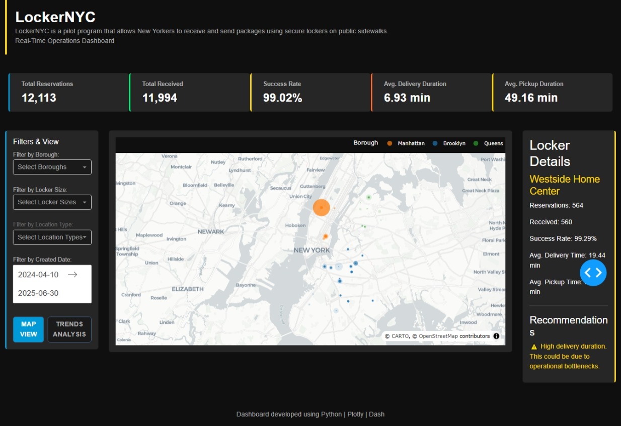
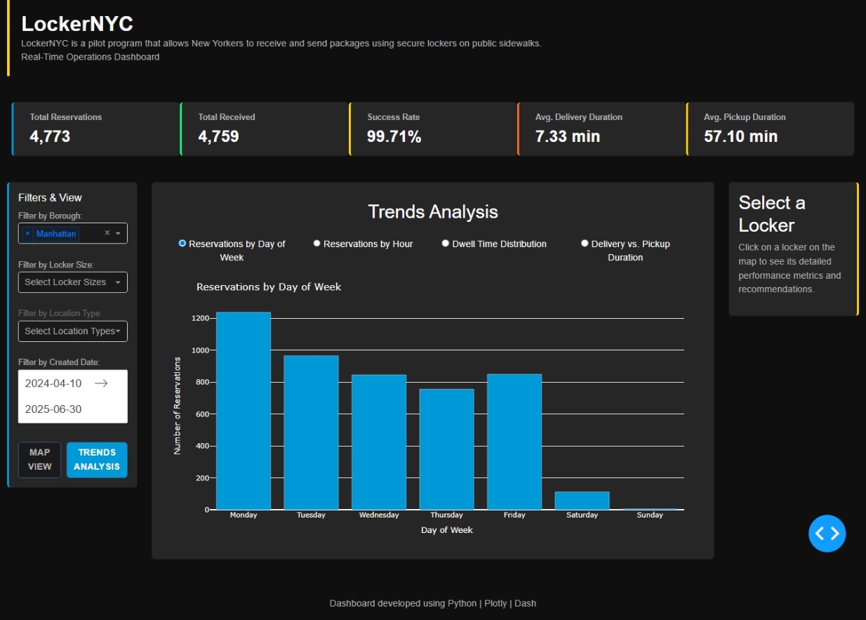
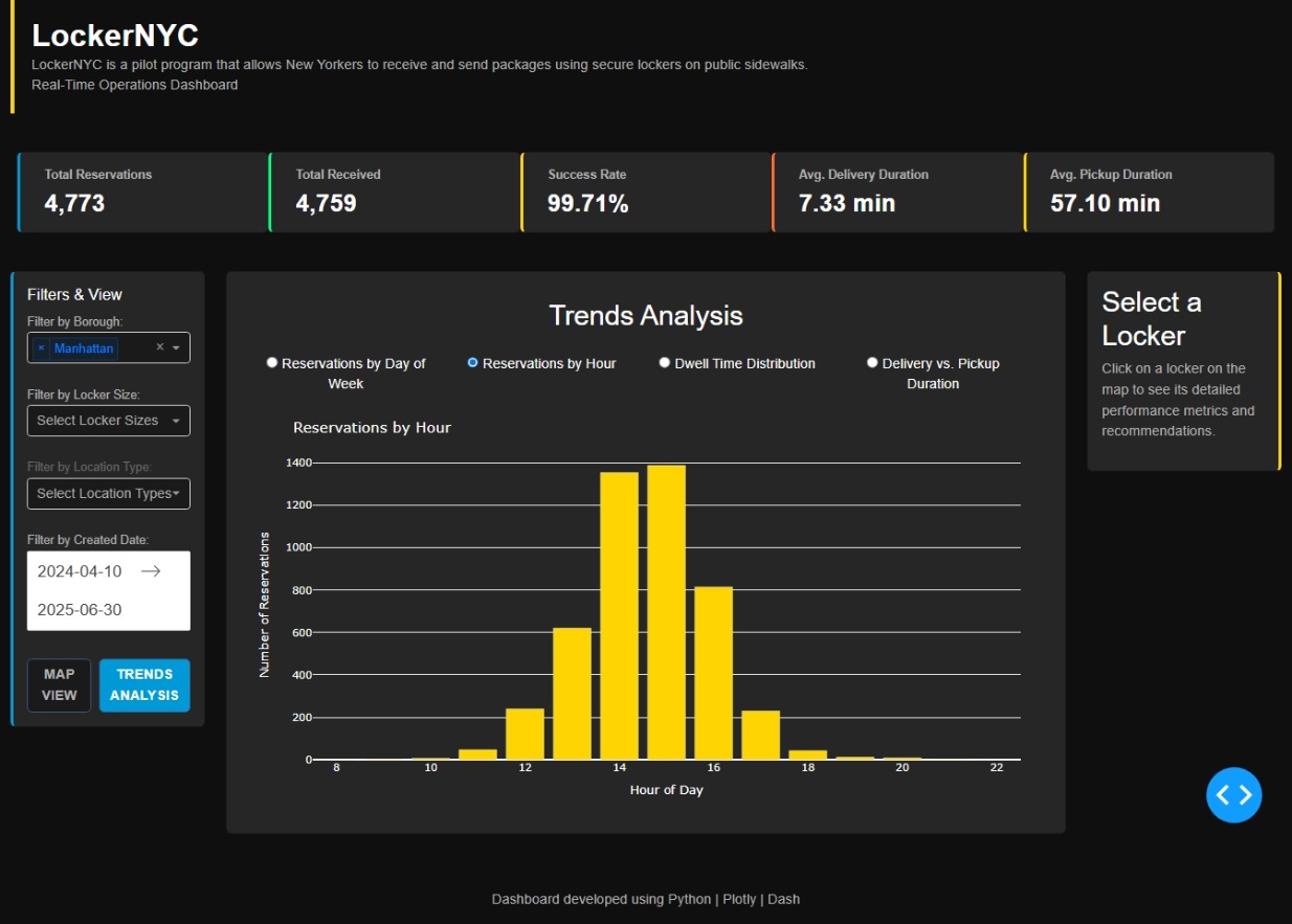
I created an interactive dashboard to visualize and analyze the performance of the package locker pilot program in New York City. The goal was to build a tool to monitor the operation of these lockers in a simple and visual way.

The dashboard has several key sections:

Key Performance Indicators (KPIs): At a glance, you can see important data like the total number of reservations, the delivery success rate, and the average time it takes to pick up or deliver a package.

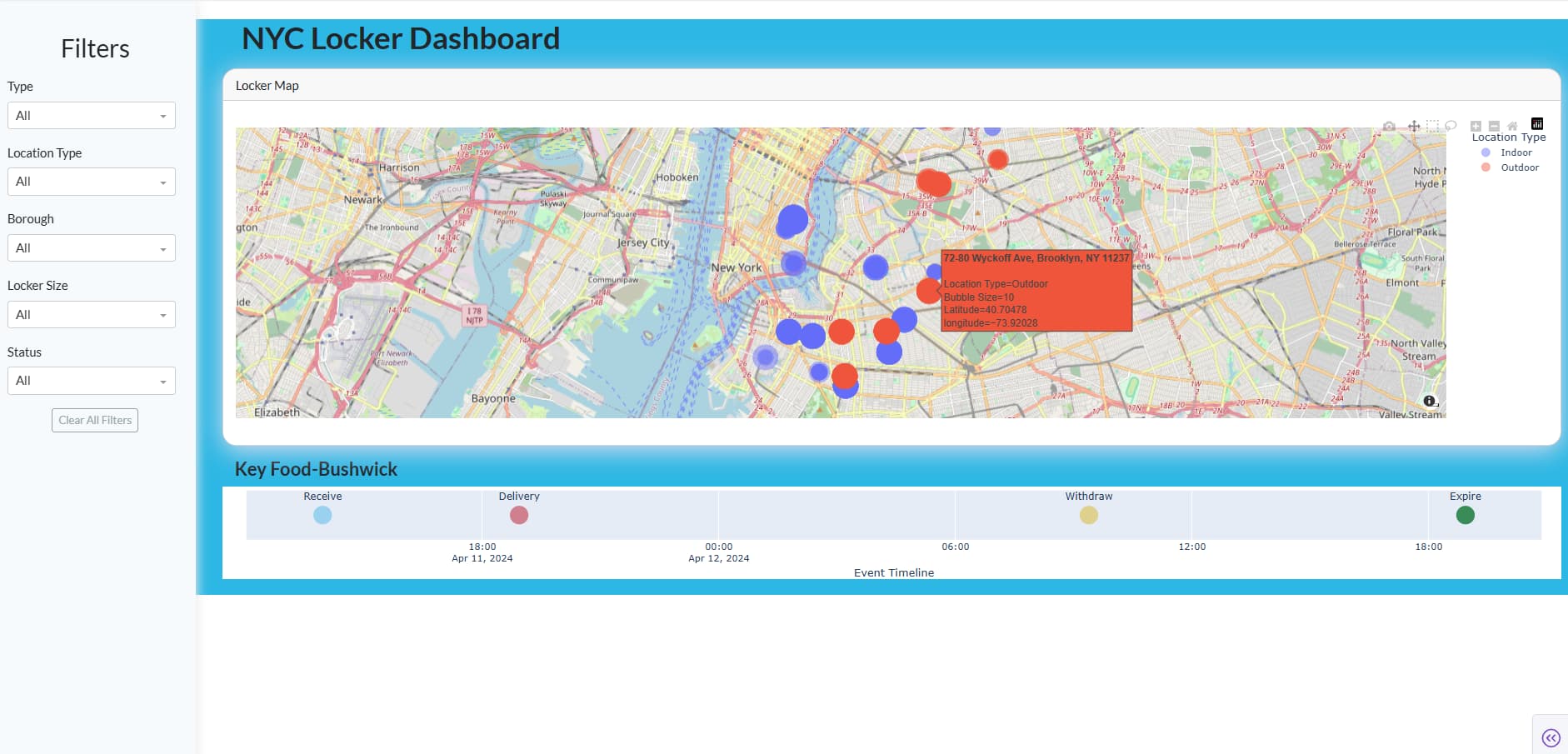
Interactive Map: The NYC map, which shows all the locker locations. If you click on any of them, a side panel appears with detailed information on that specific locker, such as how many reservations it’s had or its individual performance.

Trends Analysis: I also included a section for viewing trends. You can switch between different charts to better understand reservation behavior, for example, how reservations vary by the day of the week or time of day.

Filters: You can filter all the information by different Boroughs, locker sizes, or location types to see only what’s relevant to you.

I designed it with a fluid user experience and a visual style that evokes the city of New York. I hope you like the result.

What do you think? Any comments or suggestions are welcome!

The code

import pandas as pd
from datetime import datetime, timedelta
import dash
from dash import dcc, html, callback_context
from dash.dependencies import Input, Output, State
import plotly.express as px
import plotly.graph_objects as go
from plotly.subplots import make_subplots
import numpy as np
import dash_bootstrap_components as dbc

try:
df = pd.read_csv(“LockerNYC_Reservations_20250903.csv”)
print(“Archivo ‘LockerNYC_Reservations_20250903.csv’ cargado exitosamente.”)
except Exception as e:
print(f"Error al cargar el archivo CSV: {e}")
exit()

def parse_duration_to_minutes(duration_str):
“”“Convierte una cadena de duración (ej: ‘0.1.2’) a minutos.”“”
if pd.isna(duration_str):
return np.nan
try:
parts = str(duration_str).split(‘.’)
hours = int(parts[0]) if len(parts) > 0 else 0
minutes = int(parts[1]) if len(parts) > 1 else 0
seconds = int(parts[2]) if len(parts) > 2 else 0
total_minutes = hours * 60 + minutes + seconds / 60
return total_minutes
except (ValueError, IndexError):
return np.nan

Convertir duraciones

df[‘Pickup Duration (min)’] = df[‘Pickup Duration’].apply(parse_duration_to_minutes)
df[‘Delivery Duration (min)’] = df[‘Delivery Duration’].apply(parse_duration_to_minutes)
df[‘Pickup Duration (min)’] = df[‘Pickup Duration (min)’].fillna(0)
df[‘Delivery Duration (min)’] = df[‘Delivery Duration (min)’].fillna(0)

Procesar fechas con formato explícito para evitar advertencias

date_columns = [‘Created Date’, ‘Delivery Date’, ‘Receive Date’, ‘Withdraw Date’, ‘Expire Date’]
for col in date_columns:
df[col] = pd.to_datetime(df[col], errors=‘coerce’, format=‘mixed’)

Limpiar datos

df.dropna(subset=[‘Locker Size’, ‘Location Type’, ‘Borough’, ‘Latitude’, ‘longitude’, ‘Locker Name’], inplace=True)
df[‘Borough’] = df[‘Borough’].str.capitalize()
df = df[df[‘Borough’] != ‘nan’]

Crear métricas adicionales

df[‘Day_of_Week’] = df[‘Created Date’].dt.day_name()
df[‘Hour_Created’] = df[‘Created Date’].dt.hour
df[‘Dwell_Time’] = (df[‘Receive Date’] - df[‘Delivery Date’]).dt.total_seconds() / 3600

— NYC Styled Dashboard —

app = dash.Dash(name, external_stylesheets=[dbc.themes.DARKLY], suppress_callback_exceptions=True)

app.title = “Lockers NY Dashboard”

Paleta de colores de NYC

nyc_colors = {
‘bg’: ‘#0f0f0f’,
‘surface’: ‘#1a1a1a’,
‘card’: ‘#262626’,
‘taxi’: ‘#ffd500’,
‘subway’: ‘#0099d8’,
‘central_park’: ‘#228b22’,
‘danger’: ‘#ff6b35’,
‘text’: ‘#ffffff’,
‘text_muted’: ‘#b0b0b0’,
‘text_dark’: ‘#666666’,
‘success’: ‘#00ff7f’,
‘warning’: ‘#ffd500’,
‘error’: ‘#ff3030
}

Funciones para generar contenido del dashboard

def generate_kpi_card(title, value, unit=“”, color_accent=nyc_colors[‘subway’]):
“”“Genera una tarjeta de KPI con un estilo de NYC.”“”
return dbc.Card(style={
‘backgroundColor’: nyc_colors[‘card’],
‘borderLeft’: f’4px solid {color_accent}',
‘flex’: ‘1’
}, children=dbc.CardBody(
[
html.P(title, style={
‘margin’: ‘0’,
‘fontSize’: ‘14px’, # Aumentado el tamaño de la fuente para el título del KPI
‘fontWeight’: ‘700’,
‘color’: nyc_colors[‘text_muted’]
}),
html.H2(f"{value}{unit}", style={
‘margin’: ‘5px 0 0 0’,
‘fontSize’: ‘28px’,
‘fontWeight’: ‘bold’,
‘color’: nyc_colors[‘text’]
})
]
))

def generate_recommendations(df_filtered, selected_locker_df):
“”“Genera recomendaciones basadas en el rendimiento del casillero vs. el promedio del distrito.”“”
recommendations =

# Calcular promedios del distrito
if not selected_locker_df.empty:
    borough = selected_locker_df['Borough'].iloc[0]
    df_borough = df_filtered[df_filtered['Borough'] == borough]
    
    delivery_time = selected_locker_df['Delivery Duration (min)'].mean()
    pickup_time = selected_locker_df['Pickup Duration (min)'].mean()
    success_rate = (selected_locker_df['Received'].sum() / len(selected_locker_df)) * 100
    
    # Lógica de recomendaciones basada en percentiles o desviación estándar
    if delivery_time > df_borough['Delivery Duration (min)'].quantile(0.75):
        recommendations.append(
            html.P("⚠️ High delivery duration. This could be due to operational bottlenecks.", 
                   style={'color': nyc_colors['warning'], 'fontSize': '16px', 'marginBottom': '10px'}) # Aumentado el tamaño de la fuente
        )
    elif delivery_time < df_borough['Delivery Duration (min)'].quantile(0.25):
        recommendations.append(
            html.P("✅ Excellent delivery performance! A model for best practices.", 
                   style={'color': nyc_colors['success'], 'fontSize': '16px', 'marginBottom': '10px'}) # Aumentado el tamaño de la fuente
        )
    
    if pickup_time > df_borough['Pickup Duration (min)'].quantile(0.75):
        recommendations.append(
            html.P("⚠️ High pickup duration. Consider optimizing pickup routes.", 
                   style={'color': nyc_colors['warning'], 'fontSize': '16px', 'marginBottom': '10px'}) # Aumentado el tamaño de la fuente
        )
    elif pickup_time < df_borough['Pickup Duration (min)'].quantile(0.25):
        recommendations.append(
            html.P("✅ Efficient pickup operations. A best practice model for this route.", 
                   style={'color': nyc_colors['success'], 'fontSize': '16px', 'marginBottom': '10px'}) # Aumentado el tamaño de la fuente
        )
    
    if success_rate < df_borough['Received'].mean() * 100 * 0.9: # 10% por debajo del promedio del distrito
        recommendations.append(
            html.P("🔄 Success rate is below borough average. Review notification processes.", 
                   style={'color': nyc_colors['error'], 'fontSize': '16px', 'marginBottom': '10px'}) # Aumentado el tamaño de la fuente
        )
    elif success_rate > df_borough['Received'].mean() * 100 * 1.1: # 10% por encima del promedio del distrito
        recommendations.append(
            html.P("🏆 Outstanding success rate! Consider increasing capacity if demand allows.", 
                   style={'color': nyc_colors['success'], 'fontSize': '16px', 'marginBottom': '10px'}) # Aumentado el tamaño de la fuente
        )
    
if not recommendations:
    recommendations.append(
        html.P("📊 Performance is within expected parameters. Continue monitoring trends.", 
               style={'color': nyc_colors['text_muted'], 'fontSize': '16px', 'marginBottom': '10px'}) # Aumentado el tamaño de la fuente
    )

return recommendations

— Layout de la aplicación —

app.layout = dbc.Container(fluid=True, style={
‘backgroundColor’: nyc_colors[‘bg’],
‘color’: nyc_colors[‘text’],
‘fontFamily’: ‘Helvetica Neue, Arial, sans-serif’
}, children=[

dbc.Row(className="mb-4", children=[
    dbc.Col(
        html.Div(
            style={'display': 'flex', 'alignItems': 'center', 'padding': '20px', 'borderLeft': f'5px solid {nyc_colors["taxi"]}'}, 
            children=[
                html.Div(style={'flex': 1}, children=[
                    html.H1("LockerNYC", style={'margin': '0', 'fontSize': '36px', 'fontWeight': 'bold'}),
                    # Aumentado el tamaño de la fuente para los párrafos de contexto
                    html.P("LockerNYC is a pilot program that allows New Yorkers to receive and send packages using secure lockers on public sidewalks.", 
                           style={'margin': '0', 'color': nyc_colors['text_muted'], 'fontSize': '16px'}),
                    html.P("Real-Time Operations Dashboard", style={'margin': '0', 'color': nyc_colors['text_muted'], 'fontSize': '16px'})
                ]),
            ]
        )
    )
]),

dbc.Row(id='kpis-container', className="g-4 mb-4", style={'padding': '20px'}),

dbc.Row(className="g-4", children=[
    # Ajuste de las columnas a 2, 8, 2
    dbc.Col(width=2, children=[
        dbc.Card(style={
            'backgroundColor': nyc_colors['card'],
            'borderLeft': f'4px solid {nyc_colors["subway"]}'
        }, children=dbc.CardBody(
            [
                html.H3("Filters & View", style={'marginTop': '0', 'fontSize': '18px'}),
                html.Label("Filter by Borough:", style={'color': nyc_colors['text_muted'], 'fontSize': '14px'}),
                dcc.Dropdown(
                    id='borough-dropdown',
                    options=[{'label': b, 'value': b} for b in df['Borough'].unique()],
                    value=None,
                    multi=True,
                    placeholder="Select Boroughs",
                    className="Selectable-dropdown",
                    style={'backgroundColor': nyc_colors['surface'], 'color': nyc_colors['text_dark']}
                ),
                html.Br(),
                html.Label("Filter by Locker Size:", style={'color': nyc_colors['text_muted'], 'fontSize': '14px'}),
                dcc.Dropdown(
                    id='size-dropdown',
                    options=[{'label': s, 'value': s} for s in df['Locker Size'].unique()],
                    value=None,
                    multi=True,
                    placeholder="Select Locker Sizes",
                    className="Selectable-dropdown",
                    style={'backgroundColor': nyc_colors['surface'], 'color': nyc_colors['text_dark']}
                ),
                html.Br(),
                html.Label("Filter by Location Type:", style={'color': nyc_colors['text_dark'], 'fontSize': '14px'}),
                dcc.Dropdown(
                    id='location-type-dropdown',
                    options=[{'label': lt, 'value': lt} for lt in df['Location Type'].unique()],
                    value=None,
                    multi=True,
                    placeholder="Select Location Types",
                    className="Selectable-dropdown",
                    style={'backgroundColor': nyc_colors['surface'], 'color': nyc_colors['text_dark']}
                ),
                html.Br(),
                html.Label("Filter by Created Date:", style={'color': nyc_colors['text_muted'], 'fontSize': '14px'}),
                dcc.DatePickerRange(
                    id='date-range-picker',
                    start_date=df['Created Date'].min().date(),
                    end_date=df['Created Date'].max().date(),
                    display_format='YYYY-MM-DD',
                    style={'backgroundColor': nyc_colors['surface'], 'color': nyc_colors['text']}
                ),
                dbc.Row(className="g-2 mt-4", 
                        children=[
                            dbc.Col(dbc.Button('MAP VIEW', id='map-view-button', n_clicks=0, 
                                               style={'width': '100%', 'fontWeight': 'bold', 'backgroundColor': nyc_colors['subway'], 
                                                      'color': nyc_colors['text']})),
                            dbc.Col(dbc.Button('TRENDS ANALYSIS', id='trends-analysis-button', n_clicks=0, 
                                               style={'width': '100%', 'fontWeight': 'bold', 'backgroundColor': nyc_colors['surface'], 
                                                      'color': nyc_colors['text_muted']})),
                ]),
            ]
        ))
    ]),

    dbc.Col(width=8, children=[
        dbc.Card(style={
            'backgroundColor': nyc_colors['card']
        }, children=dbc.CardBody(
            dcc.Loading(id="loading-spinner", children=[
                html.Div(id='main-content', style={'width': '100%', 'height': '100%'})
            ], type="default")
        ))
    ]),

    dbc.Col(width=2, children=[
        dbc.Card(id='details-panel', style={
            'backgroundColor': nyc_colors['card'],
            'borderRight': f'4px solid {nyc_colors["taxi"]}'
        })
    ])
]),

# dcc.Store para guardar la vista actual y evitar que los clics del mapa se pierdan
dcc.Store(id='view-store', data='map'),

# Footer
dbc.Row(className="mt-5", children=[
    dbc.Col(
        html.Footer(
            "Dashboard developed using Python | Plotly | Dash ",
            className="text-center py-3",
            style={'color': nyc_colors['text_muted'], 'fontSize': '16px'} # Aumentado el tamaño de la fuente para el footer
        )
    )
])

])

— Callbacks —

Callback para alternar entre las vistas y manejar los filtros

@app.callback(
Output(‘kpis-container’, ‘children’),
Output(‘main-content’, ‘children’),
Output(‘map-view-button’, ‘style’),
Output(‘trends-analysis-button’, ‘style’),
Output(‘view-store’, ‘data’),
Input(‘borough-dropdown’, ‘value’),
Input(‘size-dropdown’, ‘value’),
Input(‘location-type-dropdown’, ‘value’),
Input(‘date-range-picker’, ‘start_date’),
Input(‘date-range-picker’, ‘end_date’),
Input(‘map-view-button’, ‘n_clicks’),
Input(‘trends-analysis-button’, ‘n_clicks’),
State(‘view-store’, ‘data’)
)
def update_dashboard(selected_boroughs, selected_sizes, selected_types, start_date, end_date, map_clicks, trends_clicks, current_view):
“”"
Callback principal que actualiza el dashboard según los filtros y la vista seleccionada.
Se ha reestructurado para que los botones de vista no interfieran con la selección del mapa.
“”"
ctx = callback_context
view = current_view

if ctx.triggered:
    triggered_id = ctx.triggered[0]['prop_id'].split('.')[0]
    if triggered_id == 'trends-analysis-button':
        view = 'trends'
    elif triggered_id == 'map-view-button':
        view = 'map'

# Filtrar datos
df_filtered = df.copy()
if selected_boroughs:
    df_filtered = df_filtered[df_filtered['Borough'].isin(selected_boroughs)]
if selected_sizes:
    df_filtered = df_filtered[df_filtered['Locker Size'].isin(selected_sizes)]
if selected_types:
    df_filtered = df_filtered[df_filtered['Location Type'].isin(selected_types)]

if start_date and end_date:
    df_filtered = df_filtered[
        (df_filtered['Created Date'].dt.date >= pd.to_datetime(start_date).date()) & 
        (df_filtered['Created Date'].dt.date <= pd.to_datetime(end_date).date())
    ]
    
# Calcular KPIs
total_reservations = len(df_filtered)
total_received = df_filtered['Received'].sum()
success_rate = (total_received / total_reservations) * 100 if total_reservations > 0 else 0
avg_pickup = df_filtered['Pickup Duration (min)'].mean() if not df_filtered.empty else 0
avg_delivery = df_filtered['Delivery Duration (min)'].mean() if not df_filtered.empty else 0

kpis = [
    generate_kpi_card("Total Reservations", f"{total_reservations:,}", color_accent=nyc_colors['subway']),
    generate_kpi_card("Total Received", f"{total_received:,}", color_accent=nyc_colors['success']),
    generate_kpi_card("Success Rate", f"{success_rate:.2f}", "%", color_accent=nyc_colors['warning']),
    generate_kpi_card("Avg. Delivery Duration", f"{avg_delivery:.2f}", " min", color_accent=nyc_colors['danger']),
    generate_kpi_card("Avg. Pickup Duration", f"{avg_pickup:.2f}", " min", color_accent=nyc_colors['taxi']),
]

# Estilos de los botones
map_button_style = {'width': '100%', 'fontWeight': 'bold'}
trends_button_style = {'width': '100%', 'fontWeight': 'bold'}

if view == 'map':
    map_button_style['backgroundColor'] = nyc_colors['subway']
    map_button_style['color'] = nyc_colors['text']
    trends_button_style['backgroundColor'] = nyc_colors['surface']
    trends_button_style['color'] = nyc_colors['text_muted']
    
    fig = px.scatter_map(df_filtered,
                            lat="Latitude",
                            lon="longitude",
                            color="Borough",
                            # Aumentar el tamaño de los puntos para que los más pequeños sean visibles
                            size=df_filtered['Delivery Duration (min)'] + 2,
                            size_max=30,
                            hover_name="Locker Name",
                            color_discrete_map={
                                'Manhattan': '#ff7f0e',
                                'Brooklyn': '#1f77b4',
                                'Queens': '#2ca02c',
                                'Bronx': '#d62728',
                                'Staten Island': '#9467bd'
                            },
                         map_style="carto-positron",
                            zoom=10,
                            # Altura del mapa ajustada a 500
                            height=500)
    
    fig.update_layout(
        map_center={"lat": 40.7128, "lon": -74.0060},
        paper_bgcolor=nyc_colors['bg'],
        plot_bgcolor=nyc_colors['bg'],
        font_color=nyc_colors['text'],
        margin={"r":0, "t":0, "l":0, "b":0},
        clickmode='event+select',
        legend_title_text='Borough',
        # Leyenda en la parte superior
        legend=dict(orientation="h", yanchor="bottom", y=1.02, xanchor="right", x=1)
    )
    content = dcc.Graph(id='map-section', figure=fig)
else: # Vista de tendencias
    map_button_style['backgroundColor'] = nyc_colors['surface']
    map_button_style['color'] = nyc_colors['text_muted']
    trends_button_style['backgroundColor'] = nyc_colors['subway']
    trends_button_style['color'] = nyc_colors['text']

    content = dbc.CardBody(
        [
            html.H3("Trends Analysis", className="mb-4", style={'textAlign': 'center'}),
            dcc.RadioItems(
                id='trends-radio',
                options=[
                    {'label': 'Reservations by Day of Week', 'value': 'day'},
                    {'label': 'Reservations by Hour', 'value': 'hour'},
                    {'label': 'Dwell Time Distribution', 'value': 'dwell'},
                    {'label': 'Delivery vs. Pickup Duration', 'value': 'scatter'}
                ],
                value='day',
                className="mb-4",
                # Ajuste de estilo para que los radio items se vean mejor
                style={
                    'display': 'flex',
                    'justifyContent': 'space-between', # Ajusta el espacio entre elementos
                    'flexWrap': 'wrap', # Permite que los elementos se envuelvan en la siguiente línea si no hay espacio
                    'color': nyc_colors['text']
                },
                inputStyle={"marginRight": "5px"}, # Espacio entre el radio y el texto
                labelStyle={"marginRight": "15px", "flex": "1", "textAlign": "center"} # Espacio entre los labels
            ),
            dcc.Loading(
                id="loading-trends",
                children=html.Div(id='trends-content'),
                type="default"
            )
        ]
    )

return kpis, content, map_button_style, trends_button_style, view

@app.callback(
Output(‘trends-content’, ‘children’),
Input(‘trends-radio’, ‘value’),
State(‘borough-dropdown’, ‘value’),
State(‘size-dropdown’, ‘value’),
State(‘location-type-dropdown’, ‘value’),
State(‘date-range-picker’, ‘start_date’),
State(‘date-range-picker’, ‘end_date’)
)
def update_trends_graph(selected_trend, selected_boroughs, selected_sizes, selected_types, start_date, end_date):
df_filtered = df.copy()
if selected_boroughs:
df_filtered = df_filtered[df_filtered[‘Borough’].isin(selected_boroughs)]
if selected_sizes:
df_filtered = df_filtered[df_filtered[‘Locker Size’].isin(selected_sizes)]
if selected_types:
df_filtered = df_filtered[df_filtered[‘Location Type’].isin(selected_types)]

if start_date and end_date:
    df_filtered = df_filtered[
        (df_filtered['Created Date'].dt.date >= pd.to_datetime(start_date).date()) & 
        (df_filtered['Created Date'].dt.date <= pd.to_datetime(end_date).date())
    ]

# Generación de los gráficos
if selected_trend == 'day':
    fig = px.bar(df_filtered.groupby('Day_of_Week').size().reindex(
        ['Monday', 'Tuesday', 'Wednesday', 'Thursday', 'Friday', 'Saturday', 'Sunday']).reset_index(name='Count'),
                     x='Day_of_Week', y='Count',
                     labels={'Day_of_Week': 'Day of Week', 'Count': 'Number of Reservations'},
                     title="Reservations by Day of Week",
                     color_discrete_sequence=[nyc_colors['subway']])
elif selected_trend == 'hour':
    fig = px.bar(df_filtered.groupby('Hour_Created').size().reset_index(name='Count'),
                      x='Hour_Created', y='Count',
                      labels={'Hour_Created': 'Hour of Day', 'Count': 'Number of Reservations'},
                      title="Reservations by Hour",
                      color_discrete_sequence=[nyc_colors['taxi']])
elif selected_trend == 'dwell':
    fig = px.histogram(df_filtered, x='Dwell_Time', nbins=50,
                             labels={'Dwell_Time': 'Dwell Time (hours)'},
                             title="Dwell Time Distribution",
                             color_discrete_sequence=[nyc_colors['danger']])
elif selected_trend == 'scatter':
    fig = px.scatter(df_filtered, x='Delivery Duration (min)', y='Pickup Duration (min)',
                             color='Borough',
                             title="Delivery vs. Pickup Duration",
                             color_discrete_map={
                                 'Manhattan': '#ff7f0e',
                                 'Brooklyn': '#1f77b4',
                                 'Queens': '#2ca02c',
                                 'Bronx': '#d62728',
                                 'Staten Island': '#9467bd'
                             })

fig.update_layout(
    paper_bgcolor=nyc_colors['card'],
    plot_bgcolor=nyc_colors['card'],
    font_color=nyc_colors['text'],
    margin=dict(l=20, r=20, t=40, b=20)
)

return dcc.Graph(figure=fig)

@app.callback(
Output(‘details-panel’, ‘children’),
Input(‘map-section’, ‘clickData’),
State(‘borough-dropdown’, ‘value’),
State(‘size-dropdown’, ‘value’),
State(‘location-type-dropdown’, ‘value’),
State(‘date-range-picker’, ‘start_date’),
State(‘date-range-picker’, ‘end_date’)
)
def update_details_panel(clickData, selected_boroughs, selected_sizes, selected_types, start_date, end_date):
“”"
Actualiza el panel de detalles al hacer clic en un punto del mapa.
Ahora calcula las métricas para todas las reservas asociadas con el casillero clicado.
“”"
if clickData is None:
return dbc.CardBody(children=[
html.H3(“Select a Locker”, style={‘color’: nyc_colors[‘text’]}),
html.P(“Click on a locker on the map to see its detailed performance metrics and recommendations.”,
style={‘color’: nyc_colors[‘text_muted’], ‘fontSize’: ‘16px’}) # Aumentado el tamaño de la fuente
])

# Obtener el nombre del casillero del punto en el que se hizo clic.
point_data = clickData['points'][0]
latitude = point_data['lat']
longitude = point_data['lon']

# Encontrar la fila en el DataFrame original que coincide con la latitud y longitud
# Esto asegura que obtenemos todas las reservas para ese casillero, no solo el punto del gráfico.
selected_locker_df = df[(df['Latitude'] == latitude) & (df['longitude'] == longitude)]

if selected_locker_df.empty:
    return dbc.CardBody(children=[
        html.H3("Error", style={'color': nyc_colors['error']}),
        html.P("Could not find locker details for the selected point.", style={'color': nyc_colors['text_muted'], 'fontSize': '16px'}) 
    ])

locker_name = selected_locker_df['Locker Name'].iloc[0]

# Aplicar filtros adicionales de la UI a los datos del casillero seleccionado.
if selected_boroughs:
    selected_locker_df = selected_locker_df[selected_locker_df['Borough'].isin(selected_boroughs)]
if selected_sizes:
    selected_locker_df = selected_locker_df[selected_locker_df['Locker Size'].isin(selected_sizes)]
if selected_types:
    selected_locker_df = selected_locker_df[selected_locker_df['Location Type'].isin(selected_types)]
if start_date and end_date:
    selected_locker_df = selected_locker_df[
        (selected_locker_df['Created Date'].dt.date >= pd.to_datetime(start_date).date()) & 
        (selected_locker_df['Created Date'].dt.date <= pd.to_datetime(end_date).date())
    ]
    
# Calcular las métricas agregadas para el casillero.
total_reservations = len(selected_locker_df)
total_received = selected_locker_df['Received'].sum()
success_rate = (total_received / total_reservations) * 100 if total_reservations > 0 else 0
avg_delivery = selected_locker_df['Delivery Duration (min)'].mean() if not selected_locker_df.empty else 0
avg_pickup = selected_locker_df['Pickup Duration (min)'].mean() if not selected_locker_df.empty else 0

# Generar recomendaciones basadas en el rendimiento del casillero.
recommendations = generate_recommendations(df, selected_locker_df)

return dbc.CardBody(children=[
    html.H3("Locker Details", style={'color': nyc_colors['text'], 'marginBottom': '10px'}),
    html.H4(locker_name, style={'color': nyc_colors['taxi'], 'marginTop': '0'}),
    html.P(f"Reservations: {total_reservations}", style={'color': nyc_colors['text'], 'fontSize': '16px'}), # Aumentado el tamaño de la fuente
    html.P(f"Received: {total_received}", style={'color': nyc_colors['text'], 'fontSize': '16px'}), # Aumentado el tamaño de la fuente
    html.P(f"Success Rate: {success_rate:.2f}%", style={'color': nyc_colors['text'], 'fontSize': '16px'}), # Aumentado el tamaño de la fuente
    html.P(f"Avg. Delivery Time: {avg_delivery:.2f} min", style={'color': nyc_colors['text'], 'fontSize': '16px'}), # Aumentado el tamaño de la fuente
    html.P(f"Avg. Pickup Time: {avg_pickup:.2f} min", style={'color': nyc_colors['text'], 'fontSize': '16px'}), # Aumentado el tamaño de la fuente
    html.Hr(style={'borderColor': nyc_colors['text_muted'], 'marginTop': '20px', 'marginBottom': '20px'}),
    html.H4("Recommendations", style={'color': nyc_colors['text']}),
    *recommendations
])

server = app.server

https://lockers-nyc.plotly.app


Hi, this week I’m proposing two charts. The first one uses entropy to describe the performance of the lockers over time, showing their predictability based on delivery times. The second chart reveals the composition of each locker, indicating the proportion of the most relevant sizes (S, M, L/XL) for each one. Both charts, with a month-by-month distribution, offer a dynamic view of the efficiency and demand in the locker network.

Open Application

@Avacsiglo21 I really like how we can change between trend analysis and map view. It’s very efficient because you can interact with the whole app without even scrolling down the page.

Update: I accidentally posted with private mode; just updated to public mode.

Here is the link on Plotly Cloud:
Dash

This dashboard made from scratch focuses on 33 locations in the dataset. The borough selection filters by Manhattan, Queens or Brooklyn; default is all boroughs. Top left is a map libre showing specific locations. Marker size is proportional to the total number of locker rentals; color indicates the borough. The hover information triggers the bottom left histogram with number locker rentals by locker size. Bottom right is a timeline showing cumulative activity by locker size. The small lockers are overwhelmingly the most popular (probably due to pricing). This screen shot shows a location in Manhattan that seems to have stopped offering medium and large locker sizes.

Here is the code:

import polars as pl
import polars.selectors as cs
import os
import plotly.express as px
import plotly.graph_objects as go
import dash
from dash import Dash, dcc, html, Input, Output
import dash_mantine_components as dmc
import dash_ag_grid as dag
dash._dash_renderer._set_react_version('18.2.0')

# #----- GLOBALS -----------------------------------------------------------------
style_horizontal_thick_line = {'border': 'none', 'height': '4px', 
    'background': 'linear-gradient(to right, #007bff, #ff7b00)', 
    'margin': '10px,', 'fontsize': 32}

style_horizontal_thin_line = {'border': 'none', 'height': '2px', 
    'background': 'linear-gradient(to right, #007bff, #ff7b00)', 
    'margin': '10px,', 'fontsize': 12}

style_h2 = {'text-align': 'center', 'font-size': '40px', 
            'fontFamily': 'Arial','font-weight': 'bold', 'color': 'gray'}
style_h3 = {'text-align': 'center', 'font-size': '24px', 
            'fontFamily': 'Arial','font-weight': 'normal'}
viz_template = 'plotly_dark'

borough_list = ['Brooklyn', 'Manhattan', 'Queens']
borough_color_map = {
    'Brooklyn'    :  'red',     # 'CornflowerBlue',
    'Manhattan'   :  'navy',    # 'crimson',
    'Queens'      :  'green',   # 'Chartreuse',
}

size_color_map = {
    'Small'        :  '#00FFFF',  
    'Medium'       :  '#FF007F',  
    'Large'        :  '#00FF00',  
    'Extra Large'  :  '#FFD700', 
}

#----- DASH COMPONENTS------ ---------------------------------------------------
dmc_select_borough = (
    dmc.MultiSelect(
        label='Pick 1 or more Boroughs',
        id='borough',
        data= ['Brooklyn', 'Manhattan', 'Queens'],
        value=['Brooklyn', 'Manhattan', 'Queens'],
        searchable=False,  # Enables search functionality
        clearable=True,   # Allows clearing the selection
        size='xl',
    ),
)

# #----- FUNCTIONS ---------------------------------------------------------------
def read_and_clean_csv():
    ''' read and clead data from csv, save as parquet '''
    print('reading and cleaning csv file')
    return(
        pl.scan_csv(
            'LockerNYC_Reservations_20250903.csv',
        )
        .with_columns(
            pl.col('Locker Size').fill_null('Small')
                .replace('S', 'Small')
                .replace('M', 'Medium')
                .replace('L', 'Large')
                .replace('XL', 'Extra Large'),
        )
        .rename(    
            lambda c: 
                c.upper()          # all column names to upper case
                .replace(' ', '_') # replace blanks with underscores
                .replace(r'(', '') # replace left parens with underscores
                .replace(r')', '') # replace left parens with underscores
        )
        .select(
            ['BOROUGH', 'LOCKER_NAME', 'ADDRESS', 'LOCKER_BOX_DOOR', 'LOCKER_SIZE',
            'LOCATION_TYPE', 
            'DELIVERY_DATE', 'LATITUDE', 'LONGITUDE']
        )
        .with_columns(
            cs.ends_with('_DATE').str.to_datetime(format="%m/%d/%Y %H:%M"),
            ZIP_CODE = pl.col('ADDRESS').str.split(' ').list.last(),
            RENTAL_COUNT = pl.col('ADDRESS').len().over('ADDRESS'),
        )
        .with_columns(ADDRESS = pl.col('ADDRESS').str.split(',').list.first())
        .with_columns(RENTAL_COUNT = pl.col('ADDRESS').count().over('ADDRESS'))
        .with_columns(
            LOCKER_COUNT = pl.col('ADDRESS')
                .count()
                .over(['ADDRESS','LOCKER_BOX_DOOR'])
        )
        .drop('LOCKER_BOX_DOOR')
        .collect()
    )

def get_scatter_map(borough):
    ''' return scatter map of dataset '''
    group_by_cols = [
        'LOCKER_NAME', 'ADDRESS', 'LOCATION_TYPE', 'LATITUDE', 'LONGITUDE', 
        'BOROUGH', 'ZIP_CODE', 'RENTAL_COUNT', 'LOCKER_COUNT'
    ]
    df_group_by = df_global.group_by(group_by_cols).len()
    if len(borough) < 3:
        df_group_by = (
            df_group_by
            .filter(pl.col('BOROUGH').is_in(borough))
        )

    fig_scatter_map = px.scatter_map(
        df_group_by,
        lat = 'LATITUDE',
        lon = 'LONGITUDE',
        color='BOROUGH',
        color_discrete_map=borough_color_map,
        custom_data=['BOROUGH', 'LOCKER_NAME', 'ADDRESS', 'ZIP_CODE', 
                     'LOCATION_TYPE', 'RENTAL_COUNT', 'LOCKER_COUNT'],
        size='RENTAL_COUNT',
        zoom=10,
        map_style = 'light'
    )
    hovertemplate = (
        '%{customdata[0]}<br>' + 
        '%{customdata[1]}<br>' + 
        '%{customdata[2]}, %{customdata[3]}<br>' + 
        '%{customdata[4]}<br>' + 
        '%{customdata[5]:,} Rentals<br>' + 
        '%{customdata[6]:,} Lockers<br>' + 
        '<extra></extra>')

    fig_scatter_map.update_traces(
        hovertemplate=hovertemplate,
        showlegend=False
    )

    # fig_scatter_map.update_traces(showlegend=False)
    return fig_scatter_map

def get_histogram(address):
    ''' return histogram locker sizes for specified address '''
    df_histo = (
        df_global
        .filter(pl.col('ADDRESS') == address)
        .sort('LOCKER_SIZE')
    )
    this_borough = df_histo.item(0, 'BOROUGH')
    this_locker_name = df_histo.item(0, 'LOCKER_NAME')

    fig_histo = px.histogram(
        df_histo,
        x='LOCKER_SIZE',      
        title=(
            f'{this_locker_name}, {this_borough}'.upper() + '<br>' + 
            f'<sup>{address}<br>'.upper() +
            'RENTAL COUNT BY LOCKER SIZE' + '</sup>'
        ),
        
        template=viz_template
    )
    fig_histo.update_layout(
        yaxis_title = 'RENTAL_COUNT', xaxis_title = 'LOCKER SIZE', 
        xaxis=dict(
            categoryorder='array',  # Specify custom order
            categoryarray=['Small', 'Medium', 'Large', 'Extra Large'],  # Desired order of categories
        )
    )
    fig_histo.update_xaxes(showgrid=False)
    fig_histo.update_yaxes(showgrid=False)
    return fig_histo

def get_time_plot(address):
    ''' return histogram locker sizes for specified address '''
    df_time_plot = (
        df_global
        .filter(pl.col('ADDRESS') == address)
        .sort(['LOCKER_SIZE', 'DELIVERY_DATE'])
        .with_columns(RENTAL_COUNT = pl.col('LOCKER_SIZE').cum_count().over('LOCKER_SIZE')
        )
    )
    this_borough = df_time_plot.item(0, 'BOROUGH')
    this_locker_name = df_time_plot.item(0, 'LOCKER_NAME')

    size_list = df_time_plot.unique('LOCKER_SIZE').get_column('LOCKER_SIZE').to_list()
    time_plot = go.Figure()
    for s in size_list:
        trace_color = size_color_map[s]
        df_size = df_time_plot.filter(pl.col('LOCKER_SIZE') ==  s).sort('DELIVERY_DATE')
        time_plot.add_trace(go.Scatter(
            x=df_size['DELIVERY_DATE'], y=df_size['RENTAL_COUNT'],
            name=s,
            mode='lines+markers',
            line=dict(color=trace_color, width=1),  # Set line color and width
            marker=dict(color=trace_color, size=3)  # Set line color and width
            )
        )
        max_y = df_size['RENTAL_COUNT'].to_list()[-1]
        max_x = df_size['DELIVERY_DATE'].to_list()[-1]

        time_plot.add_annotation(
            text=s,
            xref='x',   x=max_x,  xanchor='left', xshift = 10,
            yref='y',   y=max_y,
            showarrow=False,
            font=dict(color= trace_color, size=16)
        )
    time_plot.update_layout(
        title=(
            f'{this_locker_name}, {this_borough}'.upper() + '<br>' + 
            f'<sup>{address}<br>'.upper() +
            'CUMULATIVE TIMELINES' + '</sup>'
        ),
        yaxis_title = 'CUMULATIVE RENTAL COUNT', xaxis_title = '', 
        template=viz_template,
        showlegend=False
    )
    time_plot.update_xaxes(showgrid=False)
    time_plot.update_yaxes(showgrid=False)
    return time_plot

def get_ag_col_defs(columns):
    ''' return setting for ag columns, with numeric formatting '''
    ag_col_defs = []
    for i, col in enumerate(columns):
        if col == 'LOCKER_SIZE':
            col_width = 100
        else:
            col_width = 200
        ag_col_defs.append({
            'field':col, 
            'width': col_width, 
            'floatingFilter': True,
            "filter": "agTextColumnFilter", 
            "suppressHeaderMenuButton": True,
        })
    return ag_col_defs

def get_card(title, value, id=''):
    card_bg_color = '#F5F5F5'
    return(
        dmc.Card(children=[
            dmc.Text(f'{title}', ta='center', fz=24),
            dmc.Text(f'{value}', ta='center', fz=20, c='blue', id=id,),
        ],
        style={'backgroundColor': card_bg_color}, 
        #mx is left & right margin, my top & bottom margin
        withBorder=True, shadow='sm', radius='xl', mx=2, my=2
        )
    )

#----- GATHER AND CLEAN DATA ---------------------------------------------------
if os.path.exists('df.parquet'):     # read parquet file if it exists
    print('reading data from parquet file')
    df_global=pl.read_parquet('df.parquet')
else:  # if no parquet file, read csv file, clean, save df as parquet
    df_global = read_and_clean_csv()
    df_global.write_parquet('df.parquet')

#----- INFO CARDS --------------------------------------------------------------
card_borough = get_card('BOROUGH', '', id='card-borough')
card_locker_name = get_card('LOCKER_NAME', '', id='card-locker-name')
card_address = get_card('ADDRESS', '', id='card-address')
card_location_type = get_card('LOCATION_TYPE', '', id='card-location-type')
card_rental_count = get_card('RENTAL_COUNT', '', id='card-rental-count')
card_locker_count = get_card('LOCKER_COUNT', '', id='card-locker-count')

# #----- DASH APPLICATION STRUCTURE---------------------------------------------
app = Dash()
server = app.server
app.layout =  dmc.MantineProvider([
    html.Hr(style=style_horizontal_thick_line),
    dmc.Text('NYC Locker Data', ta='center', style=style_h2),
    html.Hr(style=style_horizontal_thick_line),
    dmc.Grid(children = [
        dmc.GridCol(dmc_select_borough, span=4, offset = 1),
    ]),  
    dmc.Space(h=30), 
    dmc.Grid(children = [
        dmc.GridCol(card_borough, span=2, offset=0),
        dmc.GridCol(card_locker_name, span=2, offset=0),
        dmc.GridCol(card_address, span=2, offset=0),
        dmc.GridCol(card_location_type, span=2, offset=0),
        dmc.GridCol(card_rental_count, span=2, offset=0),
        dmc.GridCol(card_locker_count, span=2, offset=0),
    ]),  
    dmc.Space(h=30),
    dmc.Space(h=0),
    html.Hr(style=style_horizontal_thin_line),
    dmc.Grid(children = [
            dmc.GridCol(dcc.Graph(id='scatter-map'), span=6, offset=0),  
            dmc.GridCol(dag.AgGrid(id='ag-grid'),span=5, offset=0),              
        ]),
    dmc.Grid(children = [
            dmc.GridCol(dcc.Graph(id='histo'), span=6, offset=0),            
            dmc.GridCol(dcc.Graph(id='time-plot'), span=6, offset=0), 
        ]),
])
# 2 call back design avoids infinite loop
# first call back reads borough selection and updates scatter map only
@app.callback(
    Output('scatter-map', 'figure'),

    Input('borough', 'value'),
)
def update_scatter(selected_borough_list):
    print(f'{selected_borough_list = }')
    if selected_borough_list is None:
        print('use first item on borough list')
        selected_borough_list = [borough_list[0]]
    if not isinstance(selected_borough_list, list):
        print('convert single selected borough to list')
        selected_borough_list = [borough_list[0]]
    scatter_map=get_scatter_map(selected_borough_list)
    return scatter_map

# 2 call back design avoids infinite loop
# second call back reads scatter hover values and updates histogram, time plot
@app.callback(
    Output('histo', 'figure'),
    Output('time-plot', 'figure'),
    Output('ag-grid', 'columnDefs'),  # columns vary by dataset
    Output('ag-grid', 'rowData'),
    Output('card-borough', 'children'), 
    Output('card-locker-name', 'children'), 
    Output('card-address', 'children'), 
    Output('card-location-type', 'children'),
    Output('card-rental-count', 'children'), 
    Output('card-locker-count', 'children'),
    Input('scatter-map', 'hoverData')
)
def update_histo(hover_info):
    address = '508  East 12th St'
    if hover_info is not None and 'points' in hover_info.keys():
        address = hover_info['points'][0]['customdata'][2]
    else:
        print('key points not found')
    histogram = get_histogram(address)
    time_plot = get_time_plot(address)
    df_table = (
        df_global
        .filter(pl.col('ADDRESS') == address)
        .select('BOROUGH', 'LOCKER_NAME', 'DELIVERY_DATE', 'LOCKER_SIZE')
        .with_columns(
            pl.col('DELIVERY_DATE')
            .dt.to_string()
            .str.split(' ').list.first()
        )
    )
    ag_col_defs = get_ag_col_defs(df_table.columns)
    ag_row_data = df_table.to_dicts()
    df_address = df_global.filter(pl.col('ADDRESS') == address )
    borough = df_address.item(0, 'BOROUGH')
    locker_name = df_address.item(0, 'LOCKER_NAME')
    address = df_address.item(0, 'ADDRESS')
    location_type = df_address.item(0, 'LOCATION_TYPE')
    rental_count = df_address.item(0, 'RENTAL_COUNT')
    locker_count = df_address.item(0, 'LOCKER_COUNT')
    return (
        histogram, time_plot, ag_col_defs, ag_row_data,
        borough, locker_name, address,
        location_type, rental_count, locker_count
    )

if __name__ == '__main__':
    app.run(debug=True)

NYC Locker Dashboard – Overview

  • Interactive map:
    All package lockers are shown on an interactive map. You can pan, zoom, and explore clusters and individual markers easily.

  • Customizable filtering (sidebar left):
    You can filter lockers by several attributes (including Package Type, Location Type, Borough, Locker Size, Status) using quick dropdowns. There is also a “Clear All Filters” button for fast reset.

  • Locker timeline visualization:
    When you click on any marker, you instantly see a timeline below the map showing the main lifecycle events (Delivery, Receive, Withdraw, Expire) of the selected locker as a horizontal Plotly chart.

  • User guidance:
    If you haven’t clicked a marker yet, a clear message reminds you to select one to see its timeline.

Code
from dash import dcc, html, Input, Output, State
import pandas as pd
import plotly.express as px
import dash_bootstrap_components as dbc

# --- Load the data ---
df = pd.read_csv("LockerNYC_Reservations.csv")

# Bubble size mapping (based on locker size)
size_column = "Bubble Size"
size_map = {"S": 14, "M": 22, "L": 32, "XL": 42}
df["Bubble Size"] = (
    df["Locker Size"].astype(str)
    .str.extract(r'([SMLX]+)')[0]
    .map(size_map)
    .fillna(10)
)

# Timeline event points to visualize for each locker
timeline_points = [
    ("Delivery", "Delivery Date"),
    ("Receive", "Receive Date"),
    ("Withdraw", "Withdraw Date"),
    ("Expire", "Expire Date"),
]

# Filters (add your package/class/type column here—adjust "Type" if your data uses another name)
filter_columns = [
    "Type",           # <-- Package/class filter (adjust if needed)
    "Location Type",
    "Borough",
    "Locker Size",
    "Status",
]

# --- Sidebar creation (filters + clear button) ---
def make_sidebar():
    return html.Div(
        [
            html.H3("Filters", style={"marginTop": "30px", "marginBottom": "18px", "textAlign": "center"}),
            *[
                html.Div([
                    dbc.Label(col, style={"fontWeight": "500"}),
                    dcc.Dropdown(
                        id=f"filter-{col}",
                        options=[{"label": "All", "value": "All"}] + [
                            {"label": v, "value": v} for v in sorted(df[col].dropna().unique())
                        ],
                        value="All",
                        clearable=False,
                        style={'width': '98%', "marginBottom": "18px"}
                    ),
                ], style={"marginBottom": "2px"})
                for col in filter_columns
            ],
            html.Div(
                dbc.Button("Clear All Filters", id="clear-all", color="secondary", outline=True, size="sm"),
                style={"marginTop": "18px", "textAlign": "center"}
            )
        ],
        className="sidebar",
        style={
            "background": "#f7fafc",
            "padding": "12px 16px 16px 16px",
            "boxShadow": "2px 0 14px #eaeaea",
            "zIndex": 200,
        }
    )


# --- Main content: Map + Timeline visualization ---
def make_main_content():
    return html.Div(
        [
            html.H2(
                "NYC Locker Dashboard",
                className="mb-3 mt-4",
                style={"textAlign": "left", "fontWeight": "bold", "marginTop": "10px", "marginLeft": "48px"}
            ),
            html.Div([
                dbc.Card([
                    dbc.CardHeader("Locker Map"),
                    dbc.CardBody([
                        dcc.Graph(
                            id="map-graph",
                            config={
                                "displayModeBar": True,
                                "scrollZoom": True
                            },
                            style={'height': "clamp(320px, 44vh, 520px)"}
                        )
                    ]),
                ], style={"marginBottom": "16px",
                          "boxShadow": "0 6px 32px #dde", "borderRadius": "18px"}),
                html.Div(id="timeline-container"),
            ], className="content-wrap")
        ],
        className="main"
    )

app = dash.Dash(__name__, external_stylesheets=[dbc.themes.FLATLY])

app.layout = html.Div(
    [
        make_sidebar(),
        make_main_content()
    ],
    style={"background": "#2db7e4"}
)

# --- Helper: filter the dataframe based on the current filters ---
def filter_df(args):
    dff = df.copy()
    for col, v in zip(filter_columns, args):
        if v not in [None, "All"]:
            dff = dff[dff[col] == v]
    return dff

# --- MAP CALLBACK: Update map based on filters ---
@app.callback(
    Output("map-graph", "figure"),
    [Input(f"filter-{col}", "value") for col in filter_columns],
)
def update_map(*filter_values):
    dff = filter_df(filter_values)
    fig = px.scatter_mapbox(
        dff,
        lat="Latitude",
        lon="longitude",
        color="Location Type",
        size=size_column,
        hover_name="Address",
        size_max=28,
        zoom=11,
        height=395,
        mapbox_style="open-street-map",
        center={
            "lat": dff["Latitude"].mean() if not dff.empty else 40.73,
            "lon": dff["longitude"].mean() if not dff.empty else -73.98
        }
    )
    fig.update_traces(marker=dict(opacity=0.45))
    fig.update_layout(margin=dict(l=0, r=0, t=18, b=0))
    return fig

# --- TIMELINE CALLBACK: Update timeline after marker click or filters ---
@app.callback(
    Output("timeline-container", "children"),
    [Input("map-graph", "clickData")]
    + [Input(f"filter-{col}", "value") for col in filter_columns],
)
def show_timeline_chart(clickData, *filter_values):
    dff = filter_df(filter_values)
    # Show "Click a marker..." message when nothing selected
    if not clickData or not clickData.get("points"):
        return html.Div([
            html.Div(
                "Click a marker to see the timeline!",
                style={
                    "fontSize": "20px",
                    "margin": "24px 0 12px 16px",
                    "color": "#267",
                    "fontWeight": "500"
                }
            )
        ])
    point = clickData["points"][0]
    addr = point.get("hovertext") or point.get("Address")
    row = dff[dff["Address"] == addr]
    if row.empty:
        return html.Div("No data for this locker.")
    r = row.iloc[0]
    # Collect timeline points; at least 2 needed
    timeline_data = []
    for label, col in timeline_points:
        dt = r.get(col)
        if pd.notnull(dt) and str(dt).strip() and str(dt).lower() != "nan":
            timeline_data.append((label, pd.to_datetime(dt)))
    if len(timeline_data) < 2:
        return html.Div([
            html.H4(r["Locker Name"] if "Locker Name" in r and pd.notnull(r["Locker Name"]) else r["Address"],
                style={"fontWeight": "bold", "marginLeft": "16px"}),
            html.Div("No timeline available for this locker.", style={"margin": "8px 0 14px 20px"})
        ])
    timeline_data.sort(key=lambda x: x[1])
    df_tl = pd.DataFrame({
        "Step": [x[0] for x in timeline_data],
        "Date": [x[1] for x in timeline_data],
        "y": 1
    })
    timeline_fig = px.scatter(
        df_tl, x="Date", y="y", text="Step", color="Step",
        color_discrete_sequence=px.colors.qualitative.Safe,
        labels={"y": ""}
    )
    timeline_fig.update_traces(marker=dict(size=24, opacity=0.81), textposition='top center', textfont=dict(size=13))
    timeline_fig.update_layout(
        height=120,
        margin=dict(l=25, r=25, t=6, b=10),
        yaxis=dict(showticklabels=False, showgrid=False, range=[0.9, 1.1]),
        xaxis_title="Event Timeline",
        showlegend=False
    )
    return html.Div([
        html.H4(
            r["Locker Name"] if "Locker Name" in r and pd.notnull(r["Locker Name"]) else r["Address"],
            style={"fontWeight": "bold", "marginLeft": "16px"}
        ),
        dcc.Graph(figure=timeline_fig, style={'height': '140px'})
    ])

# --- CLEAR ALL CALLBACK: Reset all filter dropdowns to "All" ---
@app.callback(
    [Output(f"filter-{col}", "value") for col in filter_columns],
    Input("clear-all", "n_clicks"),
    prevent_initial_call=True
)
def clear_all(n_clicks):
    # Set all filters to "All"
    return ["All"] * len(filter_columns)

if __name__ == "__main__":
    app.run(debug=True)```

Link: https://upgraded-cyan-centipede-bfcd88bb.plotly.app

@Mike_Purtell this is a beautiful chart:

Also, I like how you created the interactivity so that hovering over the map marker updates the table and chart. You’re making use of Dash’s callback :slight_smile:

Beatiful and very informative I also like it

I was in a hurry, I only started working on it today.
Sorry that the map in the app is off, I don’t know why yet, but locally it shows it well.
Happy birthday @Avacsiglo21! :slight_smile: :tada:

Thanks a lot Ester, :star_struck: :tada:

Great app, @Ester . I like the map theme you chose.
Regarding the event timeline, I think it’s a good visualization to consider. How did you make it so small?

Thanks @adamschroeder! This was my first time using a timeline visualization. I made it small by setting the plot height with update_layout(height=120) in Plotly and hiding the axis labels, so it stays compact but clear.