Sorry but I’m not a frontend guy.
I have an app where the user is expected to enter some inputs and press some buttons. I have enclosed all these inputs and buttons into two cards that look like this on mobile
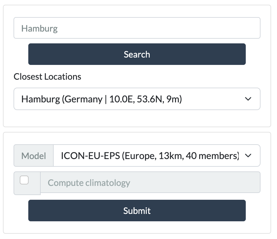
There are many problems with this.
- The buttons seem out of place and do not fill the container entirely
- The text next to the checkbox does not have the same size as the checkbox itself
- The margins are probably excessive.
I tried to wrap every component into a row and only specified the bottom margin to leave some space, but probably there’s a better way to handle it?
Her is some minimal code to reproduce this example
for the first card
dbc.Card(
    [
        dbc.Row(
            dbc.InputGroup(
                [
                    dbc.Input(placeholder="Where are you?"),
                ],
                className="mb-2",
            ),),
        dbc.Row(
            [
                dbc.Button("Search",
                           className="d-grid gap-2 col-10 mb-2")
            ], justify='center'
        ),
        dbc.Row(
            html.Div('Closest Locations', className="mb-2"),
        ),
        dbc.Row(
            dbc.InputGroup(
                [
                    dbc.Select(),
                ],
                className="mb-2",
            ),
        )
    ],
    body=True, className="mb-2"
)
for the second card
dbc.Card(
    [
        dbc.Row(
            dbc.InputGroup(
                [
                    dbc.InputGroupText("Model"),
                    dbc.Select(),
                ],
                className="mb-2",
            ),
        ),
        dbc.Row(
            dbc.InputGroup(
                [
                    dbc.InputGroupText(
                        dbc.Checkbox()),
                    dbc.Input(placeholder='Compute climatology', disabled=True)
                ],
                className="mb-2",
            ),
        ),
        dbc.Row(
            [
                dbc.Button("Submit", className="d-grid gap-2 col-10",)
            ], justify='center',
        ),
    ],
    body=True, className="mb-2"
)
