Hi,
I have a simple line chart, using the offline Plotly library v3.10, that charts a value on the yaxis and a timestamp on the xaxis. Each of the timestamps are 5 minutes apart.
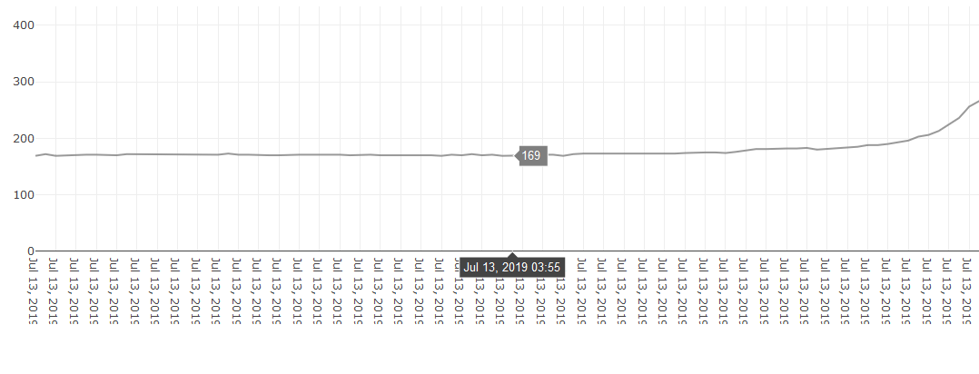
For the values of X, I’m passing in a list, where each item in the list is a string in the format of ‘Jul 12, 2019 00:00’. This is what is showing up as the label/tick for each datapoint on the x axis, and all I end up seeing is ‘Jul 12, 201’… because the rest of the tick is cutoff, like so:
(picture #1)
I have tried using the tickformat attribute, but it is not doing anything to change the format of my chart:
import plotly
import plotly.graph_objs as go
from datetime import datetime

def plotChart(xData, xName, yData, yName, tTitle, startDateTime, endDateTime):
    trace = go.Scatter(
	x = xData,    # In the format ['Jul 13, 2019 00:00', 'Jul 13, 2019 00:05', ...etc]
	y = yData,    # In the format [100, 153, 168, ...etc]
	name = xName,
	line = dict(color = '#7F7F7F'),
	opacity = 0.8)

    data = [trace]
    startDate = startDateTime.strftime('%Y-%m-%d')
    endDate = endDateTime.strftime('%Y-%m-%d')
    layout = dict(
	title = f'{tTitle}<br>{startDateTime} through {endDateTime}',
	xaxis = dict(
		range = [startDate, endDate],
		tickformat = '%b %e'),
	yaxis = dict(
		range = [0, max(yData) + (max(yData) * 0.2)])
	)
I have also tried parsing timestamps to remove the "jul 13, 2019’ from the label unless the label is midnight, (and starting a new day), but it only works when the labels are unique. Here’s a chart that encompasses data from Jul 12, 23:00 through Jul 13, 11:00:
(picture #2)
However, if I expand the date range that the chart covers, so that it includes timestamps from multiple days where the HH:MM timestamp repeats, the chart is plotting on top of itself, like this chart that was ran from Jul 12 00:00 through Jul 13 11:00:
(picture #3)
I don’t think I’ve stated my goal clearly in this post yet - my end goal is to have a chart with labels like picture #2, but without the overlapping plot when the range covers multiple days. I was unable to accomplish this goal by using tickformat and my own custom parsing.
Thanks!


