Hey all,
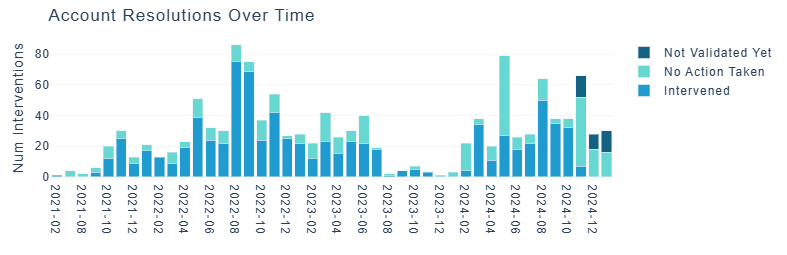
I am noticing some odd graph behavior in the deployed prod/dev instances of a Dash app utilizing plotly. Starting late this morning, the graphs appear to be rendering sideways and with the incorrect info. Below are screenshots of what it’s supposed to be (top) and how it shows up deployed (bottom). Everything looks normal when built in a normal container, and all versions in the app are pinned and have not changed.
I am positive this is something on my end and not an actual issue with Plotly itself, but I don’t know how to go about googling this since I cannot find any other instances of it happening. Has anyone seen this before, or does anyone have any tips as to what might be happening?
Thanks!
Versions used are:
Python 3.8.19
dash 2.9.0 (plotly dependency included)
k8s deployment triggered via Azure pipeline

UPDATE 1/30/2025: I have resolved this, and the issue seems to be a bug with Plotly 6.0.0 (bug-report tag added to post). I did not have Plotly version pinned (only using Dash 2.9.0’s requirement of >=5.0.0), and my local version was functioning fine with plotly 5.24.1. The deployment started using 6.0.0 yesterday when the issue started, and I was able to reproduce this error locally by pinning 6.0.0 as my version.
This is specific to the make_subplots() function - simply using a Plotly GO object does not have any issues. Example code is below - this is used to generate the chart in my screenshots and is displaying the correct one with 5.24.1 and the incorrect one with 6.0.0.
# Begin subplot
fig = make_subplots()

# Set counter to iterate through fixed list of color hex codes with each trace
counter = 0

# add each trace, iterating through colors
for flag in accounts["account_flag_desc"].unique():
    data_sub = accounts[accounts.account_flag_desc == flag]
    fig.add_trace(
        go.Bar(
            x=data_sub["flag_date"],
            y=data_sub["account_flag_id"],
            name=flag.title(),
            marker={"color": color_list[counter]},
        ),
    )
    counter += 1

# Set core layout pieces with margin, bgcolor
fig.update_layout(
    title_text="Account Resolutions Over Time",
    xaxis={"type": "category"},
    font={"family": "arial"},
    plot_bgcolor="rgb(255,255,255)",
    barmode="stack",
    margin=go.layout.Margin(
        l=0,
        r=0,
        b=25,
        t=35,
    ),
)

# Update axis titles, width, sorting, color
fig.update_xaxes(categoryorder="category ascending")
fig.update_yaxes(
    title_text="Num Assignments",
    showgrid=True,
    gridwidth=1,
    gridcolor=lightgray,
)