feffery-infographic is a Plotly Dash component library built on top of AntV Infographic. Its goal is to bring the capabilities of this next-generation declarative information visualization engine into the Python Dash ecosystem.
It allows Dash developers to build vivid, expressive infographics directly in Python, making data storytelling simpler and more efficient.
Key Features
Declarative Syntax: Inherits the core design of AntV Infographic, allowing you to describe complex visual scenarios with simple configurations.
AI-Friendly: The underlying architecture is optimized for AI generation, making it particularly suitable for building “Text-to-Chart” AI applications using LLMs.
Out-of-the-Box: Includes a rich set of built-in infographic templates and assets to help you build professional-grade visuals quickly.
Installation
The project is currently in the early preview stage. Feel free to try it out via pip:
pip install feffery-infographic -U
Simple Usage
import dash
from dash import html
import feffery_infographic as fi

app = dash.Dash(__name__)

app.layout = html.Div(
    [
        fi.Infographic(
            syntax="""
infographic list-row-simple-horizontal-arrow
data
  items
    - label 步骤 1
      desc 开始
    - label 步骤 2
      desc 进行中
    - label 步骤 3
      desc 完成
""",
        )
    ],
    style={'padding': 50},
)

if __name__ == '__main__':
    app.run(debug=True)
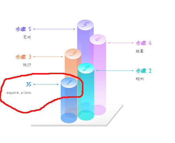
It looks very cool, so I tried it, the cylindrical one. I wanted to convert the distribution of pianotypes and was very happy with the possibility of the browser translating Chinese? into English (before your online demo was published).
do you have a coding example were you dynamically transform columns of a dataframe into label-description combinations and insert it into markdown?
is there documentation where you can see which part of the visual is dynamic and which part static (see below, I more or less expected that the 1 on the cylinder would become 35. Maybe I just missed something, very well possible.
For the example in your screenshot, the numbers on the cylinder of this chart template should be in a fixed form starting from 1.
If you are not interested in developing an automatic infographic generation function based on Dash + LLM, then the core parameter syntax of the Infographic() component in feffery-infographic can be generated entirely manually. Generation based on structured data such as data frames can be implemented in many AI applications. Recommended steps:
1 Select the type of infographic you are interested in from Gallery – AntV Infographic and copy the original syntax of the example.
Translate to English, keeping it as concise as possible to avoid large blocks of text affecting visual impact:


infographic sequence-circle-arrows-indexed-card

data

  title 企业优势列表

  desc 展示企业在不同维度上的核心优势与表现值

  items

    - label 品牌影响力

      value 85

      desc 在目标用户群中具备较强认知与信任度

      time 2021

      icon mingcute/diamond-2-fill

      illus creative-experiment

    - label 技术研发力

      value 90

      desc 拥有自研核心系统与持续创新能力

      time 2022

      icon mingcute/code-fill

      illus code-thinking

    - label 市场增长快

      value 78

      desc 近一年用户规模实现快速增长

      time 2023

      icon mingcute/wallet-4-line

      illus business-analytics

    - label 服务满意度

      value 88

      desc 用户对服务体系整体评分较高

      time 2020

      icon mingcute/happy-line

      illus feeling-happy

    - label 数据资产全

      value 92

      desc 构建了完整用户标签与画像体系

      time 2022

      icon mingcute/user-4-line

      illus mobile-photos

    - label 创新能力强

      value 83

      desc 新产品上线频率高于行业平均

      time 2023

      icon mingcute/rocket-line

      illus creativity

theme light

  palette antv
@nathandrezner As I mentioned in the issue at The SSE interface is not functioning properly, currently, applications deployed via Plotly Cloud cannot access the SSE interface properly. This makes it impossible to demonstrate advanced application functions related to LLM on Plotly Cloud.
 What is it?
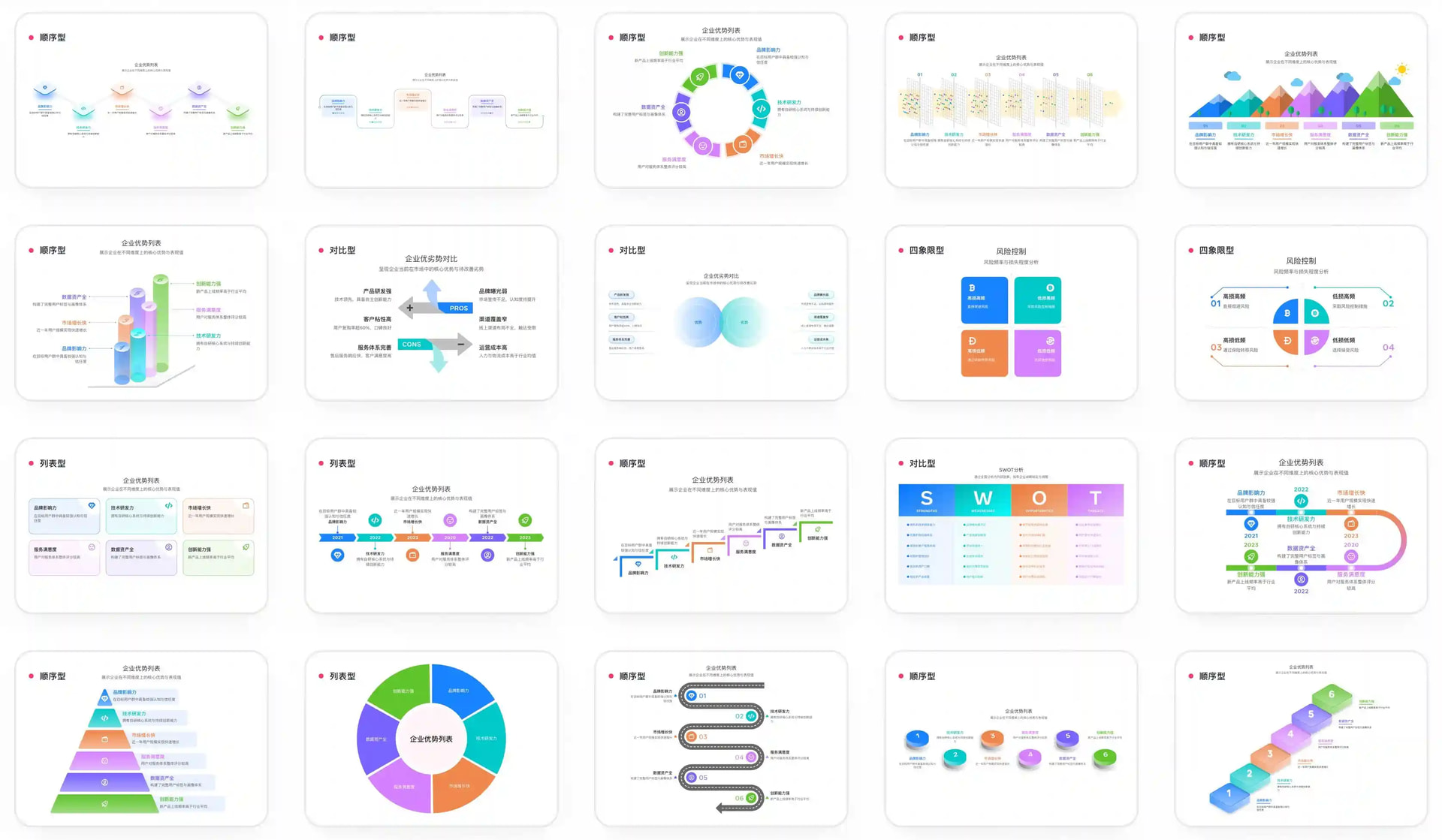
 Key Features
 Declarative Syntax: Inherits the core design of AntV Infographic, allowing you to describe complex visual scenarios with simple configurations.
 AI-Friendly: The underlying architecture is optimized for AI generation, making it particularly suitable for building “Text-to-Chart” AI applications using LLMs.
 Out-of-the-Box: Includes a rich set of built-in infographic templates and assets to help you build professional-grade visuals quickly.