Dash-Widgetbot, Dash-Mui-Charts, Dash-Flows v1.2 - Significant updates & new components across Pip-Install-Python.com component ecosystem

:rocket: What’s New at Pip Install Python: Discord Chat in Dash, Live Trading Charts & Dash Flows v1.2.0

Hey Plotly Community! :waving_hand:

Excited to share three significant updates across the Pip Install Python component ecosystem — each one documented with live, interactive examples at pip-install-python.com.


:speech_balloon: dash-widgetbot — Discord Chat Embedded Directly in Your Dash App

Your community, inside your app — no redirects, no iframes you manage yourself.

dash-widgetbot wraps WidgetBot to embed a fully functional Discord channel inside any Dash application. It goes far beyond a basic embed — the library ships a complete bot bridge that lets you handle Discord slash commands from Python callbacks, stream AI responses back to Discord, and sync user events to your Dash layout in real time.
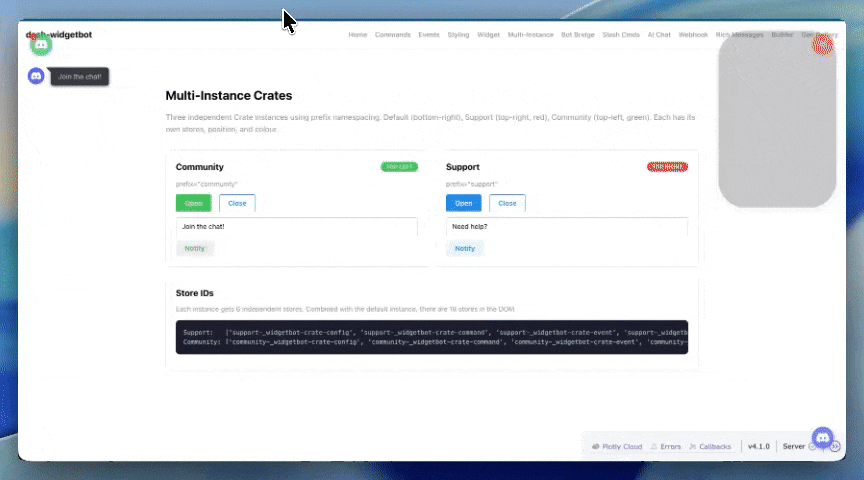
dash-widgetbot

:sparkles: Key Features

  • Global Crate widget — floating Discord button on every page, one line of setup
  • Slash command handlers/ask, /ai, /gen, /status, /navigate all dispatched as Python callbacks
  • Crate text bridge — intercept free-text messages and route them to your own logic
  • AI bot integration — stream LLM responses back into Discord from a /api/bot-bridge-prompt endpoint
  • Event propssignedIn, message, sentMessage, unreadCount all available as Dash Output props
  • Full Dash callback support — every interaction is a standard @callback

:package: Installation

pip install dash-widgetbot

:high_voltage: Quick Setup — Global Crate on Every Page

Critical: add_discord_crate() and add_discord_interactions() must be called before Dash().

from dash_widgetbot import add_discord_crate, add_discord_interactions

# Must come BEFORE Dash()
add_discord_crate(
    server="1246197743307980940",
    channel="1449848984981213385",
)
add_discord_interactions()

app = dash.Dash(__name__, use_pages=True)

:robot: Handling Slash Commands from Python

from dash_widgetbot import add_crate_slash_command

@add_crate_slash_command("ask")
def handle_ask(user, args):
    # args is the text the user typed after /ask
    return f"You asked: {args}"

:link: Documentation & Examples

View Full Documentation →


:chart_increasing: 
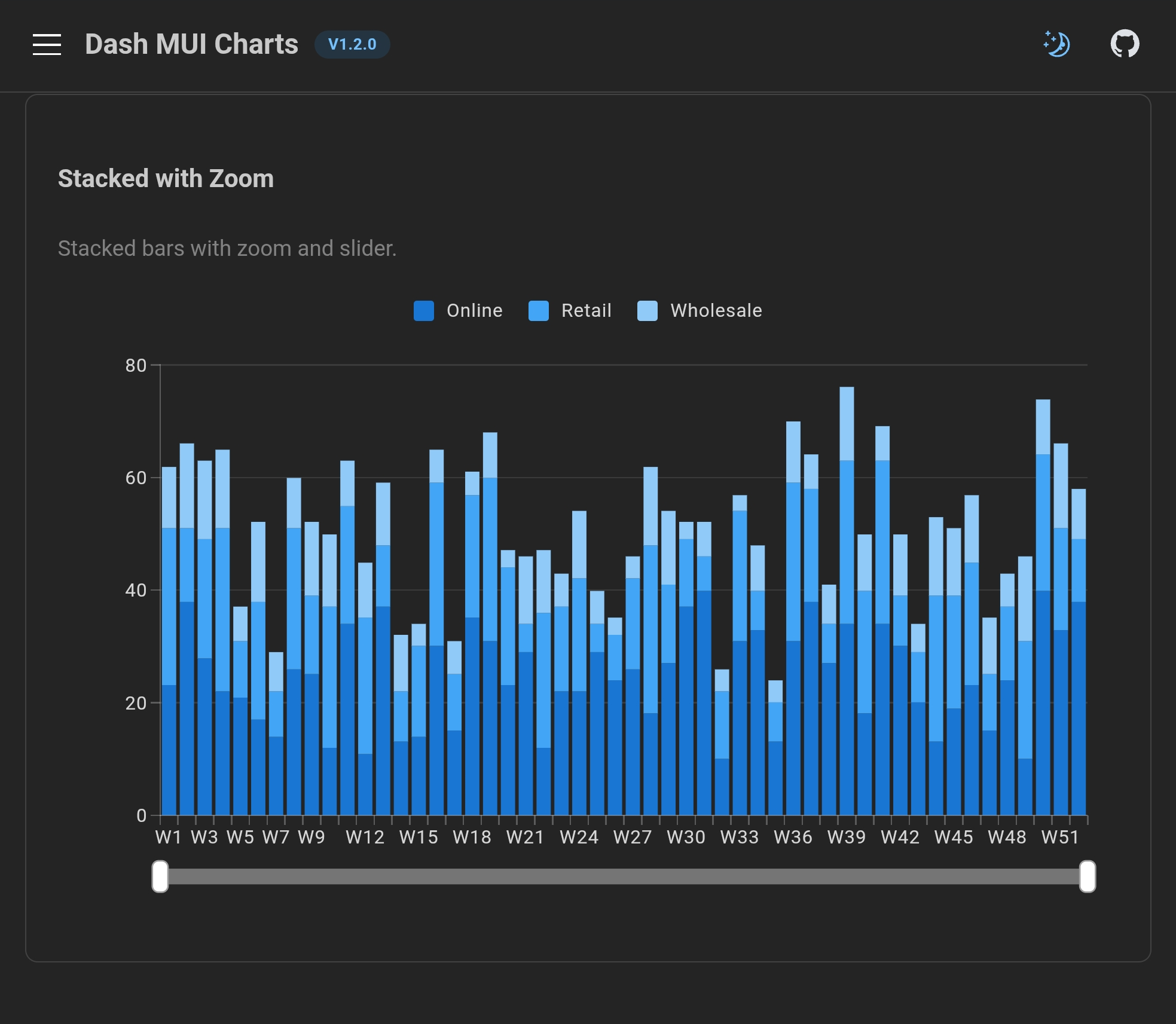
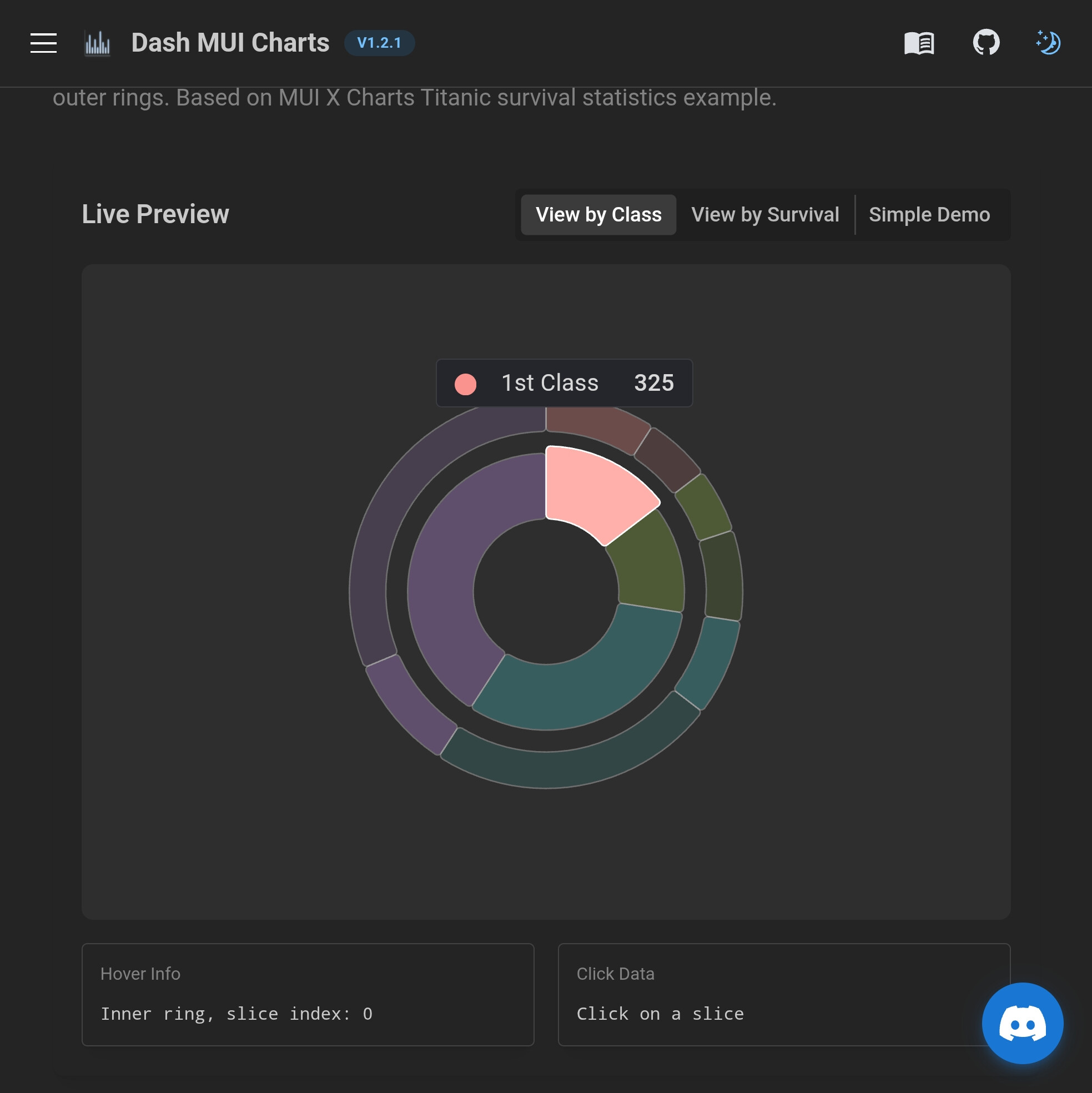
dash-mui-charts v1.1.0 — LiveTradingChart, Built-in Date Formatting & Smarter Alerts

Professional MUI X Charts for Dash — now with real-time candlestick streaming.

dash-mui-charts wraps MUI X Charts for Python developers. Version 1.1.0 ships three major additions: a brand-new LiveTradingChart component, built-in date formatting props for time-scale axes, and swing-point alert detection that eliminates label clutter.

:sparkles: What’s New in v1.1.0

:candle: 
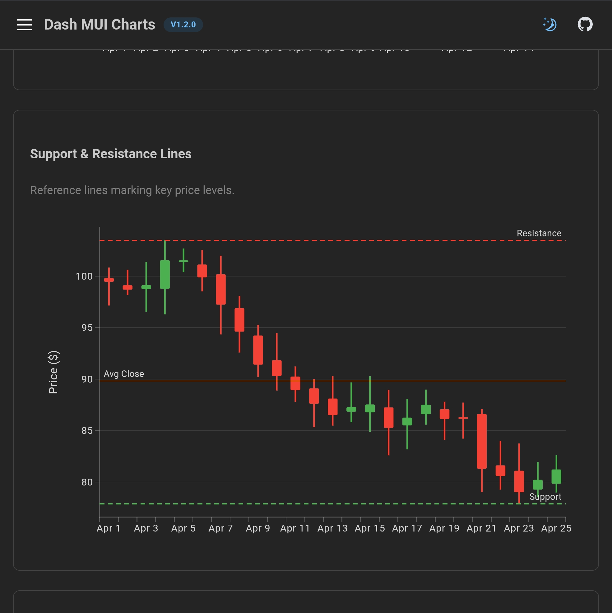
LiveTradingChart — Real-Time OHLCV Streaming

dash-mui-charts

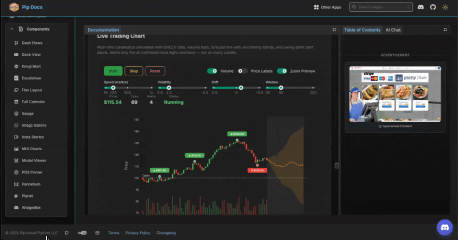
A self-contained candlestick chart that simulates (or can be wired to real) live market data:

  • OHLCV candlestick bars with volume histogram
  • Forward forecast line with uncertainty shading
  • Swing-point alert labels — only fires at confirmed local highs and lows, not on random candles
  • All simulation parameters controllable at runtime via callbacks (volatility, drift, windowSize, intervalMs)
  • Functions-as-props for custom label formatting and custom alert detection logic
from dash_mui_charts import LiveTradingChart

LiveTradingChart(
    id="my-chart",
    running=True,
    intervalMs=200,          # tick speed
    windowSize=80,           # visible candles
    volatility=0.02,
    drift=0.001,
    # Swing-point detection — labels only at confirmed extremes
    alertLookback=5,         # neighbors on each side to confirm
    alertMinDistance=10,     # min ticks between labels
    maxVisibleAlerts=6,      # cap visible labels in the window
    alertFormatter={
        "function": "priceAlertFormatter",
        "options": {"decimals": 2},
    },
    showVolume=True,
    showSlider=True,         # zoom slider (Pro)
    height=500,
)

:date: Built-in Date Formatting — No JavaScript Required

Previously, formatting time-scale axis labels required writing a JavaScript valueFormatter. v1.1.0 adds dateFormat (tooltip) and dateTickFormat (axis ticks) as plain Python strings:

LineChart(
    xAxis=[{
        "data":           epoch_ms_timestamps,
        "scaleType":      "time",
        "dateFormat":     "MMM d, YYYY",   # tooltip: "Apr 8, 2026"
        "dateTickFormat": "M/d",            # tick:    "4/8"
        "tickMinStep":    86400 * 1000 * 7, # weekly ticks
        "tickLabelStyle": {"angle": 35, "fontSize": 11, "textAnchor": "start"},
        "height":         70,
    }],
    margin={"left": 65, "right": 20, "top": 20, "bottom": 90},
)

Supported tokens: YYYY, MMM, MM, M, dd, d, HH, mm

:wrench: Functions-as-Props Pattern

The same pattern Dash Mantine Components uses for JS-bridged functions is now available across all chart components. Register a function once in assets/muiChartsFunctions.js, reference it from Python:

# Python
alertFilter={"function": "swingAlertFilter", "options": {"lookback": 7}}
// assets/muiChartsFunctions.js
window.dashMuiChartsFunctions.swingAlertFilter = function(candles, idx, ctx, opts) {
    // full candle buffer available — return 'up', 'down', or null
};

:package: Installation

pip install dash-mui-charts==1.1.0

:link: Documentation & Examples

View Full Documentation →


:ocean: dash-flows v1.2.0 — Collapsible Groups, Smart Handles, Undo/Redo & More

The most feature-packed dash-flows release yet.

demo-flows-1.2

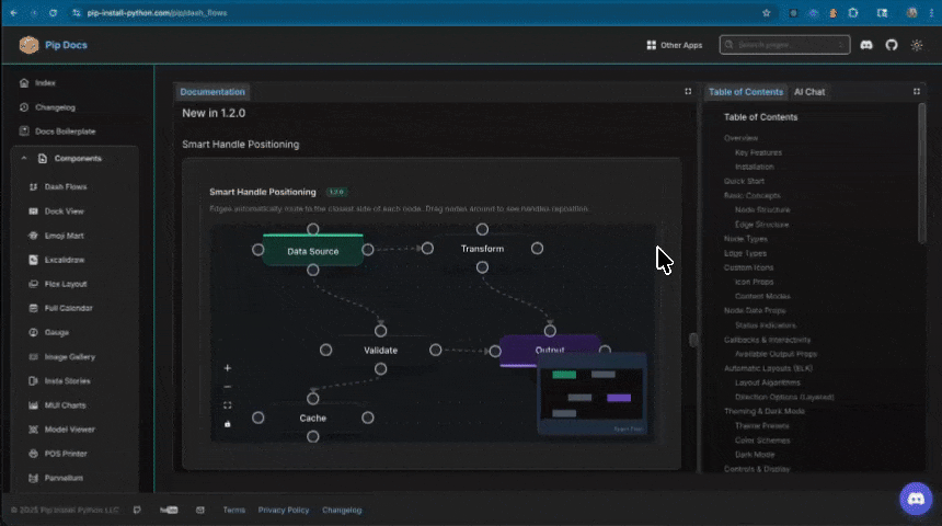
Dash Flows (React Flow for Dash) v1.2.0 ships eleven new capabilities. All are now documented with live, interactive examples.

:sparkles: New in v1.2.0

Feature Prop Description
Collapsible Groups toggleCollapseNode, collapsedGroups Double-click a group node to collapse/expand child nodes
Smart Handles smartHandles=True Edges auto-route to the closest side of each node
Floating Edges Edge type: "floating" Edges attach to node perimeters, not fixed handles
Helper Lines helperLines=True Alignment guides appear while dragging
Undo / Redo enableUndoRedo=True, undoRedoAction Full history tracking with undo/redo callbacks
Add Node on Drop addNodeOnEdgeDrop=True Drag an edge to empty canvas to create a new node
Animated Layouts animateLayout=True Smooth transitions between ELK layout changes
Computing Flows computeAction, computeResult Topological sort and data propagation through nodes
Resize Constraints Per-node resizeOptions Aspect ratio lock, min/max dimensions on resizable nodes
Accessibility ariaLabelConfig, nodesFocusable Screen reader labels and full keyboard navigation
Viewport Portal viewportOverlays Floating annotations anchored to flow coordinates

:fire: Highlight: Collapsible Group Nodes

Group nodes can now collapse to a compact size, hiding child nodes while keeping external edges connected at the group boundary:

import dash_flows
from dash import callback, Input, Output, no_update

nodes = [
    {
        "id": "pipeline",
        "type": "group",
        "data": {"label": "ETL Pipeline", "collapsedWidth": 200, "collapsedHeight": 52},
        "position": {"x": 250, "y": 50},
        "style": {"width": 350, "height": 250},
    },
    # Child nodes with parentId set
    {"id": "extract",   "parentId": "pipeline", "extent": "parent", ...},
    {"id": "transform", "parentId": "pipeline", "extent": "parent", ...},
]

# Double-click a group → collapse/expand
@callback(
    Output("my-flow", "toggleCollapseNode"),
    Input("my-flow", "doubleClickedNode"),
    prevent_initial_call=True,
)
def toggle_group(node):
    if node and node.get("type") == "group":
        return node["id"]
    return no_update

:fire: Highlight: Undo / Redo

from dash import callback, Input, Output

dash_flows.DashFlows(
    id="my-flow",
    enableUndoRedo=True,
    undoRedoMaxHistory=50,
    # undoRedoState output: {canUndo, canRedo, undoCount, redoCount}
)

@callback(
    Output("my-flow", "undoRedoAction"),
    Input("undo-btn", "n_clicks"),
    Input("redo-btn", "n_clicks"),
    prevent_initial_call=True,
)
def handle_undo_redo(_, __):
    from dash import ctx
    return {"action": "undo" if ctx.triggered_id == "undo-btn" else "redo"}

:package: Installation

pip install dash-flows

:link: Documentation & Examples

View Full Documentation →


:books: Full Documentation

Everything shown above has live, interactive examples at pip-install-python.com — copy the code, see it run, explore the props.

All components are:

:white_check_mark: Production-ready — stable, versioned, on PyPI
:white_check_mark: Fully documented — API reference + working examples
:white_check_mark: Theme-aware — light/dark mode via Dash Mantine Components
:white_check_mark: Callback-enabled — standard Dash @callback patterns throughout
:white_check_mark: Open source — MIT license, GitHub issues welcome


:link: Useful Links


:speech_balloon: Questions & Feedback

Join the discord channel - 2plot.ai

Building something with any of these? Would love to see what you create.

  • :bug: Found a bug? Open an issue on GitHub
  • :light_bulb: Have a feature idea? Start a discussion
  • :star: If these save you time, a star on the repo goes a long way
  • :red_question_mark: Questions? Drop them right here in the thread

Happy building! :rocket:


Made with :heart: by Pip Install Python LLC

Follow up on a new dash-mui-charts==1.2.1

More comprehensive documentation and examples:

1.2.1 - 2026-04-11

Fixed

  • TreeView editableItems prop not working: isItemEditable defaulted to false (a boolean), causing typeof isItemEditable === 'boolean' to short-circuit before checking the
  • editableItems array. Changed to isItemEditable === true so per-item editing via editableItems works correctly.
  • SimpleTreeView React 18 defaultProps warning: Replaced Component.defaultProps with JavaScript default parameters in the function signature.
  • TreeView edit input dark mode: Added CSS overrides for .MuiTreeItem-labelInput input fields — dark background, white text, and blue focus underline in dark mode.

Added

  • Per-item icons in SimpleTreeView: Items now support an icon field (string) resolved via iconResolver. Renders inline MUI icon (18px, 0.7 opacity) next to the label.
  • 30+ new MUI icons in iconResolver.js: ShowChart, BarChart, PieChart, ScatterPlot, GridOn, CandlestickChart, Timeline, TrendingUp, Layers, AccountTree, Brush, Highlight, Sync, ZoomIn, TouchApp, TableChart, StackedBarChart, Palette, Rule, Mouse, CheckBox, UnfoldMore, Block, Diamond, AutoGraph, ViewList, GpsFixed, Speed, Star, PlayArrow, Tune, History.
  • Changelog page: /changelog renders CHANGELOG.md via dcc.Markdown with styled tables and dark mode support.

Changed

  • Navigation tree: Reordered (Home, Changelog, SparklineChart, PieChart, BarChart, Heatmap, ScatterChart, LineChart, CandlestickChart, LiveTradingChart, CompositeChart, TreeView). All items have unique MUI icons. Groups start collapsed. itemChildrenIndentation reduced to 8px.
  • Tree state persistence: Expanded groups saved to localStorage via clientside callback, restored on page load via dash_clientside.set_props. No circular dependency.
  • SPA navigation: Tree selection uses dcc.Location(refresh="callback-nav") — page content swaps without full reload, preserving tree state.

1.2.0 - 2026-04-10

Added

BarChart Component (New)

  • Vertical & Horizontal Bars: layout='vertical' (default) or layout='horizontal'
  • Multi-Series: Multiple data series with individual colors side by side
  • Stacking: stack group ID on series, with stackOffset (‘none’, ‘expand’, ‘diverging’) and stackOrder (‘none’, ‘appearance’, ‘ascending’, ‘descending’, ‘reverse’)
  • Bar Labels: barLabel='value' with barLabelPlacement (‘center’ or ‘outside’)
  • Border Radius: Rounded bar corners via borderRadius prop
  • Dataset Mode: dataset + dataKey pattern for table-format data (no duplication)
  • Bar Spacing: categoryGapRatio and barGapRatio on band axis for gap control
  • Reference Lines: Horizontal (y) and vertical (x) markers for targets, thresholds
  • Axis Highlight: Configurable axisHighlight with ‘band’, ‘line’, or ‘none’
  • Tooltip Modes: tooltip={'trigger': 'axis'} or tooltip={'trigger': 'item'}
  • Highlighting: highlightedItem prop (controlled, bidirectional) with per-series highlightScope
  • Custom Colors: colors palette prop for series color override
  • Batch Renderer: renderer='svg-batch' for large dataset performance
  • Click Events: clickData (bar click) and axisClickData (axis area click) output props
  • Pro Features (require licenseKey):
    • initialZoom + showSlider for zoom with range slider
    • showToolbar for zoom/export toolbar
    • brushConfig for brush selection
    • zoomInteractionConfig for pan/wheel/pinch behaviors
    • zoomData output prop for zoom state callbacks

CandlestickChart Component (New)

  • OHLC Candlestick Rendering: Custom SVG candles (body + wicks) built on MUI X Charts Pro composition API
  • Array Format: series=[{data: [[open,high,low,close], ...], upColor, downColor}]
  • Dataset Format: dataset + series=[{datasetKeys: {open, high, low, close}}]
  • Volume Overlay: Optional volume bars below candles via showVolume=True with volumeKey or volume array
  • Candle Styling: bodyWidthRatio (0-1) and wickWidth (px) for custom candle appearance
  • OHLC Tooltip: Built-in hover tooltip showing Open, High, Low, Close values
  • Reference Lines: Support/resistance lines, moving averages markers
  • Click Events: clickData with {dataIndex, label, open, high, low, close, timestamp}
  • Auto Y-Axis Domain: Automatically computes min/max from OHLC data with 5% padding
  • Grid Support: grid={'horizontal': True, 'vertical': True}
  • Pro Features: Zoom, slider, toolbar (via composition API)
  • No Premium Dependency: Works with existing @mui/x-charts-pro v8.24.0 (no @mui/x-charts-premium required)

Demo Pages (7 New)

  • /barchart-basic — Multi-series, stacked, horizontal, bar labels, rounded corners, negative values
  • /barchart-dataset — Dataset mode with dataKey, bar/category gap control
  • /barchart-stacking — Stack offsets (none, expand, diverging), multiple stack groups, horizontal stacked
  • /barchart-interaction — Click events, axis click, highlighting, axis highlight modes, tooltip triggers
  • /barchart-reference — Target lines, min/avg/max refs, vertical refs, animation, legend, color palette
  • /barchart-pro — Zoom+slider, toolbar, stacked zoom (Pro features)
  • /candlestick — Array format, dataset mode, volume overlay, styling, support/resistance lines, click events

Application UI/UX Redesign

  • DMC AppShell Layout: Replaced flat blue top-bar with dmc.AppShell (header + sidebar navbar + main content area)
  • Sidebar Tree Navigation: SimpleTreeView organizes all 37 demo pages into 11 component groups with expand/collapse
  • Dark/Light Mode: dmc.ColorSchemeToggle (DMC 2.6.1) with dmc.pre_render_color_scheme() to prevent theme flash on load
  • MUI Charts Dark Mode: Global CSS overrides for axis labels, tick marks, grid lines, legend labels, tooltips, bar labels, and reference lines — all auto-switch via [data-mantine-color-scheme="dark"]
  • Theme-Aware Loading Screen: Animated liquid-blob splash screen with 2plot logo, swaps between light/dark assets based on saved preference (localStorage)
  • Page Loading Overlay: /composite-render-bp uses deferred content loading via callback with dmc.LoadingOverlay — shows logo + blur overlay while heavy chart sections build server-side
  • Home Page Redesign: Responsive 3-column component card grid with dmc.Paper, dmc.Badge, dmc.CodeHighlight for installation and usage examples

Changed

  • CompositeChart: Custom tooltip components (MuiAxisTooltip, ExternalAxisTooltip) now use Mantine CSS variables (--mantine-color-body, --mantine-color-text, --mantine-color-default-border) instead of hardcoded white/#e0e0e0 — tooltips auto-adapt to dark mode
  • SimpleTreeView: Replaced Component.defaultProps with JavaScript default parameters to eliminate React 18 deprecation warning
  • Composite Render BP page: Deferred chart section building to a callback (from static layout) for instant page load with loading overlay
  • Updated component count from 7 to 9
  • src/lib/index.js exports BarChart and CandlestickChart
  • Auto-generated Python wrappers for both components via dash-generate-components
  • Upgraded dash-mantine-components from >=1.0.0 to >=2.6.0 in requirements.txt
  • All demo pages updated with Mantine CSS variables for dark mode support (card backgrounds, text colors, code blocks, tooltips, borders)
  • Pages with dmc.MantineProvider wrappers (8 files) unwrapped — single root provider in app.py

Fixed

  • Legend labels not switching in dark mode: Added CSS selectors for .MuiChartsLegend-label and .MuiChartsLabel-root (HTML span elements used by MUI X Charts v8)
  • Custom tooltip dark mode in crosshair, highlighting sync, composite, and composite render pages — replaced hardcoded white/#333/#e0e0e0 with theme-adaptive CSS variables
  • Highlighting demo: Per-Series Highlight Scope example now uses 3 series with distinct highlightScope configs to clearly demonstrate series vs item highlight and global vs none fade behaviors
  • Circular dependency: Replaced server-side nav callbacks with clientside window.location navigation to break url.pathname ↔ nav-tree.selectedItems cycle

Updated dash-mui-charts to a new 1.2.3 release which includes a pretty awesome new tree - Pro with Selection + Editing + Reordering + Slider + Kebab - Dash MUI Charts - Interactive MUI X Charts for Python Dash

full changelog -

[1.2.3] - 2026-05-15

Fixed

TreeViewPro — Cell editing

  • [object Object] on edit: CustomTreeItem previously passed the slider/kebab wrapper as the TreeItem label prop. MUI’s getLabelProps() sets children: label and the edit input initialized from that same value, so entering edit mode stringified a React element to [object Object]. The custom UI is now injected through the slots.label slot while the real string label prop is left intact, so the edit input, onItemLabelChange, and double-click-to-edit all receive the correct text. itemId is forwarded to the slot via slotProps.label; MUI-internal props (editable, ownerState) are destructured out so they never reach the DOM. Group rows and the no-controls fallback also forward the slot props, keeping every row editable.
  • Edit mode collapsing mid-gesture: With itemsReordering=True, MUI’s reorder plugin sets draggable="true" on the TreeItem root with no editing guard. While the label input was focused, drag-selecting a word started a native HTML5 element drag of the row, which blurred the input and committed/exited edit mode on mouse-up; clicking inside the cell also bubbled to the row’s selection/focus handlers. A new custom labelInput slot (EditableLabelInput) now: (1) flips the nearest draggable="true" ancestor to false while the input is mounted and restores it on cleanup; (2) stopPropagation()s mousedown/pointerdown/click (without preventDefault, so native caret placement and text selection still work) so the row no longer reacts; (3) cancels stray dragstart. onBlur/onKeyDown/value/autoFocus/data-element pass through untouched, so click-outside and Enter/Escape still commit/cancel. Net: double-click to edit → click to position the caret, drag to highlight, edit freely → click outside or Enter to commit.

Demo page /tree-pro

  • Readouts use the renamed label: editedItemLabel is now captured into a dcc.Store of {itemId: newLabel} overrides. “Last slider”, “Last menu”, and “Selected” resolve labels through label_for(id, overrides) (override → static tree label → id). The two summary tiles render from stored last-slider / last-kebab state plus the overrides store, so renaming a cell immediately refreshes them with the new label instead of showing the stale one.
  • Selected: shows labels, not IDs: selected items (groups or leaves, single or multi) now display their human labels via a full ALL_LABELS map instead of raw slugs.

[1.2.2] - 2026-05-13

Added

TreeViewPro — Per-Item Slider + Kebab Menu

  • showItemControls (bool) — render a 0–100 Slider and a kebab IconButton directly after each tree item’s label. Designed for “tree paired with a map / canvas” patterns where each leaf is a layer with an opacity / progress value and a row-level actions menu.
  • controlsItems (list of IDs) — optional subset filter; the slider + kebab only appear on listed items (leaves only, by convention). Omit to show controls on every row.
  • sliderValues (dict, bidirectional){itemId: value}. Pre-seed initial values from Python; the prop also updates live as the user drags so callbacks can mirror the state.
  • sliderMin / sliderMax / sliderStep — bounds and granularity (defaults 0 / 100 / 1).
  • sliderColor (string) — accepts Mantine palette names ("teal", "blue.5"var(--mantine-color-...-6)), CSS literals ("#ff6b6b", "rgb(...)", "oklch(...)"), or CSS expressions ("var(--mantine-...), "light-dark(...)). Applied via sx to the slider track, thumb, hover ring, value label, and rail.
  • kebabMenuItems (list)[{label, value, icon?}] defines the actions menu. icon resolves through iconResolver.
  • sliderChange (output){itemId, value, event_timestamp}, fired on slider commit (mouse-up / touch-end).
  • kebabAction (output){itemId, action, event_timestamp} fired when a menu item is selected.
  • orderedItems (output) — the full live tree after any drag-reorder. Emitted on every onItemPositionChange via an internal applyReorder walk so Dash callbacks can render the nested current order. Falls back to items until the first reorder.
  • Dark / light mode detection — TreeViewPro now wraps its subtree in an MUI ThemeProvider whose mode is driven by a MutationObserver on <html data-mantine-color-scheme>. Checkbox, slider, IconButton, Menu paper and MenuItems re-skin automatically when the Mantine color scheme toggles.
  • Slider responsiveness on desktopItemLabelWithControls holds a local React state during drag, so the thumb tracks instantly even when Dash callback round-trips are slow. Native dragstart is cancelled on the slider + kebab area to keep itemsReordering from swallowing mouse drags; passive pointer/touch events no longer call preventDefault (silences the “Unable to preventDefault inside passive event listener invocation” console message).
  • MoreVert, ContentCopy, PersonAdd, CheckCircle, Archive icons registered in iconResolver.js for kebab menu usage.

Demo page /tree-pro rebuilt

  • Two-column grid (dmc.Grid): the Pro tree on the left, a “map companion” panel on the right that mirrors the tree’s state via dmc.Text tiles (Last slider, Last menu), a JSON readout titled “Slider values and nested order:”, and a rolling action log.
  • Slug-derived IDs: slugify_label + assign_ids turn label strings into stable IDs at startup. Spaces and non-alphanumerics → -, duplicate slugs auto-disambiguate with -1, -2, … so Site survey overlay becomes site-survey-overlay and the JSON output reads like a layer manifest instead of task-1, task-2.
  • Nested order JSONbuild_nested_view walks orderedItems (or the initial items on first render) and injects slider values at the leaves, so the readout always reflects the current reordered tree.
  • Layer-themed labels (Planning / Active / Reference) replace the placeholder “Backlog / In Progress / Done” copy to match the map-companion use case.
  • Section 3 wires sliderColor="teal"; ThemeIcon and action-log icons reuse the same constant.

Notes

  • Two Each child in a list should have a unique "key" prop warnings remain when checkboxSelection={true} and when the kebab menu opens. Both originate in MUI v6 internals (ButtonBase ripple array, FocusTrap children) and are tracked upstream — they are not caused by our code. They clear on upgrade to MUI v7.