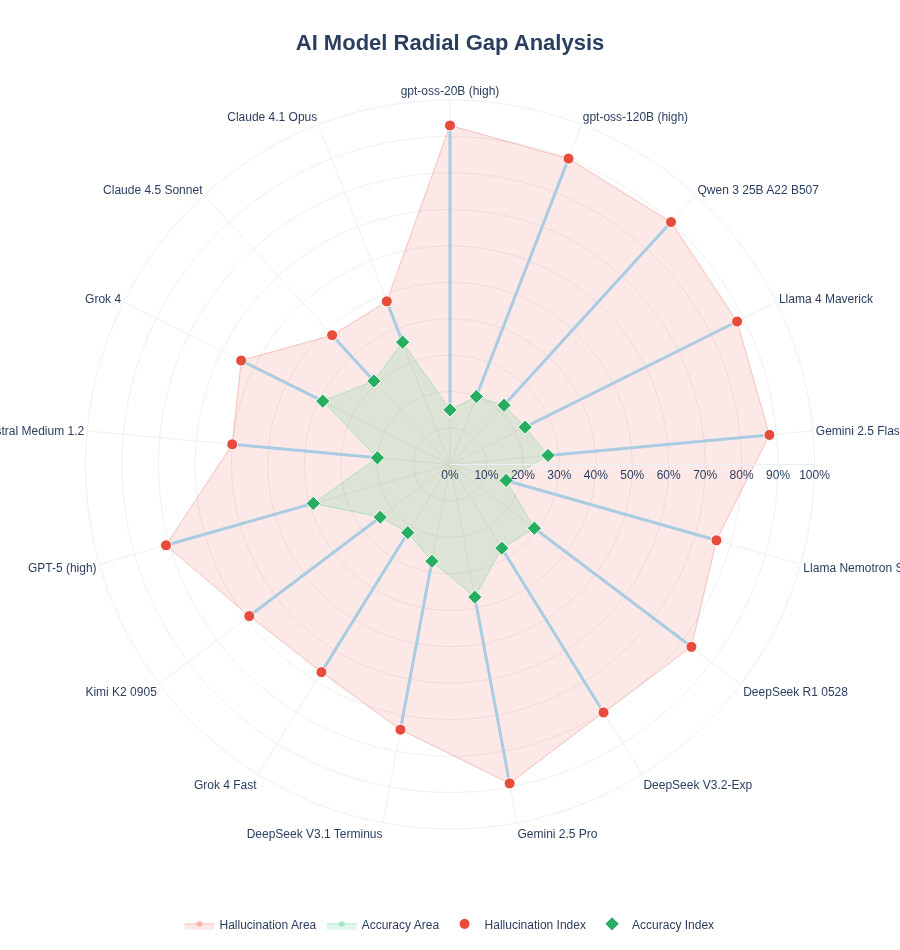
My first idea was to use a scatter plot, Hallucination Index vs Accuracy Index (inverted scale) and create high-risk and low-risk zones. Then I read the article shared along with the dataset (Voronoi article, a really cool scatter plot by VizMaya with exactly the same approach). So, I decided to pivot and was between a dumbbell chart or a butterfly chart; in the end, the latter helped me more with the narrative I wanted to tell.
To provide a business context, I created several metrics that would help me with this purpose:
The code
import dash
from dash import dcc, html, Input, Output, callback, State
import dash_bootstrap_components as dbc
import plotly.graph_objects as go
from plotly.subplots import make_subplots
import pandas as pd

# ---------------------------------------------------------
# DATA SET ORIGINAL (17 MODELOS)
# ---------------------------------------------------------
data = [
    {"Model": "Claude 4.1 Opus", "Accuracy": 36, "Hallucination": 48, "Type": "Proprietary", "Owner": "Anthropic", "BestFor": "Complex Reasoning", "Pros": "High Logic, Nuance", "Cons": "High Cost"},
    {"Model": "Claude 4.5 Sonnet", "Accuracy": 31, "Hallucination": 48, "Type": "Proprietary", "Owner": "Anthropic", "BestFor": "Coding & Writing", "Pros": "Balanced Speed", "Cons": "Mid Accuracy"},
    {"Model": "DeepSeek R1 0528", "Accuracy": 29, "Hallucination": 83, "Type": "Open Weights", "Owner": "DeepSeek", "BestFor": "General Tasks", "Pros": "Open Access", "Cons": "High Hallucination"},
    {"Model": "DeepSeek V3.1 Terminus", "Accuracy": 27, "Hallucination": 74, "Type": "Open Weights", "Owner": "DeepSeek", "BestFor": "Conversational", "Pros": "Fast Response", "Cons": "Logical Gaps"},
    {"Model": "DeepSeek V3.2-Exp", "Accuracy": 27, "Hallucination": 80, "Type": "Open Weights", "Owner": "DeepSeek", "BestFor": "Research", "Pros": "Broad Knowledge", "Cons": "Erratic Output"},
    {"Model": "Gemini 2.5 Flash (Sep)", "Accuracy": 27, "Hallucination": 88, "Type": "Proprietary", "Owner": "Google", "BestFor": "Fast API Tasks", "Pros": "Ultra Low Latency", "Cons": "Basic Reasoning"},
    {"Model": "Gemini 2.5 Pro", "Accuracy": 37, "Hallucination": 89, "Type": "Proprietary", "Owner": "Google", "BestFor": "Multimodality", "Pros": "Massive Context", "Cons": "Very High Risk"},
    {"Model": "GPT-5 (high)", "Accuracy": 39, "Hallucination": 81, "Type": "Proprietary", "Owner": "OpenAI", "BestFor": "Enterprise SOTA", "Pros": "Market Leader", "Cons": "Opaque Logic"},
    {"Model": "gpt-oss-120B (high)", "Accuracy": 20, "Hallucination": 90, "Type": "Open Weights", "Owner": "OpenAI", "BestFor": "Local Deployment", "Pros": "Full Control", "Cons": "Limited Factuals"},
    {"Model": "gpt-oss-20B (high)", "Accuracy": 15, "Hallucination": 93, "Type": "Open Weights", "Owner": "OpenAI", "BestFor": "Edge Computing", "Pros": "Tiny Footprint", "Cons": "High Error Rate"},
    {"Model": "Grok 4", "Accuracy": 39, "Hallucination": 64, "Type": "Proprietary", "Owner": "xAI", "BestFor": "Real-time Data", "Pros": "Live Search", "Cons": "Sarcastic Bias"},
    {"Model": "Grok 4 Fast", "Accuracy": 22, "Hallucination": 67, "Type": "Proprietary", "Owner": "xAI", "BestFor": "Quick Insights", "Pros": "X Integration", "Cons": "Lower Depth"},
    {"Model": "Kimi K2 0905", "Accuracy": 24, "Hallucination": 69, "Type": "Open Weights", "Owner": "Moonshot", "BestFor": "Long Context", "Pros": "Efficient Attention", "Cons": "Niche Support"},
    {"Model": "Llama 4 Maverick", "Accuracy": 23, "Hallucination": 88, "Type": "Open Weights", "Owner": "Meta", "BestFor": "Fine-tuning", "Pros": "Community Support", "Cons": "High Noise"},
    {"Model": "Llama Nemotron Super", "Accuracy": 16, "Hallucination": 76, "Type": "Open Weights", "Owner": "Meta", "BestFor": "NVIDIA Stack", "Pros": "Hardware Optimized", "Cons": "Low Accuracy"},
    {"Model": "Magistral Medium 1.2", "Accuracy": 20, "Hallucination": 60, "Type": "Proprietary", "Owner": "Mistral AI", "BestFor": "European Markets", "Pros": "GDPR Focused", "Cons": "Lower Reasoning"},
    {"Model": "Qwen 3 25B A22", "Accuracy": 22, "Hallucination": 90, "Type": "Open Weights", "Owner": "Alibaba", "BestFor": "Bilingual Tasks", "Pros": "East-West Balance", "Cons": "High Risk"}
]
df = pd.DataFrame(data)

# Business Logic
df['Safety_Margin'] = 100 - df['Hallucination']
df['Cost_Factor'] = df['Type'].apply(lambda x: 3 if x == 'Proprietary' else 1)
df['Technical_Value'] = df['Accuracy'] * (df['Safety_Margin'] / 100)
df['ROI_Score'] = (df['Technical_Value'] / df['Cost_Factor']) * 10

# ---------------------------------------------------------
# ASSETS & ANIMATIONS
# ---------------------------------------------------------
external_stylesheets = [
    dbc.themes.SANDSTONE,
    dbc.icons.BOOTSTRAP,
    "https://cdnjs.cloudflare.com/ajax/libs/animate.css/4.1.1/animate.min.css"
]

app = dash.Dash(__name__, external_stylesheets=external_stylesheets)

# CSS para el efecto "Hover" en las tarjetas
app.index_string = '''
<!DOCTYPE html>
<html>
    <head>
        {%metas%}
        <title>AI Hallucination Dashboard</title>
        {%favicon%}
        {%css%}
        <style>
            .hover-card { transition: transform 0.3s ease, box-shadow 0.3s ease; }
            .hover-card:hover { transform: translateY(-5px); box-shadow: 0 10px 20px rgba(0,0,0,0.1) !important; }
        </style>
    </head>
    <body>{%app_entry%}<footer>{%config%}{%scripts%}{%renderer%}</footer></body>
</html>
'''

app.layout = dbc.Container([
    # HEADER ORIGINAL
    dbc.Row([
        dbc.Col([
            html.H1("Which AIs Hallucinate More?", className="display-4 fw-bold text-primary animate__animated animate__fadeInDown"),
            html.P("Comparative analysis of model reliability and cost-efficiency", className="lead text-secondary animate__animated animate__fadeIn"),
        ], xs=12, md=8),
        dbc.Col([
            dbc.Button([html.I(className="bi bi-sliders me-2"), "Select Models"], id="open-modal", color="primary", className="float-end mt-3 px-4 shadow-sm fw-bold")
        ], xs=12, md=4, className="align-self-center")
    ], className="py-5 px-3 mb-4 bg-white rounded shadow-sm"),

    # MODAL
    dbc.Modal([
        dbc.ModalHeader(dbc.ModalTitle("Select AI Models to Compare")),
        dbc.ModalBody(dcc.Checklist(id='model-checklist', options=[{'label': f" {m}", 'value': m} for m in df['Model'].unique()], value=['Claude 4.1 Opus', 'GPT-5 (high)', 'Grok 4', 'DeepSeek R1 0528'], labelStyle={"display": "block", "padding": "5px"}, inputClassName="me-2")),
        dbc.ModalFooter(dbc.Button("Apply Selection", id="close-modal", color="primary"))
    ], id="modal", is_open=False, size="lg"),

    # INDICADOR
    dbc.Row([dbc.Col(id='selected-indicator', width=12, className="mb-4")]),

    # CHARTS AREA
    dbc.Row([
        dbc.Col(dbc.Card([
            dbc.CardHeader([
                html.H5([html.I(className="bi bi-bar-chart-steps me-2"), "Where do models fall on the hallucination spectrum?"], className="mb-0 fw-bold"),
                html.Small("Lower hallucination + higher accuracy = safer for production", className="text-muted")
            ]),
            dbc.CardBody(dcc.Graph(id='tech-chart', config={'displayModeBar': False}))
        ], className="shadow-sm border-0 h-100 hover-card animate__animated animate__fadeInLeft"), lg=7, className="mb-4"),

        dbc.Col(dbc.Card([
            dbc.CardHeader([
                html.H5([html.I(className="bi bi-graph-up-arrow me-2"), "Which models deliver the best value for money?"], className="mb-0 fw-bold"),
                html.Small("ROI score balances performance against costs", className="text-muted")
            ]),
            dbc.CardBody(dcc.Graph(id='finance-chart', config={'displayModeBar': False}))
        ], className="shadow-sm border-0 h-100 hover-card animate__animated animate__fadeInRight"), lg=5, className="mb-4"),
    ]),

    # SCORECARDS
    html.H3([html.I(className="bi bi-info-square me-2"), "Model Implementation Insights"], className="text-primary fw-bold mb-4 ms-2"),
    dbc.Row(id='model-cards', className="g-4 mb-5"),

    # FOOTER ORIGINAL CON METODOLOGÍA
    dbc.Row([
        dbc.Col(dbc.Card([
            dbc.CardBody([
                html.H6([html.I(className="bi bi-database-check me-2"), "Methodology & Sources"], className="fw-bold text-primary"),
                html.P([
                    html.B("Metrics: "), "Accuracy and Hallucination based on MMLU and TruthfulQA benchmarks. ",
                    html.B("Insights: "), "Business profiles derived from official Technical Whitepapers (OpenAI, Anthropic, Meta).",
                ], className="small text-muted mb-2"),
                html.Hr(),
                html.P(["Dashboard created using Plotly-Dash by ", html.Strong("avacsiglo 21"), " • Source: ", html.Strong("MakeOverMonday")], className="text-center small mb-0")
            ])
        ], className="bg-white shadow-sm border-0"))
    ], className="mb-5 mt-4")
], fluid=True, className="bg-light px-4")

# ---------------------------------------------------------
# CALLBACKS (CONSOLIDADOS Y SIN ERRORES)
# ---------------------------------------------------------
@callback(Output("modal", "is_open"), [Input("open-modal", "n_clicks"), Input("close-modal", "n_clicks")], [State("modal", "is_open")])
def toggle_modal(n1, n2, is_open):
    if n1 or n2: return not is_open
    return is_open

@callback(
    [Output('tech-chart', 'figure'), Output('finance-chart', 'figure'), Output('model-cards', 'children'), Output('selected-indicator', 'children')],
    [Input('model-checklist', 'value')]
)
def update_dashboard(selected_models):
    if not selected_models: return go.Figure(), go.Figure(), [], dbc.Alert("No models selected.", color="warning")

    dff = df[df['Model'].isin(selected_models)].copy()
    avg_acc = dff['Accuracy'].mean()

    # 1. Indicador
    indicator = dbc.Alert([
        html.I(className="bi bi-check-all me-2"),
        html.Span(f"{len(selected_models)} models selected: ", className="small text-muted me-2"),
        html.Span(" • ".join(selected_models), className="small fw-bold text-primary")
    ], color="light", className="shadow-sm border")

    # 2. Butterfly Chart
    dff_chart = dff.sort_values("Accuracy", ascending=True)
    fig_tech = make_subplots(rows=1, cols=2, shared_yaxes=True, horizontal_spacing=0.04, subplot_titles=("Hallucination (Risk)", "Accuracy (Value)"))
    fig_tech.add_trace(go.Bar(y=dff_chart['Model'], x=dff_chart['Hallucination'], orientation='h', marker_color='#e74c3c', text=dff_chart['Hallucination'].apply(lambda x: f"{x}%"), textposition='inside', textfont=dict(color='white', size=13, family="Arial Black")), row=1, col=1)
    fig_tech.add_trace(go.Bar(y=dff_chart['Model'], x=dff_chart['Accuracy'], orientation='h', marker_color='#2c3e50', text=dff_chart['Accuracy'].apply(lambda x: f"{x}%"), textposition='inside', textfont=dict(color='white', size=13, family="Arial Black")), row=1, col=2)
    fig_tech.update_xaxes(range=[100, 0], row=1, col=1, gridcolor='#f0f0f0')
    fig_tech.update_xaxes(range=[0, 100], row=1, col=2, gridcolor='#f0f0f0')
    fig_tech.update_layout(showlegend=False, template="plotly_white", margin=dict(l=0, r=0, t=30, b=0), height=350)

    # 3. ROI Chart
    dff_roi = dff.sort_values("ROI_Score", ascending=True)
    fig_fin = go.Figure(go.Bar(y=dff_roi['Model'], x=dff_roi['ROI_Score'], orientation='h', marker_color='#18bc9c', text=dff_roi['ROI_Score'].apply(lambda x: f"{x:.1f}"), textposition='inside', textfont=dict(color='white', size=13, family="Arial Black")))
    fig_fin.update_layout(template="plotly_white", margin=dict(l=0, r=0, t=10, b=0), height=350)

    # 4. Scorecards Originales Animadas
    cards = []
    for _, row in dff.sort_values("Accuracy", ascending=False).iterrows():
        badge_color = "success" if row['Accuracy'] >= avg_acc else "warning"
        cards.append(dbc.Col(dbc.Card([
            dbc.CardHeader([
                html.Div([
                    html.H5([html.I(className="bi bi-cpu me-2"), row['Model']], className="mb-0 fw-bold text-primary small"),
                    dbc.Badge("Above Avg" if row['Accuracy'] >= avg_acc else "Below Avg", color=badge_color, className="ms-2")
                ], className="d-flex justify-content-between align-items-center")
            ], className="bg-white border-0 pt-3"),
            dbc.CardBody([
                html.Div([html.B("Business Case: "), html.Span(row['BestFor'], className="text-primary")], className="mb-3 small"),
                html.Div([
                    html.Div([html.I(className="bi bi-check-circle text-success me-2"), html.Small(row['Pros'])]),
                    html.Div([html.I(className="bi bi-exclamation-triangle text-danger me-2"), html.Small(row['Cons'])]),
                ], className="bg-light p-2 rounded mb-2"),
            ]),
            dbc.CardFooter(html.Small(f"Owner: {row['Owner']} | Type: {row['Type']}", className="text-muted small"), className="bg-transparent border-0 text-center pb-3")
        ], className="shadow-sm border-0 h-100 hover-card animate__animated animate__zoomIn"), xs=12, sm=6, lg=4, xl=3))

    return fig_tech, fig_fin, cards, indicator

server = app.server
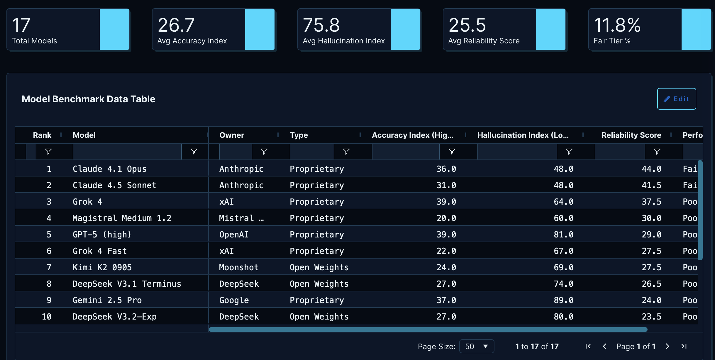
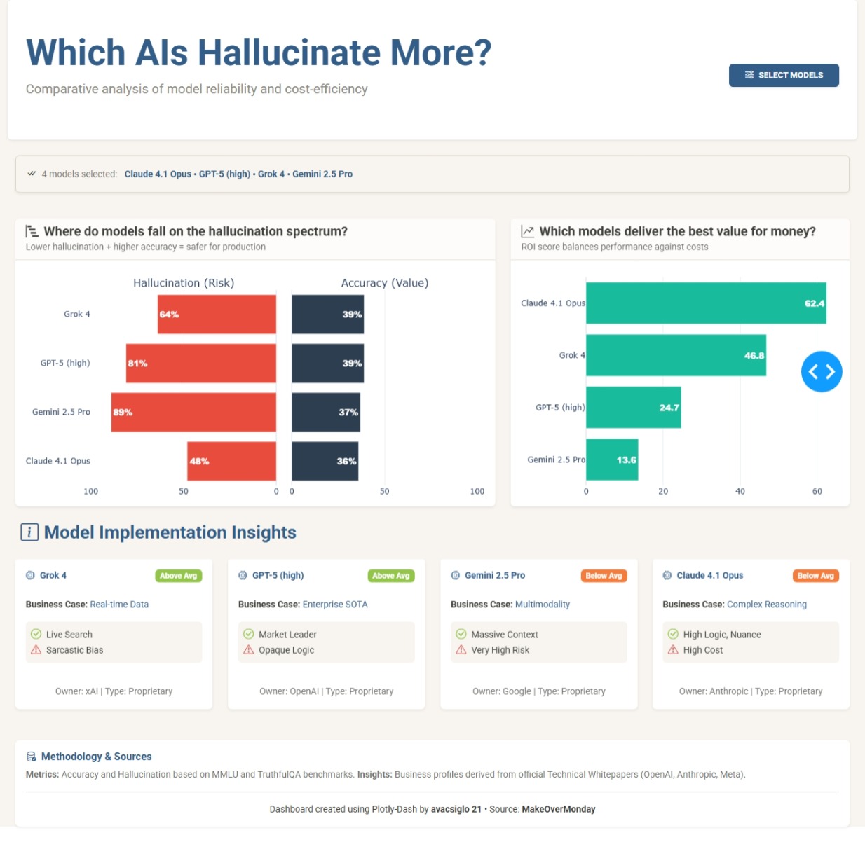
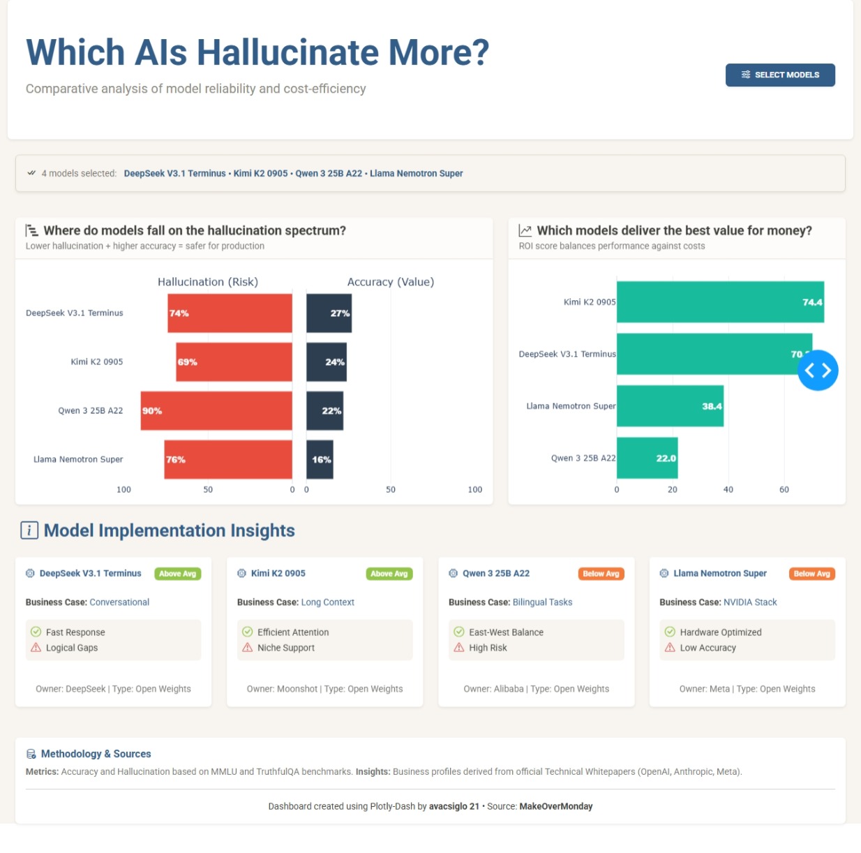
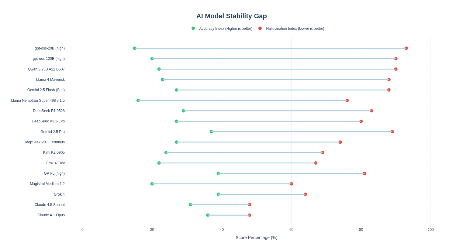
The application works as a comparative explorer that tests seventeen artificial intelligence models under the same lens. The central component is a butterfly chart that pits hallucination risk against accuracy value. By using this format instead of scattered dots, I sought a cleaner reading where the user can visually contrast whether a model’s reliability justifies its error rate.
To go a bit beyond pure statistics, I introduced an experimental return on investment metric. It is important to clarify that this is an arbitrary calculation designed for this exercise, where technical performance is penalized by a cost factor based on the model’s license type. The goal of this score is to open the conversation about efficiency: is it worth paying for a proprietary model if an open-weights model offers similar accuracy with a lower hallucination risk?
In the final section, the application presents descriptive cards that attempt to give a practical purpose to each model. Instead of saturating the view with more numbers, these cards offer a qualitative synthesis of which tasks each model might be best suited for and what limitations to expect according to the industry’s technical consensus. Rather than a definitive tool, it is a visual exercise to understand the trade-offs of risk and value in the current AI landscape.
I must confess that I did not know, until today, about the Hallucination Index (nor do I have any idea how they measure it); what is certain is that it is quite high, and this emphasizes the care and judgment we must sharpen for the use of this superpower called AI.
I want to take advantage of this last dashboard/application of the year (at least for me) to thank this excellent Figure Friday initiative, Adam, and everyone who (Figure Friday Friends as Mike named), through their participation with questions, dashboards, or charts, allows us to grow together.
I want to wish you a Merry Christmas and a better Year 2026, and may we continue growing with whatever new initiative comes next.
As usual any comments/questions/feedbacks more than welcome