Show&Tell: Interactively explain your ML models with explainerdashboard & shap

explainerdashboard

I’d like to share something I’ve been working on lately: a new library to
automatically generate interactive dash apps to explore the inner workings
of machine learning models, called explainerdashboard.

You can build and launch an interactive dashboard to explore the workings
of a fitted machine learning model with a single line of code:

ExplainerDashboard(ClassifierExplainer(RandomForestClassifier().fit(X_train, y_train), X_test, y_test)).run()

Adding a few more lines you can add some functionality and control e.g. over which
tabs are displayed in the dashboard, and on which port it is run:

from sklearn.ensemble import RandomForestClassifier

from explainerdashboard.explainers import *
from explainerdashboard.dashboards import *
from explainerdashboard.datasets import *

X_train, y_train, X_test, y_test = titanic_survive()
train_names, test_names = titanic_names()

model = RandomForestClassifier(n_estimators=50, max_depth=5)
model.fit(X_train, y_train)

explainer = RandomForestClassifierExplainer(model, X_test, y_test, 
                                cats=['Sex', 'Deck', 'Embarked'],
                                idxs=test_names, 
                                labels=['Not survived', 'Survived'])

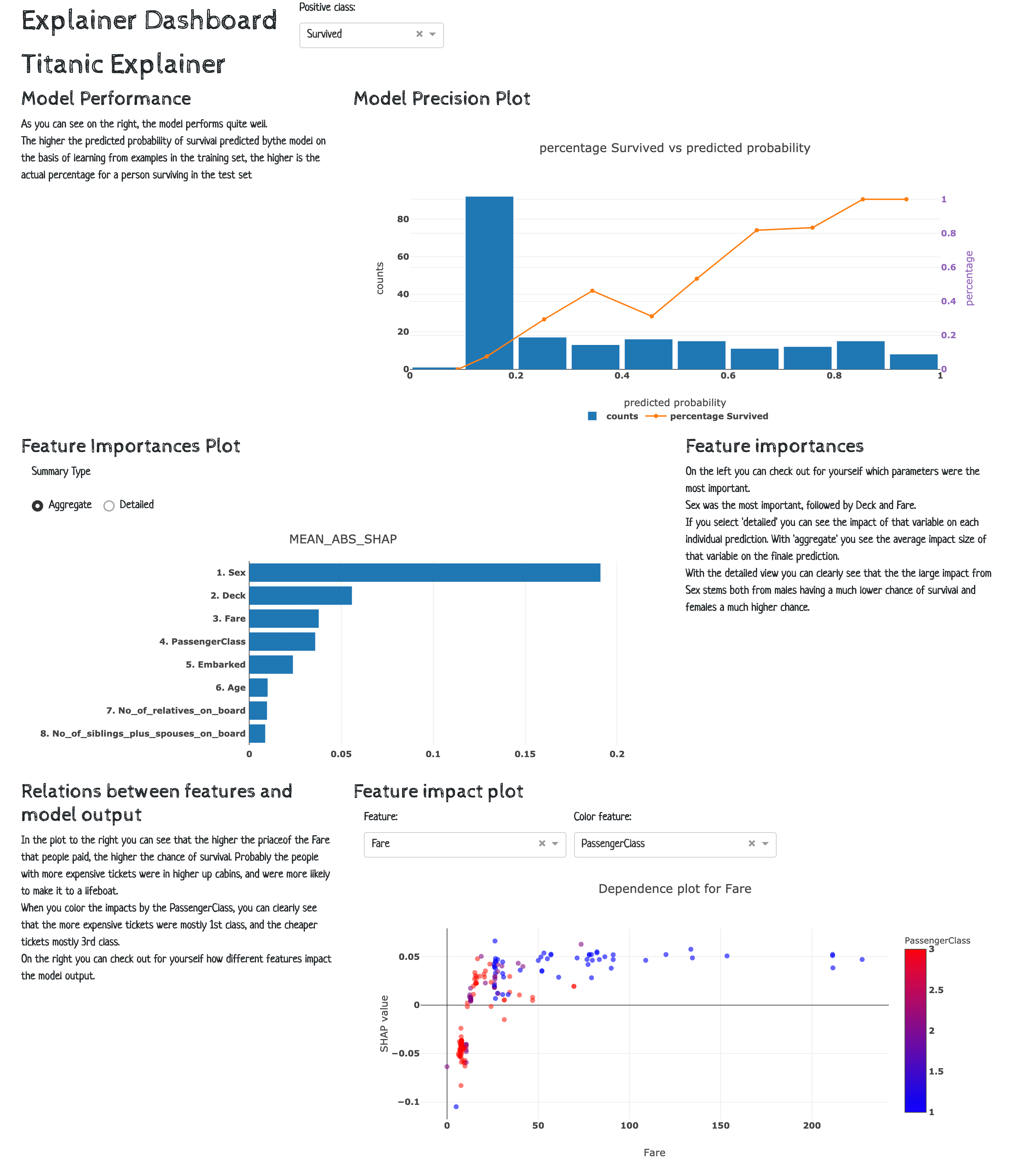
db = ExplainerDashboard(explainer, "Titanic Explainer",
                        model_summary=True,  
                        contributions=True,
                        shap_dependence=True,
                        shap_interaction=False, # switch off individual tabs
                        decision_trees=True)
db.run(port=8051)

The above example is deployed on heroku at titanicexplainer.herokuapp.com.

Installation

The githup repo can be found at https://github.com/oegedijk/explainerdashboard.

You can install the package through pip:

pip install explainerdashboard

Background

The idea behind the package is that with the awesome shap library, it is now
quite straightforward to explain the predictions of so-called “black box” machine
learning models, but it is still quite some interactive manual data science gruntwork
to actually explore the model. The shap library comes with its own plots, but
these are not plotly based so not so easy to build a dashboard out of them.

So I reimplemented all of the shap graphs in plotly, added some additional
functionality (pdp graphs, permutation importances, individual decision tree analysis,
classification and regression plots, etc), and wrapped them all in convenient
classes that handle all of the complexity behind the scenes.

The idea was to make the library as modular as possible so that it would be easy
to build your own dashboards on top of the primitives. But it also comes with
a built-in default dashboard.

So with this library it should be easy to:

  1. As a data scientist quickly explore your model to understand what it’s doing.
  2. Allow non-technical stakeholders to explore your model. Either to make sure
    there are no problematic features, or in order to understand what the model bases
    its decisions on, so they can know for example when to overrule the model.
  3. Explain individual predictions to people affected by your model, and answer
    “what if” questions.

Implementation

You first wrap your model in an Explainer object that (lazily) calculates
shap values, permutation importances, partial dependences, shadowtrees, etc.

You can use this Explainer object to interactively query for plots, e.g.:

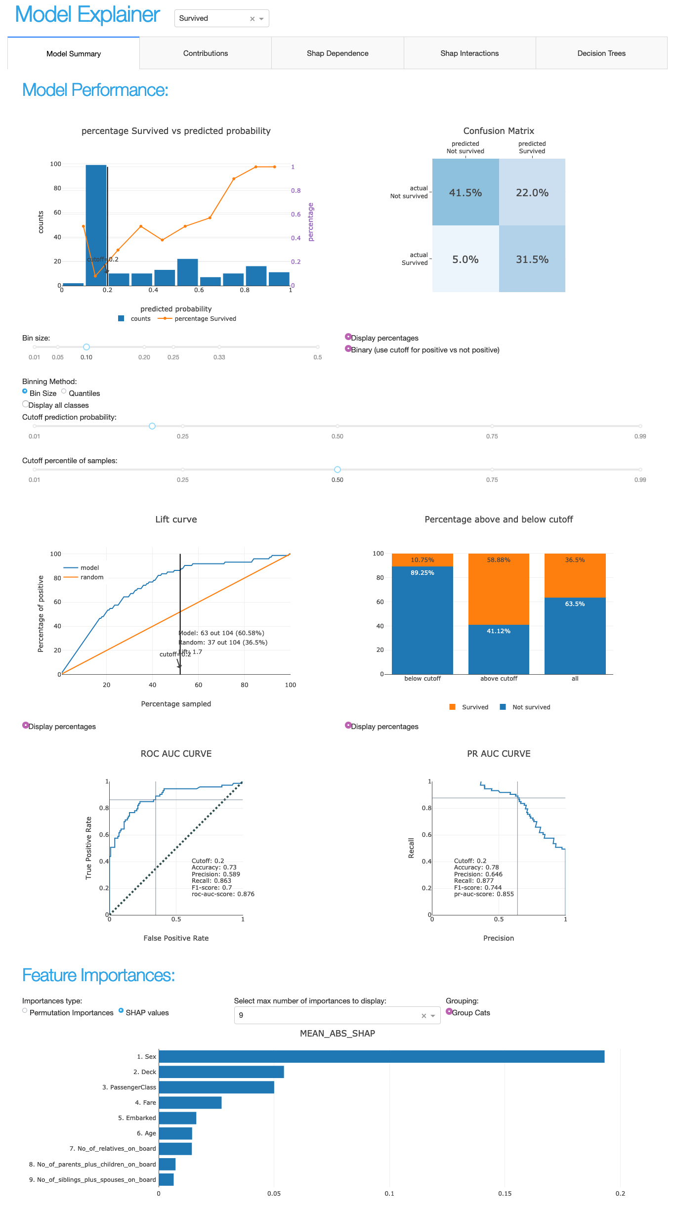
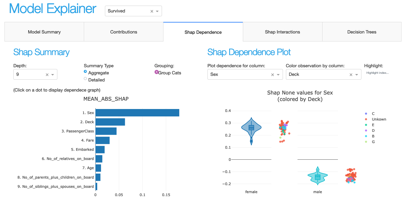
explainer = ClassifierExplainer(model, X_test, y_test)

explainer.plot_shap_dependence('Age')
explainer.plot_confusion_matrix(cutoff=0.6, normalized=True)
explainer.plot_importances(cats=True)
explainer.plot_pdp('PassengerClass', index=0)

You can then pass this explainer object to an ExplainerDashboard instance
to launch your dashboard. The callbacks in the dash app are quite straightforward
since basically all the logic is already encapsulated by the Explainer object.

db = ExplainerDashboard(explainer, 'Titanic Explainer`,
                        model_summary=True,
                        contributions=True,
                        shap_dependence=True,
                        shap_interaction=False,
                        shadow_trees=True)
db.run()

It should be pretty straightforward to build your own dashboard based on the
underlying Explainer object primitives, maybe including more elaboration about
the specific context and interpretation of your particular model.

Supported models

It should work with all models that come in a scikit-learn compatible wrapper
and that are supported by the shap library. I’ve tested it with sklearn models,
XGBoost, LightGBM and CatBoost. However test coverage is not perfect, so let me
know if you run into any problems with any specific model specification.

(e.g.: right now, there are some issues with shap version 0.36 and support for
sklearn RandomForests that stochastically fail on some platforms and XGBoost
version 1.0 and 1.1. Hopefully to be fixed in the next release)

Working within Jupyter

When working inside jupyter you can use JupyterExplainerDashboard() instead
of ExplainerDashboard to use JupyterDash instead of dash.Dash() as a backend
for the app. (this allows you to keep the rest of the notebook interactive while
the app is running, either inline in the cell output or external in a seperate tab)

To simply view a single tab inline in your notebook your can use InlineExplainer:

InlineExplainer(explainer).shap_dependence()

Documentation

An example is deployed at: titanicexplainer.herokuapp.com. (source code on github here)

Documentation can be found at explainerdashboard.readthedocs.io.

Example notebook on how to launch dashboards for different model types here: dashboard_examples.ipynb.

Example notebook on how to interact with the explainer object here: explainer_examples.ipynb.

Ways to contribute

Would love it some of you could try it out and give your feedback. Are there
any issues with particular models/parameterizations that need different default
settings? Weird crashes or failures? Any additional plots or analyses you’d like to see?

Also, I’m not really a trained frontend developer, so if anybody wants to help with
designing a more responsive layout or cooler graphs, let me know!

Also, if anybody is up for building a React.js based decision tree explorer,
that would be really nice to have!

20 Likes

This is so great! The shap library is really cool, glad to see a reusable Dash framework come out of it! I hope that the community makes some contributions to your project.

Just sharing a few screenshots of your app for those just passing through :slightly_smiling_face:


4 Likes

I really appreciate that you made this it’s own standalone package! This is such a great approach for the community: instead of individual sample sample code demonstrating how to integrate Dash with shap (or other packages), reusable packages that generate Dash apps.

1 Like

@chriddyp Thanks for sharing the screenshots! Should have probably posted those myself :slight_smile:

Also have a question: would the design pattern that I use to generate the dash app run into any performance or scaling issues?

So what I do is have one class that holds the data and has plotting methods and another class that outputs a dash layout and a register_callbacks method. So what I do is something like this:

class PlotMaker:
  def __init__(self, data):
    self.data = data

 def plot(self):
   return data_plot(self.data)

class Dashboard:
  def __init__(self, plotmaker):
    self.plotmaker = plotmaker

  def layout(self):
    return dbc.Container([dcc.Graph(...)])
  
  def register_callbacks(self, app):
    @app.callback(...)
    def update_plot(...):
      return self.plotmaker.plot()

data = pd.read_csv("data.csv")
plotmaker = PlotMaker(data)
db = DashBoard(plotmaker)

app = dash.Dash(__name__)
app.layout = db.layout()
db.register_callbacks(app)

app.run_server()

One of the things to look out for is to make sure that PlotMaker objects are not stateful, as you then run into issues with multiple workers (and whole point of dash is that it’s not stateful).

Any other reason not to use this design pattern?

That looks pretty reasonable @oegedijk. You’re wise to look out for stateful / mutable objects in the PlotMaker. We don’t really have an official recommended way to encapsulate layout + callbacks into a reusable object yet but that might change in the coming year. For now, at first glance that approach looks right :+1:

Just released version 0.2 of the library, with a major refactor behind the scenes that divides the layout into re-usable ExplainerComponents. This now makes it much easier to make your own custom pages, by instantiating such a component and then including it in your page layout.

The example below shows such a layout with three rows of two columns with a PrecisionComponent, a ShapSummaryComponent and a ShapDependenceComponent.

If you derive your dashboard class from ExplainerComponent, then all you need to do is define the layout under the _layout(self) method, and include the .layout() of your components. And then register the components.

You can then run it with ExplainerDashboard(explainer, CustomDashboard).

This example is deployed at http://titanicexplainer.herokuapp.com/custom/

(the default dashboard is at http://titanicexplainer.herokuapp.com/default/)

More info on custom dashboard at https://explainerdashboard.readthedocs.io/en/latest/custom.html

class CustomDashboard(ExplainerComponent):
    def __init__(self, explainer, title="Titanic Explainer",
                        header_mode="hidden", name=None):
        super().__init__(explainer, title, header_mode, name)
        self.precision = PrecisionComponent(explainer, 
                                hide_cutoff=True, hide_binsize=True, 
                                hide_binmethod=True, hide_multiclass=True,
                                cutoff=None)
        self.shap_summary = ShapSummaryComponent(explainer, 
                                hide_title=True,
                                hide_depth=True, depth=8, 
                                hide_cats=True, cats=True)
        self.shap_dependence = ShapDependenceComponent(explainer, 
                                hide_title=True,
                                hide_cats=True, cats=True, 
                                hide_highlight=True,
                                col='Fare', color_col="PassengerClass")
        self.connector = ShapSummaryDependenceConnector(self.shap_summary, self.shap_dependence)
        
        self.register_components(self.precision, self.shap_summary, self.shap_dependence, self.connector)
        
    def _layout(self):
        return dbc.Container([
            html.H1("Titanic Explainer"),
            dbc.Row([
                dbc.Col([
                    html.H3("Model Performance"),
                    html.Div("As you can see on the right, the model performs quite well."),
                    html.Div("The higher the predicted probability of survival predicted by"
                             "the model on the basis of learning from examples in the training set"
                             ", the higher is the actual percentage for a person surviving in "
                             "the test set"),
                ], width=4),
                dbc.Col([
                    html.H3("Model Precision Plot"),
                    self.precision.layout()
                ])
            ]),
            dbc.Row([
                dbc.Col([
                    html.H3("Feature Importances Plot"),
                    self.shap_summary.layout()
                ]),
                dbc.Col([
                    html.H3("Feature importances"),
                    html.Div("On the left you can check out for yourself which parameters were the most important."),
                    html.Div(f"{self.explainer.columns_ranked_by_shap(cats=True)[0]} was the most important"
                             f", followed by {self.explainer.columns_ranked_by_shap(cats=True)[1]}"
                             f" and {self.explainer.columns_ranked_by_shap(cats=True)[2]}."),
                    html.Div("If you select 'detailed' you can see the impact of that variable on "
                             "each individual prediction. With 'aggregate' you see the average impact size "
                             "of that variable on the finale prediction."),
                    html.Div("With the detailed view you can clearly see that the the large impact from Sex "
                            "stems both from males having a much lower chance of survival and females a much "
                            "higher chance.")
                ], width=4)
            ]),
            dbc.Row([
                dbc.Col([
                    html.H3("Relations between features and model output"),
                    html.Div("In the plot to the right you can see that the higher the priace"
                             "of the Fare that people paid, the higher the chance of survival. "
                            "Probably the people with more expensive tickets were in higher up cabins, "
                            "and were more likely to make it to a lifeboat."),
                    html.Div("When you color the impacts by the PassengerClass, you can clearly see that "
                             "the more expensive tickets were mostly 1st class, and the cheaper tickets "
                             "mostly 3rd class."),
                    html.Div("On the right you can check out for yourself how different features impact "
                            "the model output."),
                ], width=4),
                dbc.Col([
                    html.H3("Feature impact plot"),
                    self.shap_dependence.layout()
                ]),
            ])
        ], fluid=True)

3 Likes

Looks great, really excited to see what the Dash community will do with the new reusable components!

Thank you very much! Very insightful
However, I am wondering whether we can use this with multiple regressors at the same time. I want to discply the results of different models at the same time.
Thanks a lot

Yes, in principle that is possible, although you will have to do some customisation to do it. The trick is to instantiate a custom tab before passing it to the ExplainerDashboard. Otherwise it will try to instantiate the component/tab with the particular explainer passed to the dashboard.

See Customizing your dashboard — explainerdashboard 0.2 documentation for more info about customizing layouts.

from explainerdashboard import *
from explainerdashboard.datasets import *
from explainerdashboard.custom import *

from sklearn.ensemble import RandomForestClassifier
from xgboost import XGBClassifier

X_train, y_train, X_test, y_test = titanic_survive()
model1 = RandomForestClassifier(n_estimators=50, max_depth=4).fit(X_train, y_train)
model2 = XGBClassifier(n_estimators=10, max_depth=5).fit(X_train, y_train)
explainer1 = ClassifierExplainer(model1, X_test, y_test)
explainer2 = ClassifierExplainer(model2, X_test, y_test)


class ConfusionComparison(ExplainerComponent):
    def __init__(self, explainer1, explainer2):
        super().__init__(explainer1)
        
        self.confmat1 = ConfusionMatrixComponent(explainer1)
        self.confmat2 = ConfusionMatrixComponent(explainer2)
        
    def layout(self):
        return dbc.Container([
            dbc.Row([
                dbc.Col([
                    self.confmat1.layout()   
                ]),
                dbc.Col([
                    self.confmat2.layout()   
                ])
            ])
        ])
    
tab = ConfusionComparison(explainer1, explainer2)

ExplainerDashboard(explainer1, tab).run(port=8051)

This is cool oegedijik. I have a quick question, how can I customize a component of this dashboard without run it on its own port. I am trying to create a separate frontend to one or two of the tabs but I do not want to use the primary ExplainerDashboard. I read the document and I understand that I can get an importance plot by using explainer.plot_importances() command but how can a obtain the tab that includes importance, index slider among others without using the app.run(). I must commend you for this great work.

Hi @tayo,

In general if you have defined any ExplainerComponent, you can get the layout with e.g. component.layout() and register the callbacks with component.register_callbacks(app), so should be easy to integrate into any dash app!

love it … wanna use the trees!