Figure Friday 2025 - week 42

join the Figure Friday session on October 24, at noon Eastern Time, to showcase your creation and receive feedback from the community.

Where is food waste the most problematic?

Answer this question and a few others by using Plotly on the Food waste dataset.

Things to consider:

  • what can you improve in the app or sample figure below (pie chart)?
  • would you like to tell a different data story using a Dash app?
  • how can you explore the data with Plotly Studio?

Sample figure (built on top of the dataset sheet named Most wasted food type - global):
:pray: Thank you to @Ester for the code and sample figure

Code for sample figure:
import pandas as pd
import plotly.express as px
from dash import Dash, dcc, html

# Download data from: https://docs.google.com/spreadsheets/d/1RXk6tihEq9sS7LozSvc7Cp6HlxM45S0hehV4-q4c_kk/edit?usp=sharing
# This graph was built on top of the dataset sheet named "Most wasted food type - global"

# Load the data, skipping the first 3 rows. Only read the next 7.
df = pd.read_csv('food.csv', skiprows=3, nrows=7)

# Keep only the first 2 columns
df = df.iloc[:, :2]

# Rename columns for clarity
df.columns = ['Food Category', 'Percentage']

# Clean the 'Percentage' column by removing '%' signs and converting to float
df['Percentage'] = df['Percentage'].str.rstrip('%').astype(float)

# Remove the 'TOTAL' row, if present
df = df[df['Food Category'] != 'TOTAL']

# Create a donut pie chart using Plotly Express
fig = px.pie(
    df,
    values='Percentage',
    names='Food Category',
    title='Most Wasted Food by Type',
    hole=0.5,
    template='plotly_white',
    color_discrete_sequence=px.colors.sequential.RdBu,
    height=600
)

# Customize pie chart; pull out all slices slightly for emphasis
fig.update_traces(
    textinfo='percent+label',
    pull=[0.07] * len(df)  # Pull out each slice a bit
)

# Further layout customization: center the title, set font, remove legend
fig.update_layout(
    title_x=0.5,
    font=dict(
        family="Courier New, monospace",
        size=12,
        color="RebeccaPurple",
    ),
    showlegend=False
)

# Initialize Dash app and define the layout
app = Dash(__name__)
app.layout = html.Div(children=[
    # Dashboard main title
    html.H1('Food Wastage Dashboard', style={'textAlign': 'center'}),
    # Subtitle/description
    html.Div(
        children='A visualization of the most wasted food categories worldwide.',
        style={'textAlign': 'center', 'marginBottom': '20px'}
    ),
    # Insert the donut chart into the app
    dcc.Graph(
        id='food-wastage-donut',
        figure=fig
    )
])

# Run the app in debug mode
if __name__ == '__main__':
    app.run(debug=True)

Below is a screenshot of the app that Plotly Studio created on top of this dataset:

Prompt for the bar chart:

Food waste breakdown by source as a stacked bar chart with multi-dropdown to filter countries and toggle between per capita and total tonnage views.

Participation Instructions:

  • Create - use the weekly data set to build your own Plotly visualization or Dash app. Or, enhance the sample figure provided in this post, using Plotly or Dash.
  • Submit - post your creation to LinkedIn or Twitter with the hashtags #FigureFriday and #plotly by midnight Thursday, your time zone. Please also submit your visualization as a new post in this thread.
  • Celebrate - join the Figure Friday sessions to showcase your creation and receive feedback from the community.

:point_right: If you prefer to collaborate with others on Discord, join the Plotly Discord channel.

Data Source:

Thank you to Information Is Beautiful for the data.

3 Likes

Hello to the Figure Friday community,

To answer this week’s question (Week 42), “Where is food waste the most problematic?”,
I created an interactive Dash application which I’ve called “The Waste Triangle”.

I named it this way because the central figure is a Ternary Plot, which is perfect for immediately visualizing the breakdown of food waste in each country among the three main focus areas: Household, Retail, and Food Service.

How does it help answer the question?

Focusing the Problem (Clustering): The app groups countries into four key waste pattern clusters that I previously identified (e.g., ‘Household Crisis’, ‘Multi-Sector Challenge’, ‘Household + Retail Leakage’, ‘Household + Food Service’).
By selecting a pattern, you can see how the problem is concentrated.

Quick Identification with the Ternary Plot: The Ternary Plot allows you to see the distribution of the problem and, crucially, the size of the markers indicates the amount of waste per capita, identifying the countries where the problem is most acute.

Strategic Deep Dive: By clicking on a country, you get a detailed view of its waste metrics compared to its cluster average.
Additionally, a specific Strategy section is provided for that pattern, which is essential for determining where the most problematic and urgent intervention is required.

In short, the application allows you to identify not only the countries with the highest per capita waste (showing where the problem is), but also the nature of that problem (Household, Retail, or Food Service) for a strategic approach.

By the way, this is my first time using the Ternary Plot, and for some, it may be a little challenging to understand how the scales/coordinates work. But, on the other hand, thanks to the amazing Plotly charts capability, you can use the zooming tool, which in this case maintains a really cool triangle form.

App link:

some images


As usual, any question more than welcome,
T

5 Likes

Here I´m sharing in case you are interested or curios about the code where I create the clusters for this app. This codes includes the elbow method and the silhoutte score.

Clusters Code

import pandas as pd
from sklearn.cluster import KMeans
from sklearn.metrics import silhouette_score # Importación para Silueta
import numpy as np
import matplotlib.pyplot as plt
import warnings
import os # Importación para manejar archivos

Suprimir advertencias de KMeans para evitar ruido en la salida

warnings.filterwarnings(“ignore”, category=FutureWarning)
warnings.filterwarnings(“ignore”, category=UserWarning)

— 1. Carga y Limpieza Inicial —

file_name = “food waste by country.csv”

Cargar el DataFrame, usando la tercera fila (índice 2) como encabezado

df = pd.read_csv(file_name, header=2)

Eliminar filas de metadatos/resumen (‘AVERAGE’ y la fila de porcentajes vacía)

df = df.iloc[2:].copy()

Eliminar columnas irrelevantes o duplicadas para el análisis de patrón

df = df.drop(columns=[‘M49 code’, ‘Source’, ‘combined figures (kg/capita/year)’])

Renombrar columnas clave para facilitar el acceso

df = df.rename(columns={
‘Country’: ‘Country’,
‘Household estimate (kg/capita/year)’: ‘HH_kg_capita’,
‘Household estimate (tonnes/year)’: ‘HH_tonnes_year’,
‘Retail estimate (kg/capita/year)’: ‘Retail_kg_capita’,
‘Retail estimate (tonnes/year)’: ‘Retail_tonnes_year’,
‘Food service estimate (kg/capita/year)’: ‘FS_kg_capita’,
‘Food service estimate (tonnes/year)’: ‘FS_tonnes_year’,
‘Confidence in estimate’: ‘Confidence’,
‘Region’: ‘Region’
})

— 2. Conversión de Datos a Numérico —

Columnas de toneladas necesitan limpieza: eliminar comas y convertir a float

tonnes_cols = [‘HH_tonnes_year’, ‘Retail_tonnes_year’, ‘FS_tonnes_year’]

for col in tonnes_cols:
# Eliminar comillas y comas, y luego convertir a numérico. Usar ‘coerce’ para NaN si hay problemas.
df[col] = df[col].astype(str).str.replace(‘"’, ‘’, regex=False).str.replace(‘,’, ‘’, regex=False)
df[col] = pd.to_numeric(df[col], errors=‘coerce’)

Columnas de kg/capita ya deberían ser numéricas (float)

kg_capita_cols = [‘HH_kg_capita’, ‘Retail_kg_capita’, ‘FS_kg_capita’]
for col in kg_capita_cols:
df[col] = pd.to_numeric(df[col], errors=‘coerce’)

Eliminar filas donde los datos clave de desperdicio total son NaN

df.dropna(subset=kg_capita_cols + tonnes_cols, how=‘all’, inplace=True)

Llenar NaN en las estimaciones individuales con 0 si faltan

df[kg_capita_cols] = df[kg_capita_cols].fillna(0)
df[tonnes_cols] = df[tonnes_cols].fillna(0)

— 3. Cálculo de Variables Clave para el Análisis —

Calcular Desperdicio Total (kg/capita y toneladas/año)

df[‘Total_Waste_kg_capita’] = df[‘HH_kg_capita’] + df[‘Retail_kg_capita’] + df[‘FS_kg_capita’]
df[‘Total_Waste_tonnes’] = df[‘HH_tonnes_year’] + df[‘Retail_tonnes_year’] + df[‘FS_tonnes_year’]

Calcular Población (derivada de Total_Waste_tonnes / Total_Waste_kg_capita * 1000)

Multiplicamos por 1000 porque las toneladas son 1000 kg

df[‘Population_Estimate’] = np.where(
df[‘Total_Waste_kg_capita’] > 0,
(df[‘Total_Waste_tonnes’] * 1000 * 1000) / df[‘Total_Waste_kg_capita’], # Tonnes/year * 1,000,000 (kg/ton) / kg/capita/year
0
)

Convertir a millones de personas para una mejor visualización

df[‘Population_Millions’] = df[‘Population_Estimate’] / 1_000_000

Calcular Proporciones para el Ternary Plot (deben sumar 100%)

Usamos un pequeño epsilon (np.finfo(float).eps) para evitar división por cero

epsilon = np.finfo(float).eps
df[‘HH_share’] = (df[‘HH_kg_capita’] / (df[‘Total_Waste_kg_capita’] + epsilon)) * 100
df[‘Retail_share’] = (df[‘Retail_kg_capita’] / (df[‘Total_Waste_kg_capita’] + epsilon)) * 100
df[‘FS_share’] = (df[‘FS_kg_capita’] / (df[‘Total_Waste_kg_capita’] + epsilon)) * 100

Asegurar que las acciones no tengan un total de desperdicio cero

df = df[df[‘Total_Waste_kg_capita’] > 0].copy()

— 4. Determinación del Número Óptimo de Clusters (Métodos del Codo y Silueta) —

Preparamos los datos de entrada para el clustering (las 3 proporciones)

X = df[[‘HH_share’, ‘Retail_share’, ‘FS_share’]].values

wcss =
silhouette_scores = {}
k_values = range(1, 11)

print(“\nCalculando métricas para determinar el número óptimo de clusters (K)…”)
for i in k_values:
kmeans_model = KMeans(n_clusters=i, random_state=42, n_init=10)
kmeans_model.fit(X)
wcss.append(kmeans_model.inertia_)

# Calcular Silueta solo si K > 1
if i > 1:
    score = silhouette_score(X, kmeans_model.labels_)
    silhouette_scores[i] = score

Imprimir el gráfico del Codo para visualización

print(“\n— Gráfico del Codo (WCSS vs. K) —”)
print(“El valor ‘óptimo’ de K se encuentra donde la pendiente del gráfico se ‘dobla’ (el codo).”)

plt.figure(figsize=(10, 6))
plt.plot(k_values, wcss, marker=‘o’, linestyle=‘–’, color=‘blue’)
plt.title(‘Método del Codo para el Clustering de Proporciones de Desperdicio’)
plt.xlabel(‘Número de Clusters (K)’)
plt.ylabel(‘WCSS (Suma de Cuadrados Dentro del Cluster)’)
plt.xticks(k_values)
plt.grid(True)
plt.show() # Mostrar el gráfico generado por Matplotlib

Imprimir Coeficientes de Silueta

print(“\n— Coeficiente de Silueta por K —”)
print(“El valor más cercano a 1 indica la mejor separación y cohesión del clustering.”)
for k, score in silhouette_scores.items():
print(f"K={k}: {score:.4f}")

— 5. Aplicación del Clustering (usando k=4) —

Usamos k=4 clusters (basado en el análisis de codo y silueta)

n_clusters = 4
kmeans = KMeans(n_clusters=n_clusters, random_state=42, n_init=10)
df[‘Cluster’] = kmeans.fit_predict(X)

Asignar nombres descriptivos a los clusters basados en sus centroides

cluster_centers = kmeans.cluster_centers_

Crear una lista de tuplas (cluster_id, centroide_HH_share)

sorted_clusters = sorted(enumerate(cluster_centers), key=lambda x: x[1][0], reverse=True) # Ordenar por mayor HH_share

NOMBRES DE CLUSTERS EN INGLÉS

cluster_map = {
sorted_clusters[0][0]: ‘1 - Household Crisis’, # Mayor HH_share
sorted_clusters[1][0]: ‘2 - Multi-Sector Challenge’,
sorted_clusters[2][0]: ‘3 - Household + Retail Leakage’,
sorted_clusters[3][0]: ‘4 - Household + Food Service’
}
df[‘Cluster_Name’] = df[‘Cluster’].map(cluster_map)

Imprimir un resumen de los clusters para la verificación

print(“\nResumen de Centros de Cluster (Proporción %):”)
cluster_summary = df.groupby(‘Cluster_Name’)[[‘HH_share’, ‘Retail_share’, ‘FS_share’]].mean().reset_index()
print(cluster_summary.to_markdown(index=False, floatfmt=“.1f”))

— 6. Exportar el DataFrame limpio y clusterizado a un nuevo archivo CSV —

output_file = ‘clustered_food_waste.csv’
df.to_csv(output_file, index=False)

print(f"\nDataFrame limpio y clusterizado EXPORTADO a ‘{output_file}’.")
print(“Listo para construir la aplicación Dash usando este nuevo archivo CSV.”)This text will be hidden

1 Like

If I may, I found this interesting infographic on the Information Is Beautiful page. I thought it was worth sharing here in case you missed it. There are great charts there.

4 Likes

Great job using the Ternary plot, @Avacsiglo21 . Thank you for creating and sharing it.

I like how you add comparisons to cluster avg and you change the color based on how far the percentage is from the average (nice detail)

I wonder why Malaysia is such an exception when it comes to retail waste.

I was thinking that it might be helpful to add a see all button next to the reset selection button, unless you wanted to avoid showing a graph with all the points.

How exactly were these clustered? Was it mainly based on Food Service Waste or an average of all waste?

2 Likes

First of all, thank you, Adam, for your excellent questions.

Let me start by explaining the clustering methodology:

The clusters were created using all three waste sources (Household, Retail, and Food Service) simultaneously, meaning countries were grouped based on their overall waste distribution pattern across all three dimensions, not just one sector.

The cluster profiles are:

  • Cluster 1 (Household Crisis): High Household (HH) share, low Retail and Food Service (FS) shares.
  • Cluster 2 (Multi-Sector Challenge): Relatively balanced across all three sectors.
  • Cluster 3 (Househol +Retail Leakage):High HH share + High Retail share, low FS share.
  • Cluster 4 (Househol + Food service): High HH share + High FS share, low Retail share.

The case of Malaysia is interesting because its waste profile is relatively “balanced”, yet the country was assigned to Cluster 4 The centroid of Cluster 4 has a significantly high Food Service (FS) component, which is the factor that strongly ‘pulls’ Malaysia into this group, as it aligns with the relative importance of the food service sector in its overall waste pattern. The clustering analysis could be improved by incorporating a socioeconomic metric like GDP per Capita or the Human Development Index (HDI) to differentiate waste patterns based on a country’s level of development.

Regarding the ‘See All’ button, I initially intended to show only the points for the selected cluster. However, if you suggest its inclusion, I agree it must be helpful to give the user a complete overall picture.

Hopefully I clarify all your doubts

2 Likes

Hi Figure Friday Community!

Short Technical Summary:

  • The script builds an interactive Dash dashboard to visualize global food waste data.
  • It loads, cleans, and formats the CSV dataset for analysis.
  • The layout uses Bootstrap styling and custom CSS enhancements.
  • The interface includes a header, KPI cards, and interactive filters (country, confidence level, display mode, and map settings).
  • Three main visualizations are: a funnel/bar chart, a pie chart, and a world map.
  • A Reset button restores all filters to their default state.
  • Chart updates are handled dynamically through Dash callbacks.

Code
import pandas as pd
import plotly.express as px
import plotly.graph_objects as go
from dash import Dash, dcc, html, Input, Output, callback, State
import dash_bootstrap_components as dbc

# Load the food waste by country data
# The header is on row 3 (0-indexed), so we skip the first 3 rows and use row 3 as header
df_country = pd.read_csv('food waste by country.csv', skiprows=3, header=0)

# The first column is actually 'AVERAGE' but contains country names
# Let's rename the columns properly
df_country.columns = ['Country', 'combined_figures', 'household_estimate', 'household_tonnes', 
                      'retail_estimate', 'retail_tonnes', 'food_service_estimate', 'food_service_tonnes',
                      'confidence', 'm49_code', 'region', 'source']

# Clean the data
df_country = df_country.dropna(subset=['Country'])
df_country = df_country[df_country['Country'] != 'AVERAGE']
df_country = df_country[df_country['Country'].notna()]

# Convert numeric columns to proper format
numeric_columns = ['combined_figures', 'household_estimate', 'retail_estimate', 'food_service_estimate']
for col in numeric_columns:
    df_country[col] = pd.to_numeric(df_country[col], errors='coerce')

# Initialize Dash app with Bootstrap theme
app = Dash(__name__, external_stylesheets=[dbc.themes.BOOTSTRAP])

# Custom CSS for table styling
app.index_string = '''
<!DOCTYPE html>
<html>
    <head>
        {%metas%}
        <title>{%title%}</title>
        {%favicon%}
        {%css%}
        <style>
            /* Custom table styling */
            .table-striped > tbody > tr:nth-of-type(odd) > td {
                background-color: #e3f2fd;
                color: #000000;
            }
            .table-striped > tbody > tr:nth-of-type(even) > td {
                background-color: #bbdefb;
                color: #000000;
            }
            .table-hover > tbody > tr:hover > td {
                background-color: #90caf9 !important;
            }
            .table thead th {
                background-color: #1976d2 !important;
                color: #ffffff !important;
                font-weight: bold;
            }
        </style>
    </head>
    <body>
        {%app_entry%}
        <footer>
            {%config%}
            {%scripts%}
            {%renderer%}
        </footer>
    </body>
</html>
'''

# Create the dashboard layout
app.layout = dbc.Container([
    # Header with infographic style
    dbc.Row([
        dbc.Col([
            html.Div([
                html.H1("GLOBAL FOOD WASTE CRISIS",
                       style={'color': '#ffffff', 'fontWeight': 'bold', 'fontSize': '3rem',
                              'textAlign': 'center', 'marginBottom': '10px', 'textShadow': '2px 2px 4px rgba(0,0,0,0.3)'}),
                html.H2("DATA VISUALIZATION DASHBOARD",
                       style={'color': '#ffffff', 'fontWeight': '300', 'fontSize': '1.5rem',
                              'textAlign': 'center', 'marginBottom': '20px'}),
                html.Div([
                    html.P("200+ COUNTRIES ANALYZED",
                           style={'display': 'inline-block', 'margin': '10px 20px', 'fontSize': '1.2rem',
                                  'fontWeight': 'bold', 'color': '#ffffff'}),
                    html.P("REAL-TIME DATA",
                           style={'display': 'inline-block', 'margin': '10px 20px', 'fontSize': '1.2rem',
                                  'fontWeight': 'bold', 'color': '#ffffff'}),
                    html.P("INTERACTIVE FILTERS",
                           style={'display': 'inline-block', 'margin': '10px 20px', 'fontSize': '1.2rem',
                                  'fontWeight': 'bold', 'color': '#ffffff'})
                ], style={'textAlign': 'center', 'marginBottom': '30px'})
            ], style={'background': 'linear-gradient(135deg, #0c4a6e 0%, #3b82f6 50%, #fb923c 100%)',
                      'padding': '40px', 'borderRadius': '15px', 'marginBottom': '30px',
                      'boxShadow': '0 10px 30px rgba(0,0,0,0.2)'})
        ])
    ]),
    
    # Summary cards
    dbc.Row([
        dbc.Col([
            dbc.Card([
                dbc.CardBody([
                    html.H4("🌎 Countries", className="card-title"),
                    html.H2(f"{len(df_country)}", className="text-primary"),
                    html.P("Total countries analyzed", className="card-text")
                ])
            ], className="text-center", style={'border': '2px solid white', 'boxShadow': '0 4px 8px rgba(0,0,0,0.1)'})
        ], width=3),
        dbc.Col([
            dbc.Card([
                dbc.CardBody([
                    html.H4("📊 Avg Waste", className="card-title"),
                    html.H2(f"{df_country['combined_figures'].mean():.0f} kg", className="text-warning"),
                    html.P("Per capita per year", className="card-text")
                ])
            ], className="text-center", style={'border': '2px solid white', 'boxShadow': '0 4px 8px rgba(0,0,0,0.1)'})
        ], width=3),
        dbc.Col([
            dbc.Card([
                dbc.CardBody([
                    html.H4("🏠 Household", className="card-title"),
                    html.H2(f"{df_country['household_estimate'].mean():.0f} kg", className="text-primary"),
                    html.P("Household waste per capita", className="card-text")
                ])
            ], className="text-center", style={'border': '2px solid white', 'boxShadow': '0 4px 8px rgba(0,0,0,0.1)'})
        ], width=3),
        dbc.Col([
            dbc.Card([
                dbc.CardBody([
                    html.H4("🏪 Retail", className="card-title"),
                    html.H2(f"{df_country['retail_estimate'].mean():.0f} kg", className="text-info"),
                    html.P("Retail waste per capita", className="card-text")
                ])
            ], className="text-center", style={'border': '2px solid white', 'boxShadow': '0 4px 8px rgba(0,0,0,0.1)'})
        ], width=3)
    ], className="mb-4"),
    
    # Interactive filters at the top
    dbc.Row([
        dbc.Col([
            html.Div([
                dbc.Row([
                    dbc.Col([
                        html.Label("Select Confidence Level:", style={'fontWeight': 'bold', 'color': '#000000'}),
                        dcc.Dropdown(id='confidence-filter',
                                     options=[{'label': conf, 'value': conf} for conf in df_country['confidence'].unique()],
                                     value=[], placeholder="All Confidence Levels", clearable=True, style={'boxShadow': 'none'}, multi=True),
                        html.Br(),
                        html.Label("Select Country:", style={'fontWeight': 'bold', 'color': '#000000'}),
                        dcc.Dropdown(id='country-filter',
                                     options=[{'label': country, 'value': country} for country in sorted(df_country['Country'].unique())],
                                     value=[], placeholder="Select Countries", clearable=True, style={'boxShadow': 'none'}, multi=True),
                        html.Br(),
                        html.Label("Display Options:", style={'fontWeight': 'bold', 'color': '#000000'}),
                        dcc.Checklist(id='country-display-filter',
                                      options=[{'label': 'All Countries', 'value': 'all'},
                                               {'label': 'Top 10', 'value': 'top10'},
                                               {'label': 'Bottom 10', 'value': 'bottom10'}],
                                      value=['top10'], 
                                      labelStyle={'display': 'inline-block', 'marginRight': '15px'}),
                        html.Br(),
                        html.Label("Select Map Projection:", style={'fontWeight': 'bold', 'color': '#000000', 'marginTop': '10px'}),
                        dcc.Dropdown(id='map-projection-filter',
                                     options=[
                                         {'label': 'Equirectangular', 'value': 'equirectangular'},
                                         {'label': 'Mercator', 'value': 'mercator'},
                                         {'label': 'Orthographic', 'value': 'orthographic'},
                                         {'label': 'Natural Earth', 'value': 'natural earth'},
                                     ], value='equirectangular', clearable=False),
                        html.Br(),
                        html.Label("Select Map Color Scale:", style={'fontWeight': 'bold', 'color': '#000000'}),
                        dcc.Dropdown(id='map-color-filter',
                                     options=[{'label': color, 'value': color} for color in ['Oranges', 'Blues', 'Reds', 'Greens', 'Viridis']],
                                     value='Oranges', clearable=False),
                        html.Br(),
                        dbc.Button("Reset Filters", id="reset-button", color="secondary", className="w-100 mt-4")
                    ], width=5),
                    dbc.Col([
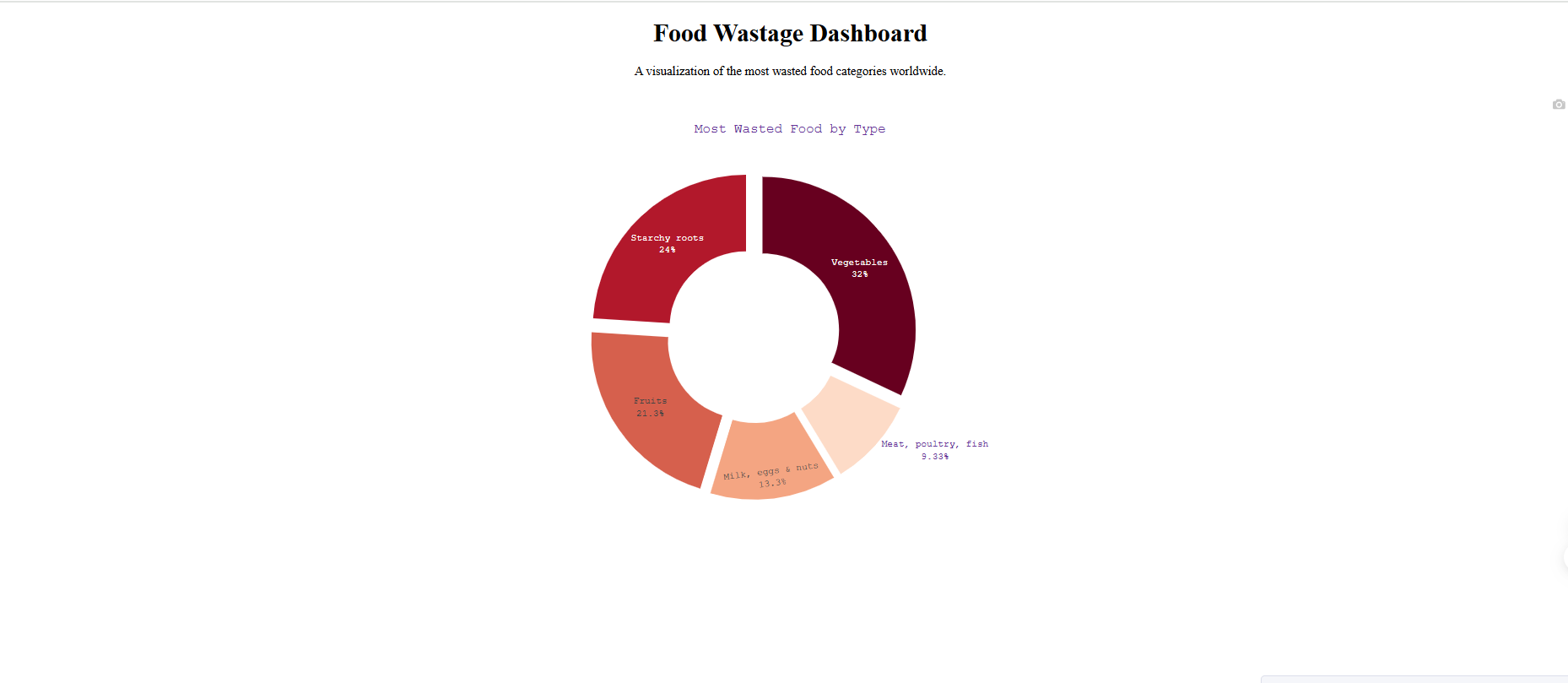
                        html.H5("WASTE BY SOURCE", id='pie-chart-title', style={'textAlign': 'center', 'fontWeight': 'bold'}),
                        dcc.Graph(id='waste-source-pie-chart', style={'height': '350px'}, config={'displayModeBar': False})
                    ], width=7)
                ], align="center")
            ], style={'background': 'rgba(255,255,255,0.9)', 'padding': '20px', 'borderRadius': '10px',
                      'marginBottom': '30px',
                      'boxShadow': '0 8px 20px rgba(0,0,0,0.15)'})
        ])
    ]),
    
    # Charts row - Two charts side-by-side
    dbc.Row([
        # Top 20 countries bar chart
        dbc.Col([
            html.Div([
                html.H3("TOP COUNTRIES", id='top-countries-title',
                       style={'color': '#000000', 'fontWeight': 'bold', 'textAlign': 'center', 'marginBottom': '10px', 'fontSize': '1.8rem'}),
                html.P("Countries with highest food waste per capita", 
                       style={'color': '#000000', 'textAlign': 'center', 'marginBottom': '20px', 
                              'fontSize': '1.1rem', 'fontStyle': 'italic'}),
                dcc.Graph(id='top-countries-chart', style={'height': '500px'})
            ], style={'background': 'rgba(255,255,255,0.9)', 'padding': '20px', 'borderRadius': '10px',
                      'boxShadow': '0 5px 15px rgba(0,0,0,0.1)', 'height': '600px'})
        ], width=6),
        
        # World Map
        dbc.Col([
            html.Div([
                html.H3("GLOBAL FOOD WASTE MAP", id='world-map-title',
                       style={'color': '#000000', 'fontWeight': 'bold', 'textAlign': 'center', 'marginBottom': '10px', 'fontSize': '1.8rem'}),
                html.P("Food waste per capita by country worldwide", 
                       style={'color': '#000000', 'textAlign': 'center', 'marginBottom': '20px', 
                              'fontSize': '1.1rem', 'fontStyle': 'italic'}),
                dcc.Graph(id='world-map-chart', style={'height': '500px'})
            ], style={'background': 'rgba(255,255,255,0.9)', 'padding': '20px', 'borderRadius': '10px',
                      'boxShadow': '0 5px 15px rgba(0,0,0,0.1)', 'height': '600px'})
        ], width=6)
    ]),
    
    
], fluid=True)

# Callback to reset all filters
@callback(
    [Output('confidence-filter', 'value'),
     Output('country-filter', 'value'),
     Output('country-display-filter', 'value'),
     Output('map-projection-filter', 'value'),
     Output('map-color-filter', 'value')],
    Input('reset-button', 'n_clicks'),
    prevent_initial_call=True
)
def reset_all_filters(n_clicks):
    # Return the default values for each filter:
    # - Empty lists for the multi-select dropdowns
    # - ['top10'] for the checklist
    return [], [], ['top10'], 'equirectangular', 'Oranges'

# Callback for interactive filtering - Top Countries Chart
@callback(
    [Output('top-countries-chart', 'figure'),
     Output('top-countries-title', 'children')],
    [Input('confidence-filter', 'value'),
     Input('country-filter', 'value'),
     Input('country-display-filter', 'value')]
)
def update_top_countries_chart(selected_confidence, selected_country, selected_display):
    filtered_df = df_country.copy()
    title = "Top Countries"
    
    if selected_confidence:
        filtered_df = filtered_df[filtered_df['confidence'].isin(selected_confidence)]
    
    if selected_country:
        filtered_df = filtered_df[filtered_df['Country'].isin(selected_country)]

    # Checklist returns a list, handle it. Default to 'all' if empty.
    display_mode = selected_display[0] if selected_display else 'all'

    # Sort by waste amount to handle top/bottom/all
    if display_mode == 'top10':
        display_df = filtered_df.nlargest(10, 'combined_figures')
    elif display_mode == 'bottom10':
        # For bottom 10, we need to sort ascending and take the head
        display_df = filtered_df.nsmallest(10, 'combined_figures')
    else: # 'all'
        # Sort descending for the 'all' view for consistency
        display_df = filtered_df.sort_values('combined_figures', ascending=False)
    
    fig = px.funnel(
        display_df,
        x='combined_figures',
        y='Country',
        title="",
        color_discrete_sequence=['#3b82f6']
    ).update_layout(
        xaxis_title="Food Waste (kg/capita/year)",
        yaxis_title="Country",
        showlegend=False,
        plot_bgcolor='rgba(0,0,0,0)',
        paper_bgcolor='rgba(0,0,0,0)',
        height=500
    )

    return fig, title

# Callback for the new dynamic pie chart (Waste Source)
@callback(
    [Output('waste-source-pie-chart', 'figure'),
     Output('pie-chart-title', 'children')],
    [Input('confidence-filter', 'value'),
     Input('country-filter', 'value')]
)
def update_pie_chart(selected_confidence, selected_country):
    filtered_df = df_country.copy()
    title = "Waste by Source"
    
    if selected_confidence:
        filtered_df = filtered_df[filtered_df['confidence'].isin(selected_confidence)]

    if selected_country:
        filtered_df = filtered_df[filtered_df['Country'].isin(selected_country)]

    # Calculate the total waste for each sector
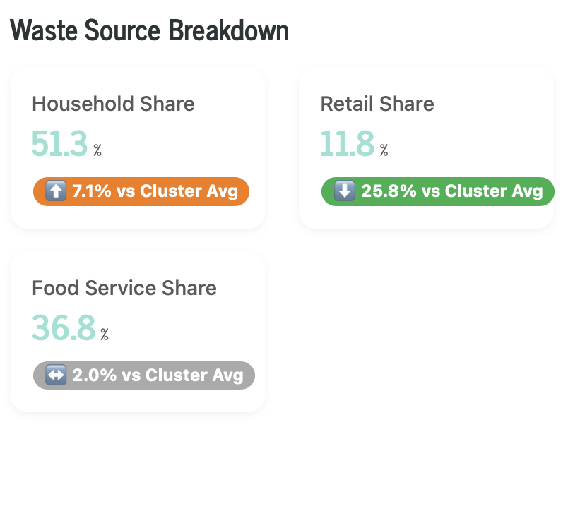
    # We use mean() to get the average per-capita waste across the filtered countries
    household_waste = filtered_df['household_estimate'].mean()
    retail_waste = filtered_df['retail_estimate'].mean()
    service_waste = filtered_df['food_service_estimate'].mean()

    # Create a dataframe for the pie chart
    source_df = pd.DataFrame({
        'Source': ['Household', 'Retail', 'Food Service'],
        'Waste (kg/capita)': [household_waste, retail_waste, service_waste]
    })

    # Handle cases with no data to avoid errors
    source_df['Waste (kg/capita)'] = source_df['Waste (kg/capita)'].fillna(0)

    # Determine colors and pull based on the largest value
    pull_values = [0, 0, 0]
    colors = ['#3b82f6', '#0284c7', '#0c4a6e'] # Shades of blue
    
    if not source_df.empty and source_df['Waste (kg/capita)'].sum() > 0:
        # Find the index of the largest slice
        max_index = source_df['Waste (kg/capita)'].idxmax()
        
        # Set the largest slice to be pulled out and colored orange
        pull_values[max_index] = 0.2
        colors[max_index] = '#f97316' # Orange

    fig = px.pie(
        source_df,
        values='Waste (kg/capita)',
        names='Source',
        title="",
        # hole=0.7, # Removed to make it a standard pie chart
        color_discrete_sequence=colors
    ).update_traces(
        textinfo='percent+label',
        textfont_size=12,
        pull=pull_values
    ).update_layout(
        showlegend=False, 
        plot_bgcolor='rgba(0,0,0,0)', 
        paper_bgcolor='rgba(0,0,0,0)',
        margin=dict(l=20, r=20, t=20, b=20)
    )
    
    return fig, title

# Callback for World Map Chart
@callback(
    [Output('world-map-chart', 'figure'),
     Output('world-map-title', 'children')],
    [Input('confidence-filter', 'value'),
     Input('country-filter', 'value'),
     Input('country-display-filter', 'value'),
     Input('map-projection-filter', 'value'),
     Input('map-color-filter', 'value')]
)
def update_world_map_chart(selected_confidence, selected_country, selected_display, map_projection, map_color):
    filtered_df = df_country.copy()
    
    title = "Global Food Waste Map"
    if selected_confidence:
        filtered_df = filtered_df[filtered_df['confidence'].isin(selected_confidence)]

    if selected_country:
        filtered_df = filtered_df[filtered_df['Country'].isin(selected_country)]
    
    # Apply the same display logic as the bar chart
    display_mode = selected_display[0] if selected_display else 'all'

    if display_mode == 'top10':
        display_df = filtered_df.nlargest(10, 'combined_figures')
    elif display_mode == 'bottom10':
        display_df = filtered_df.nsmallest(10, 'combined_figures')
    else: # 'all'
        display_df = filtered_df

    # Create a simple choropleth map using plotly
    fig = px.choropleth(
        display_df,
        locations='Country',
        locationmode='country names',
        color='combined_figures',
        hover_name='Country',
        hover_data=['region', 'confidence', 'household_estimate'],
        color_continuous_scale=map_color,
        title=""
    )
    
    fig.update_layout(
        plot_bgcolor='rgba(0,0,0,0)',
        paper_bgcolor='rgba(0,0,0,0)',
        geo=dict(
            showframe=False,
            showcoastlines=True,
            projection_type=map_projection
        ),
        height=500
    )
    
    return fig, title

# Run the app
if __name__ == '__main__':
    app.run(debug=True)

5 Likes

Hi @Ester
nice app, thanks for sharing.
I like the graphs you chose and the capability to change the map colors.

One thing I would recommend is to make the first two dropdowns chained. So if someone picks low-confidence the country dropdown will only have those counties with low-confidence.

2 Likes

Hi @adamschroeder
Thank you your feedback! It wasn’t good, but I fixed it with chained and replaced the app.

2 Likes

I made this nice treemap only with one prompt with Plotly Studio:

2 Likes

That’s a short and sweet prompt for such a cool treemap. Thanks for sharing, @Ester

Here is my Plotly Studio app, I choose only 2 charts now.

2 Likes

Hi, the dashboard is very pleasant. The header’s color gradient is very relevant to the theme. On the other hand, the treemap occupies the full available width, but the map looks very small on large screens. Additionally, in Firefox, I still have issues when opening certain dash applications, but I believe that problem is not related to the deployment or the development of the app.

3 Likes

Hi, thank you the advice! The map is also set to full-width, I don’t understand why it can’t be set wider, I would have to set it with prompts in PS. If you have any ideas, I’ll accept them.

1 Like

this layout is absolutely beautiful! The color scheme, very clean and professional look (not overloaded). Nice job :clap:

1 Like

I have also had problems with map sizes using choropleth. I generally use Mapbox for maps; that could be an alternative.

2 Likes

I wrote mapbox in the prompt. Please check it 10minutes later.

2 Likes