Figure Friday 2025 - week 30

join the Figure Friday session on August 1, at noon Eastern Time, to showcase your creation and receive feedback from the community.

Which country generated the most electricity? How have emissions changed over time?

Answer these questions and a few others by using Plotly and Dash on electricity generation and emissions in Europe.

Things to consider:

  • what can you improve in the app or sample figure below (line chart)?
  • would you like to tell a different data story using a different graph?
  • can you create a different Dash app?
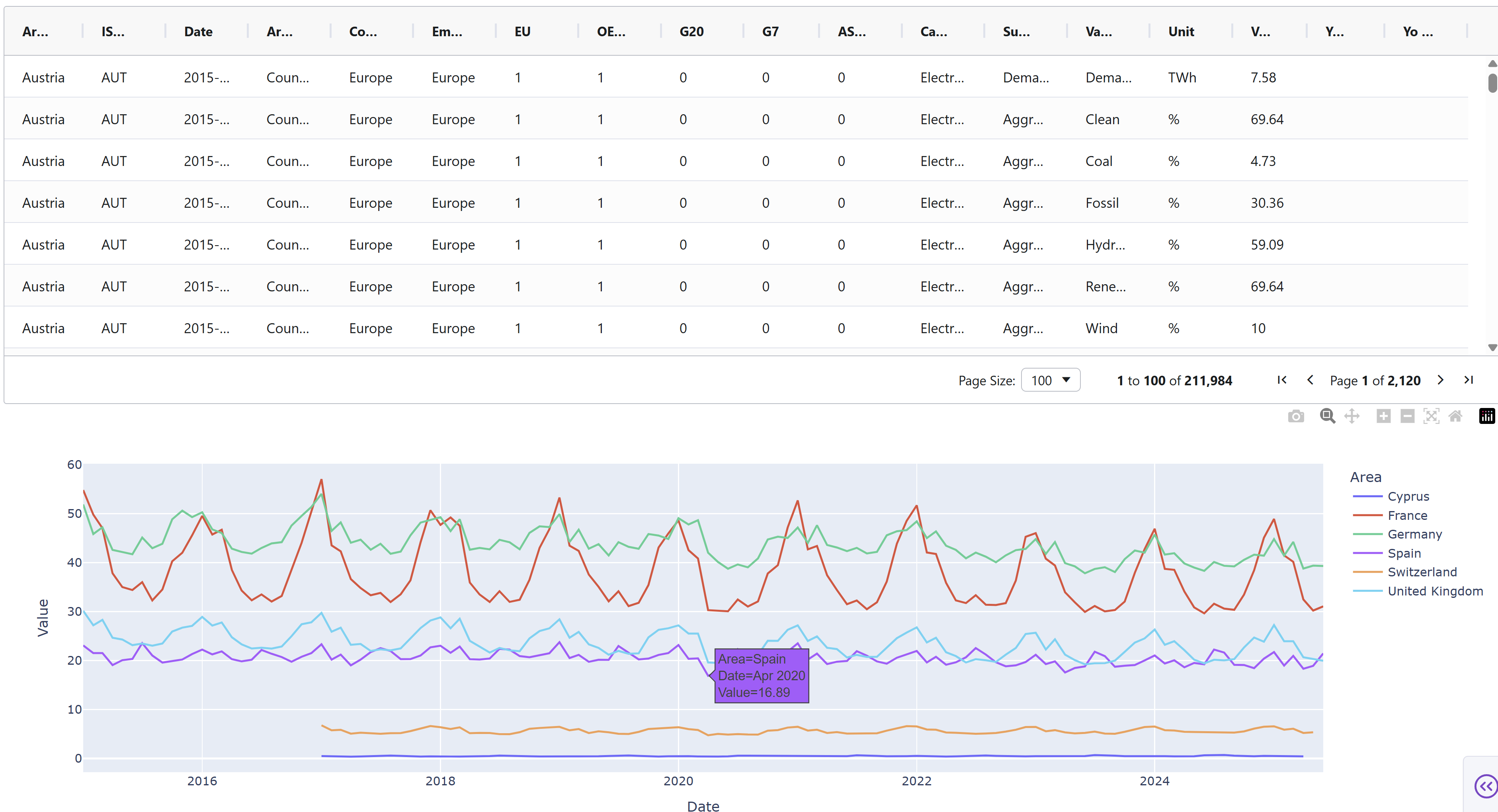
Sample figure:

Code for sample figure:
from dash import Dash, dcc
import dash_ag_grid as dag
import plotly.express as px
import pandas as pd

# Download CSV sheet from Google Drive: https://drive.google.com/file/d/1q_2EQ4gx_BLKSuwfMZcmCqetY1UV8BD1/view?usp=sharing
df = pd.read_csv("europe_monthly_electricity.csv")

df_filtered = df[df['Variable'] == 'Demand']
df_filtered = df_filtered[df_filtered['Area'].isin(['France', 'Germany', 'Spain', 'United Kingdom', 'Cyprus', 'Switzerland'])]

fig = px.line(df_filtered, x='Date', y='Value', color='Area')

grid = dag.AgGrid(
    rowData=df.to_dict("records"),
    columnDefs=[{"field": i, 'filter': True, 'sortable': True} for i in df.columns],
    dashGridOptions={"pagination": True},
    columnSize="sizeToFit"
)

app = Dash()
app.layout = [
    grid,
    dcc.Graph(figure=fig)
]


if __name__ == "__main__":
    app.run(debug=True)


For community members that would like to build the data app with Plotly Studio, but don’t have the application yet, simply click the Apply For Early Access button on Plotly.com/studio and fill out the form. You should get the invite and download emails shortly after. Please keep in mind that Plotly Studio is still in early access.

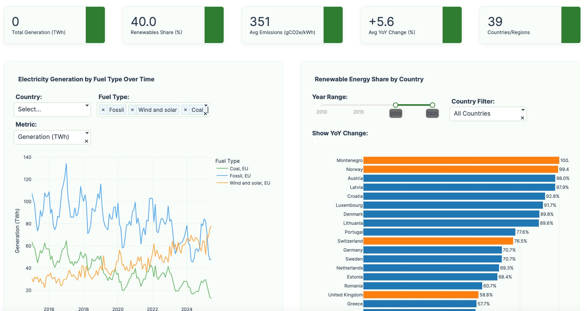
Below is a screenshot of a Plotly Studio app built on top of this dataset:

Participation Instructions:

  • Create - use the weekly data set to build your own Plotly visualization or Dash app. Or, enhance the sample figure provided in this post, using Plotly or Dash.
  • Submit - post your creation to LinkedIn or Twitter with the hashtags #FigureFriday and #plotly by midnight Thursday, your time zone. Please also submit your visualization as a new post in this thread.
  • Celebrate - join the Figure Friday sessions to showcase your creation and receive feedback from the community.

:point_right: If you prefer to collaborate with others on Discord, join the Plotly Discord channel.

Data Source:

Thank you to EMBER for the data.

4 Likes

is ploty studio ia free of cost

1 Like

yes @assad_zafar , during early access it is completely free for our users. Even after early access you will have a free tier.

Have you had a chance to download it and build apps with it?

1 Like

Hello Everyone,

My approach for this Week 30 FF is a simple interactive dashboard that allows us to compare how different European countries generate electricity. Think of it as a “visual comparator” where you can see which countries are leaders in solar, wind, nuclear energy, etc., and how they have evolved over time. This can help to better understand Europe’s energy landscape visually, or at least provide an overall idea about it.

Main Charts

Radar Chart (The Main One)

It’s like an “energy fingerprint” of each country. Each tip of the radar represents a type of energy (solar, wind, nuclear, etc.).

  • Further from center = More generation of that energy type
  • Similar shapes = Countries with similar energy strategies

Trends Chart

Shows how electricity generation has changed from 2016 to 2025. You can see if a country is increasing renewables or reducing coal.

Similarity Matrix

It’s like a “similarity thermometer”. It tells you which countries have similar energy strategies. Useful for finding business partners or models to follow.

What does Normalization do?

Imagine you want to compare how fast an elephant and a mouse run, but the elephant is 1000 times bigger:

0-100 Scale (Recommended for comparisons)

  • What it does: Converts everything to a 0 to 100% scale
  • Example: Germany generates 200 TWh solar, Malta generates 2 TWh solar. On the scale, both appear according to their national context.
  • When to use it: When you want to compare “profiles” or “strategies” between countries of different sizes

Original Values (For real numbers)

  • What it does: Shows exact figures in TWh (terawatt-hours)
  • Example: Germany: 200 TWh, Malta: 2 TWh (real difference)
  • When to use it: For business decisions, investments, or when you need exact numbers

Z-Score (For experts)

  • What it does: Shows how “normal” or “exceptional” a country is compared to the European average
  • Example: A country with +2 is “2 levels above the European average”
  • When to use it: For statistical analysis or identifying exceptional countries

Practical Example

Situation: A company wants to invest in solar energy in Europe.

  1. Use “Original Values” to see the real market size
  2. Use “0-100 Scale” to see which countries prioritize solar energy in their strategy
  3. Use Similarity Matrix to find countries with strategies similar to theirs
  4. Use Trends to see which countries are growing fastest in solar

Hope this proposal helps! Let me know if you have any questions or feedback


6 Likes

Hi,

I chose to look at just one part, electricity generation. For the basis of the app I chose to use the ‘Fuel Types’ illustration on page of the Ember ‘Methology’ .pdf.

While it can be used for viewing multiple countries, this MVP project needs improvement as it quickly gets difficult to read due to the abundance of lines on the graph.

Oddly, my data is in stark contrast to what is listed directly on the Ember ‘Latest Insights’ page “Solar is EU’s biggest power source for the first time ever“ - mine pointed towards ‘wind’ as the biggest power source, however I don’t know the time frame, it could have been only one month, for example June 2025.

4 Likes

Hi Mike,

Your dashboard looks great! I especially like how you structured the buttons. I’d respectfully suggest assigning a unique color to each country and a distinct symbol to each energy generation variable. This would make your chart much cleaner, which was exactly the problem I faced, and that’s how I solved it. You can check the images I shared.

3 Likes

That’s a beautiful app, @Avacsiglo21 .

Just a reminder that you can also deploy these Dash apps directly to Plotly Cloud. All you need is the requirements.txt file (include gunicorn inside) and the app.py file.

Just remember to include in the app.py file these two lines:

  • app = Dash()
  • server = app.server
2 Likes

I’ll do that thanks a Lot Adams

1 Like

Just Let me ask you there Is data size limit?How many apps for account or just one?

1 Like

Those are some great ideas, thanks! I completely forgot about ‘icons’, i like FontAwesome and they even have a ‘wind turbine’ icon (!) but it’s in the ‘Pro’ set (e.g. not free). Also, they are not multi-colored. Coloring countries (with their flag) would definitely help.

I’ve already put in a lot of time, but hopefully Friday I can find a little time to ‘spruce up’ my dashboard.

2 Likes

This dashboard provides an interactive visualization of CO₂ intensity in the European power sector using Dash and Plotly. Users can select multiple countries to compare their CO₂ intensity trends over time. The main line chart displays CO₂ intensity for each country, with minimum and maximum values clearly highlighted. A country-year heatmap shows the average CO₂ intensity across years and countries, using a light color scale for clarity. With a clean, responsive layout and modern design, the dashboard makes it easy to explore and compare CO₂ intensity patterns across Europe.

import plotly.express as px
import pandas as pd
from dash import Dash, dcc, html, Input, Output
import dash_bootstrap_components as dbc
import plotly.graph_objects as go

# --- 1. Data Loading and Preparation ---

df = pd.read_csv('monthly.csv')
df['Date'] = pd.to_datetime(df['Date'])
df['Year'] = df['Date'].dt.year
df['Month'] = df['Date'].dt.month
if 'Day' not in df.columns:
    df['Day'] = 1  # fallback if no daily data

ALL_COUNTRIES = sorted(df['Area'].unique())

# Only CO2 metric
METRIC_LABEL = 'CO₂ Intensity (gCO2e/kWh)'
METRIC_DETAILS = {
    'Category': 'Power sector emissions',
    'Variable': 'CO2 intensity'
}

# --- 2. Initialize Dash App ---
app = Dash(__name__, external_stylesheets=[dbc.themes.FLATLY])
server = app.server

# --- 3. App Layout ---
app.layout = dbc.Container([
    dbc.Row(
        dbc.Col(
            html.H1("European CO2 Intensity 2015 - 2025", className="text-primary my-4", style={'textAlign': 'left'}),
            width=12
        )
    ),

    dbc.Row([
        dbc.Col([
            html.Label("Select Countries:", className="fw-bold text-center"),
            dcc.Dropdown(
                id='country-multiselect-dropdown',
                options=[{'label': country, 'value': country} for country in ALL_COUNTRIES],
                value=['Germany', 'Cyprus', 'Portugal'],
                multi=True,
                clearable=False
            )
        ], width=6),
    ], className="mb-4 justify-content-center align-items-center"),

    dbc.Row([
        dbc.Col(
            dbc.Card(
                dbc.CardBody([
                    dcc.Graph(id='multi-country-line-chart', figure={}, style={'height': '500px'})
                ]),
                className="shadow-sm h-100"
            ),
            lg=7, md=12, className="mb-4 mb-lg-0"
        ),

        dbc.Col(
            dbc.Card(
                dbc.CardBody([
                    html.H5("Country-Year", className="card-title text-center"),
                    dcc.Graph(id='heatmap-chart', figure={}, style={'height': '500px'}),
                ]),
                className="shadow-sm h-100"
            ),
            lg=5, md=12
        ),
    ]),

], fluid=True, className="bg-light p-4")


# --- 4. Callback to Update Charts ---
@app.callback(
    Output('multi-country-line-chart', 'figure'),
    Output('heatmap-chart', 'figure'),
    [Input('country-multiselect-dropdown', 'value')]
)
def update_charts(selected_countries):
    category = METRIC_DETAILS['Category']
    variable = METRIC_DETAILS['Variable']

    dff_line = df[
        (df['Area'].isin(selected_countries)) &
        (df['Category'] == category) &
        (df['Variable'] == variable)
    ]

    # --- Spline Line Chart with min/max markers ---
    if dff_line.empty:
        line_fig = go.Figure().update_layout(
            title_text="Please select at least one country",
            template='plotly_white'
        )
    else:
        line_fig = go.Figure()
        for area in dff_line['Area'].unique():
            area_df = dff_line[dff_line['Area'] == area].sort_values('Date')
            line_fig.add_trace(go.Scatter(
                x=area_df['Date'],
                y=area_df['Value'],
                mode='lines',
                name=area,
                line_shape='spline'
            ))
            # Min and max markers
            min_idx = area_df['Value'].idxmin()
            max_idx = area_df['Value'].idxmax()
            for idx, marker_color in [
                (min_idx, 'red'),
                (max_idx, 'green')
            ]:
                if pd.notna(idx):
                    line_fig.add_trace(go.Scatter(
                        x=[area_df.loc[idx, 'Date']],
                        y=[area_df.loc[idx, 'Value']],
                        mode='markers',
                        marker=dict(color=marker_color, size=12, symbol='circle'),
                        name=f"{area} {'min' if marker_color=='red' else 'max'}",
                        showlegend=False
                    ))
        line_fig.update_layout(
            transition_duration=500,
            legend_title_text='Country',
            title={
                'text': f"{METRIC_LABEL} by Country Over Time",
                'x': 0.5,
                'xanchor': 'center'
            },
            template='plotly_white'
        )

    # --- Heatmap: év (x) vs ország (y), átlag ---
    dff_heatmap = df[
        (df['Area'].isin(selected_countries)) &
        (df['Category'] == category) &
        (df['Variable'] == variable)
    ]
    pivot = dff_heatmap.groupby(['Area', 'Year'])['Value'].mean().unstack(fill_value=0)

    if pivot.empty:
        heatmap_fig = go.Figure()
        heatmap_fig.update_layout(
            title="No data for selected countries.",
            template='plotly_white'
        )
    else:
        heatmap_fig = px.imshow(
            pivot,
            aspect="auto",
            color_continuous_scale='YlGnBu',  # világos színskála
            labels=dict(x="Year", y="Country", color="Average Value"),
            template='plotly_white'
        )
        heatmap_fig.update_layout(
            transition_duration=300,
            title="Country-Year Heatmap"
        )

    return line_fig, heatmap_fig

# --- 5. Run the App ---
if __name__ == '__main__':
    app.run(debug=True)
2 Likes

Thank you for this, @Ester .
Will you join us at the session today to showcase your app?

Are you able to update the code in your post so it shows correctly? for example:

from dash import Dash

app = Dash()
...

Here is a last-minute submission of a very simple dashboard, to look at the patterns by month of each year.

Here is the code:

import polars as pl
pl.Config().set_tbl_cols(20)
import plotly.express as px
import dash
from dash import Dash, dcc, html, Input, Output
import dash_mantine_components as dmc
import os
dash._dash_renderer._set_react_version('18.2.0')

#----- GLOBALS ------------- ---------------------------------------------------


style_horiz_line = {'border': 'none', 'height': '4px', 
    'background': 'linear-gradient(to right, #007bff, #ff7b00)', 
    'margin': '10px,', 'fontsize': 32}

style_h2 = {'text-align': 'center', 'font-size': '32px', 
            'fontFamily': 'Arial','font-weight': 'bold'}
style_h3 = {'text-align': 'center', 'font-size': '24px', 
            'fontFamily': 'Arial','font-weight': 'normal'}
map_styles = ['basic', 'carto-darkmatter', 'carto-darkmatter-nolabels', 
    'carto-positron', 'carto-positron-nolabels', 'carto-voyager', 
    'carto-voyager-nolabels', 'dark', 'light', 'open-street-map', 
    'outdoors', 'satellite', 'satellite-streets', 'streets', 'white-bg'
]

legend_font_size = 20
date_fmt ='%m/%d/%Y'

#----- GATHER AND CLEAN DATA ---------------------------------------------------
parquet_data_source = 'df.parquet'
if os.path.exists(parquet_data_source): # use pre-cleaned parquet file
    print(f'Reading data from {parquet_data_source}')
    df = pl.read_parquet(parquet_data_source)

else:  # read data from csv and clean
    csv_data_source = 'europe_monthly_electricity.csv' 
    print(f'Reading data from {csv_data_source}')
    df = (
        pl.read_csv(
            csv_data_source,
            )
        .select(
            COUNTRY = pl.col('Area'),
            ISO_3_CODE = pl.col('ISO 3 code'),
            YEAR = pl.col('Date')
                .str.to_date(format=date_fmt)
                .dt.year(),
            MONTH = pl.col('Date')
                .str.to_date(format=date_fmt)
                .dt.strftime("%b"),
            MONTH_NUM = pl.col('Date')
                .str.to_date(format=date_fmt)
                .dt.month(),
            DATE = pl.col('Date')
                .str.to_date(format=date_fmt),
            EU = pl.col('EU').cast(pl.Boolean),
            OECD = pl.col('OECD').cast(pl.Boolean),
            G20 = pl.col('G20').cast(pl.Boolean),
            G7 = pl.col('G7').cast(pl.Boolean),
            CAT = pl.col('Category').cast(pl.Categorical),
            SUBCAT = pl.col('Subcategory').cast(pl.Categorical),
            EMISSION = pl.col('Variable').cast(pl.Categorical),
            UNIT = pl.col('Unit').cast(pl.Categorical),
            VALUE = pl.col('Value'),
        )
        .drop_nulls(subset='ISO_3_CODE') 
        .filter(pl.col('YEAR') > 2014)   # data is parse prior to 2015
    )
    df.write_excel('df.xlsx')
    df.write_parquet('df.parquet')

#----- GLOBAL LISTS ------------------------------------------------------------
country_list = df.get_column('COUNTRY').unique().sort().to_list()
emission_list = df.get_column('EMISSION').unique().sort().to_list()

#----- FUNCTIONS----------------------------------------------------------------

def get_px_line(country, emission):
    df_local = (
        df
        .filter(pl.col('COUNTRY') == country)
        .filter(pl.col('EMISSION') == emission)
        .pivot(
            on='YEAR',
            values='VALUE',
            index=['MONTH', 'MONTH_NUM'],
            aggregate_function='sum'
        )
    )

    year_cols = df_local.columns[2:]
    fig = px.line(
        df_local,
        x='MONTH',
        y=year_cols,
        template='plotly_white',
        title=f'MONTHLY EMISSION OF {emission} from {country}'
    )
    return fig

#----- DASHBOARD COMPONENTS ----------------------------------------------------
dmc_select_country = (
    dmc.Select(
        label='Select County',
        placeholder="Select one",
        id='country',    # default value
        data=country_list,
        value='Austria',
        size='xl',
    ),
)
dmc_select_emission = (
    dmc.Select(
        label='Select Emission',
        placeholder="Select one",
        id='emission',    # default value
        data=emission_list,
        value='Demand',
        size='xl',
    ),
)

#----- DASH APPLICATION STRUCTURE-----------------------------------------------
app = Dash()
app.layout =  dmc.MantineProvider([
    dmc.Space(h=30),
    html.Hr(style=style_horiz_line),
    dmc.Text('European Emissions Dashboard', ta='center', style=style_h2),
    dmc.Text('', ta='center', style=style_h3, id='zip_code'),
    html.Hr(style=style_horiz_line),
    dmc.Space(h=30),
    dmc.Grid(
        children = [
            dmc.GridCol(dmc_select_country, span=3, offset = 1),
            dmc.GridCol(dmc_select_emission, span=3, offset = 1),
        ]
    ),
    dmc.Space(h=10),
    dmc.Grid(  
        children = [dmc.GridCol(dcc.Graph(id='px_line'), span=8, offset=2),
        ]
    ),
])

# callback update px_scatter with selected country and emission
@app.callback(
    Output('px_line', 'figure'),
    Input('country', 'value'),
    Input('emission', 'value'),
)
def update(country, emission):
    px_line = get_px_line(country, emission)
    return px_line

if __name__ == '__main__':
    app.run(debug=True)
3 Likes

Hey all, this is something was in work in progress. My aim was to build this quick and fast to get an idea of energy generated and emission. I also added a filter card with country, measure, power range and unit.

You can have a look at the code at github too. Link to code

Hi rishinigam,

I tried to enter and give an error, you missed to download the csv file :winking_face_with_tongue:

“FileNotFoundError: [Errno 44] No such file or directory: ‘europe_monthly_electricity.csv’”

@rishinigam I’m getting the same error as @Avacsiglo21 .
It might be easier if you just load your app to Plotly Cloud. I can give you access if you want.

1 Like

Hey @Avacsiglo21 and @adamschroeder yeah didn’t push the last change i made. Now should be good to view. And yeah sure Adam access to plotly cloud would be good.

1 Like

I’m currently practicing uploading for render, and as a sudden idea I added an interval and a play button so you don’t have to click :slight_smile: I’d love to hear feedback on whether it’s good or not.

1 Like

Hi @Ester
I like the idea of the animation button for the complete data app, but I think it would be more useful in other types of graphs or visualizations. Maybe where the line graph shows an animation over time from left to right, or a bar chart that moves on the axis from left to right.

However, I might suggest giving the user the choice to pre-select the dropdown values that will run during the animation (instead of the current alphabetical order).

1 Like

Great initiative! This kind of practice with Render not only helps you get familiar with the deployment process, but also brings you quite close to a real production setup. Adding features like the play button and the automatic interval is a great way to start thinking about user experience from the start.

As a suggestion for future versions, especially thinking about mobile use: the play button appears at the bottom, which might make it harder to access. It could work better if placed right below the title, along with the chart options. That way, it would be more visible and easier to use on any device.

2 Likes