@Mike_Purtell what is the area plot incremental decade telling us? It looks like there was a big drop in emissions in the 90’s, but is that the right reading of the graph?
Hello everyone,
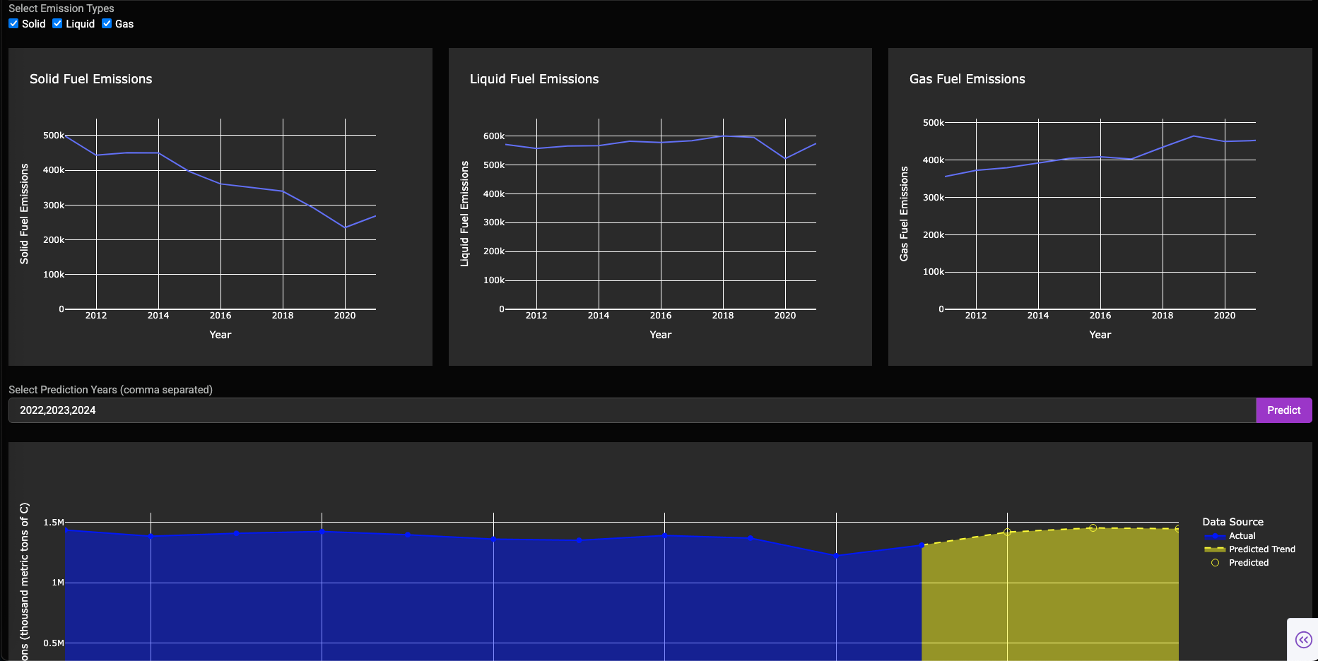
Here’s my CO2 emission analysis dashboard.
Working:
- Select the country you want to look into, (default: USA). Select the simple year bandwidth like 10Y, 20Y, etc. If you aren’t happy with default years, you can have a custom year range.
- Next graph: Based on the year and country selection → In detailed description using Solid, Liquid and Gas.
a. One can select based on button to hide and unhide the graph of their choice. - Lastly, there’s Machine Learning to predict future CO2 Emission across countries with a list of years you want to predict.
a. Added a simpledash.dcc.Loadingto let the graph load → Backend, ML model runs and predicts for the selected years.
One can find the code:
Github: Week_21
Dockerhub: Docker Image


Incase anyone interested in the ML side: Check out eda.ipynb
Any suggestions or queries let me know. ![]()
4 Likes
Hi Adam, I think you are reading it correctly. The incremental plot is the derivative if the data plot. What looks like a dip is just a reduction in the rate of change. Pollution was increasing while the rate of increase was decreasing. Out of control air and water pollution in the 1960s led to tougher environmental regulations and inspired the start of Earth Day in 1970, which likely slowed things down. I believe these are factors, but just my guess. Thank you.
1 Like
Thanks, Adam!
So similar to Streamlit, the requirements.txt serves as a critical link.
Also had a corrupt .csv I uploaded, fixed, now all words good!
2 Likes
Here’s a Jupyter Notebook using Plotly to demonstrate the relationship (correlation) between the C02 Emissions data and Temperature Anomaly data from NOAA.
[emissions/correlating_emissions_and_temp_anomalies_by_category.ipynb at main · rebeccapeltz/emissions · GitHub](https://Jupyter Notebook hosted on GitHub)
The data from NOAA is also hosted on GitHub.
3 Likes
Thank you!
I think, it because:
- Population growth.
- Small changes: only ~0.185 metric tons increase over 50+ years.
1 Like