Hi Adams, of course
import pandas as pd
import numpy as np
import plotly.express as px
from sklearn.preprocessing import StandardScaler
from sklearn.cluster import KMeans
import dash
from dash import dcc, html
from dash.dependencies import Input, Output
import dash_bootstrap_components as dbc

# Load and clean data
df = pd.read_csv("SaaS-businesses-NYSE-NASDAQ.csv").drop(['Company Website',
       'Company Investor Relations Page', 'S-1 Filing', '2023 10-K Filing'], axis=1)

df['Net Income Margin'] = pd.to_numeric(df['Net Income Margin'].str.replace('%', ''))
net_income_positive = df[df['Net Income Margin'] > 0].iloc[:, :28]

features = ['Market Cap', 'Annualized Revenue', 'YoY Growth%', 'Revenue Multiple', 'EBITDA Margin', 'Net Income Margin']
data_selected = net_income_positive[features]

data_selected = data_selected.replace(r'[^\d.-]', '', regex=True)
data_selected = data_selected.apply(pd.to_numeric, errors='coerce')

# Handle missing values
data_selected = data_selected.dropna()

# Normalize/Standardize the data
scaler = StandardScaler()
data_scaled = scaler.fit_transform(data_selected)

# Apply K-Means clustering
kmeans = KMeans(n_clusters=3, random_state=42)
clusters = kmeans.fit_predict(data_scaled)

# Add cluster labels to the dataset
data_selected['Cluster'] = clusters
data_selected['Cluster'] = data_selected.Cluster.astype("str")

cluster_companies = pd.concat([data_selected, net_income_positive['Company']], axis=1)

cluster_dict = {"0": "Mega-Cap High-Growth Leaders", "1": "Emerging Mid-Cap Players", "2": "Established Large-Cap Companies"}
cluster_companies['Cluster'] = cluster_companies.Cluster.map(cluster_dict)

cluster_companies.to_csv("cluster_saas_business.csv")

cluster_data = pd.read_csv("cluster_saas_business.csv").iloc[:, 1:]

# Dash app setup
app = dash.Dash(external_stylesheets=[dbc.themes.BOOTSTRAP])

SIDEBAR_STYLE = {
    "position": "fixed",
    "top": 0,
    "left": 0,
    "bottom": 0,
    "width": "14rem",
    "padding": "2rem 1rem",
    "background-color": "#f8f9fa",
}
CONTENT_STYLE = {
    "margin-left": "18rem",
    "margin-right": "2rem",
    "padding": "2rem 1rem",
}

card_style_cluster_0 = {'backgroundColor': '#94bdff'}
card_style_cluster_1 = {'backgroundColor': '#ffb8f3'}
card_style_cluster_2 = {'backgroundColor': '#ccc8cb'}

sidebar = html.Div([
    html.H6("SaaS", className="display-6"),
    html.Hr(),
    html.P("A free database of 170+ SaaS businesses listed on the U.S. Stock exchanges NYSE and NASDAQ", className="lead"),
    html.Hr(),
    dcc.RadioItems(
        id='features-radioitems',
        options=[
            {'label': 'Market Cap', 'value': 'Market Cap'},
            {'label': 'YoY Growth%', 'value': 'YoY Growth%'},
            {'label': 'Net Income Margin', 'value': 'Net Income Margin'}
        ],
        value='Net Income Margin',
        className='card border-primary mb-3',
        style={'text-align': 'left', 'padding': '10px'},
    )
], style=SIDEBAR_STYLE)

content = html.Div([
    dbc.Row([
        dbc.Col(html.H4("SaaS Financial Metrics Explorer: Market Cap, YoY Growth%, Net Income Margin"),
                style={'text-align': 'center', 'margin': '10px', 'padding': '10px'}, width=12),
        dbc.Row([
            dbc.Col(dbc.Card(
                [dbc.CardHeader(html.H6("Mega-Cap High-Growth Leaders",
                                        style={'textAlign': 'left', 'padding': '0px', 'margin': '0px'}), style=card_style_cluster_0),
                 dbc.CardBody(
                     html.H6("Average Net Income Margin 30%, Average YoY Growth% 18%, Average Market Cap 246 US$ Billion"), style=card_style_cluster_0)
                 ], className="card border-light mb-3")),
            dbc.Col(dbc.Card(
                [dbc.CardHeader(html.H6("Emerging Mid-Cap Players",
                                        style={'textAlign': 'center', 'padding': '0px', 'margin': '0px'}), style=card_style_cluster_1),
                 dbc.CardBody(
                     html.H6("Average Net Income Margin 5%, Average YoY Growth% 13%, Average Market Cap 17.68 US$ Billion"), style=card_style_cluster_1)
                 ], className="card border-light mb-3")),
            dbc.Col(dbc.Card(
                [dbc.CardHeader(html.H6("Established Large-Cap Companies",
                                        style={'textAlign': 'center', 'padding': '0px', 'margin': '0px'}), style=card_style_cluster_2),
                 dbc.CardBody(
                     html.H6("Average Net Income Margin 16%, Average YoY Growth% 9.5%, Average Market Cap 21.50 US$ Billion"), style=card_style_cluster_2)
                 ], className="card border-light mb-3")),
        ]),
        html.Hr(),
        dbc.Col(dcc.Graph(id='bar-plot'))
    ])
], style=CONTENT_STYLE)

app.title = "SaaS Business"

app.layout = html.Div([sidebar, content])

# Define callback to update graph
@app.callback(
    Output('bar-plot', 'figure'),
    Input('features-radioitems', 'value')
)
def update_graph(feature):
    """
    Update the bar plot based on the selected feature.
    """
    clusters_orders = {'Cluster': ["Mega-Cap High-Growth Leaders", "Emerging Mid-Cap Players", "Established Large-Cap Companies"]}
    clusters_colors = {"Mega-Cap High-Growth Leaders": "#94bdff", "Emerging Mid-Cap Players": "#ffb8f3", "Established Large-Cap Companies": "#ccc8cb"}

    data_filtered = cluster_data.sort_values(feature, ascending=False)
    fig = px.bar(data_filtered, x='Company', y=feature, height=600, color='Cluster',
                 template='plotly_white', labels={'Company': ''},
                 hover_name='Company',
                 category_orders=clusters_orders, color_discrete_map=clusters_colors)
    fig.update_layout(legend=dict(
        title=None, orientation="h", y=1.1, yanchor="bottom", x=0.5, xanchor="center", font=dict(size=18)),
    )

    return fig

if __name__ == "__main__":
    app.run_server(debug=True)
3 Likes
Hi @Mike_Purtell , this is cool. What I was wondering, how exactly did you get the lat/lons from ChatGPT and removing Oracle and Snowflake, was that something you knew, you researched, ChatGPT came up with?
1 Like
Hi @adamschroeder, these days San Mateo and San Francisco are both considered to be in Silicon Valley, however that wasn’t the case 20 to 30 years ago.
1 Like
Hi @marieanne, for ChatGPT, I pasted in a table with only the Bay Area company names and asked for a table back with the address of each company HQ, and the latitude and longitude. It was more straightforward than I had expected. A small data cleaning task converted latitude strings like 25°N to floating point 25.0, and longitude strings from 120°W to floating point -120.0. Regarding Oracle and Snowflake, both companies have moved HQ out of the Bay Area, so I excluded them. Oracle moved to Austin TX in 2020, and moving again to Nashville TN. Snowflake has moved to Bozeman MT.
Thank you, great questions.
1 Like
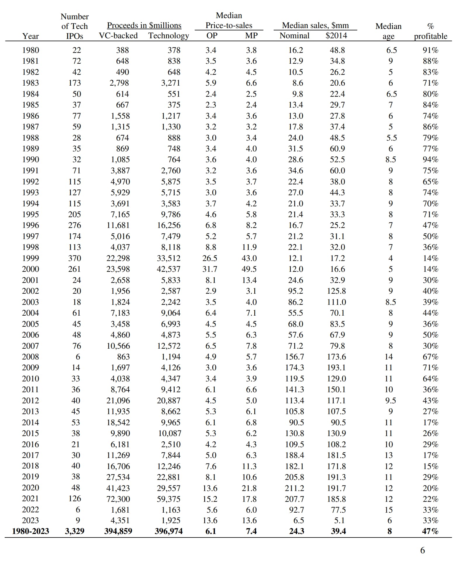
I have a comment about the time from when these companies were founded until they complete an IPO. Many companies delay IPOs as long as possible until they feel that the market is right. After all, the goal of an IPO is to raise as much money as possible. I believe this affected the early 2000s where time from founding to IPO was quite long based on the data from @adamschroeder. The market was in terrible shape following the dot com bust and the events of Sept 11, 2001. In those very down years, doing an IPO was thought of as selling your company for much less than the founders were willing to take or thought it was worth. So, IPO activity was greatly reduced. I think this pattern will repeat whenever the market takes a major dip.
1 Like
That is straightforward.
1 Like
You can definitely see the trend in the number of companies going public when the market is hot, like the time you mentioned leading up to the dot com bubble.
Even though the general market is good in the last few years, a lot of companies are choosing to stay private longer. In the past IPOs were a good way of getting funding, and now that’s readily available through private investors and venture capital funds.
This is image is from the study I posted earlier.
3 Likes
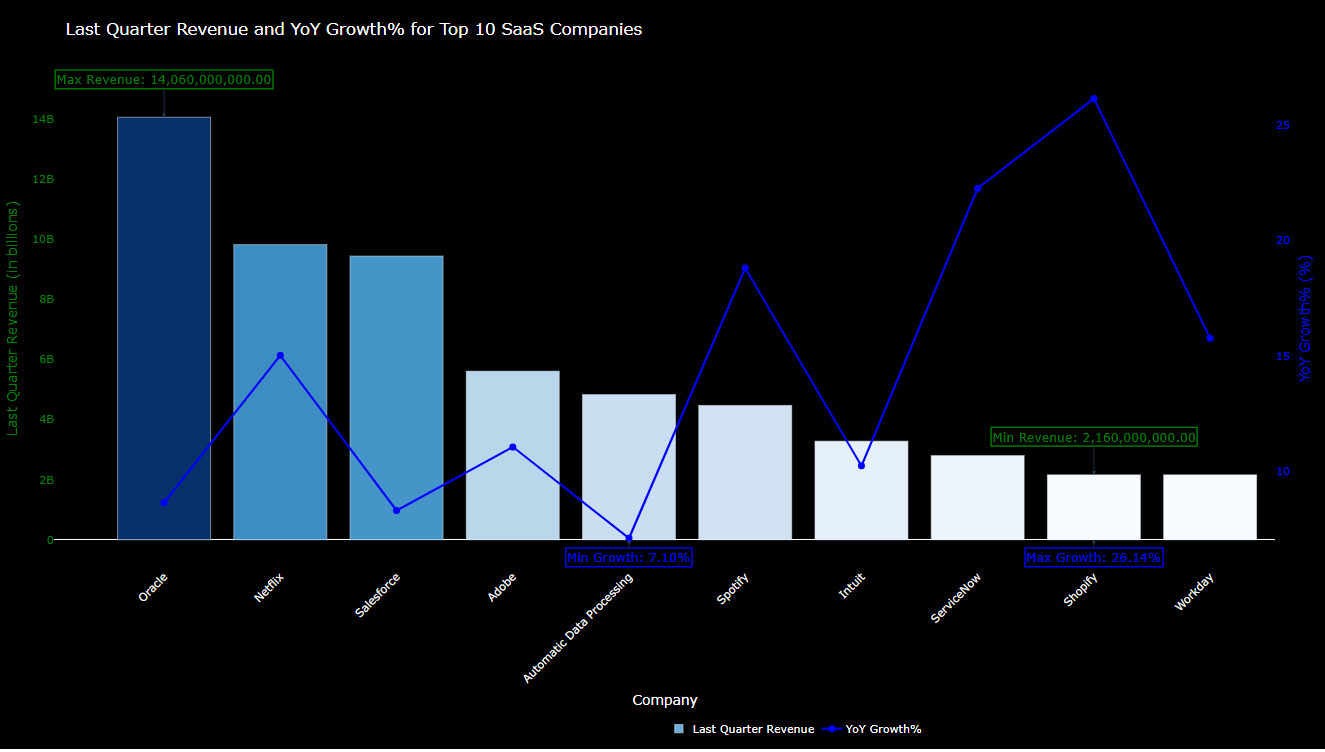
Hello,
I made another chart, because I have lost the another.
from dash import Dash, dcc, html
import pandas as pd
import plotly.graph_objects as go

# Load the dataset from the GitHub URL
url = "https://raw.githubusercontent.com/plotly/Figure-Friday/refs/heads/main/2024/week-52/SaaS-businesses-NYSE-NASDAQ.csv"
data = pd.read_csv(url)

# Clean and preprocess the data
data['Annualized Revenue'] = data['Annualized Revenue'].str.replace('[$,]', '', regex=True).astype(float)
data['Last Quarter Revenue'] = data['Last Quarter Revenue'].str.replace('[$,]', '', regex=True).astype(float)
data['YoY Growth%'] = data['YoY Growth%'].str.replace('%', '', regex=True).astype(float)

# Select the top 10 companies by Annualized Revenue
top_companies = data.nlargest(10, 'Annualized Revenue')

# Extract necessary data
companies = top_companies['Company']
last_quarter_revenue = top_companies['Last Quarter Revenue']
yoy_growth = top_companies['YoY Growth%']

# Create the Dash app
app = Dash(__name__)

# Create the figure
fig = go.Figure()

# Add bar chart for Last Quarter Revenue with gradient colors
fig.add_trace(
    go.Bar(
        x=companies,
        y=last_quarter_revenue,
        name="Last Quarter Revenue",
        marker=dict(
            color=last_quarter_revenue,
            colorscale="Blues",
            showscale=False
        ),
    )
)

# Add line chart for YoY Growth%
fig.add_trace(
    go.Scatter(
        x=companies,
        y=yoy_growth,
        name="YoY Growth%",
        mode="lines+markers",
        line=dict(color="blue", width=3),
        marker=dict(size=10, color="blue"),
    )
)

# Min and Max annotations for "Last Quarter Revenue"
min_revenue_idx = last_quarter_revenue.idxmin()
max_revenue_idx = last_quarter_revenue.idxmax()

# Min and Max annotations for "YoY Growth%"
min_growth_idx = yoy_growth.idxmin()
max_growth_idx = yoy_growth.idxmax()

# Add annotations for min and max values
fig.update_layout(
    title="Last Quarter Revenue and YoY Growth% for Top 10 SaaS Companies",
    title_font=dict(size=24, color="white"),  # White title font color
    plot_bgcolor="black",  # Dark background
    paper_bgcolor="black",  # Paper background color (for surrounding area)
    xaxis=dict(
        title="Company",
        tickangle=-45,
        titlefont=dict(size=20, color="white"),  # Larger font size for X-axis title
        tickfont=dict(size=16, color="white"),  # Larger font size for X-axis ticks
    ),
    yaxis=dict(
        title="Last Quarter Revenue (in billions)",
        titlefont=dict(size=20, color="green"),  # Larger font size for Y-axis title
        tickfont=dict(size=16, color="green"),  # Larger font size for Y-axis ticks
        showgrid=False,  # No gridlines
    ),
    yaxis2=dict(
        title="YoY Growth% (%)",
        titlefont=dict(size=20, color="blue"),  # Larger font size for Y2-axis title
        tickfont=dict(size=16, color="blue"),  # Larger font size for Y2-axis ticks
        overlaying="y",
        side="right",
        showgrid=False,  # No gridlines
    ),
    legend=dict(x=0.5, y=-0.3, orientation="h", font=dict(size=16, color="white")),
    height=1080,  # Full HD height
    width=1920,   # Full HD width
    barmode="group",
    annotations=[
        # Min/Max Annotations for Last Quarter Revenue
        dict(
            x=companies[min_revenue_idx],
            y=last_quarter_revenue[min_revenue_idx],
            xanchor="center",
            yanchor="bottom",
            text=f"Min Revenue: {last_quarter_revenue[min_revenue_idx]:,.2f}",
            showarrow=True,
            arrowhead=2,
            arrowsize=1,
            ax=0,
            ay=-40,
            font=dict(size=18, color="green"),  # Increased font size
            bgcolor="rgba(0, 0, 0, 0.7)",  # Dark background with transparency
            bordercolor="green",  # Border color
            borderwidth=2,  # Border width
            opacity=1  # Fully opaque
        ),
        dict(
            x=companies[max_revenue_idx],
            y=last_quarter_revenue[max_revenue_idx],
            xanchor="center",
            yanchor="bottom",
            text=f"Max Revenue: {last_quarter_revenue[max_revenue_idx]:,.2f}",
            showarrow=True,
            arrowhead=2,
            arrowsize=1,
            ax=0,
            ay=-40,
            font=dict(size=18, color="green"),  # Increased font size
            bgcolor="rgba(0, 0, 0, 0.7)",  # Dark background with transparency
            bordercolor="green",  # Border color
            borderwidth=2,  # Border width
            opacity=1  # Fully opaque
        ),
        # Min/Max Annotations for YoY Growth
        dict(
            x=companies[min_growth_idx],
            y=yoy_growth[min_growth_idx],
            xanchor="center",
            yanchor="bottom",
            text=f"Min Growth: {yoy_growth[min_growth_idx]:.2f}%",
            showarrow=True,
            arrowhead=2,
            arrowsize=1,
            ax=0,
            ay=40,
            font=dict(size=18, color="blue"),  # Increased font size
            bgcolor="rgba(0, 0, 0, 0.7)",  # Dark background with transparency
            bordercolor="blue",  # Border color
            borderwidth=2,  # Border width
            opacity=1  # Fully opaque
        ),
        dict(
            x=companies[max_growth_idx],
            y=yoy_growth[max_growth_idx],
            xanchor="center",
            yanchor="bottom",
            text=f"Max Growth: {yoy_growth[max_growth_idx]:.2f}%",
            showarrow=True,
            arrowhead=2,
            arrowsize=1,
            ax=0,
            ay=40,
            font=dict(size=18, color="blue"),  # Increased font size
            bgcolor="rgba(0, 0, 0, 0.7)",  # Dark background with transparency
            bordercolor="blue",  # Border color
            borderwidth=2,  # Border width
            opacity=1
        ),
    ]
)

# Attach secondary y-axis for YoY Growth%
fig.update_traces(yaxis="y2", selector=dict(name="YoY Growth%"))

# App layout
app.layout = html.Div([
    html.H3(
        "This visualization compares the top 10 SaaS companies by last quarter revenue, their YoY growth percentage, "
        "and highlights the minimum and maximum values for both metrics.",
        style={
            'textAlign': 'center',
            'color': 'white',  # White text color
            'fontSize': 20,  # Larger font size for the summary
            'marginBottom': '20px'
        }
    ),
    dcc.Graph(figure=fig)
])

# Run the app
if __name__ == "__main__":
    app.run_server(debug=True)
3 Likes
![]() Fantastic work, Mike! I’m delighted with the hover-template on the map! I hope to see you in the meetup.
Fantastic work, Mike! I’m delighted with the hover-template on the map! I hope to see you in the meetup.
1 Like
Very nice usage of graph objects, @Ester .
What’s the reason you chose a bluish color gradient for the bar charts? At first glance I expected all of them to be green, just like the color of the y axis and annotations.
Will you be joining the session today?

Of course, you can find it here: Figure Friday 2024 Week 52 Chart.
3 Likes