Hello @RomarReid,
Congratulations on your first contribution to FigureFriday! ![]()
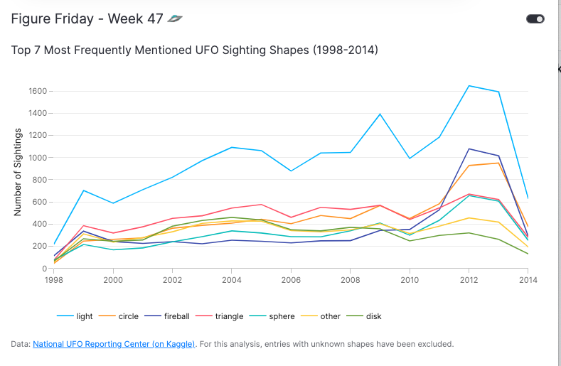
Great job on your line chart - it already looks fantastic! Since you asked for suggestions on improvement, here are a few tips to declutter the chart even further. These changes are mostly minor and some are based on personal preference, so feel free to use what resonates with you ![]()
Suggestions
- Remove the “unknown” category from the data set. Since your analysis focuses on the most commonly mentioned shapes, the “unknown” category might not add much value. You could remove it from the data set and mention this removal in your chart footer.
- Sort the legend entries. Organizing the legend entries in descending order can help users quickly identify the hierarchy without needing to map all the colors to the entries.
- Remove the y-axis gridlines, align the y-axis zero line with the x-axis line, and remove the xaxis title to reduce visual clutter.
- Move the legend to the bottom to create more horizontal space for the chart and consider removing the grey background color for a cleaner look (this one is a personal preference).
Here’s an example of how it could look. Since Py.Cafe doesn’t support pure Plotly charts yet, I’ve embedded the Plotly chart in a Vizro dashboard. However, you can definitely achieve the same results using pure Plotly!
Code: PyCafe - Vizro - Top UFO Sighting Shapes Over Time (1998-2014)