Figure Friday 2024 - week 46

join the Figure Friday sessions to showcase your creation and receive feedback from the community.

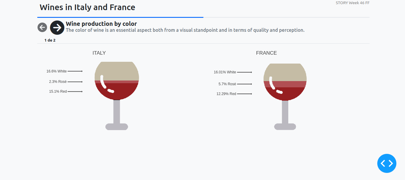
Did you know that Italy and France produce more than half of the wines that fall under the Protected Designation of Origin label within the European Union.

In this week’s data set we’ll explore over 5000 wines from France and Italy together with the wine name, max allowed yields, category, color, registration date and more.

If you’d like to read more about the data, see the respective article in Science Direct.

Things to consider:

  • can you improve the sample Violin figure built?
  • would a different figure tell the data story better?
  • can you create a Dash app instead?

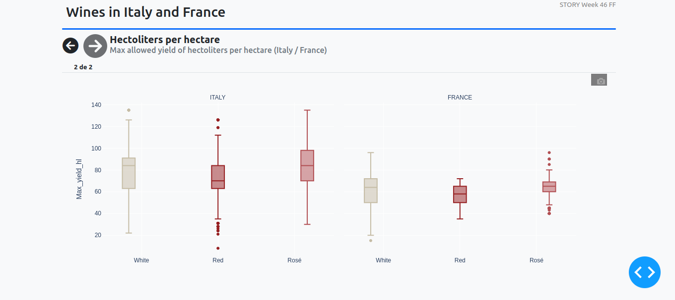
Sample Violin figure:

Code for sample figure:
import plotly.express as px
import pandas as pd

df = pd.read_csv("https://raw.githubusercontent.com/plotly/Figure-Friday/refs/heads/main/2024/week-46/PDO_wine_data_IT_FR.csv")
df['Max_yield_hl'] = pd.to_numeric(df['Max_yield_hl'], errors='coerce')
df_cleaned = df.dropna(subset=['Max_yield_hl'])  # Remove rows with NaN

fig = px.violin(df_cleaned, x='Color', y='Max_yield_hl',
                facet_col='Country',
                title="Max allowed yield of hectoliters per hectare (Italy / France)")
fig.show()

Participation Instructions:

  • Create - use the weekly data set to build your own Plotly visualization or Dash app. Or, enhance the sample figure provided in this post, using Plotly or Dash.
  • Submit - post your creation to LinkedIn or Twitter with the hashtags #FigureFriday and #plotly by midnight Thursday, your time zone. Please also submit your visualization as a new post in this thread.
  • Celebrate - join the Figure Friday sessions to showcase your creation and receive feedback from the community.

:point_right: If you prefer to collaborate with others on Discord, join the Plotly Discord channel.

Data Source:

Thank you to Sebastian Candiago et al. for the data.

2 Likes

Is it ok to improve the dataset by adding the geo data (Region, Department, ISO code) ? Not manually, using LLM.

of course @Alfred . Feel free to improve the data set any way you want.

1 Like

UPDATE (Friday Nov 22): Cleaned up the header, wikipedia link, and y-axis title, and removed the legend. Great suggestions for @li.nguyen , thank you.

UPDATE: Linked the title to the data source, and saved the visualization as an html file to test the link - it works. Thank you @adamschroeder .

Here are a few minor improvements to this week’s sample visualization, a violin chart.

Red, White, and Rose wine categories are associated with color, so I used these colors for the data visualization. The color for white is from a deep chardonnay, for red I used a color named winered, and for rosé I extracted a color from a web picture.

For other touch-ups, I replaced FR, IT with France, Italy, removed "Country= " from the labels above each facet, took out the xlabel Color from below each facet, and used a ‘plotly_dark’ template for a good background.

A big takeaway for me this week: I learned how to use a faceted plot, something I didn’t know existed. I do the same thing with subplots and grids, but those are harder to write and require more complex code. I will use this to improve the quality of my work, over other techniques that are more complex.

Appreciate any comments or suggestions.

import plotly.express as px
import polars as pl

# constants
SOURCE_LOCAL = True # if True, data from csv, if False data from get git-repo
csv_local = 'week_46_data.csv'

csv_git_source = 'https://raw.githubusercontent.com/plotly/Figure-Friday/refs/'
csv_git_source += 'heads/main/2024/week-46/PDO_wine_data_IT_FR.csv'

wine_colors = {
    'Rosé'  : '#E3AFA7',  # Rose colors vary, extracted this from a picture
    'Red'   : '#9B2242',  # matches color named winered
    'White' : '#E7DF99',  # white wine is not white, this is deep charconnay
    }

#------------------------------------------------------------------------------#
#     initialize dataframe df_source from local file or git repo
#------------------------------------------------------------------------------#
if SOURCE_LOCAL:   # read cleand-up data from local directory
    df = pl.read_csv(csv_local)       
else:             # read source data from git_repo, and clean-up
    df = (
        pl.read_csv(csv_git_source)
        .with_columns(
            pl.col('Max_yield_hl')
                .cast(pl.UInt16, strict=False),  # False changes na to null         
            pl.col('Country')
                .str.replace('FR', 'France')
                .str.replace('IT', 'Italy')
        )
        .drop_nulls(subset='Max_yield_hl')
        .select(pl.all().exclude('PDOid', 'Info'))
        .with_columns(
            COLOR_RGB = pl.when(pl.col('COLOR') == 'Rosé')
                           .then(pl.lit('#FF0080'))
        )
    )
    df.write_csv(csv_local)
    df.head()

fig = px.violin(
    df,
    x='Color',
    y='Max_yield_hl',
    facet_col='COUNTRY',
    title = (
        'Maximum permitted wine yield (hectoliters per hectare) in France and Italy'
        '<a href="https://en.wikipedia.org/wiki/Yield_(wine)" ' + 
        'style="color:blue;"> Wikipedia LINK</a>'
    ),
    color='Color', 
    color_discrete_map=wine_colors,
    template='plotly_dark',
)

fig.update_layout(
    font=dict(size=16), 
    showlegend=False,
    # xaxis_title=dict(text='Date', font=dict(size=16, color='#FFFFFF')),
    yaxis_title=dict(text=''),
)

# next line changes facet labels from COUNTRY=xyz, to just show xyz
fig.for_each_annotation(lambda a: a.update(text=a.text.replace("COUNTRY=", "")))

# # this syntax is specific to the faceted plot
fig.update_xaxes(title='')

fig.show()
fig.write_html('Wines.html')
4 Likes

You definitely made good improvements to the original plot, @Mike_Purtell . I like what you did with the colors and the cleaning of the labels/titles.
One small thing that I would add is a link in the title because not a lot of people know what wine yields are.

Try updating the title attribute to:

title="<a href='https://en.wikipedia.org/wiki/Yield_(wine)' style='color:blue;'>Max allowed yield of hectoliters per hectare</a>") 
1 Like

Thank you @adamschroeder. BTW, I also posted this visualization on Bluesky.

1 Like

Can you please share a link to your post on BlueSky?

1 Like

Hi @adamschroeder , I have updated the post on Bluesky, here is the link:

1 Like

Fantastic work, @Mike_Purtell! I absolutely love the way you’ve matched the chart’s colors to the wine hues—it’s a great touch! :art:

The chart is already very clean, but you could eventually declutter it even more by:

  • Removing the color legend entirely, as there are only three values and the color encoding is self-explanatory from the chart itself, making the legend redundant.
  • Eliminating the y-axis title since its meaning is clear from the chart title, or simply renaming it to “In hectoliters” if you want to emphasize the unit again.
  • Eventually rename your chart title to “Maximum permitted wine yield (hectoliters per hectare) in France and Italy” - I think this summarises what’s visible in the chart. If you can add some insights from the chart into your title - even better!
  • Keeping the chart title in white rather than blue (I noticed you’ve already made this change in your Bluesky posts, so this might just be an outdated screenshot) :slight_smile:
2 Likes

Hi @adamschroeder, I’ve made a few changes to this week’s sample visualization.
First I started with changing from a violin chart to a box plot to provide easy interpretation of the Max yield data.

I also updated the colors Red White and Rose, making each wine category easy to identify.

This week I learned how to use “facet_col” to separate the data by country .

I would greatly appreciate any suggestions on improvement.

import pandas as pd
import plotly.express as px


fig = px.box(
   wine,  
   x='Color',  
   y='Max_yield_hl',
   color='Color_group',
   color_discrete_map={'Rose': 'pink', 'White': 'lightblue', 'Red': 'red'},  
   title="Max Yield by Wine Color and Country",
   facet_col='Country',
)
fig.update_layout(
   title="Max Yield by Wine Color and Country",
   title_x=0.5,
   showlegend=False
)


fig.for_each_annotation(lambda a: a.update(text=a.text.split("=")[-1]))
fig.show()
2 Likes

Hi,
For this week’s data set I decided to add box plots within violins to highlight medians, quartiles, and overall distribution.
For aesthetics and better visual differentation purposes I applied a pastel color palette.
Also, I Introduced jittered, semi-transparent points to reduce overlap and show individual data points more clearly.
For the y-axis values, I formatted them to two decimal places for clarity and precision, ensuring that the Max Yield (hl/ha) values are easy to interpret.
I’d love to hear your feedback on the overall design and if there’s anything else I can improve! :blush:

import plotly.express as px
import pandas as pd


df = pd.read_csv("wine_data.csv")
df['Max_yield_hl'] = pd.to_numeric(df['Max_yield_hl'], errors='coerce')
df_cleaned = df.dropna(subset=['Max_yield_hl'])


fig = px.violin(
    df_cleaned, 
    x='Color', 
    y='Max_yield_hl', 
    facet_col='Country',
    color='Color',  
    box=True,       
    title="Distribution of Max Allowed Yield (Hectoliters per Hectare) by Wine Color and Country",
    labels={"Max_yield_hl": "Max Yield (hl/ha)", "Color": "Wine Color"},
    color_discrete_sequence=px.colors.qualitative.Pastel  # Subtle color palette
)


fig.update_traces(
    jitter=0.3,         
    opacity=0.6         
)
fig.update_layout(
    title_font_size=18,
    legend_title="Wine Color",
    xaxis_title="Wine Color",
    yaxis_title="Max Yield (hl/ha)",
    yaxis=dict(tickformat=".2f")   # Format y-axis values
)

fig.show()

1 Like

Hi, I have added a chart that shows wine production by color and a boxplot for the initially proposed chart.


Application code

7 Likes

EDITED
Following @adamschroeder feedback I changed the checklist to a dropdown, the scatter chart to a bar chart, removed axis titles and also added datapoints to the bars on both charts.

I created a Dash App with the following features:

  • Stacked Bar Chart: Visualize the distribution of wine colors.
  • Scatter Plot: Analyze the trend of wine registrations over time.
  • Checklist Filter: Select wines categories to display.

I created it in a rush so there is so much room for improvement but I wanted to explore to this interesting dataset :smiley:

Live App
Code

3 Likes

Hello @li.nguyen , thank you so much for these great suggestions and comments. I have put all of them into the code all will update in the next 15 minutes or so. I used the title you suggested in white font and appended a link to the end of the title in conventional html-link blue.

1 Like

Hello @U-Danny , your visualization with the wine glasses it gorgeous. I have no idea how you did this but will look into your code to see if I can figure it out. I assume that is only doable with dash, is that correct? This weekend I will surely have a glass of wine from Italy or France, to toast the great topic of week 46.

1 Like

I decided to showcase this data in a sunburst chart because it visually breaks down wine production by country, color, and category. To simplify the data, I combined closely related subcategories such as ‘Sparkling Wine,’ ‘Semi-Sparkling Wine,’ ‘Quality Sparkling Wine,’ and ‘Quality Aromatic Sparkling Wine’ into a single ‘Sparkling Wine’ category. Similarly, I grouped ‘Wine From Raisined Grapes’ and ‘Wine Of Overripe Grapes’ into the broader ‘Wine’ category. This makes it easier to see the proportions and allows for clear comparisons between the two countries in terms of their focus on specific wine types and colors


import plotly.express as px

import numpy as np
import pandas as pd


wine_data = pd.read_csv('data/PDO_wine_data_IT_FR.csv')

wine_data['Category'] = wine_data['Category'].replace({
    'Semi-Sparkling Wine': 'Sparkling Wine',
    'Quality Sparkling Wine': 'Sparkling Wine',
    'Quality Aromatic Sparkling Wine': 'Sparkling Wine',
    'Wine From Raisined Grapes': 'Wine',
    'Wine Of Overripe Grapes': 'Wine'
})


sunburst_grouped_data = (
    wine_data.groupby(['Country', 'Color', 'Category'])
    .size()
    .reset_index(name='Count')  
)


fig_sunburst = px.sunburst(
    sunburst_grouped_data,
    path=['Country', 'Color', 'Category'],  
    values='Count',                        
    color='Color',                         
    title="Sunburst Chart: Wine Production by Country, Color, and Major Categories",
    width=800,
    height=800
)


fig_sunburst.update_traces(
    insidetextfont=dict(size=16, family="Arial Bold"),  
    textfont=dict(size=16)          
)


fig_sunburst.show()


4 Likes

Hi,
Wow, so many beautiful and interesting graphics this week ! :star_struck:
My choice is Split Violin Plot. :woman_technologist:

Code

df_it = df[df['Country'] == 'IT'][['Country', 'Color', 'Max_yield_hl']]
df_fr = df[df['Country'] == 'FR'][['Country', 'Color', 'Max_yield_hl']]

yaxis_tickvals = df['Max_yield_hl'].aggregate(['min', 'mean', 'max']).to_list()
yaxis_ticktext = [f'{m}<br>{v:.0f} hl' for m, v in zip(['Min', 'Avg', 'Max'], yaxis_tickvals)]

title='Distribution of Max Yield of Wine by Color in <span style="color:green; font-weight:bold">Italy</span>'\
        ' and <span style="color:navy; font-weight:bold">France</span><br><sub>(hectolitres per hectare)</sub><br>'

# Unique categories (colors) in the DataFrame
categories = df['Color'].unique()

# Create the Figure
fig = go.Figure()

# Add a violin trace for each category with a specific fill color
line_colors = ['white', '#A85668', 'pink',]
fill_colors = ['green', 'navy']

for color, fill_color in zip(categories, line_colors):
    subset = df_it[df_it['Color'] == color]
    fig.add_trace(go.Violin(
        y=subset['Max_yield_hl'],
        x=subset['Color'],
        name='Italy',
        side='negative', 
        line_color=fill_colors[0],  # Outline color
        fillcolor=fill_color,  # Specific fill color for each category
        opacity=0.7))    

    subset2 = df_fr[df_fr['Color'] == color]
    fig.add_trace(go.Violin(
        y=subset2['Max_yield_hl'],
        x=subset2['Color'],
        name='France',
        side='positive',
        line_color=fill_colors[1], 
        fillcolor=fill_color,  
        opacity=0.7))         

fig.update_traces(meanline_visible=True,
                  hoveron='violins',
                  spanmode='hard',       # "hard" means the span goes from the sample's minimum to its maximum value
                  scalemode='count',    
                  points=False,)     
                   
fig.add_scatter(x=df_fr['Color'].unique(), y=[140]*3, mode='text+markers', hoverinfo='skip',
                text=[f' <b>{v:,.0f} ' for v in df_it['Color'].value_counts()], 
                textposition='middle left', textfont_color=fill_colors[0], textfont_size=14)

fig.add_scatter(x=df_it['Color'].unique(), y=[140]*3, hoverinfo='skip',
                mode='text+markers', marker_color='grey',
                text=[f' <b>{v}' for v in df_fr['Color'].value_counts()],
                textposition='middle right', textfont_color=fill_colors[1], textfont_size=14)

fig.update_layout(
    title=title, title_x=0.1, showlegend=False, font_size=14, template='ggplot2',
    violingap=0, violinmode='overlay', violingroupgap=0, 
    xaxis_gridwidth=2, xaxis_gridcolor='lightgrey', xaxis_range=[-0.7, 2.5],
    yaxis_zeroline=False, yaxis_ticksuffix=' hl', 
    yaxis_tickvals=yaxis_tickvals,  # The values for the ticks 
    yaxis_ticktext=yaxis_ticktext,  # The labels for the ticks
    width=800, margin=dict(l=10, t=100, r=10, b=10))                
               
fig.show()

5 Likes

Amazing @Snowmbird!

Definitely this data is a perfect fit for a sunburst chart. Not too many levels and options.

Figure Friday session just started: Launch Meeting - Zoom