Figure Friday 2024 - week 33

Update : Figure Friday 2024 - week 34 is the newer dataset.

As we approach the next US elections, we thought it would be interesting to view the results of previous elections (from 1976-2020).

Things to consider:

  • how can the map be improved? It’s hard to distinguish colors between states where vote count is very low.
  • can we use a different map or graph to tell a data story around historical US elections?
  • is there a better way to show how each state’s votes differ over time?
  • would it be advantageous to use polars instead of pandas?
  • what graph can we use to analyze non-democrat and non-republican party participation (LIBERTARIAN & OTHER)?

Sample Figure:
map-us-elections

Code for sample figure:
import plotly.express as px
import pandas as pd

df = pd.read_csv('https://raw.githubusercontent.com/plotly/Figure-Friday/main/2024/week-33/1976-2020-president.csv')

# Group by year and state, then calculate the vote difference between DEMOCRAT and REPUBLICAN
filtered_data = df[df['party_simplified'].isin(['DEMOCRAT', 'REPUBLICAN'])]

# Pivot the data to get the vote difference
pivot_data = filtered_data.pivot_table(index=['year', 'state'], columns='party_simplified', values='candidatevotes')

# Calculate the vote difference between DEMOCRAT and REPUBLICAN
pivot_data['vote_diff'] = pivot_data['DEMOCRAT'] - pivot_data['REPUBLICAN']

# Convert the pivot table back to a regular dataframe
regular_df = pivot_data.reset_index()
regular_df.columns = ['year', 'state', 'DEMOCRAT', 'REPUBLICAN', 'vote_diff']

# Merge the abbreviated state column into the regular_df
final_df = regular_df.merge(df[['state', 'state_po']], on='state', how='right')

# Create the map
fig = px.choropleth(final_df,
                    geojson="https://raw.githubusercontent.com/plotly/datasets/master/geojson-counties-fips.json",
                    locationmode='USA-states',
                    locations='state_po',
                    color='vote_diff',
                    scope="usa",
                    color_continuous_scale=px.colors.diverging.RdBu,
                    color_continuous_midpoint=0,
                    range_color=[-500000,500000],
                    animation_frame='year'
                    )
fig.update_layout(margin={"r":0, "t":0, "l":0, "b":0})
fig.show()

Participation Instructions:

  • Create - use the weekly data set to build your own Plotly visualization or Dash app. Or, enhance the sample figure provided in this post, using Plotly or Dash.
  • Submit - post your creation to LinkedIn or Twitter with the hashtags #FigureFriday and #plotly by midnight Thursday, your time zone. Please also submit your visualization as a new post in this thread.
  • Celebrate - join the Figure Friday sessions to showcase your creation and receive feedback from the community.

:point_right: If you prefer to collaborate with others on Discord, join the Plotly Discord channel .

Thank you to Bojan Tunguz on Kaggle for the data.

3 Likes

From the history of Plotly plots related to presidential elections:

  1. A scoreboard for republican candidates as of August 17, 2015: https://chart-studio.plotly.com/~empet/2922
  2. Pew Research Poll on Presidential Vote Preference, 2020: https://chart-studio.plotly.com/~empet/15807
3 Likes

Map can be improved by replacing vote difference with percentage difference as the color value for px.choropleth and updating the color range (I used -35% to +35%). Other improvement is to add more to the hover info

A different story to tell relates to the power of each state’s vote outcome. States with high populations have significantly more electoral votes than states with low populations. All electoral votes of each state are awarded to the winner of that state, with a few minor exceptions where they are split by district (Nebraska & Maine). For example, winner of California will be awared all of its 54 electoral votes, and it doesn’t matter if they win by 1% or win by 90%. This aspect of US presidential elections is very complicated to say the least.

I would say a graph is better than a map for showing how the votes of each state differ over time. I will try this later in the week.

I don’t see any significant advantage of polars or pandas for this exercise. Plotly works seemlessly with either dataframe library. The speed advantage of polars matters for large datasets and computations, I would say not for this one. I use polars to speed up work with very large sets of semiconductor test data. I like the syntax of polars more than pandas, and find it easier to use, so I use if for everything. I used pandas for 5 years though and can’t ignore how much I have grown by using it, and how much it has contributed to my work and my hobbies (including data analysis for a local political party).

One problem I have not solved with this data set is that the hoverinfo would not update correctly when stepping through the animation by year. I will try to fix that. For this first run, the maps are separated by year.

Thank you @adamschroeder for selecting another great dataset for Figure Friday.

In 1976, Georgia was the bluest of the blue states, with election won by native son Jimmy Carter

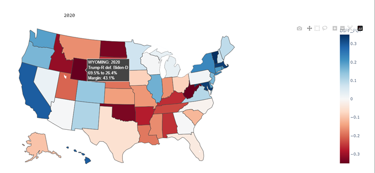
in 2020, Donald Trump won Wyoming by a margin of 43%, and secured all 3 of its electoral votes out of 538 total for all states and territories.

import plotly.express as px
import plotly.graph_objects as go
import polars as pl
pl.Config().set_tbl_rows(30)
pl.Config().set_tbl_cols(20)
import numpy as np

#------------------------------------------------------------------------------#
#     Read dataset from local file, clean up - uses polars LazyFrame           #
#------------------------------------------------------------------------------#
keep_columns = [
    'candidate', 'year', 'state', 'state_po', 
    'party_simplified', 'candidatevotes','totalvotes'
]
df = (
    pl.scan_csv(       # pl.scan_csv creates Lazy Frame for query optimization
    './Dataset/1976-2020-president.csv',
    ignore_errors=True
    )
    .select(
        pl.col(keep_columns))
    .filter(pl.col('party_simplified').is_in(['DEMOCRAT', 'REPUBLICAN']))
    .with_columns(
        pl.col('party_simplified')
        .str.replace('DEMOCRAT', 'DEM')
        .str.replace('REPUBLICAN', 'REP')
    )
    .filter(pl.col('candidate') != 'OTHER')
    .with_columns(
        pl.col('candidate')
            # for unique candidate family names, fix the Bushes
            .str.replace('BUSH, GEORGE H.W.', 'Bush Senior')
            .str.replace('BUSH, GEORGE W.', 'Bush Junior')
            # for unique candidate family names, fix the Clintons
            .str.replace('CLINTON, BILL', 'Clinton B.')
            .str.replace('CLINTON, HILLARY', 'Clinton H.')
            # ROMNEY, MITT wrongly listed as MITT ROMNEY, Washington 2012
            .str.replace('MITT, ROMNEY', 'ROMNEY, MITT'),
        pl.col('year').cast(pl.Int16)
    )
    .with_columns(             # get last name of candidate
        pl.col('candidate')
        .str.split(',')        
        # .list.slice(0, 1)      # gets all text up to first comma
        .list.first()           # gets all text up to first comma, usually the last name
        .str.to_titlecase()     # Title case breaks on McCain, next line fixes is
        .str.replace('Mccain', 'McCain')
    )
    # Un-named DEMOCRATIC candidate from ARIZONA in 2016 won 4 votes, drop nulls to remove
    .drop_nulls('candidate')
    .collect()    # collect applies auto-optimization to covert Lazy Frame to usable Data Frame
)

#------------------------------------------------------------------------------#
#     Make a list of candidate last names by election year. Special attention  #
#     for the Bushes (Junior & Senior) & the Clintons (Bill & Hillary)         #
#------------------------------------------------------------------------------#
df_candidates = (
    df
    .select(pl.col('candidate', 'year','party_simplified'))
    .unique()
    .sort('year')
    .pivot(index='year', on='party_simplified', values='candidate')
)

#------------------------------------------------------------------------------#
#     Group by year, state, calc difference between DEM_VOTES and REP_VOTES    #
#------------------------------------------------------------------------------#
df_votes = (
    df
    .rename({'totalvotes':'TOT_VOTES'})
    .pivot(
        index=['year', 'state', 'state_po','TOT_VOTES'],  # , 'candidate'], 
        on ='party_simplified', 
        values='candidatevotes', 
        aggregate_function='sum'
        )
    .with_columns(pl.col('year').cast(pl.Int16))
    .rename({'DEM': 'DEM_VOTES', 'REP': 'REP_VOTES'})
)

#------------------------------------------------------------------------------#
#     Use a lazy frame to goin df_votes and df_candidates, and finish          #
#     Remaining calculations                                                   #
#------------------------------------------------------------------------------#
final_df = (
    pl.LazyFrame(
        df_candidates.join(
            df_votes,
            on='year',
            how='left'
        )
        .with_columns(
            DEM_PCT = pl.col('DEM_VOTES') / pl.col('TOT_VOTES'),
            REP_PCT = pl.col('REP_VOTES') / pl.col('TOT_VOTES'),
        )
        .with_columns(   # DIFF_PCT is used for coloring each state
            DIFF_PCT = pl.col('DEM_PCT') -  pl.col('REP_PCT'),
        )
        .with_columns(   # absolute value of vote margin used by hovertemplate
            ABS_DIFF_PCT = abs(pl.col('DIFF_PCT'))
        )
        # make columns with winner's name and party for hovertemplate
        .with_columns(
            STATE_WINNER = 
                pl.when(pl.col('DEM_PCT')> pl.col('REP_PCT'))
                .then('DEM')
                .otherwise('REP'),
            WINNING_PARTY = 
                pl.when(pl.col('DEM_PCT')> pl.col('REP_PCT'))
                .then(pl.lit('D'))
                .otherwise(pl.lit('R'))
        )
        # make columns with loser's name and party for hovertemplate
        .with_columns(
            STATE_LOSER = 
                pl.when(pl.col('DEM_PCT')> pl.col('REP_PCT'))
                .then('REP')
                .otherwise('DEM'),
            LOSING_PARTY = 
                pl.when(pl.col('DEM_PCT')> pl.col('REP_PCT'))
                .then(pl.lit('R'))
                .otherwise(pl.lit('D'))
        )
         # make column with winers's vote percentage for hovertemplate
        .with_columns(
            WINNING_PCT = 
                pl.when(pl.col('DEM_PCT')> pl.col('REP_PCT'))
                .then('DEM_PCT')
                .otherwise('REP_PCT')
        )
         # make column with losers's vote percentage for hovertemplate
        .with_columns(
            LOSING_PCT = 
                pl.when(pl.col('DEM_PCT')> pl.col('REP_PCT'))
                .then('REP_PCT')
                .otherwise('DEM_PCT')
        )
    )
    .collect()
)

#------------------------------------------------------------------------------#
#     Assemle hover data                                                       #
#------------------------------------------------------------------------------#
customdata=np.stack(
    (
        final_df['state'],            #  customdata[0]
        final_df['year'],             #  customdata[1]
        final_df['STATE_WINNER'],     #  customdata[2]
        final_df['WINNING_PARTY'],    #  customdata[3]
        final_df['STATE_LOSER'],      #  customdata[4]
        final_df['LOSING_PARTY'],     #  customdata[5]
        final_df['WINNING_PCT'],      #  customdata[6]
        final_df['LOSING_PCT'],       #  customdata[7]
        final_df['ABS_DIFF_PCT']      #  customdata[8]
        ), 
        axis=-1
    )

#------------------------------------------------------------------------------#
#     make map of each election year                                           #
#------------------------------------------------------------------------------#
for year in sorted(final_df['year'].unique()):
    print(year)
    year_df = final_df.filter(pl.col('year') == year)
    fig = px.choropleth(
        year_df,
        geojson="https://raw.githubusercontent.com/plotly/datasets/master/geojson-counties-fips.json",
        locationmode='USA-states',
        locations='state_po',
        color='DIFF_PCT',
        scope="usa",
        color_continuous_scale=px.colors.diverging.RdBu,
        color_continuous_midpoint=0,
        range_color=[-0.35,0.35],
        animation_frame='year',
        custom_data=[
            'state', 'year', 
            'STATE_WINNER', 'WINNING_PARTY',
            'STATE_LOSER', 'LOSING_PARTY', 
            'WINNING_PCT', 'LOSING_PCT',
            'ABS_DIFF_PCT'
        ],
        title = str(year)
    )
#------------------------------------------------------------------------------#
#     Update trace with hovertemplate                                          #
#------------------------------------------------------------------------------#
    fig.update_traces(
        hovertemplate =
            '%{customdata[0]}: %{customdata[1]}<br>' +
            '%{customdata[2]}-%{customdata[3]} def. %{customdata[4]}-%{customdata[5]}<br>' +
            '%{customdata[6]:.1%} to %{customdata[7]:.1%}<br>' +
            'Margin: %{customdata[8]:.1%}<br>' +
            '<extra></extra>'
    )
    fig.update_layout(
        margin={"r":0, "t":0, "l":0, "b":0},
        )
    fig.show()

2 Likes

These plots show the winning party by state over all years in the dataset. Vote totals and percentages are ignored. This aligns with US practice of using state winners over vote decide the winner.

This image show all states. Not useful with all legend entries selected. Click on legend entries to show states of interest.

California (home state of President Reagan) was republican until 1992

Ohio voted republican during Reagan years, then voted twice for Bill Clinton, George Bush Junior, Barack Obama and Donald Trump. Interesting pattern.

Kansas has only voted Republican (along with other states), Minnesota has only voted Democrat (the only state with this distinction and the only state in 1984 to vote for Walter Mondale over Ronald Reagan.)

import plotly.express as px
import plotly.graph_objects as go
import polars as pl
import numpy as np

#------------------------------------------------------------------------------#
#     Read dataset from local file, clean up - uses polars LazyFrame           #
#------------------------------------------------------------------------------#
keep_columns = [
    'candidate', 'year', 'state', 'state_po', 
    'party_simplified', 'candidatevotes','totalvotes'
]
df = (
    pl.scan_csv(       # pl.scan_csv creates Lazy Frame for query optimization
    './Dataset/1976-2020-president.csv',
    ignore_errors=True
    )
    .select(
        pl.col(keep_columns))
    .filter(pl.col('party_simplified').is_in(['DEMOCRAT', 'REPUBLICAN']))
    .with_columns(
        pl.col('party_simplified')
        .str.replace('DEMOCRAT', 'DEM')
        .str.replace('REPUBLICAN', 'REP')
    )
    .filter(pl.col('candidate') != 'OTHER')
    .with_columns(
        pl.col('candidate')
            # for unique candidate family names, fix the Bushes
            .str.replace('BUSH, GEORGE H.W.', 'Bush Senior')
            .str.replace('BUSH, GEORGE W.', 'Bush Junior')
            # for unique candidate family names, fix the Clintons
            .str.replace('CLINTON, BILL', 'Clinton B.')
            .str.replace('CLINTON, HILLARY', 'Clinton H.')
            # ROMNEY, MITT wrongly listed as MITT ROMNEY, Washington 2012
            .str.replace('MITT, ROMNEY', 'ROMNEY, MITT'),
        pl.col('year').cast(pl.Int16)
    )
    .with_columns(             # get last name of candidate
        pl.col('candidate')
        .str.split(',')        
        # .list.slice(0, 1)      # gets all text up to first comma
        .list.first()           # gets all text up to first comma, usually the last name
        .str.to_titlecase()     # Title case breaks on McCain, next line fixes is
        .str.replace('Mccain', 'McCain')
    )
    # Un-named DEMOCRATIC candidate from ARIZONA in 2016 won 4 votes, drop nulls to remove
    .drop_nulls('candidate')
    .collect()    # collect applies auto-optimization to covert Lazy Frame to usable Data Frame
)

#------------------------------------------------------------------------------#
#     Make a list of candidate last names by election year. Special attention  #
#     for the Bushes (Junior & Senior) & the Clintons (Bill & Hillary)         #
#------------------------------------------------------------------------------#
df_candidates = (
    df
    .select(pl.col('candidate', 'year','party_simplified'))
    .unique()
    .sort('year')
    .pivot(index='year', on='party_simplified', values='candidate')
)

#------------------------------------------------------------------------------#
#     Group by year, state, calc difference between DEM_VOTES and REP_VOTES    #
#------------------------------------------------------------------------------#
df_votes = (
    df
    .rename({'totalvotes':'TOT_VOTES'})
    .pivot(
        index=['year', 'state', 'state_po','TOT_VOTES'],  # , 'candidate'], 
        on ='party_simplified', 
        values='candidatevotes', 
        aggregate_function='sum'
        )
    .with_columns(pl.col('year').cast(pl.Int16))
    .rename({'DEM': 'DEM_VOTES', 'REP': 'REP_VOTES'})
)

#------------------------------------------------------------------------------#
#     Use a lazy frame to goin df_votes and df_candidates, and finish          #
#     Remaining calculations                                                   #
#------------------------------------------------------------------------------#
final_df = (
    pl.LazyFrame(
        df_candidates.join(
            df_votes,
            on='year',
            how='left'
        )
        .with_columns(
            DEM_PCT = pl.col('DEM_VOTES') / pl.col('TOT_VOTES'),
            REP_PCT = pl.col('REP_VOTES') / pl.col('TOT_VOTES'),
        )
        .with_columns(   # DIFF_PCT is used for coloring each state
            DIFF_PCT = pl.col('DEM_PCT') -  pl.col('REP_PCT'),
        )
        .with_columns(   # absolute value of vote margin used by hovertemplate
            ABS_DIFF_PCT = abs(pl.col('DIFF_PCT'))
        )
        # make columns with winner's name and party for hovertemplate
        .with_columns(
            STATE_WINNER = 
                pl.when(pl.col('DEM_PCT')> pl.col('REP_PCT'))
                .then('DEM')
                .otherwise('REP'),
            WINNING_PARTY = 
                pl.when(pl.col('DEM_PCT')> pl.col('REP_PCT'))
                .then(pl.lit('D'))
                .otherwise(pl.lit('R'))
        )
        # make columns with loser's name and party for hovertemplate
        .with_columns(
            STATE_LOSER = 
                pl.when(pl.col('DEM_PCT')> pl.col('REP_PCT'))
                .then('REP')
                .otherwise('DEM'),
            LOSING_PARTY = 
                pl.when(pl.col('DEM_PCT')> pl.col('REP_PCT'))
                .then(pl.lit('R'))
                .otherwise(pl.lit('D'))
        )
         # make column with winers's vote percentage for hovertemplate
        .with_columns(
            WINNING_PCT = 
                pl.when(pl.col('DEM_PCT')> pl.col('REP_PCT'))
                .then('DEM_PCT')
                .otherwise('REP_PCT')
        )
         # make column with losers's vote percentage for hovertemplate
        .with_columns(
            LOSING_PCT = 
                pl.when(pl.col('DEM_PCT')> pl.col('REP_PCT'))
                .then('REP_PCT')
                .otherwise('DEM_PCT')
        )
    )
    .collect()
)

#------------------------------------------------------------------------------#
#     Make dataframe  with year + states as columns. data shows winning party  #
#------------------------------------------------------------------------------#
df_state_winners = (
    final_df
    .select('year', 'state', 'state_po', 'WINNING_PARTY')
    .with_columns(
        pl.col('WINNING_PARTY').str.replace('R', 'REP').str.replace('D', 'DEM')
    )
    .pivot(
        index='year',
        on = 'state_po',
        values='WINNING_PARTY'
    )
    .with_columns(pl.col('year').cast(pl.String))
    .with_columns(pl.all().cast(pl.String))
)

#------------------------------------------------------------------------------#
#     Make scatter plot of each state's winning party by year                  #
#------------------------------------------------------------------------------#
states = df_state_winners.columns[1:]
fig = px.scatter(df_state_winners, 'year', states)
fig.update_layout(
    title = f'USA Elections: State Winner by year'.upper(),
    height=300, width=800,
    xaxis_title='ELECTION YEAR'.upper(),
    yaxis_title="Winning party".upper(),
    yaxis_title_font=dict(size=14),
    xaxis_title_font=dict(size=14),
    margin={"r":50, "t":50, "l":50, "b":50},
    autosize=False,
    showlegend=True,
    template='plotly_white'
)
#  Setup hover elements
fig.update_traces(
    mode='markers+lines',
    marker=dict(size=12, line=dict(width=0)),
    )
fig.update_layout(hovermode='x unified')
fig.update_layout(legend_title='STATE')
fig.update_yaxes(range = ['REP', 'DEM'])
fig.update_yaxes(categoryorder='category descending')

fig.show()
1 Like

So far I’ve only checked the presidential election file.
As we have each party results for all US states, it is not possible to illustrate, by a choropleth, all information encoded in the kaggle file. (for european elections, for example, are shown comparatively the number of votes for all or for the most important two parties). A choropleth maps the values of a single variable onto a colorscale or palette. Much more appropriate for our data is a small multiple plot.

Here is a gif file of small multiple pie charts, associated to the number of votes got by the democrat and republican candidate, as well as by the union of other candidates:

pie-charts-us-pres

and here https://nbviewer.org/gist/empet/75e2210909e761888de6261971cfcf7b a PlotlyJS animation of small multiple bar charts, with button and slider (PlotlyJS is the Julia version of plotly.py).
Similarly can be generated an animation of small multiple treemaps.

8 Likes

Hello @empet, great job on both visualizations. On the bar chart display it looks like the REP and DEM data is reversed. California in 2020 was a dominant win for the Democratic Blue, but the graph shows the opposite. I am very familiar with errors like this, I make them all the time. The result for California in 2020 should be Biden-D with 63.5%, Trump-R with 34.3%. These numbers match https://www.cnn.com/election/2020/results/president, and match what I have found as well.

Personally, I like your bar charts better than the pie charts. Bar charts make it easier to see who won in close races (just a personal opinion).

Thank you

2 Likes

Hello @Mike_Purtell,
Thank you very much for looking at the content of my plot, not just how it plays. I’ll look for the error, fix it and repost the animation.

1 Like

Interesting insights - using the sunburst - on the vote preference. I would love to see the Pew Research Poll on Presidential Vote Preference in 2024 and compare that to 2020.
Thanks for sharing, @empet

2 Likes

nice one, @Mike_Purtell . This is most likely a better view of the data because it’s easier to gauge the gap between votes with percentages than it is with vote counts. For example, if I said party X had 500k more votes than party Y, what does that mean? Is that a big win or a small win? But if I said party X won 51% of the vote, it’s much clearer.

2 Likes

I like this graph. The one thing I would say is that this is a good opportunity for a simple Dash app with a dropdown. So, instead of having the user deselect a state from the legend, they could select the states of interest using the dropdown.

Thanks for sharing, @Mike_Purtell

1 Like

The animation of small multiple bar charts, illustrating presidential election results, between 1976-2020, displays now the right values.
https://nbviewer.org/gist/empet/75e2210909e761888de6261971cfcf7b.
The error has been generated by the frames settings, traces=[1, 2, …, 51] (in Julia indices start from 1). But in the case of frames definition they start from 0, i.e. the frames modify data in traces=[0,1, …,50]. This is an issue that should be fixed.

2 Likes

Hi people,

I create an alternative map chart to visualize the winning party using different colors and the % of votes the winning party had using color scale.

Live App
Source Code

2 Likes

are we limited to use only choropleth for the map?

1 Like

hi @Moritus
no, you can use any plotly express map or graph you want.

1 Like

nice work, @Alfredo49
Do you know why Georgia is blue with under 50% of the vote?

2 Likes

Hi @adamschroeder Biden won Georgia in 2020 with 49.47% of the vote, while trump got 49.24%. Most likely other candidates on the ballot or write-ins account for the other 1.29%.

2 Likes

Thanks @adamschroeder and sharp answer @Mike_Purtell ,

That will be the case for all the winners with less than 50% vote share, that is a quite common case ven reaching the 30-40% range.

2 Likes

Sometimes the best visualization is a table, and easy to make a nice one using plotly Graph Objects. In this table, ELECTION WINS is a count of elections where a state’s results matched the national election outcome, ELECTION LOSSES means the opposite.

The state with most election wins is OHIO. The only election where OHIO result did not match the national outcome was 2020, when OHIO went for Trump, and Biden won. Notice that the top 4 states are all considered battleground areas, where candidates will put most of their money and resources (a bit less in Florida, but maybe changing)

image

This table was inspired by a question on Figure Friday discord channel that asked if any state had voted opposite the national outcome for all years of the dataset. This screen shot is the bottom of the table, and in the last 12 elections every state has matched the national outcome at least 6 times. One thing I noticed is that all of the bottom states that matched the national outcome 6 times have voted for the same party every year. Like they say, a broken clock is correct twice a day.

image

Note: It is impossible to get the national election winner from this dataset of vote tallies. Bush in 2000 and Trump in 2016 both won the national election with fewer votes than their opponents. Crazy system. I separately made a 12 row, 2 column dataframe to map the year with the winning party.

import plotly.express as px
import plotly.graph_objects as go
import polars as pl
import numpy as np

#------------------------------------------------------------------------------#
#     Election winners cannot be determined from the weekly dataset. Two       # 
#     elections were won by candidates who loser of the popular vote.          #
#------------------------------------------------------------------------------#
df_election_winners = (
    # this df created as Lazy Frame for later join with other lazy frame
    pl.LazyFrame(
    {
        'YEAR'    : [1976, 1980, 1984, 1988, 1992, 1996, 2000, 2004, 2008 ,2012, 2016, 2020],
        'WINNER'  : ['Democrat','Republican','Republican','Republican', 'Democrat', 
                     'Democrat','Republican','Republican','Democrat','Democrat',
                     'Republican','Democrat'] 
    }
    )
    .with_columns(pl.col('YEAR').cast(pl.Int16))
)
print(f'{df_election_winners =  }')
# print(f'{df_election_winners.schema =  }')
print(f'{df_election_winners.collect_schema() =  }')
print(f'{df_election_winners.describe =  }')
print(f'{df_election_winners.inspect =  }')

#------------------------------------------------------------------------------#
#     Read dataset from local file, clean up - uses polars LazyFrame           #
#------------------------------------------------------------------------------#
df = (
    pl.scan_csv(       # pl.scan_csv creates Lazy Frame for query optimization
    './Dataset/1976-2020-president.csv',
    ignore_errors=True
    )
    .select(pl.col('year', 'state', 'party_simplified', 'candidatevotes'))
    .rename(
        {
            'year': 'YEAR',
            'state':'STATE',
            'party_simplified':'PARTY',
            'candidatevotes':'VOTES'
        }
    )
    .filter(pl.col('PARTY').is_in(['DEMOCRAT', 'REPUBLICAN']))
    .with_columns(
        pl.col('PARTY')
        .str.replace('DEMOCRAT', 'DEM')
        .str.replace('REPUBLICAN', 'REP'),
        pl.col('YEAR').cast(pl.Int16),
        pl.col('VOTES').cast(pl.Int32)
    )
     # optimize & run query from scan_csv to .collect() on the next line
    .collect()   
    .pivot(
         index =['YEAR', 'STATE'],
         on = 'PARTY',
         values='VOTES',
         aggregate_function='sum'
    )
    # convert back to lazy mode post-pivot
    .lazy()     # converting back to Lazy Frames
    .with_columns(
        STATE_WINNER = 
            pl.when(pl.col('DEM')> pl.col('REP'))
            .then(pl.lit('Democrat'))
            .otherwise(pl.lit('Republican'))
    )
    .with_columns(
        STATE_LOSER = 
            pl.when(pl.col('DEM')> pl.col('REP'))
            .then(pl.lit('Republican'))
            .otherwise(pl.lit('Democrat'))
    )
    .join(
        df_election_winners,
        on='YEAR',
        how='left'
    )
    .with_columns(
        WIN = pl.when(pl.col('STATE_WINNER') == pl.col('WINNER'))
                .then(pl.lit(1))
                .otherwise(pl.lit(0))
    )
    .with_columns(
        LOSS = pl.when(pl.col('STATE_WINNER') != pl.col('WINNER'))
                .then(pl.lit(1))
                .otherwise(pl.lit(0))
    )

    # optimize & run query from previous .lazy() to .collect() on the next line
    .collect()
)

#------------------------------------------------------------------------------#
#     Make scatter plot to show  each state's winning party by year            #
#------------------------------------------------------------------------------#
states = df.columns[0:-2]
df_state_winners = (
    df
    .pivot(
        index = 'YEAR',
        on = 'STATE',
        values = 'STATE_WINNER'
    )
    .with_columns(pl.col('YEAR').cast(pl.String))
)
print(f'{df_state_winners.head(2) = }')
print(f'{df_state_winners.glimpse() = }')

states = df_state_winners.columns[1:]

fig = px.scatter(df_state_winners, 'YEAR', states)
fig.update_layout(
    title = f'USA Elections: State Winner by YEAR'.upper(),
    height=300, width=1000,
    xaxis_title='ELECTION YEAR'.upper(),
    yaxis_title="Winning party".upper(),
    yaxis_title_font=dict(size=14),
    xaxis_title_font=dict(size=14),
    margin={"r":50, "t":50, "l":50, "b":50},
    autosize=False,
    showlegend=True,
    template='plotly_white'
)
#  Setup hover elements
fig.update_traces(
    mode='markers+lines',
    marker=dict(size=12, line=dict(width=0)),
    )
# fig.update_layout(hovermode='x unified')
fig.update_layout(legend_title='STATE')
fig.update_yaxes(range = ['REP', 'DEM'])
fig.update_yaxes(categoryorder='category descending')

fig.show()

#------------------------------------------------------------------------------#
#     Draw a plotly table with the win/loss results                            #
#------------------------------------------------------------------------------#
df_wins_losses = (
    pl.LazyFrame(   # start as a lazy frame
        df
        .group_by('STATE')
        .agg(
            [
                pl.col('WIN').sum(),
                pl.col('LOSS').sum()
            ]
        )
        .sort('WIN', 'STATE', descending =[True, False])
    )
    .collect()    # convert lazy frame to dataframe
)

fig = go.Figure(
    data=[
        go.Table(
            header=dict(
                values=['STATE', 'ELECTION<br>WINS', 'ELECTION<br>LOSSES'],
                line_color='darkslategray',
                fill_color='royalblue',
                align=['left','center'],
                font=dict(color='white', size=20),
                height=40
                ),
                cells = dict (
                    values=[
                            df_wins_losses['STATE'], 
                            df_wins_losses['WIN'],
                            df_wins_losses['LOSS'],
                        ],
                        line_color='gray',
                        fill_color='white',
                        align=['left','center'],
                        font_size=20,
                        height=40
                ),
        )
    ]
)
fig.update_layout(template = 'plotly_white', width=800, height=800)

fig.show()

11 to 1: those are pretty good results for Ohio. I guess that’s why they often say that Ohio is the bell weather of election results.

Thanks for sharing the code, @Mike_Purtell

1 Like

Wow! :star_struck:

@empet, I’m super impressed by your chart! I’ve seen similar versions in other tools and articles, like this one: Small Multiple Tile Grid Map - PolicyViz

But I always thought it wasn’t possible with Plotly. You’ve definitely proven me wrong! :rocket: I agree with @Mike_Purtell, your bar-chart version is better than the pie-chart. Pie charts can be pretty controversial in data viz; some people even avoid them completely. They can be useful sometimes, but the issues are well explained here: The issue with pie chart

We humans struggle more with reading angles and comparing areas, which is why pie charts often don’t work well for comparisons. Bar charts are easier for our eyes, as it’s to compare lengths :slight_smile:

2 Likes