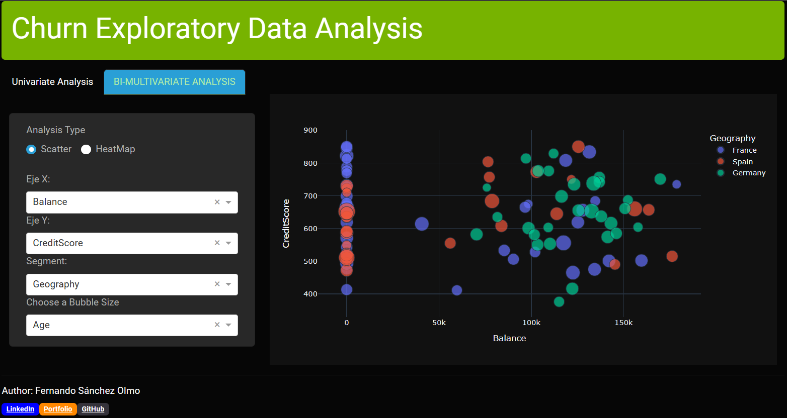
Hello Everyone, here I share my final Dashboard app its purpose is to enable the user to explore the data by itself and find its own insights and use it for making presentations of them. It could also be used for group discussions about the data.


code:
from dash import Dash,dcc,html,Input,Output,callback
import dash_bootstrap_components as dbc
import plotly.express as px
import pandas as pd

df = pd.read_csv("https://raw.githubusercontent.com/fersaol/Python_Churn_Project/main/churn.csv").head(100)
df = df.drop(columns=["RowNumber","Surname","CustomerId"])
for i in ["HasCrCard","IsActiveMember","Exited"]:
    df[i] = df[i].astype("bool")

options_uni = df.columns
options_bi = df.select_dtypes(include="number").columns
cate_options = df.select_dtypes(exclude="number").columns

app = Dash(__name__,external_stylesheets=[dbc.themes.CYBORG])

controls = dbc.Card([
    dbc.Container([
        html.H5("Options"),
        dbc.Label('Eje X:'),
        dcc.Dropdown(
                    id='dropdownUni1',
                    options=options_uni,
                    value='CreditScore'
                ),
        dbc.Label('Segment:'),
        dcc.Dropdown(
                    id='segmentUni1',
                    options=cate_options,
                    value=None
                )
    ])
],body=True)

radioitems = html.Div(
    [
        dbc.Label("Analysis Type"),
        dbc.RadioItems(
            options=[
                {"label": "Scatter", "value": "Scatter"},
                {"label": "HeatMap", "value": "HeatMap"}
            ],
            value="Scatter",
            id="BiAnalysis",
            inline=True
        ),
    ]
)

controls2 = dbc.Card([
    dbc.Container([
                html.Div([
                    radioitems,
                    html.Br(),
                dbc.Label('Eje X:'),
                dcc.Dropdown(
                    id='dropdownBi1',
                    options=options_bi,
                    value='Balance'
                ),
                dbc.Label('Eje Y:'),
                dcc.Dropdown(
                    id='dropdownBi2',
                    options=options_bi,
                    value='EstimatedSalary'
                    ),
                dbc.Label('Segment:'),
                dcc.Dropdown(
                    id='segmentBi',
                    options=cate_options,
                    value=None
                ),
                dbc.Label("Choose a Bubble Size"),
                dcc.Dropdown(
                                options=options_bi,
                                id="bubbleSize",
                                value=None),
                    ])
    ])
],body=True)

badges = html.Div([
                    html.Hr(),
                    html.H6("Author: Fernando Sánchez Olmo"),
                    html.Span([
                        dbc.Badge(
                                    "LinkedIn",
                                    href="https://www.linkedin.com/in/fernandosanchezolmo/",
                                    color="blue",
                                    className="LinkedIn"),
                        dbc.Badge(
                                    "Portfolio",
                                    href="https://fersaol.github.io/",
                                    color="warning",
                                    className="Portfolio"),
                        dbc.Badge(
                                    "GitHub",
                                    href="https://github.com/fersaol",
                                    color="#35333B",
                                    className="Github")
                                ])
                    ])


app.layout = dbc.Container([
    dbc.Alert(html.H2("Churn Exploratory Data Analysis")),

    dbc.CardHeader(
    dbc.Tabs(id='tabs',
        children=[
        dbc.Tab(label='Univariate Analysis',children=[
            dbc.Container([
                dbc.Row([dbc.Col(controls,md=4),
                        dbc.Col(dcc.Graph(id='uniGraph1',figure={}),md=8)],align="center")
                    ],fluid=True)
        ],
        active_tab_style={"textTransform": "uppercase"},
        active_label_style={"color": "#B0EBA9"}),

        dbc.Tab(label='Bi-Multivariate Analysis', children=[
                dbc.Container([
                        dbc.Row([
                                dbc.Col(controls2,md=4),
                                dbc.Col(dcc.Graph(id='biGraph1',figure={}),md=8)],align="center")],
                            fluid=True),
                ],
                active_tab_style={"textTransform": "uppercase"},
                active_label_style={"color": "#B0EBA9"}
                )],
                )),
    badges])

@callback(Output(component_id="uniGraph1",component_property="figure"),
            Input(component_id="dropdownUni1",component_property="value"),
                    Input(component_id="segmentUni1",component_property="value"))
def updateGraphTab1(xaxis,segment):

    col_type = str(df[xaxis].dtypes)

    if col_type in ["int64","float64"]:
        figUni = px.histogram(data_frame=df,x=xaxis,marginal="box",color=segment,template="plotly_dark")
    else:
        figUni = px.bar(data_frame=df,x=xaxis,color=xaxis,template="plotly_dark")
    return figUni

@callback(Output(component_id="biGraph1",component_property="figure"),
            Input(component_id="BiAnalysis",component_property="value"),
                Input(component_id="dropdownBi2",component_property="value"),
                    Input(component_id="dropdownBi1",component_property="value"),
                            Input(component_id="segmentBi",component_property="value"),
                                Input(component_id="bubbleSize",component_property="value"))
def updateGraphTab2(analysis,yaxis,xaxis,segment,size):

    if analysis != "HeatMap":
        figBi = px.scatter(data_frame=df,y=yaxis,x=xaxis,color=segment,size=size,template="plotly_dark")
    else:
        figBi = px.imshow(df[options_bi].corr("pearson").round(2),
                text_auto=True,template="plotly_dark",height=500)
    return figBi


if __name__ == '__main__':
    app.run_server(debug=True)
I hope you like, thank you!