Hello,
I’m having issues getting my Plotly JS scatter chart to render properly.
Here’s a before and after pic:
It was working properly in the before pic but not in the after pic.
As you can see, the after pic shows that it’s not really a scatter plot; it’s a line graph seemingly connecting the points in random directions. I’m still setting the type to ‘scatter’ so I’m not sure why it’s connecting the points with lines.
Here is the code from the before pic:
var chartDiv = document.querySelector('#scatter-plot-chart');
Plotly.plot(chartDiv, [{
	type: 'scatter',
	mode: 'markers',
	x: $scope.valuesX,
	y: $scope.valuesY,
	xaxis: 'x',
	yaxis: 'y',
	name: xAxisLabel,
	marker: {
		color: 'red',
		size: 3
	}
}], {
	title: 'Scatter Plot',
	dragmode: 'lasso',
	autosize: false,
	width: 400,
	height: 400,
	margin: {
		l: 30,
		r: 1,
		b: 35,
		t: 23
	},
//	paper_bgcolor: '#7f7f7f',
	plot_bgcolor: '#c7c7c7',
	showlegend: false
});
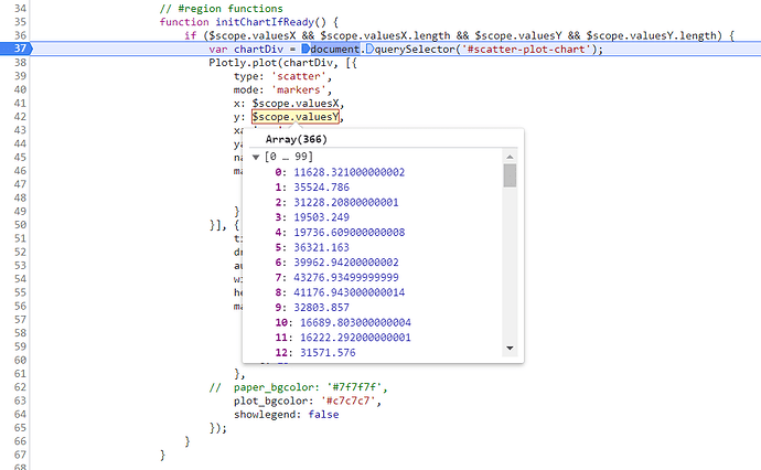
Here’s some screen shots of the x and y values:
The after pic shows what happens when I try to modify the code to handle multiple drivers. By ‘drivers’ I mean multiple series to be plotted on the x-axis so that we can see their correlation to the values on the y axis. Examples drivers may be temperature, water volume, gas flow, etc. and along the y axis, we want to see energy consumption (by how much energy goes up or down based on temperature, water volume, gas flow, etc.).
Here’s the code for the after pic:
// #region event handlers
$scope.$on('data-ready', function() {
	// Need timeout since angular digest cycle hasn't updated valuesX and valuesY yet:
	setTimeout(function() {
		var series = $scope.valuesX[0].measurementGroupId
		? _.map($scope.valuesX, function(driver) {
			return {
				type: 'scatter',
				mode: 'marker',
				x: driver.values,
				y: $scope.valuesY,
				xaxis: 'x',
				yaxis: 'y',
				name: driver.unit,
				marker: {
					color: driver.color,
					size: 3
				}
			}
		})
		: [{
			type: 'scatter',
			mode: 'markers',
			x: $scope.valuesX,
			y: $scope.valuesY,
			xaxis: 'x',
			yaxis: 'y',
			name: 'Date',
			marker: {
				color: 'red',
				size: 3
			}
		}];

		var chartDiv = document.querySelector('#scatter-plot-chart');
		Plotly.plot(chartDiv,
			series,
			{
				title: 'Scatter Plot',
				dragmode: 'lasso',
				autosize: false,
				width: 400,
				height: 400,
				margin: {
					l: 30,
					r: 1,
					b: 35,
					t: 23
				},
			//	paper_bgcolor: '#7f7f7f',
				plot_bgcolor: '#c7c7c7',
				showlegend: false
			}
		);

		$scope.dataReady = true;
	});

});
// #endregion event handlers
And here’s some screen shots of the x and y values:
First thing to note is that the Y values are the same (still just energy). The x values are also the same but wrapped up in a more complex object (so that I can specify the color, units, id, etc. separately from the actual values) of the series. (The first value of the x and y values seems to be an exception to this for some reason, but I don’t see why that should result in the way the chart renders with the lines). Second thing to note is that I’m checking the first series in valuesX for measurementGroupId (the id that identifies the series) before using lodash map to create the array of series. If measurementGroupId exists, it means there are multiple series (hence the need for an identifier on each one) and the use of lodash map is warranted. Otherwise, I create an array with just one series the way I did before. Finally, you’ll also note that even though the code is setup to handle multiple series, I’m still only giving it one series, which is the weird part because it should behave exactly as in the before case. This is where I’m stumped. I don’t know why it’s failing to render the scatter plot properly just because I’m generating the series using lodash map instead of hard coding it (unless there’s something else different that I’m missing).
Can anyone see what I’m doing wrong? Thanks!


