hello,
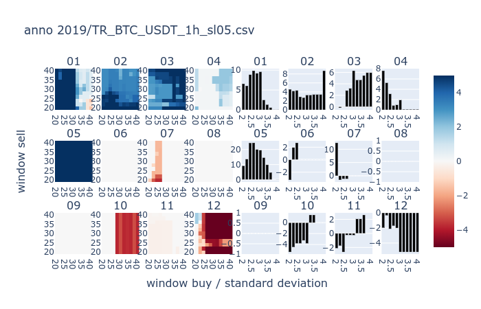
i’m trying to color the bars in the right according to a vector.
the chart is dynamically generated, so i’d like to make it for instance in shades of gray (not 50, though), from black (highest values) to white (lowest).
i believe i’ve attached the image of what i’m talking about here
i’ve searched for the go.Bar.marker reference, and it’s not hyperlinked.
if you can suggest me a way to do this, i appreciate.
i prefer to do it with graph_objects, otherwise i’d have a hard time to migrate it to express or any other sub module.
bellow here is my function that performs the plot.
the core is on fig.add_traces
hints and hunches are welcome.
best.
fernando a. bender
def plot_exDict3(_dict, filename):
for k in _dict.keys():

	_title = 'anno 20' + k + filename

	_subtitles = list(_dict[k].keys())
	_subtitles = _subtitles[:4] + _subtitles[:4] + _subtitles[4:8] + _subtitles[4:8] + _subtitles[8:] + _subtitles[8:]

	fig = make_subplots(rows=3, cols=8,
						subplot_titles=_subtitles,
						x_title='window buy / standard deviation',
						y_title='window sell')

	for _k in _dict[k].keys():

		narray_exPivot = _dict[k][_k]['_narray_exPivot']
		x_plot = _dict[k][_k]['_x_plot']
		y_plot = _dict[k][_k]['_y_plot']
		x_plot2 = _dict[k][_k]['_x_plot2']
		y1_plot2 = _dict[k][_k]['_y1_plot2']
		y2_plot2 = _dict[k][_k]['_y2_plot2']
		_row = 1 + int ( int(_k) / 4.1 )
		_col = 1 + int ( int(_k) % 4.1 )
		if int(_k) <= 4:
			_col -= 1
		fig.add_trace(
			Heatmap(
				z=narray_exPivot.transpose(),
				x=x_plot,
				y=y_plot,
				coloraxis="coloraxis"),
			row=_row, col=_col)
		fig.add_trace(
			Bar(
				x=x_plot2,
				y=y1_plot2,
				marker_color=y2_plot2),
			row=_row, col=_col + 4)

	fig.update_layout(title_text=_title, coloraxis=dict(colorscale='RdBu', cmin=-5, cmid=0, cmax=5), showlegend=False)
	fig.show()