I have a very weird bug on Dash. When ploting a bar chart using the dcc.Graph() option on dash, my x axis doesn’t take into account my x labels, and it renders a weird output. Using the exact same code using plotly gives me an accurate result. I am wondering what is wrong here:
Below the dash code:
import dash
import dash_core_components as dcc
import dash_html_components as html
import numpy as npapp = dash.Dash()
app.layout = html.Div(children=[
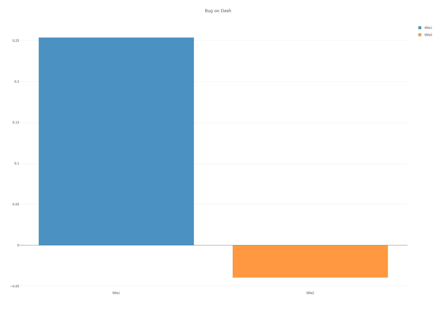
html.H1(children=‘Hello Dash’),html.Div(children=''' Dash: A web application framework for Python. '''), dcc.Graph( id='example-graph', figure={ 'data': [{'opacity': 0.8, 'visible': True, 'y': np.array([0.25364668]), 'showlegend': True, 'legendgroup': 'title1', 'hoverinfo': 'x+y+text', 'x': 'title1', 'text': 'title1', 'orientation': 'v', 'type': 'bar', 'name': 'title1'}, {'opacity': 0.8, 'visible': True, 'y': np.array([-0.03951842]), 'showlegend': True, 'legendgroup': 'title2', 'hoverinfo': 'x+y+text', 'x': 'title2', 'text': 'title2', 'orientation': 'v', 'type': 'bar', 'name': 'title2'}], 'layout': {'title': 'Bug on Dash'} } )])
if name == ‘main’:
app.run_server(debug=True)

And, ploting my graph using plotly directly, and the following code, which is exactly the same as the one I am using above gives me an accurate x axis:
import plotly.plotly as py
import numpy as np
figure={
‘data’: [{‘opacity’: 0.8, ‘visible’: True, ‘y’: np.array([0.25364668]), ‘showlegend’: True,
‘legendgroup’: ‘title1’, ‘hoverinfo’: ‘x+y+text’, ‘x’: ‘title1’,
‘text’: ‘title1’, ‘orientation’: ‘v’, ‘type’: ‘bar’, ‘name’: ‘title1’},
{‘opacity’: 0.8, ‘visible’: True, ‘y’: np.array([-0.03951842]), ‘showlegend’: True,
‘legendgroup’: ‘title2’, ‘hoverinfo’: ‘x+y+text’, ‘x’: ‘title2’,
‘text’: ‘title2’, ‘orientation’: ‘v’, ‘type’: ‘bar’, ‘name’: ‘title2’}],'layout': {'title': 'Bug on Dash'} }py.plot(figure, filename=‘’)