Dash does not display bar chart correctly

Hi,
I am working in a Jupyter Notebook with Python 3 and successfully built a bar chart with all the modifications i want:

Code:

Result:

This is exactly what I wanted.
However, when I try to display it on my dash app, the bar labels just vanish:

Dash App Layout Code:

(It’s the first Div inside this whole Div)

I tried to change the text position around, but the labels will not be displayed regardless of position. I don’t have this problem with any of my other figures (bar charts, tables, pie charts) - just with this histogram.
I also tried restarting the notebook kernel, as well as restarting my pc.

What is happening and how can I fix it?

Hi @hahaHeinrich and welcome to the forum! :tada:

I think your problem is similar tot the one in this thread: https://community.plotly.com/t/annotation-not-showing-on-dash-dcc-graph/6660

Can you try changing cliponaxis=False to cliponaxis=True on line 12?

Hi @celia , thanks for the welcome!

I tried your suggestion:
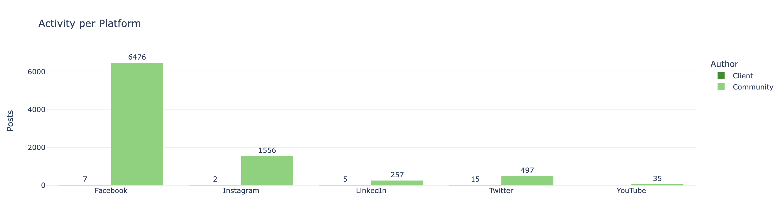
Within the notebook display the Facebook label “6476” was cut in half, the dash display did not change unfortunately.

Edit:

I built another histogram with a different set of data and have the same problem here. I think the issue might be related to the plotly.express.histogram object itself and how it is translated to be displayed on dash.

I think you are right. I have been able to replicate your problem and when the elements are inspected in the browser they are different:

Bar plot (labels work)

Histogram (labels don’t work)

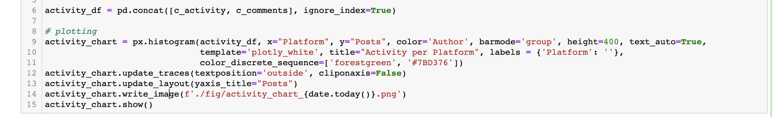
What I would do is change px.histogram for px.bar (after calculating the count). It should give you the same result but the labels will appear in the app too.

1 Like

Yes this worked perfectly!
Thank you :- )