I am trying to put notes as text on specific dates on the x-axis in my plot while still leaving the dates when no notes are present. If found the following about tickvals and ticktext but they are not working in the same way I see presented in the documentation.
Enumerated Ticks with Tickvals and Ticktext
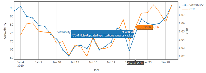
If I use this code with these lists, I get the output below:

traceA = Scatter(
x = new_df[‘Date’],
y = new_df[‘Daily_Viewability’],
name = ‘Viewability’,
yaxis = ‘y’,
mode=‘markers+lines’,
text=new_df[‘Notes’]
)
traceB = Scatter(
x = new_df[‘Date’],
y = new_df[‘TP_CTR’],
name = ‘CTR’,
yaxis = ‘y2’
)
data = [traceA, traceB]
layout = Layout(
title=‘TITLE’,
xaxis=dict(
range = [start_date, end_date],
showgrid=True,
zeroline=True,
showline=True,
mirror=‘ticks’,
gridcolor=’#bdbdbd’,
gridwidth=1,
zerolinecolor=’#969696’,
zerolinewidth=4,
linecolor=’#636363’,
linewidth=3,
title=‘Date’,
ticktext=notes_list,
tickvals=dates_list
),
yaxis=dict(
#range=[60,100],
showgrid=False,
zeroline=True,
showline=True,
mirror=‘ticks’,
gridcolor=’#bdbdbd’,
gridwidth=2,
zerolinecolor=’#969696’,
zerolinewidth=4,
linecolor=’#636363’,
linewidth=3,
title=“Viewability”
),
yaxis2=dict(
title=‘CTR’,
showgrid=False,
zeroline=True,
showline=True,
mirror=‘ticks’,
gridcolor=’#bdbdbd’,
gridwidth=2,
zerolinecolor=’#969696’,
zerolinewidth=4,
linecolor=’#636363’,
linewidth=3,
overlaying=‘y’,
side=‘right’
)
)
fig = FigureWidget(data,layout)
display(fig)

You can see from the plot that the dates do not show on the x-axis even though I am trying to only replace them at the tickvals for the 3 dates in the dates_list. The notes do show up in both the trace and the x-axis as I am specifiying though.
With this code where I comment out the tickvals and ticktext, the dates appear on the x-axis, but the notes do not appear.
traceA = Scatter(
x = new_df[‘Date’],
y = new_df[‘Daily_Viewability’],
name = ‘Viewability’,
yaxis = ‘y’,
mode=‘markers+lines’,
text=new_df[‘Notes’]
)
traceB = Scatter(
x = new_df[‘Date’],
y = new_df[‘TP_CTR’],
name = ‘CTR’,
yaxis = ‘y2’
)
data = [traceA, traceB]
layout = Layout(
title=‘TITLE’,
xaxis=dict(
range = [start_date, end_date],
showgrid=True,
zeroline=True,
showline=True,
mirror=‘ticks’,
gridcolor=’#bdbdbd’,
gridwidth=1,
zerolinecolor=’#969696’,
zerolinewidth=4,
linecolor=’#636363’,
linewidth=3,
title=‘Date’,
ticktext=notes_list,
tickvals=dates_list
),
yaxis=dict(
    #range=[60,100],
    showgrid=False,
    zeroline=True,
    showline=True,
    mirror='ticks',
    gridcolor='#bdbdbd',
    gridwidth=2,
    zerolinecolor='#969696',
    zerolinewidth=4,
    linecolor='#636363',
    linewidth=3,
    title="Viewability"
),
yaxis2=dict(
    title='CTR',
    showgrid=False,
    zeroline=True,
    showline=True,
    mirror='ticks',
    gridcolor='#bdbdbd',
    gridwidth=2,
    zerolinecolor='#969696',
    zerolinewidth=4,
    linecolor='#636363',
    linewidth=3,
    overlaying='y',
    side='right'
)
)
fig = FigureWidget(data,layout)
display(fig)
What am I missing here in terms of using tickvals and ticktext effectively to produce dates on the x-axis from the data set and then replace the dates with those from the notes_listf for the specified dates in the dates_list?