Hello,
First of all I’d like to congratulate you on this amazing library.
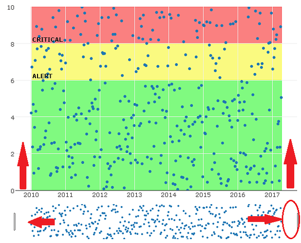
I have been using Plotly to build a data monitoring program (time series). I have an issue regarding the xaxis range because, even though I define the range within a fixed set of values, the plotted axis’ range is always bigger, which makes sense in being able to clearly see all the markers. In the context of my application I would like that extra white space to be removed (see red arrows in picture below). I’ve searched in the forums for similar issues and I haven’t found anything helpful.
Since I have data within a variable time frame, I would like the xaxis limits to be coincidental with the first (earliest) and last (latest) points of my data set.
I am aware that setting xaxis range will automatically zoom the graphic and rangeslider to the desired time frame but eventually this will be problematic when I add a rangeselector, since the “all” selector will zoom out of the desired time frame. Double-clicking the plot will also cause the plot to zoom out of the desired time window.
This is the code I am using to obtain the plot (removed the shapes and annotations for simplicity):
# Thresholds
alert = 6
critical = 8
min_value = 0
max_value = 10

# Time series
time_end <- Sys.time()
time_begin <- as.Date("2010-1-1 00:00:00")

x <- seq(time_begin, as.Date(time_end), "week")
y <- runif(n = length(x), min = 0, max = 10)

new_plot <- plot_ly(x = ~x, y = ~y)

new_plot<- layout(new_plot,
    titlefont = list(
      color = "rgba(0,0,144,1)",
      size = 16
    ),

    xaxis = list(
      title = "",
      rangeslider = list(type = "date"),
      range = c(as.numeric(as.Date(time_begin))*24*60*60*1000,
                as.numeric(as.Date(time_end))*24*60*60*1000)
  ),
  yaxis = list(title = "",
               range = c(min_value, max_value),
               showgrid=TRUE),
)
Any suggestions?
Thank you
