Thank you for your interest in submitting your Dash app to the Plotly Explore Page platform, visited by thousands of Dash users daily.
Current submissions cycle will go until February 28, 2025.
To submit your app, please reply to this thread directly.
Please refer to the following suggestions when building and submitting your app. The more suggestions your app adheres to, the more likely it is to be added to the Explore Page.
Apps in the following categories are encouraged: Energy & Utilities, Business, Predictive Analytics & Forecasting, NLP, Connecting to APIs
App should look as good or better than the current apps on the platform
App should use different data than the other apps and try to cover a unique story
Content/story should be neutral or positive
App with live data that updates itself is encouraged
App that goes beyond exploratory analysis – app that perform advanced analytics
App that uses 3rd-party libraries (e.g., SciPy, spaCy, TensorFlow, Scikit-learn)
App that solves real-life problems, app that could have practical use cases
App content and results should be easy to access (we discourage requiring log-ins or uploading data as a precursor to seeing the full app).
The Plotly Example Apps team will review the apps submitted and update this post with the names of the apps that have been selected.
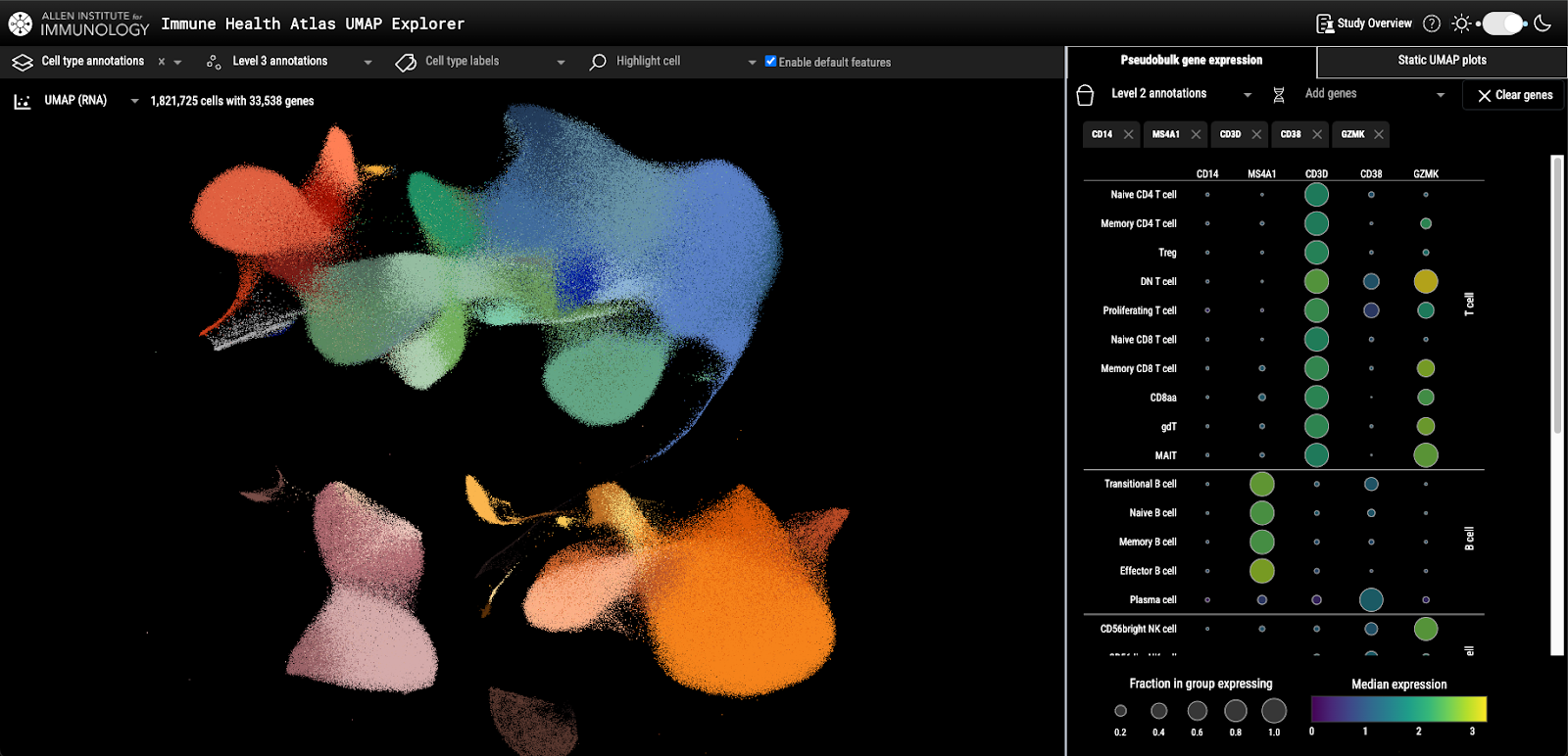
This Dash app lets users explore single-cell RNA sequencing data from 108 study participants of varying age groups, providing a snapshot of the immune system at different ages in 71 different immune cell types. The dataset consists of over 1.8 million individual cells, each with 33,000+ genes, totaling over 59 billion data points.
Dimensionality reduction techniques common in bioinformatics were utilized to visualize these data. This includes a UMAP (Uniform Manifold Approximation and Projection) scatter plot, where:
Each dot represents a single cell, positioned based on its similarity to other cells.
Users can color the plot by categories (like cell type or participant metadata) or continuous values (such as gene expression levels).
For a broader view of different immune cell types, the app includes a “pseudobulk” gene expression dot plot:
It shows median gene expression for each cell type at 3 cell type “resolutions” (levels 1, 2, and 3).
It also highlights what fraction of cells in each type express a given gene.
The following key packages were used to handle and visualize all the data:
Zarr – cloud-optimized chunked arrays for fast, scalable access to large datasets.
dash-deck – Dash component based on deck.gl, a high-performance visualization tool powered by WebGL, enabling smooth, real-time rendering of over 1.8 million points at once.
Hi Dave, thank you! Yes, we have info on the study on our website here (which can also be accessed from the “study overview” button within the app). We also have a preprint for a publication here.
a) who’s the audience for this app
b) what insights might they be looking to glean by exploring the data as made available in the app
c) are there any plans to add more capabilities to the app
d) what constraints/challenges (technical or otherwise; with plotly/dash/python/etc) did you encounter / what might be a wishlist of “if only plotly/dash could do ____”
HI @clafrance7
Thank you for sharing this beautiful app. We found some of the other apps from the Allen Institute as well. We would love to feature one of these on the Plotly Examples Page. I’ll reach out via DM.
a) Biologists, college students, or anyone interested in immunology.
b) Exploring which genes are specific to different immune cells. For example, someone hears about a gene in a research paper or news article and is curious to learn more about it. This app would be a good starting point.
c) Yes there are plans for some more features. For example, plotting density of points on the scatter plot to better visualize differences in cell type abundance based on participant metadata (like younger people have more of X cell type than older people).
d) I think the biggest challenge was making plot updates fast enough that the app wasn’t annoying to use. For example, I found that the straight-forward plotting approach (user makes some selection and the the plot is generated in python) was quite slow for this many points. I ended up storing data separately (such as the point coordinates, which don’t change throughout a session), then when a user makes a selection, like a particular gene, only those gene values are sent to the browser where a client side callback generates the plot via the deck.gl JSON API. This was the most performant approach I was able to figure out.
My name is Jordan and I am somewhat active in the Plotly Discord Channel. Over the past few months I got back into doing some front end development and playing with Plotly dash and dash-bootstrap-components. I created a Dash app which examines commercial airline travel within the USA. I grabbed 2023 data from the Bureau of transportation Statistics, using datasets T-100 Segment (All Carriers) and Reporting Carrier On Time Performance .
My App allows you to view the following for :
Passenger Statistics (Domestic and International Carriers)
Airport Statistics (Domestic and International Carriers)
Route Statistics (Domestic and International Carriers)
On Time Performance Statistics (Domestic Carriers)
I am hosting my app on Railway.app, and you can access it here: Dash
I am submitting my app for either the Business Section or the Data Visualization & Dashboards section of the explore page. Please feel free to take a look, and let me know if there’s any feedback. Additionally, let me know if I should be hosting my app on a different platform if I am submitting for the explore page.
A (fake) investment fund portfolio app, with five tabs: Performance: The fund price plotted over time. Analysis: Fund composition and price deltas. Intel: Fund asset sentiments and market sentiments plotted. Related news stories displayed. Research: Machine learning techniques used in attempt to maximise investment yield. About: The project explained: goals, ci/cd, and project architecture.
. . .
Apps in the following categories are encouraged: Business, Predictive Analytics, Connecting to APIs
App should look as good or better than the current apps on the platform
App should use different data than the other apps and try to cover a unique story
Content/story should be neutral or positive
App with live data that updates itself is encouraged
App that goes beyond exploratory analysis – app that perform advanced analytics
App that uses 3rd-party libraries (e.g., SciPy, spaCy, TensorFlow, Scikit-learn)