Thank you for your interest in submitting your Dash app to the Plotly Explore Page platform, visited by thousands of Dash users daily.
Current submissions cycle will run from September 1 to September 30, 2023.
To submit your app, please reply to this thread directly.
Please refer to the following suggestions when building and submitting your app:
- Apps in the following categories are encouraged: Energy & Utilities, Business, Predictive Analytics & Forecasting, NLP, Connecting to APIs
- App should look as good or better than the current apps on the platform
- App should use different data than the other apps and try to cover a unique story
- Content/story should be neutral or positive
- App with live data that updates itself is encouraged
- App that goes beyond exploratory analysis – app that perform advanced analytics
- App that uses 3rd-party libraries (e.g., SciPy, spaCy, TensorFlow, Scikit-learn)
- App that solves real-life problems, app that could have practical use cases
- App content and results should be easy to access (we discourage requiring log-ins or uploading data as a precursor to seeing the full app).
The Plotly Example Apps team will review the apps submitted and update this post with the names of the apps that have been selected.
Happy Dash app building!
Hi, this is a little different, not sure if it’s the kind of thing you’re looking for. I’ve been exploring Plotly and Dash as a way of displaying interactive timelines of historical data.
The app is at https://dh3968mlq-timelines-bac1706e8a48.herokuapp.com/
I’ve open sourced the code that creates the Plotly figure and handles BC and approximate dates (but not the Dash app) at GitHub - dh3968mlq/historicaldate: Interactive timelines of historical events and lives
hi @davidharris
welcome to the community. Really neat app you made. Thanks for sharing.
I love the difference you highlight between personal life and an event. I was only able to get the British Monarchs data set to plot. How can I get one of the sports data sets to show up? And what does the Redraw button do exactly? It was irresponsive for me.
Hi all,
I’m a neuroscientist and, as part of a research project I developed a simple app to show in an interactive form a relatively complex dataset we created for a publication. I would like to submit it.
I think it might have some visualizations that are slightly different from the common kinds of plots, like coronal sections of the brain that show the abundance of biological structures for each brain region.
Here’s the link:
https://www.pnnatlas.sns.it/
Source code:
https://github.com/LeonardoLupori/pnnatlas
Reference publication:
https://www.cell.com/cell-reports/fulltext/S2211-1247(23)00799-4
This is an amazing app, @lupoleon. Thanks for sharing and congratulations on getting your paper published.
This is definitely a strong contender for the Explore Page.
Also, thank you for open-sourcing the code.
Thanks for the response.
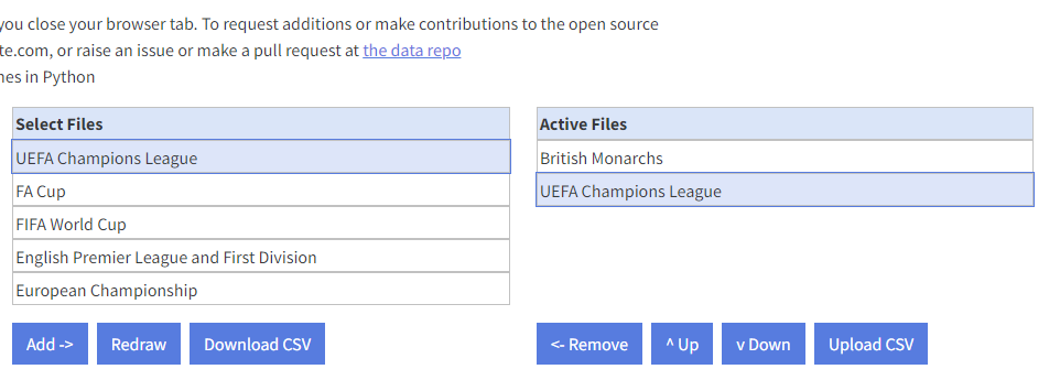
If something appears under ‘Active files’ it should also be showing on the timeline.
Is it possible you need to scroll down? The display area likely goes quite a way below the area initially showing on the screen.
If it’s not that could you let me know what browser you’re using? I’ve only tested Firefox and Chrome.
‘Redraw’ can look unresponsive if it’s just reproducing exactly the same display as before. But if you have something like ‘UEFA Champions League’ displaying, the number of separate display lines used to show it can depend on how widely zoomed the date axis is. So if you zoom in (press ‘X+’) a few times and then press Redraw it should rearrange the display.
oh right, now that I used the zoom functionality, I could see how the redraw works.
And yes, scrolling down I could see the UEFA data set. Thank you. Looks really good.
Hope I can add - I do think there’s an application area for this, maybe educational, and Plotly does seem to produce better-looking results than, say the timeline at List of English monarchs - Wikipedia
(I think including the football datasets may not have been a good move on my part - it doesn’t offer any particular value for them, and seems ot work better with lives or historical events)
Fully understand if you feel this is too different from your core subject area to be of interest, however. And it is a work in progress.
Thank you @davidharris and @lupoleon for submitting your apps to the Explore Page.
The following app will be added to the Plotly Explore Page bioinformatcis category by the end of the week.
Thank you for using Dash and Plotly in your everyday lives