 Thank you everyone for having participated in this challenge.
Integrating Power Bi semantic models into Dash or Plotly Studio is not straightforward, which is why we’re really proud of the apps that were submitted. In addition to showcasing strong visualizations, these apps stand out in their beautify and sophistication.
It was a pleasure for Plotly staff to judge these apps. After much deliberation, the winners are…
@Ester for the best Plotly Studio app.
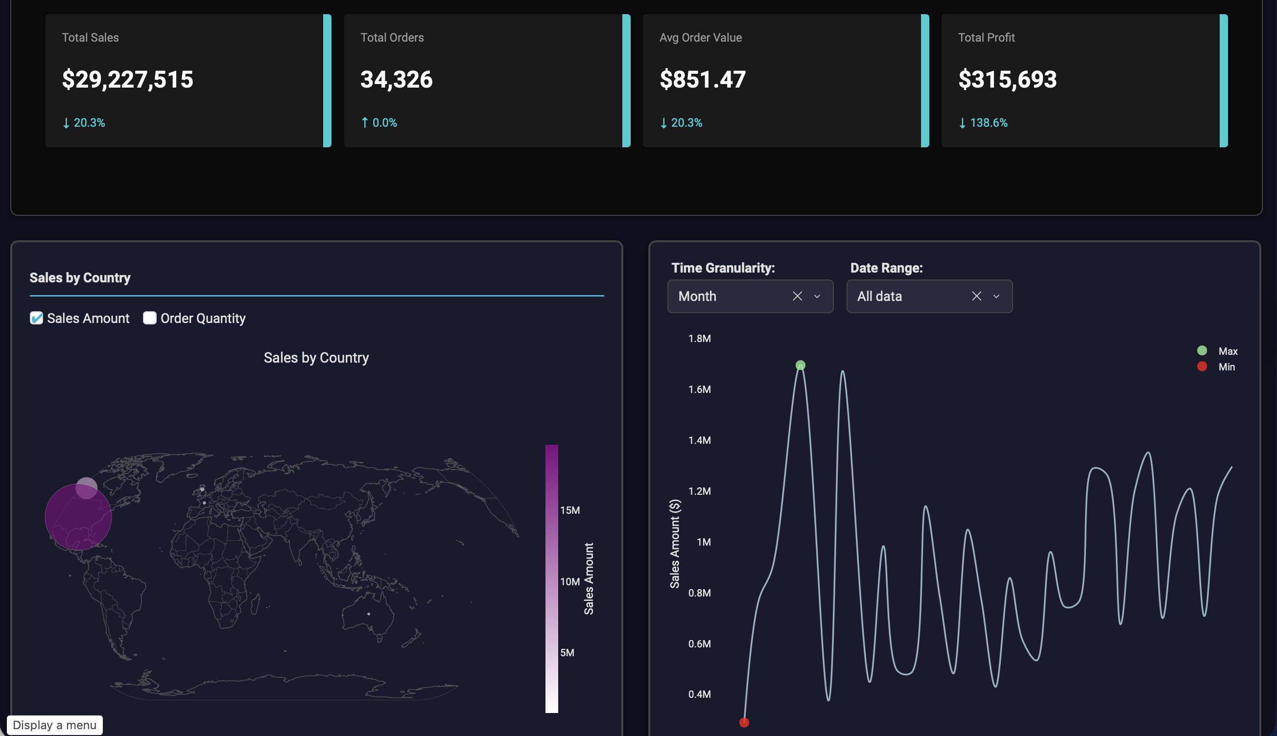
Eszter’s app is absolutely beautiful: from the unique logo at the top right, to the color theme, and the pivot table presented, her work highlights how clean and readable Plotly Studio apps can be.
In the Dash category, in 2nd place we have @back1ply with the Sales Dashboard.
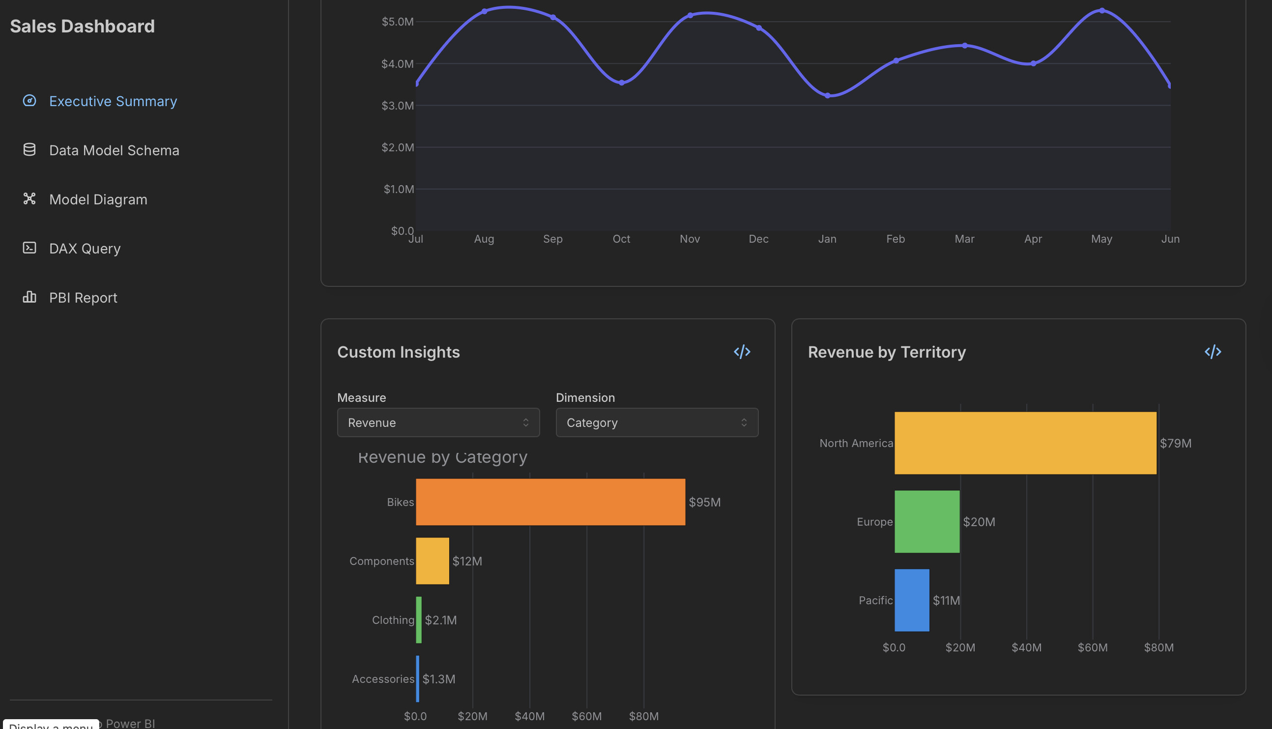
Back1ply’s app stands out thanks to the implementation of unique features not commonly seen in a Dash app. The way they integrated a DAX Query Editor and embeded the original Power BI report is phenomenal.
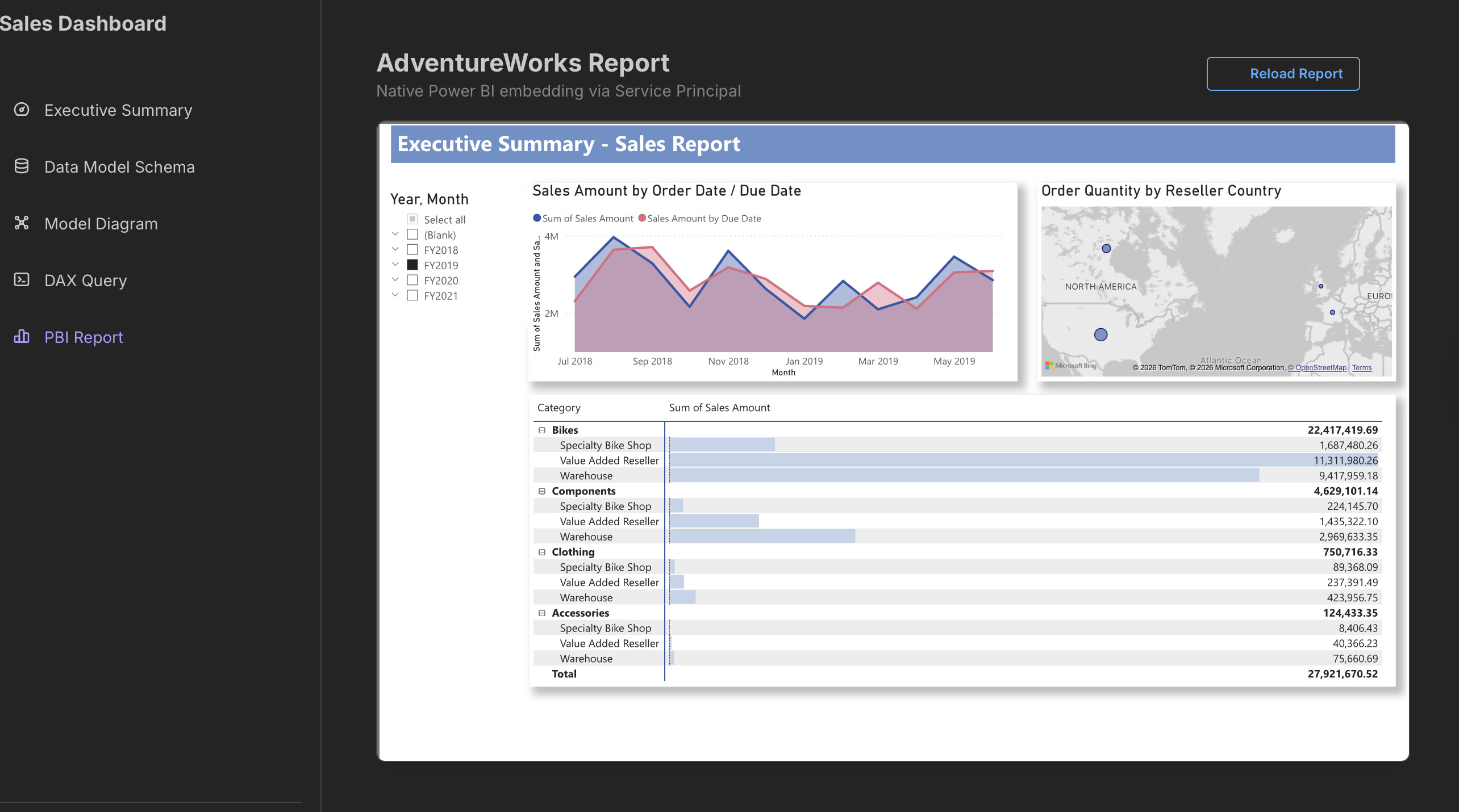
In addition, the model diagram is an elegant touch that allows one to get a bird’s eye view of the meta data. Finally, bonus points for the solid usage of the Dash Mantine Components library.
In 1st place, within the Dash category, we have @deepa-shalini and her AdventureWorks Uncharted app.


Deepa’s app wins frist place in these two categories:
- Data insights revealed from the dataset
- App UI/UX Design
The uniqueness of the charts chosen, combined with the Dash AG Grid, allows the user to explore the dataset in depth and gain quick insights. The ability to collaps the side bar and seemlessly filter the data with the controls is an element that the Plotly judges really liked.
The sunburst chart also provides a clear breakdown of the products, by order and revenue.
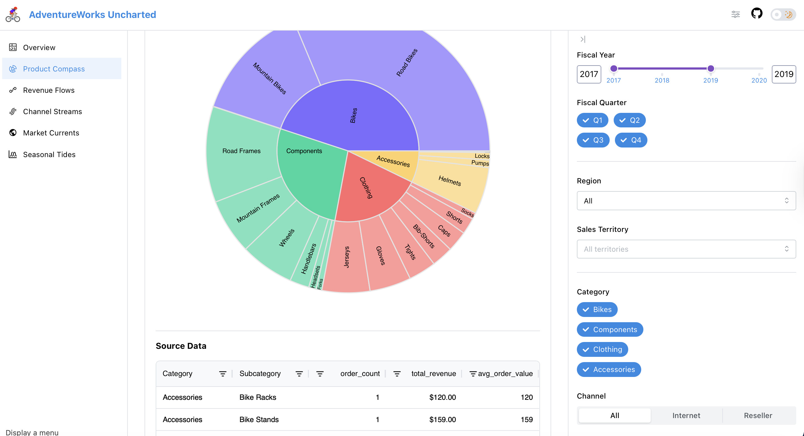
Another impressive build is the summary cards, which allow one to quickly change tabs after reading their inidividual summary.
Thank you again for making amazing Dash and Plotly Studio apps 