Hi all
Is it possible to plot dates or time on a log axis in Plotly?
Trying to achieve something like this:
I have tried the usual:
xaxis= dict(
                type='log',
            ),
But it’s not plotting anything and my axis values look like this rather than what I’m expecting in my screenshot above.
Thanks
Chris
Hi @Chris369, could you please give an example of code reproducing what you want to do? On a log-axis, if the dates are from 2011 to 2020 then the axis spacing will not be very different from a linear one since their differences are very small compared to their value. On the other hand, for dates spanning more range on a log-axis, I tried the following which works ok
import plotly.graph_objects as go
x = [1000, 2011, 2012, 2013, 2050, 2100]
y = [0.5, 1, 2, 3, 4, 5]
fig = go.Figure(go.Scatter(x=x, y=y))
fig.update_layout(xaxis_type='log')
fig.show()
Please share more code if you cannot find a solution.
Hi Emmanuelle
Thanks for the reply. Your x values are integers that happen to represent years though and I want to use x values that are of type datetime e.g.
2010-09-01 00:00:00
2010-09-02 00:00:00
2010-09-03 00:00:00
2010-09-04 00:00:00
2010-09-05 00:00:00
…
2019-12-25 00:00:00
2019-12-26 00:00:00
2019-12-27 00:00:00
2019-12-28 00:00:00
2019-12-29 00:00:00
2019-12-30 00:00:00
2019-12-31 00:00:00
With data like this as my x values and a log scale I’m getting weird labels with % (see my second screenshot) and no line is being plotted. If I change back to non-log it plots fine (with a normal looking time series labels and plot line).
Anyone else? Is this possible?
My plot with a non log x-axis works fine e.g.
By changing to 'type=‘log’ I’m wanting my x-axis to squash up like this:
But I’m getting this:
an axis type can be "linear" | "log" | "date" | "category" | "multicategory" (see https://plot.ly/python/reference/#layout-xaxis) but cannot combine date and log. What you can do is transform your dates to numerical values (using for example https://docs.python.org/3/library/datetime.html#datetime.datetime.timestamp) and set ticks manually to format them as dates (https://plot.ly/python/tick-formatting/#tickmode--array).
However, if you really want to squash your axis using a log scale will not be enough, you would need to remove a value close to the initial value for example.
ok thanks - have tried this and my plot is now appearing but my tick labels are 1.3b, 1.32b etc (the float version of the date time), even though I have set tick text as follows:
x2 = [datetime.timestamp(x) for x in x1]
x_tick_text = [datetime.fromtimestamp(x) for x in x2]
x_tick_values = [x for x in x2]
xaxis= dict(
                type='log',
                tickmode = 'array',
                ticktext=x_tick_text,
                tickvals=x_tick_values,

            ),
But you are right - the log scale is not looking as I was after and looks exactly the same as a linear scale. What do you mean by this?
you would need to remove a value close to the initial value for example.
Hi Chris,
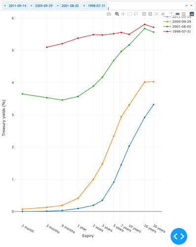
I’ve followed Emmanuelle’s advice, i.e. “transform your dates to numerical values and set ticks manually to format them as dates” and that did the trick:
The below code is not perfect but does work:
@app.callback(Output('yield-curves-graph', 'figure'),
             [Input('memory-storage', 'data')])
def updateYieldCurvesFigure(selectedYieldCurveNames):

    if selectedYieldCurveNames is None:
        raise PreventUpdate

    rates = dict()

    savedDataframe = pd.read_csv(DATA_PATH.joinpath("yield_curve.csv"))

    for selectedYieldCurveName in selectedYieldCurveNames:
        workingDataframe = savedDataframe.copy()
        workingDataframe = workingDataframe[workingDataframe['y'] == selectedYieldCurveName]
        del workingDataframe["x"]
        del workingDataframe["y"]
        rates[selectedYieldCurveName] = workingDataframe.iloc[0]

    shifts = [
        {'1 month': 30},
        {'3 months': 30 * 3},
        {'6 months': 30 * 6},
        {'1 year': 365},
        {'2 years': 365 * 2},
        {'3 years': 365 * 3},
        {'5 years': 365 * 5},
        {'7 years': 365 * 7},
        {'10 years': 365 * 10},
        {'20 years': 365 * 20},
        {'30 years': 365 * 30}
    ]

    timestamp = 0
    now = datetime.fromtimestamp(timestamp)

    timestamps = list()
    labels = list()

    for shift in shifts:
        key = shift.keys()[0]
        value = shift.values()[0]
        date = now + timedelta(days=value)
        timestamp = time.mktime(date.timetuple())
        timestamps.append(timestamp)
        labels.append(key)

    yieldCurvesFigure = {
        'data': [
            dict(
                x=timestamps,
                y=rates[selectedYieldCurveName],
                type='line',
                name=selectedYieldCurveName,
                orientation='h'
            ) for selectedYieldCurveName in selectedYieldCurveNames
        ],
        'layout': dict(
            plot_bgcolor=settings.colors['background'],
            xaxis=dict(
                type='log',
                title='Expiry',
                tickmode='array',
                tickvals=timestamps,
                ticktext=labels,
            ),
            yaxis=dict(
                type='linear',
                title='Treasury yields (%)'
            ),
            margin={'l': 50, 'b': 60, 't': 10, 'r': 20},
            legend={'x': 1, 'y': 1},
            hovermode='closest'
        )
    }

    return yieldCurvesFigure
Good luck.


