Logarifmic axis minor tick lables removing

Hi!
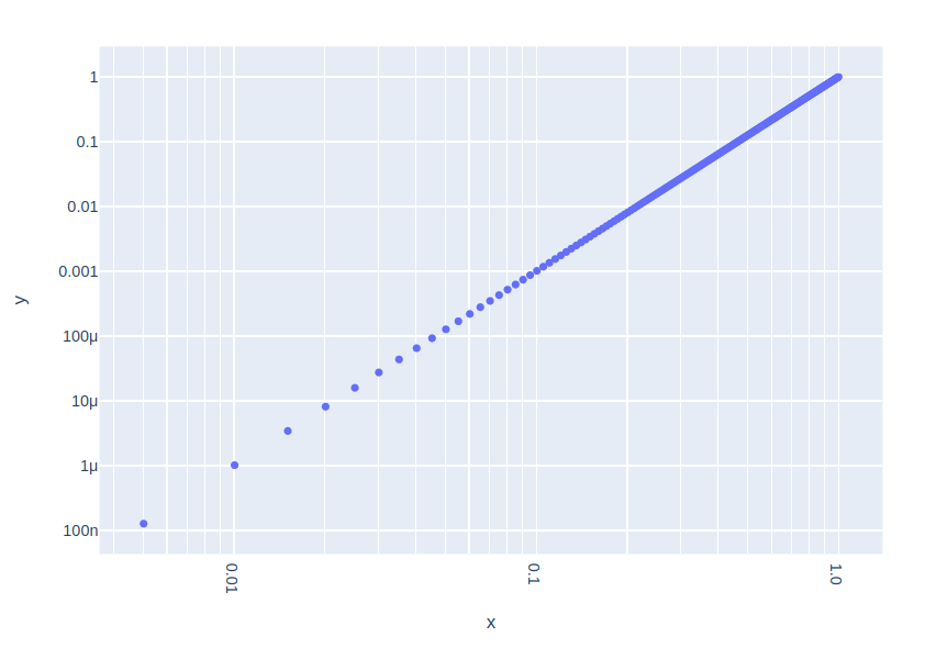
Is it possible to make the correct log Plot like

I want to remove minor ticks labels on the y-axis. My plot is

My code

fig = px.bar(ICP, x = 'Name', y = 'au', title='ICP Gold, %')
fig.update_yaxes(type="log")
fig.update_layout(
    template="plotly_white",
    #title="Us influence on CO conversion",
    xaxis_title= "Type",
    yaxis_title="log, [%]",
    font=dict(
        family="Courier New, monospace",
        size=14,
        color="black"
    )
)
fig.show()

There are some same questions in this community page but there are no answers: example

Hi @Ilia, plotly displays a ticks label for every tick line, but you can override this by passing directly the tick labels. Below is an example of how to do this (for the x axis), please also see https://plot.ly/python/axes/#enumerated-ticks-with-tickvals-and-ticktext

import numpy as np
import plotly.express as px
x = np.linspace(0, 1, 200)
fig = px.scatter(x=x, y=x**3)
tickvals = np.concatenate((np.arange(0.004, 0.01, 0.001),
                           np.arange(0.01, 0.1, 0.01),
                           np.arange(0.1, 1.1, 0.1)))
ticktext = [str(val) if val in [0.01, 0.1, 1] else '' for val in tickvals]
fig.update_xaxes(type="log", tickvals=tickvals, ticktext=ticktext)
fig.update_yaxes(type="log")
fig.show()

2 Likes

Dear, @Emmanuelle. After using your solution got Y title β€œbug”

my code

fig = go.Figure(data=[go.Bar(x = ICP['Name'], y = ICP['au'],
                                text=round(ICP['au'], 3),
                                textposition='auto')])
fig.update_yaxes(type="log", showgrid=True, dtick=1)
#your method
tickvals = np.concatenate((np.arange(0.004, 0.01, 0.001),
                           np.arange(0.01, 0.1, 0.01),
                           np.arange(0.1, 1.1, 0.1),
                           np.arange(1, 10.1, 1)))
ticktext = [str(val) if val in [0.01, 0.1, 1, 10] else '' for val in tickvals]
fig.update_yaxes(type="log", tickvals=tickvals, ticktext=ticktext, showgrid=True)


fig.update_layout(
    template="simple_white",
    #title="Us influence on CO conversion",
    xaxis_title= "Type",
    yaxis_title="log, [%]",
    font=dict(
        size=14,
        color="black")
)
fig.write_image("images/ISP.png", width=1000, height=600, scale=2)

fig.show()

Do you have any ideas about how to fix it?

Hoping to use plotly js for scientific graphs, and it would be fantastic if one were able to generate plots exactly like the one shown by Ilia (Screen Shot 2018-04-28 at 17.25.00 Β· 772Γ—808). I have searched extensively without finding a way to do this, so I assume this is not possible at the moment?

Also brilliant would be a way to switch off the minor and major grid lines independently of each other and independently of the minor and major tick marks and labels. I notice currently, in a log scale axis, the tick marks are spaced evenly and not logarithmically (at least that’s the best I was able to get), so logarithmic tick spacing would be great as well. If I have missed anything and these capabilities already exist, then apologies, and I would be grateful for a link to a resource describing how to achieve such plots.

1 Like