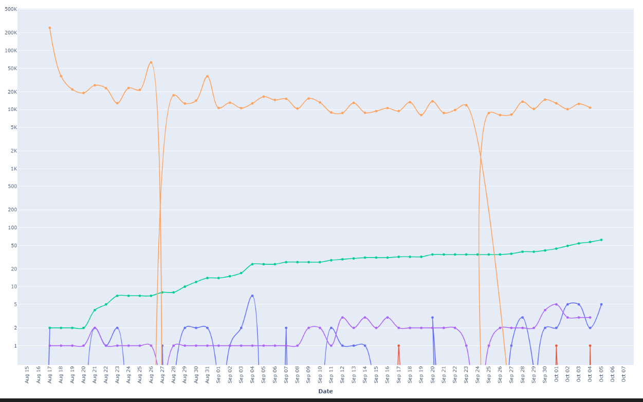
I have been trying to plot some graphs using plotly. However, the graph plotted has artifact around dates that have a 0 value(orange line). The curve should ideally be dropping to same point and rising from it. The artifact is too big to go unnoticed. Is this a plotly bug or can be fixed with some flag?
HI @novachrono welcome to the forums.
If I understand you correctly, this might help you. I replace the 0- values with np.nan and use the connectgapsparameter:
import numpy as np
import plotly.graph_objects as go
import numpy as np
np.random.seed(42)

x = np.arange(100)
y = np.ones_like(x)

y[10] = 0
y[50] = 0

#y = np.where(y==0, np.nan, y)

fig = go.Figure(
    go.Scatter(
    x=x,
    y=y,
    connectgaps=True
    )
)

fig.show()

Now, uncommenting the line where I change 0 to nan:

Hey @AIMPED . The two dates where the points are 0 are Aug 27 and Sept 24. How there are two distinct lines at those dates instead of a single smooth line. I don’t want the line to continue as if nothing happened by ignoring zero.
I misunderstood your question then.
This has to be something in your data. Did you check the dtype of the values on the x-axis?