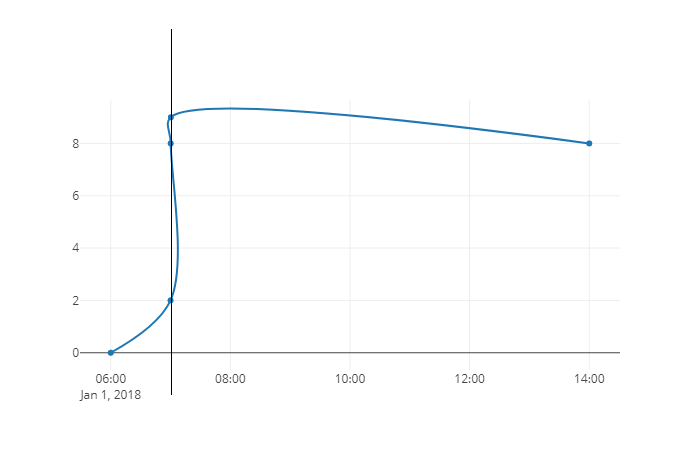
Spline bad rendering

Hallo :slight_smile:
I created line chart with data using line type “spline”:
x: [2018-01-01 07:00:00, 2018-01-01 07:00:10, 2018-01-01 07:00:20, 2018-01-01 14:00:00 ]
y: [2, 8, 9, 8]

  1. When points are close to each other line is rendered wrong (photo).
  2. I do not know why but in range slider this line is cut.

When I zoom data it is rendered properly.

There is any solution or do I do something wrong ?

import plotly

from datetime import datetime

fig = plotly.graph_objs.Figure(data=[plotly.graph_objs.Scatter(
x=[datetime(2018, 1, 1, 7, 0, 0), datetime(2018, 1, 1, 7, 0, 10), datetime(2018, 1, 1, 7, 0, 20), datetime(2018, 1, 1, 14, 0, 0)],
y=[2, 8, 9, 8],
name=‘test’,
line=dict(
shape=‘spline’
),

)]
)

plotly.offline.plot(fig, auto_open=False, filename=’/tmp/line.html’, show_link=False)

Thanks in advance!! :slight_smile:

Hi @wciurzynski,

Did you create this plot using Python? If so could you include the code you used to create it? If you created it with the Chart Editor could you move it to the Chart Editor category?

Thanks!
-Jon

Yes, I made it using Python. I edited post :slight_smile: .

Hi @wciurzynski,

Ok, I can reproduce the plot. It looks like the line is cut off at the top because the plotly.js
auto ranging logic doesn’t know about how the line curves upward a bit at the top. You can prevent the cutoff by setting this range yourself using the fig.layout.yaxis.range property.

import plotly

from datetime import datetime

fig = plotly.graph_objs.Figure(
    data=[plotly.graph_objs.Scatter(
        x=[datetime(2018, 1, 1, 7, 0, 0), datetime(2018, 1, 1, 7, 0, 10), datetime(2018, 1, 1, 7, 0, 20), datetime(2018, 1, 1, 14, 0, 0)],
        y=[2, 8, 9, 8],
        name='test',
        line=dict(shape='spline'))],
    layout={'yaxis': {'range': [1, 10]}}
)

I’m not sure what you mean when you say “When points are close to each other line is rendered wrong”. Could you elaborate?

-Jon

newplot

In this program you can observe at a guess that line for point x has 3 value instead of 1 value

import plotly
from datetime import datetime

fig = plotly.graph_objs.Figure(data=[plotly.graph_objs.Scatter(
    x=[datetime(2018, 1, 1, 6, 0, 0), datetime(2018, 1, 1, 7, 0, 0), datetime(2018, 1, 1, 7, 0, 10), datetime(2018, 1, 1, 7, 0, 20), datetime(2018, 1, 1, 14, 0, 0)],
    y=[0, 2, 8, 9, 8],
    name='test',
    line=dict(
        shape='spline'
    ),

)]
)

plotly.offline.plot(fig, auto_open=False, filename='/tmp/spline.html', show_link=False)

When I zoom chart looks properly:
good

I expect that without zoom this line will be simple. There is any solution for it ?
Thanks in advance!! :slight_smile:

Hi @wciurzynski, thanks for clarifying.

Yeah, it looks like the spline properties properties here are in screen coordinates rather than data coordinates. So the amount of ‘curviness’ is consistent as you zoom in, but not the interpolated points. There has been some discussion on the plotly.js side of supporting multiple spline types in https://github.com/plotly/plotly.js/issues/993, which I think is what would be needed to support this use case in a more intuitive way. If you have another minute, I think it would be useful to capture this situation explicitly in that issue.

In the meantime, I think your best bet is to compute the spline coordinates yourself using scipy or pandas.

-Jon