Hello, is anyone here familiar with Plotly (R or Python). I am trying to use R plotly to visualize 3D cones (vectors). Below are my codes
library(plotly)
library(tidyverse)
## Data preparation ##
rotate_x <- function(vector, theta) {
x = vector[1]
y = vector[2]
return(x*cos(theta) - y*sin(theta))
}
rotate_y <- function(vector, theta) {
x = vector[1]
y = vector[2]
return(x*sin(theta) + y*cos(theta))
}
tail_1 = c(0, 0, 0)
tail_2 = c(1, 1, 1) * 0.5
tail_3 = c(
rotate_x(tail_2, 2*pi/3),
rotate_y(tail_2, 2*pi/3),
tail_2[3]
)
tail_4 = c(
rotate_x(tail_2, -2*pi/3),
rotate_y(tail_2, -2*pi/3),
tail_2[3]
)
four_cones <- matrix(
c(tail_1, tail_2, tail_3, tail_4),
ncol = 3,
byrow = TRUE
) %>%
as.data.frame() %>%
setNames(c("X", "Y", "Z")) %>%
mutate(
U = X * c(0, 1.5, 1.75, 2),
V = Y * c(0, 1.5, 1.75, 2),
W = Z + c(-2, 0.5, 0.75, 0.1)
)
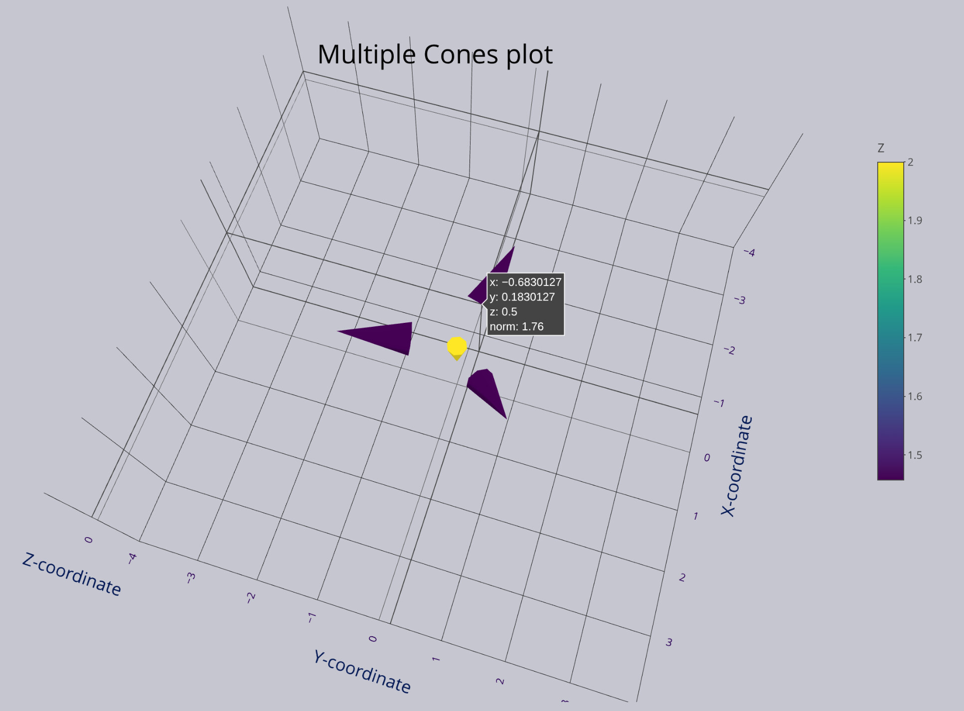
print(four_cones)
# X Y Z U V W
# 1 0.0000000 0.0000000 0.0 0.0000000 0.0000000 -2.00
# 2 0.5000000 0.5000000 0.5 0.7500000 0.7500000 1.00
# 3 -0.6830127 0.1830127 0.5 -1.1952722 0.3202722 1.25
# 4 0.1830127 -0.6830127 0.5 0.3660254 -1.3660254 0.60
## Create 3D cone plot object using plot_ly() and add_trace(type = "cone") ##
multi_3Dcone <- plot_ly( # Mapping data
data = four_cones,
x = ~X, # x has 4 elements => 4 cones
y = ~Y,
z = ~Z
) %>%
add_trace(
type = "cone",
u = ~U,
v = ~V,
w = ~W,
anchor = "tail",
sizemode = "raw",
sizeref = 2,
showscale = TRUE
)
## Display output ##
options(browser = "xdg-open") # For Linux
multi_3Dcone
The problem I encountered is that my 3D cone plot scales the color bar with the Z values, not with the magnitude (or norm) of the vectors (cones), like the picture I show here.
Can you help me to fix this? To make this plot scale the color with magnitude instead of the Z values ?