This is my code.
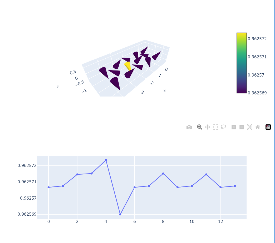
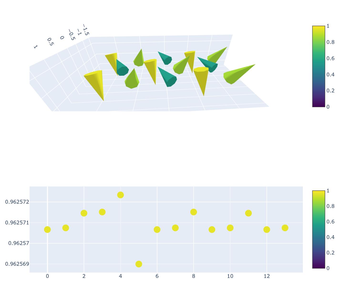
x = [0. , 1. , 2. , 0.5, 1.5, 2.5, 3. , 4. , 3.5, 0. , 1. , 2. , 3. , 4. ]
y = [ 0.8660254,  0.8660254,  0.8660254,  0.       ,  0.       ,  0.       ,  0.8660254,  0.8660254,  0.       , -0.8660254, -0.8660254, -0.8660254, -0.8660254, -0.8660254]
z = [0, 0, 0, 0, 0, 0, 0, 0, 0, 0, 0, 0, 0, 0]
u = [-0.2457108 , -0.14523492,  0.3909496 ,  0.3909698 , -0.2457666 , -0.14518224, -0.2457108 , -0.14523492,  0.3909698 , -0.2457108 , -0.14523492,  0.3909496 , -0.2457108 , -0.14523492]
v = [ 0.5456254,  0.3224986, -0.8681328, -0.8681778,  0.5457494,  0.3223816,  0.5456254,  0.3224986, -0.8681778,  0.5456254,  0.3224986, -0.8681328,  0.5456254,  0.3224986]
w = [ 0.7539638 , -0.895234  ,  0.14158978,  0.14125808,  0.753858  , -0.8952828 ,  0.7539638 , -0.895234  ,  0.14125808,  0.7539638 , -0.895234  ,  0.14158978,  0.7539638 , -0.895234  ]

fig = go.Figure()

fig.add_trace(go.Cone(
    x=x,
    y=y,
    z=z,
    u=u,
    v=v,
    w=w,
    sizemode="raw",
    sizeref=1,
    cmin=0, cmax=1.,
    colorscale="Viridis",
))
Result is here.
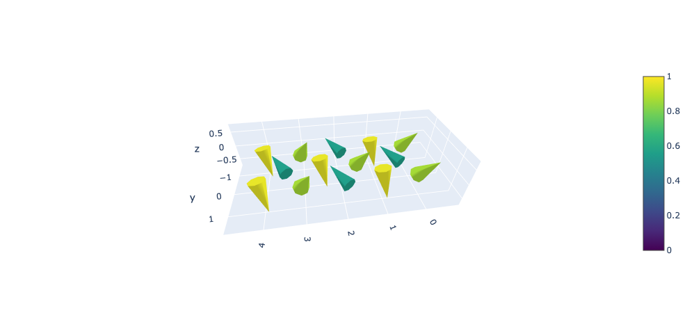
The norms of (u[i],v[i],w[i]) are very close (about 0.92), but they do not match the colorbar (they appear to range from 0.6 to 1.0).
Python verion: 3.13.9, plotly version: 6.5.0, I use macOS and vscode.