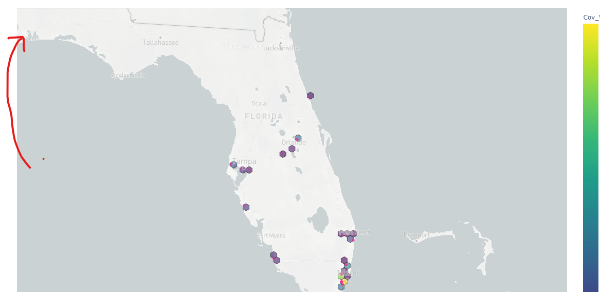
Loving the figure factory hexbin map! Is there a way I can append a table below it? I can see that my table loads up behind the hexbin map, but can’t get it to show up below it like in a subplot (row=2). Any help would be appreciated.
import pandas as pd

import numpy as np

import plotly.offline as pyo

import plotly.graph_objects as go

from plotly.subplots import make_subplots

import plotly.figure_factory as ff

import plotly.express as px

from plotly import subplots

#from plotly.tools import FigureFactory as ff

px.set_mapbox_access_token(open(".mapbox_token.txt").read())

#df = pd.read_csv('test.xlsx')

df = pd.read_excel(open('test.xlsx','rb'), sheet_name='Sheet1.xlsx')

df2 = pd.read_excel(open('test.xlsx','rb'), sheet_name='Sheet2.xlsx')

df3 = pd.read_excel(open('test.xlsx','rb'), sheet_name='Sheet3.xlsx')

df4 = pd.read_excel(open('test.xlsx','rb'), sheet_name='Sheet4.xlsx')

df5 = pd.read_excel(open('test.xlsx','rb'), sheet_name='Sheet5.xlsx')

#Initializing a figure with fff

fig = ff.create_hexbin_mapbox(

        data_frame=df5, lat="Lat", lon="Lon",

        nx_hexagon=20, opacity=0.6, labels={"color": "Cov_Wind"},

        min_count=1, color_continuous_scale="Viridis",

        show_original_data=True,

        original_data_marker=dict(size=7, opacity=0.6, color="deeppink")

)

trace1 = go.Table(

    header=dict(values=list(df2.columns),

        align='left'),

    cells=dict(values=[df2.County, df2.CountDistinctStreetAddress, df2.DistinctControlNo, df2.Premium, df2.LocationTIV],

        align='left')

)

fig.add_traces([trace1])

fig['layout']['xaxis2'] = {}

fig['layout']['yaxis2'] = {}

fig.layout.xaxis.update({'domain': [0, 1]})

fig.layout.xaxis2.update({'domain': [0, 1]})

fig.layout.yaxis.update({'domain': [0, .5]})

fig.layout.yaxis2.update({'domain': [.51, 1]})

#fig.layout.yaxis2.update({'anchor': 'x2'})

fig.layout.margin.update({'t':50, 'b':100})

fig.layout.update({'title': 'Munich FL: Weekly Report - Wind Only'})

pyo.plot(fig,filename='plotly.html')