Our users have complained about the imprecise nature of non-equant markers.
Here’s a pen which illustrates the problem with non-equant markers:
https://codepen.io/wcroteau/pen/RwwPbeb
“Plot 1” is a good example of 3 markers (the circle being the only equant marker) which all demonstrate a relatively “higher” Y-value due to their weight-center visually appearing higher when in reality all 3 of these points are equivalent.
The problem becomes even more obvious when you rotate the same marker as in “Plot 2” and the effect varies based on the amount of visual offset of the marker as in “Plot 3”.
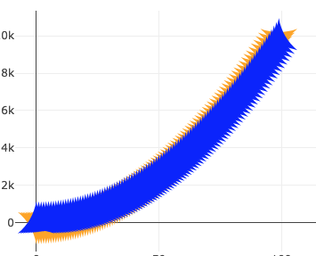
This problem is not simply academic - our users have complained that in situations similar to this:
https://codepen.io/wcroteau/pen/gOOppZp
That the orange trace seems to trend generally lower than the blue trace when in reality they are equal.
Many of the default marker shapes suffer from this problem and I recognize that some of them (e.g. ‘y-up’) do have a deterministic “center” (the intersection of the 3 line segments) however many of them do not but rather force the user to visually identify the “center” of the marker which can be somewhat dependent on the user’s interpretation.
I wonder if you would consider making all markers equant (e.g. equilateral triangles as opposed to the current isosolese variant)?
Hey, I learned a new word today, equant 
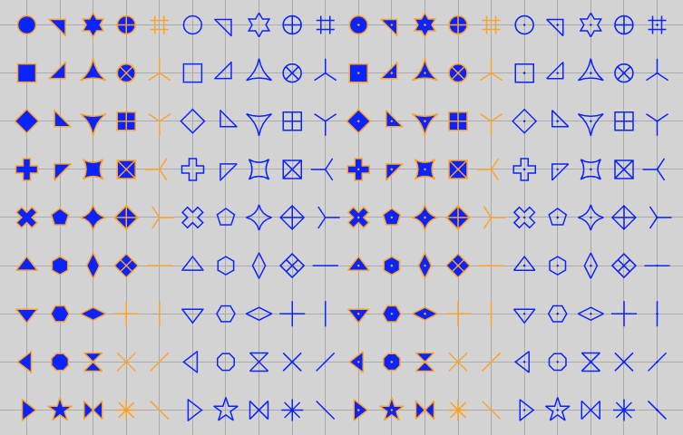
I see your point - but I think what we’ve done with markers is the best we can do at an “objectively correct” centering. Specifically, the center we choose is the center of gravity of the marker as a solid shape with zero line width (AFAICT the only cases where the latter two clauses are relevant are, as you say, the non-equilateral triangles). For the record here’s a codepen showing the aligned centers of all the markers we support: https://codepen.io/alexcjohnson/pen/XWWmpGG
Heavy overdrawing like your second codepen does cause problems - because there’s more overlap in the fatter parts of the marker, the thinner parts end up with a greater apparent weight. But it’s also not as simple as making all of these markers equilateral (the triangles in that codepen are equilateral, just with curved edges) nor fixing the vertical alignement - take a look at what happens to that very trace if I squish it horizontally - at some angles the blue appears higher, at some angles yellow does:
Honestly I think the only sure-fire solution you have to all of these concerns is to use markers that are closer to circular; for triangular markers in particular there is simply no way to satisfy all of these constraints. Restricting yourself to the 4-fold symmetric subset would go a long way, though could still have a second-order version of the issue at odd angles, where a cloud of points may look fatter in certain directions depending on the choice of marker.