Hi all,
I’m having trouble changing the marker shapes and colors when one plot is overlayed on top of another. Here’s an example:
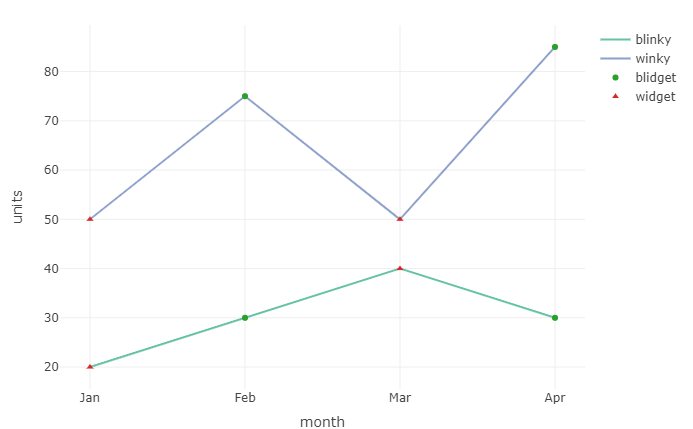
library(plotly)
library(dplyr)

df <- data.frame(month = factor(c("Jan", "Feb", "Mar", "Apr", "Jan", "Feb", "Mar", "Apr"), levels = c("Jan", "Feb", "Mar", "Apr")),
  manufacturer = c("winky", "winky", "winky", "winky", "blinky", "blinky", "blinky", "blinky"),
                 units = c(50, 75, 50, 85, 20, 30, 40, 30),
                 item = c("widget", "blidget", "widget", "blidget", "widget", "blidget", "widget", "blidget"))

plot_ly(df) %>%
  add_trace(x = ~month,
            y = ~units,
            type = "scatter",
            color = ~manufacturer,
            mode = "lines") %>%
  add_trace(x = ~month,
            y = ~units,
            type = "scatter",
            mode = "markers",
            symbol = ~item,
            symbols = c("circle-open", "circle")
            )
Instead of the symbols of the marker trace being changed to open circles and circles, they stay the default circles and triangles, like in the png below. Am I doing something wrong? Thanks in advance for the help.