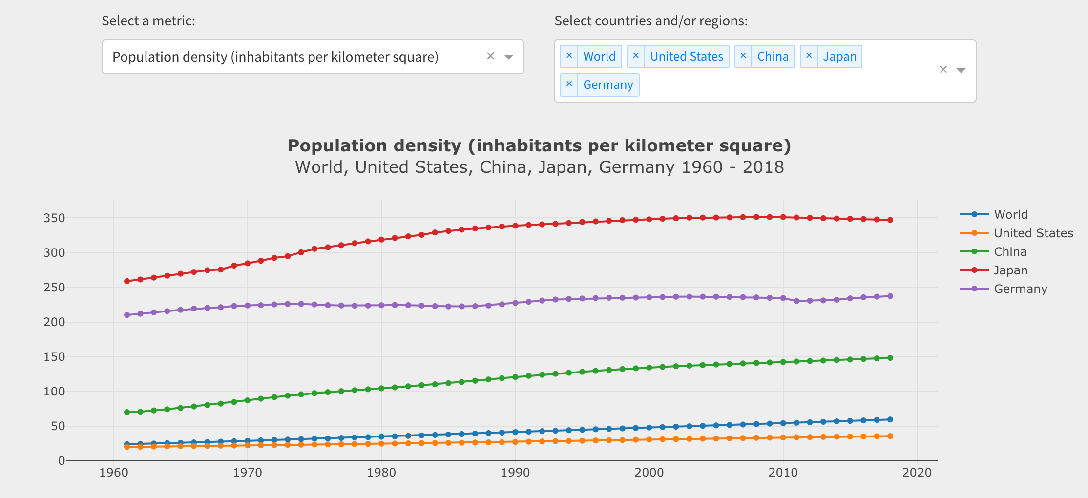
I just created a dashboard for analyzing migration and population density data based on WorldBank data.
Three datasets were imported and merged, and a choropleth map, a bar chart, and a time series chart allow for exploration in a top-down and a bottom-up approach. “Which were the top/bottom countries in year X?” and “How did metric Y evolve in time for certain countries and/or regions?”.

In addition to pandas for data manipulation and pandas_datareader for importing the data, the following Dash package versions were used:
dash==1.7.0
dash-bootstrap-components==0.7.2
dash-core-components==1.6.0
dash-html-components==1.0.2
dash-renderer==1.2.2
plotly==4.2.1
Live dashboard: https://www.dashboardom.com/migration-population
Code: https://github.com/eliasdabbas/migration-population
Dataset: https://www.kaggle.com/eliasdabbas/migration-data-worldbank-1960-2018
All feedback more than welcome.
Thanks!
