Hi,
Having some issues with log plots in py. First issue is when I define log axes ticks the y-axis label flies off to the side - I raised this on git here - https://github.com/plotly/plotly.py/issues/2359
And today I have tried to get my Y-axis to start at 0.
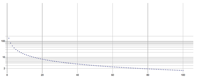
I start with this plot:
Which doesn’t start at 0 on the Y. So I first tried to set
yaxis_rangemode='tozero'
In the update_layout method but this didn’t appear to do anything.
So I set the axes manually using
yaxis_range=[0,200]
as the max point is ~150. This results in a weird compressed plot:
Which even when I zoom in on doesn’t actually seem to have started at 0?:
Any ideas? I need to start the Y-axis at 0. I’m not even too bothered about having the max set to 200 - it’s fine as it was in the original plot.
Thanks.


