Interpolating a cyclic colormap

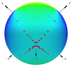
I’m plotting a cyclic value over a sphere using graph_objects.Surface, and I’m using the ‘Phase’ colourmap. When the value goes from 1->0, the plot interpolates through the whole colormap between the two values as shown below.

image

I was wondering if there was a way to disable the interpolation, or interpolate cyclic colormaps correctly.

I have also tried plotting as Mesh3d and using intensitymode=‘cell’, which looks roughly correct, but then I run into a new set of problems as I have n-long 1D lists of x, y, z, and phase, and I’m getting confused about how to convert the n vertex values to ~2n face values.

Any help is appreciated, thank you!

Hi @Graham,

To get help you should provide your code and data. From your story it’s difficult to understand what you really expect from mapping circular data onto sphere.

Hi @empet,

Thanks for the response. Here’s some example data and code:

Data example: plotly_cyclic_phase_example.txt - Google Drive

import numpy as np
import plotly.graph_objects as go

# Import data
filename=r"C:\Downloads\plotly_cyclic_phase_example.txt" #Change this to where ever the file is
phase = np.genfromtxt(filename,delimiter=',')
n_theta = 51
n_theta_ip = 101

#Define sphere coordinates
theta, theta_ip = np.mgrid[0: np.pi:n_theta*1j,-np.pi:np.pi:n_theta_ip*1j]
x = np.sin(theta)*np.cos(theta_ip)
y = np.sin(theta)*np.sin(theta_ip)
z = np.cos(theta)

# Make figure and plot
fig = go.Figure()
fig.add_trace(go.Surface(x=x, y=y, z=z, 
                         surfacecolor=phase, 
                         colorscale='Phase', 
                         cmin=-np.pi, 
                         cmax=np.pi, 
                         lighting=dict(ambient=1,roughness=1)))
fig.show()

I get the artifacts from when the shading interpolates between pi and -pi. I understand why this is happening, but I was trying to figure out a way to prevent it.

image

With matplotlib you can stop the interpolation completely with “shade=False” in plot_surface. This gets rid of the artifacts. I’ve been trying to find a way to do this with go.Surface but haven’t found anything yet.

import matplotlib.pyplot as plt
from seaborn import color_palette
from mpl_toolkits.mplot3d import Axes3D
from matplotlib.colors import ListedColormap

# Import data
filename=r"C:\Downloads\plotly_cyclic_phase_example.txt" #Change this to where ever the file is
phase = np.genfromtxt(filename,delimiter=',')
phase0 = np.mod(phase,2*np.pi)/(2*np.pi) # Normalised to 0-1

# Define sphere coordinates
n_theta = 51
n_theta_ip = 101
theta, theta_ip = np.mgrid[0: np.pi:n_theta*1j,-np.pi:np.pi:n_theta_ip*1j ]
x = np.sin(theta)*np.cos(theta_ip)
y = np.sin(theta)*np.sin(theta_ip)
z = np.cos(theta)

# Convert seaborn husl colourpalette to matplotlib colourmap
huslwheel=color_palette("husl", 256)
husl_cmap = ListedColormap(huslwheel)

# Make figure, axes and plot phase
fig = plt.figure(figsize=(3, 3),dpi=300)
ax = fig.add_axes([0,0,1,1],projection='3d')
surf = ax.plot_surface(
    x,y,z, rstride=1, cstride=1, facecolors=husl_cmap(phase0), shade=False)
ax.view_init(elev=-30, azim=30)

Thank you again for your help.

@Graham

Your data are not periodic:

phase.min()
-3.02937499999999

phase.max()
3.26187500000001

min and max values must be -3.14…, 3.14… to get a plot without that boundary line.
Plotly maps the values of the array phase onto the cyclic colorscale. But the min value -3.029 is mapped to a distinct color from that of 3.14 (cmax=pi).

To see better the artifacts I used the hsv colorscale:


pl_hsv=[[0.0, 'rgb(0, 242, 242)'],#S=1, V=0.95, 
 [0.083, 'rgb(0, 121, 242)'],
 [0.166, 'rgb(0, 0, 242)'],
 [0.25, 'rgb(121, 0, 242)'],
 [0.333, 'rgb(242, 0, 242)'],
 [0.416, 'rgb(242, 0, 121)'],
 [0.5, 'rgb(242, 0, 0)'],
 [0.583, 'rgb(242, 121, 0)'],
 [0.666, 'rgb(242, 242, 0)'],
 [0.75, 'rgb(121, 242, 0)'],
 [0.833, 'rgb(0, 242, 0)'],
 [0.916, 'rgb(0, 242, 121)'],
 [1.0, 'rgb(0, 242, 242)']]

and got this image:

The trick made by matplotlib gives a false information as long as your data are not periodic.

1 Like

Hi @empet, thank you for your response & help.

Sorry I didn’t realise the data went beyond pi. It is a phase so one can add or subtract 2N pi to give equivalent values. If I add in the line:

phase0 = np.mod(phase,2*np.pi)

and then plot phase0 with cmin=0, cmax=2*np.pi, then I still get these artifacts.

I guess it’s because if you had, say, a 0-1 colourmap, and two adjacent points 0.9 and 0.1, then it interpolates through the whole map 0.9 → 0.1. Ideally there would be a way to indicate that it’s a cyclic map and to interpolate through the shortest distance, 0.9 → 1 = 0 → 0.1. I guessed that’s too niche to be built into the plot function, so I was hoping there was some way to turn off the interpolation, then I could potentially write that cyclic interpolation manually into the data or leave it ‘pixelated’.

I don’t see how the matplotlib shade=False method gives false information, the only problem I can see is that it colours the face based on the value in one corner, so the data look shifted from their ‘true’ positions, but I can imagine a hacky way to fix that.

@Graham,
Yes, theoretically any interval of length 2*pi, should be mapped correctly, but Plotly has no special mapping for periodic values onto a cyclic colormap. You should adapt your values to the rule of interpreting a cyclic colorscale. For example, when using the HSV colormap (but not recommended due to variation of lightness), you should ensure by code that 0 is mapped to red, pi to cyan, etc, as in this colorwheel:

ColorWheelV1

See an example with no artifacts in this file.

1 Like

Hi @empet , the example file you sent is exactly what I’m after, however I’m still struggling to understand how you achieved it. Is it possible to share the code used to make that plot?

I have managed to do a dodgy work-around by defining two colourmaps with pi shift between them, and plotting the top half of the sphere with one and the bottom half with the other.

image

I’m not sure what you mean by “ensure by code that 0 is mapped to red, pi to cyan, etc”, I can map the values to the colours on the cyclic colourscale but I still (sometimes) get the artifacts when the data goes 2pi->0 or 0->2pi. I thought maybe you meant you could pass an array of colours to the surfacecolor argument, but it doesn’t seem like I’m allowed to do that.

Thank you again for all your help.

@Graham

I posted a notebook (https://chart-studio.plotly.com/~empet/15911 ) to illustrate when periodic data are plotted correctly with a cyclic colorscale and when the corresponding plot can exhibit artifacts.
Please download it and run each cell.

1 Like

Hi @empet, this is really brilliant, thank you so much!

Based on this I think the issue in the original image I posted was to do with the colour map/data not being properly cyclic (giving the artifacts in solid lines), and the problem after that was to do with poor discretisation (giving patchy artifacts) as I only have 51x101 points thanks to a very expensive calculation.

If I do some manual interpolation I can get rid of the artifacts. I did the interpolating with the mean of circular quantities which I think is reasonable as long as the phase is slowly changing.

51x101:
image

101x201:
image

201x401:
image

Thank you again for all your help, it is very generous.