Infinite Callback Recursion

I’m getting an issue where my expected behavior is that the figure that is inputted into the callback will update and change the graph to have a different xaxis range. Currently, the code will run forever in an infinite recursion loop. The reason I think this is happening is because the figure updates itself and that runs the callback once again.

Anyone else have this issue?

    Output(component_id='generated-graph', component_property='figure'),
    Input(component_id='generated-graph', component_property='figure'),
    Input(component_id='date-picker', component_property='start_date'),
    Input(component_id='date-picker', component_property='end_date'),
    prevent_initial_call = True
)
def month_filtering(fig, start, end):
    fig = go.Figure(fig)

    fig.update_xaxes(autorangeoptions_clipmax=start)
    fig.update_xaxes(autorangeoptions_clipmax=end)

    return fig

Welcome to the forums @danejcamacho.

Unfortunately your code snippet is not suffice to help you. What other callback do you have in your app?

Thanks for your help, this is the callback that creates the graph.

@callback(
    Output(component_id='graph-container', component_property='children'),
    Input(component_id='specific-test-selection', component_property='value'),
    Input(component_id='graph-type-selection', component_property='value'),
    prevent_initial_call=True
)
def update_graph(selected_path, graph_type):
    if selected_path is None:
        return html.Div()  # Return empty if no path is selected

    # Filter the DataFrame based on the selected path
    dff = df[df['readable_path'] == selected_path]

    if dff.empty:
        return html.Div("No data available for the selected path.")

    # Create the plot based on the selected graph type
    if graph_type == 'scatterplot':
        fig = px.scatter(dff, x='date', y='measurement', hover_data=['gitSHA'])
    if graph_type == 'lineplot':
        fig = px.line(dff, x='date', y='measurement', hover_data=['gitSHA'])

    fig.update_xaxes(type='date')
    fig.update_yaxes(type='linear')
    fig.layout.width = 500
    fig.layout.height = 500 

    return dcc.Graph(id='generated-graph', figure=fig)

And this is the callback that generates that ‘specific-test-selection’ dropdown…

    Output(component_id='specific-test-dropdown-holder', component_property='children'),
    Input(component_id='test-selection', component_property='value'),
    prevent_initial_call=True
)
def update_test_selection(selected_test):
    # Get all readable paths that match the selected test name
    dff = df[df['test_name'] == selected_test]
    
    # Create a dropdown for all readable paths associated with the selected test name
    return dcc.Dropdown(
        options=[{'label': path, 'value': path} for path in dff['readable_path'].unique()],
        value=selected_test, 
        id='specific-test-selection',
        clearable=False
    )

The format of my app is that I have a dropdown that creates a more specific dropdown, and from that specific dropdown I filter my df to generate a graph. My goal is to have my dcc.DatePickerRange narrow down my graph’s x-axes to see only that range of points. The graph is of Dates on the x axis and a measurement on the y axis.

#in app.layout
 dcc.DatePickerRange(
            id='date-picker',
            min_date_allowed=df['date'].min(),
            max_date_allowed=df['date'].max(),
            start_date=df['date'].min(),
            end_date=df['date'].max()

        ),

Thank you again for your help! Let me know if there is any more information you need.

If you just want to adapt the ranges, I would use partial updates and Patch. That’s way faster than creating the figure and updating it.

from dash import Patch

@callback(
    Output(component_id='generated-graph', component_property='figure'),
    Input(component_id='generated-graph', component_property='figure'),
    Input(component_id='date-picker', component_property='start_date'),
    Input(component_id='date-picker', component_property='end_date'),
    prevent_initial_call=True
)
def month_filtering(fig, start, end):

    patched = Patch()
    patched["layout"]["xaxis"] = {"range": [start, end]}
    patched["layout"]["title"] = {"text": f'Filtered Data from {start} to {end}'}

    return patched

As you can see, you do not need the figure as input.

MRE:

import dash
from dash import dcc, html, Input, Output, callback, Patch
import plotly.graph_objects as go
import pandas as pd
import datetime
import random

# Initialize the Dash app
app = dash.Dash(__name__)

# Sample data for demonstration
dates = pd.date_range('2023-01-01', '2024-12-31', freq='D')
sample_data = pd.DataFrame({
    'date': dates,
    'value': [random.random() for _ in range(len(dates))]
})

# Create initial figure
initial_fig = go.Figure()
initial_fig.add_trace(go.Scatter(
    x=sample_data['date'],
    y=sample_data['value'],
    mode='lines',
    name='Sample Data'
))
initial_fig.update_layout(title='Sample Time Series Data')

# App layout
app.layout = html.Div([
    html.H1("Dash App with Date Filtering"),

    dcc.DatePickerRange(
        id='date-picker',
        start_date=datetime.date(2023, 1, 1),
        end_date=datetime.date(2024, 12, 31),
        display_format='YYYY-MM-DD'
    ),

    dcc.Graph(
        id='generated-graph',
        figure=initial_fig
    )
])


# Your callback function (with corrections)
@callback(
    Output(component_id='generated-graph', component_property='figure'),
    Input(component_id='date-picker', component_property='start_date'),
    Input(component_id='date-picker', component_property='end_date'),
    prevent_initial_call=True
)
def month_filtering(start, end):

    patched = Patch()
    patched["layout"]["xaxis"] = {"range": [start, end]}
    patched["layout"]["title"] = {"text": f'Filtered Data from {start} to {end}'}

    return patched


# Run the app
if __name__ == '__main__':
    app.run(debug=True)
1 Like

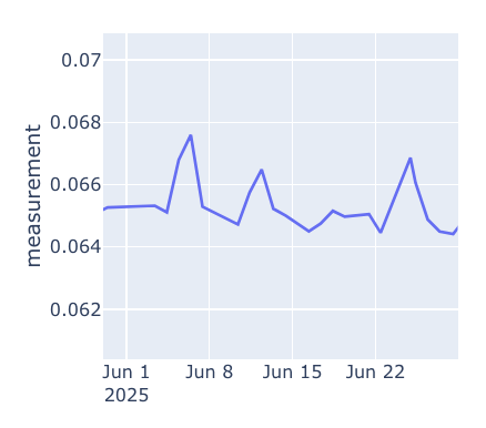
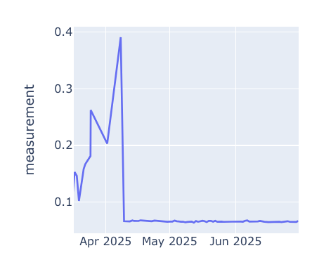
Thank you! This covers the x axis nicely. I also want to scale the graph on the y axis so the data points are not sitting at the bottom of the screen.

UnPatched Graph

Patched Graph

Intended Behavior

** I accomplished getting this screenshot by just doing a box zoom on the graph, I want a way to do that programmatically

You will have to figure out the min and max values on the y axis in the zoomed in graph. There are several ways of doing so, here is one approach. I filter the df first depending on the x-axis range and write the values into a dcc.Store(). Afterwards I update the graph. This should work ok for smaller df.

import dash
from dash import dcc, html, Input, Output, callback, Patch
import plotly.graph_objects as go
import pandas as pd
import datetime
import random

# margin for y range
MARGIN = 0.1

# Sample data for demonstration
dates = pd.date_range('2023-01-01', '2024-12-31', freq='D')
sample_data = pd.DataFrame({
    'date': dates,
    'value': [100]*100 + [random.random() for _ in range(len(dates)-100)]
})

# ensure datetime
sample_data['date'] = pd.to_datetime(sample_data['date'])

# function for df filtering
def get_min_max(df: pd.DataFrame, min_date: str, max_date: str) -> dict:
    filtered = df.query(f'"{min_date}" <= date <= "{max_date}"')
    return {
        "min_date": filtered.min().date,
        "min_val": filtered.min().value,
        "max_date": filtered.max().date,
        "max_val": filtered.max().value
    }

# Create initial figure
initial_fig = go.Figure()
initial_fig.add_trace(go.Scatter(
    x=sample_data['date'],
    y=sample_data['value'],
    mode='lines',
    name='Sample Data'
))
initial_fig.update_layout(title='Sample Time Series Data')


# Initialize the Dash app
app = dash.Dash(__name__)

# App layout
app.layout = html.Div([
    html.H1("Dash App with Date Filtering"),

    dcc.DatePickerRange(
        id='date-picker',
        start_date=datetime.date(2023, 1, 1),
        end_date=datetime.date(2024, 12, 31),
        display_format='YYYY-MM-DD'
    ),

    dcc.Graph(
        id='generated-graph',
        figure=initial_fig
    ),
    dcc.Store(id="min_max_y")
])

# get min max for selected range
@callback(
    Output(component_id='min_max_y', component_property='data'),
    Input(component_id='date-picker', component_property='start_date'),
    Input(component_id='date-picker', component_property='end_date'),
    prevent_initial_call=True
)
def month_filtering(start, end):
    return get_min_max(sample_data, start, end)

# update graph
@callback(
    Output(component_id='generated-graph', component_property='figure'),
    Input(component_id='min_max_y', component_property='data'),
    prevent_initial_call=True
)
def month_filtering(data):
    patched = Patch()
    patched["layout"]["xaxis"] = {"range": [data.get("min_date"), data.get("max_date")]}
    patched["layout"]["yaxis"] = {"range": [data.get("min_val")*(1-MARGIN), data.get("max_val")*(1+MARGIN)]}

    patched["layout"]["title"] = {"text": f'Filtered Data from {data.get("min_date")} to {data.get("max_date")}'}

    return patched


# Run the app
if __name__ == '__main__':
    app.run(debug=True)
1 Like