How to implement custom plotly bubble chart

I new to plotly library , I want to visualize a dafarame into a plotly Bubble chart.

here’s the code :

import plotly.graph_objects as go
import plotly.graph_objects as px 
import streamlit as st
import pandas as pd

data = {'x': [1.5, 1.6, -1.2],
        'y': [21, 16, 46],
        'circle-size': [10, 5, 6],
        'circle-color': ["red","blue","green"]
        }
# Create DataFrame
df = pd.DataFrame(data)
st.dataframe(df)
fig = px.scatter(df, x="x", y="y", color="circle-color",
                 size='circle-size')
fig.show()
st.plotly_chart(fig

)

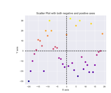
I have problems, the first one is how to plug the dataframe(df) with plotly to see the data ? and the second I’m lookng to implement a custom bubble chart, something with colors with negative values like this :

can anyone help pleas to solve these problems ? thnaks

Hey @Youp

this code

import plotly.graph_objects as go
import plotly.express as px 
import pandas as pd

data = {'x': [1.5, 1.6, -1.2],
        'y': [21, 16, 46],
        'circle-size': [10, 5, 6],
        'circle-color': ["red","blue","green"]
        }
# Create DataFrame
df = pd.DataFrame(data)
fig = px.scatter(df, x="x", y="y", color="circle-color",
                 size='circle-size')
fig.show()

creates

As for your second question, what do you want to do? Have a different background color in each axis sector? If so, you could create shapes.

Here a full example:

import plotly.graph_objects as go
import plotly.express as px 
import pandas as pd

margin_factor = 1.6

data = {'x': [1.5, 1.6, -1.2],
        'y': [21, -16, 46],
        'circle-size': [10, 5, 6],
        'circle-color': ["red","blue","green"]
        }

red_x = min(data["x"]) * margin_factor
red_y = max(data["y"]) * margin_factor

blue_x = max(data["x"]) * margin_factor
blue_y = min(data["y"]) * margin_factor

# Create DataFrame
df = pd.DataFrame(data)
fig = px.scatter(df, x="x", y="y", color="circle-color",
                 size='circle-size')

fig.add_scatter(
    x=[0, 0, red_x, red_x],
    y=[0, red_y, red_y, 0],
    fill="toself",
    fillcolor="rgba(255,0,0,0.5)",
    zorder=-1,
    mode="markers",
    marker_color="rgba(0,0,0,0)",
    showlegend=False,
    hoverinfo="skip"
)

fig.add_scatter(
    x=[0, 0, blue_x, blue_x],
    y=[0, blue_y, blue_y, 0],
    fill="toself",
    fillcolor="rgba(0,0,255,0.5)",
    zorder=-1,
    mode="markers",
    marker_color="rgba(0,0,0,0)",
    showlegend=False,
    hoverinfo="skip"
)
fig.show()

@AIMPED thanks for your time and effort, Yes you are right the code is working but for the second issue, I do not want shapes, I need to have something like this :

is it possible with plotly please ?

not sure what I am looking at. Looks like a standard scatter plot, doesn’t it?

Yes a standard one.

1 Like

are you referring to the dotted lines?

something like this :slight_smile:

@AIMPED did you get what I meant please ? I dont want the way plotly sdisplays the bubbles…I need to display them in a chart like this :

Like this?

import plotly.graph_objects as go
import plotly.express as px 
import pandas as pd

margin_factor = 1.6

data = {'x': [1.5, 1.6, -1.2],
        'y': [21, -16, 46],
        'circle-size': [10, 5, 6],
        'circle-color': ["red","blue","green"]
        }

x_max = max(
    [
        max(data["x"]), 
        abs(min(data["x"]))
    ]
) * margin_factor

y_max = max(
    [
        max(data["y"]), 
        abs(min(data["y"]))
    ]
) * margin_factor

# Create DataFrame
df = pd.DataFrame(data)
fig = px.scatter(
    df,
    x="x", 
    y="y", 
    color="circle-color",
    size='circle-size'
)


fig.update_xaxes(range=[-x_max, x_max], )
fig.update_yaxes(range=[-y_max, y_max])


fig.update_layout(
    {
        'xaxis': {
            'zerolinewidth': 3, 
            "zerolinecolor": "blue",
            # "zerolinedash": "does not exist",
            # "linewidth": 3, 
            # "linecolor": "red", 
            # "linedash": "does not exist",
            # "gridwidth": 2,
            # "gridcolor": "black",
            # "griddash": "dashdot"
        },
        'yaxis': {
            'zerolinewidth': 3, 
            "zerolinecolor": "green",
            # "zerolinedash": "does not exist",
            # "linewidth": 3, 
            # "linecolor": "red", 
            # "linedash": "does not exist",
            # "gridwidth": 2,
            # "gridcolor": "black",
            # "griddash": "dashdot"
        },
        "width": 500,
        "height": 500
    }
)
fig.show()

I just adjusted the axis ranges

If you need the axes to have the same range, i.e same scaling on each axis, you need to set the range accordingly.

thanks a lot ,
If you need the axes to have the same range, i.e same scaling on each axis, you need to set the range accordingly.
=> where I can do that please ? I want to have this range 0 25 75 100 0 -25 -75 -100 by deault

like this :

import plotly.graph_objects as go
import plotly.express as px 
import pandas as pd


data = {'x': [1.5, 1.6, -1.2],
        'y': [21, -16, 46],
        'circle-size': [10, 5, 6],
        'circle-color': ["red","blue","green"]
        }

# Create DataFrame
df = pd.DataFrame(data)
fig = px.scatter(
    df,
    x="x", 
    y="y", 
    color="circle-color",
    size='circle-size'
)


fig.update_layout(
    {
        'xaxis': {
            "range": [-100, 100],
            'zerolinewidth': 3, 
            "zerolinecolor": "blue",
            "tick0": -100,
            "dtick": 25,
            'scaleanchor': 'y'
        },
        'yaxis': {
            "range": [-100, 100],
            'zerolinewidth': 3, 
            "zerolinecolor": "green",
            "tick0": -100,
            "dtick": 25
        },
        "width": 500,
        "height": 500
    }
)
fig.show()

1 Like

thanks a lot for your help ser. :slight_smile:

1 Like