I am looking into Python plotly for visualizing scatter plots of data where some data points are much closer than the size of the visual dots representing them and some may even be at the same coordinates multiple times.
However additional data related to these points which I want to show in the hover box may be different.
I have been using the hvPlot library for this previously which will show stacked hover boxes for ALL overlapping points under the cursor. This is what is useful and what actually represents the data.
But Plotly will only show the hover box for one of the overlapping or identical points. Is there a way to change the behavior to show all the hover boxes for these points?
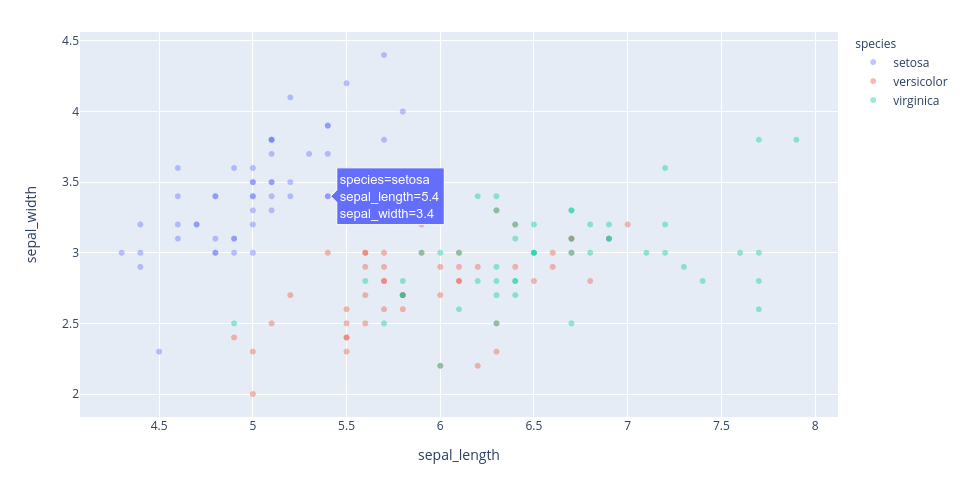
Here is what it looks with Plotly on the Iris dataset:
Here is what it looks with hvPlot on the same dataset, same point(s):

Hi @johann.petrak maybe for this you can use the x-unified hovermode https://plotly.com/python/hover-text-and-formatting/#unified-hovermode introduced with plotly 4.6; it will work well for timeseries for example but not so well for the iris dataset because there are several data points at the same x (or y) coordinate. It’s supposed to represent one point per trace and will not work for multiple points of the same trace at the same location. It’s an interesting usecase anyway.
Hi - thanks!
I have seen the unified hovermode, but as you say it does something different: it shows data from different traces so in the example graph it would show hoverboxes for points from different species on the same x coordinate, but not all the points from the same species on the same or very close x and y coordinates.
I have looked a bit more and I think Plotly, other than hvPlot just cannot do this right. I think it really is bug because what is shown does not correspond properly with the data actually there. It is also not clear which of several overlapping or identical (according to the coordinates but maybe not according to other variables) points it shows. So the user sees one random point where there should potentially be many!
There is a lot I like about Plotly, but for my applicaiton this is a serious shortcoming so for now I sadly may have to go back to hvPlot for this.
Opened an issue: https://github.com/plotly/plotly.py/issues/2476
but it does not sound like this would be high on the priority list though I think it is a real bug, as it “swallows” and ignores data that is actually there and thus can give a completely wrong impression of the data. Which is the opposite of what visualization software is supposed to do.