Heatmap Colorbar Displays Ticks in Incorrect Locations

Hi all,
I’m creating a heatmap with a discrete colormap following this guide.
I noticed that when my z variable is one dimensional, the colorbar displays ticks in incorrect locations.
Here is the guide’s original code:

def discrete_colorscale(bvals, colors):
    """
    bvals - list of values bounding intervals/ranges of interest
    colors - list of rgb or hex colorcodes for values in [bvals[k], bvals[k+1]],0<=k < len(bvals)-1
    returns the plotly  discrete colorscale
    """
    if len(bvals) != len(colors) + 1:
        raise ValueError('len(boundary values) should be equal to  len(colors)+1')
    bvals = sorted(bvals)
    nvals = [(v - bvals[0]) / (bvals[-1] - bvals[0]) for v in bvals]  # normalized values

    dcolorscale = []  # discrete colorscale
    for k in range(len(colors)):
        dcolorscale.extend([(nvals[k], colors[k]), (nvals[k + 1], colors[k])])
    return dcolorscale


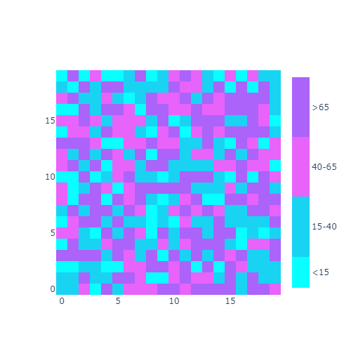
bvals = [2, 15, 40, 65, 90]
colors = ['#09ffff', '#19d3f3', '#e763fa' , '#ab63fa']
dcolorsc = discrete_colorscale(bvals, colors)

bvals = np.array(bvals)
tickvals = [np.mean(bvals[k:k + 2]) for k in range(len(bvals) - 1)]  # position with respect to bvals where ticktext is displayed
ticktext = [f'<{bvals[1]}'] + [f'{bvals[k]}-{bvals[k+1]}' for k in range(1, len(bvals)-2)]+[f'>{bvals[-2]}']

z = np.random.randint(bvals[0], bvals[-1]+1, size=(20, 20))

heatmap = go.Heatmap(z=z,
                     colorscale=dcolorsc,
                     colorbar=dict(
                         thickness=25,
                         tickvals=tickvals,
                         ticktext=ticktext,
                     ))
fig = go.Figure(data=[heatmap])
fig.update_layout(width=500, height=500)
fig.show()

multi_dim

Now do the same thing, but only display the first line of z:

heatmap = go.Heatmap(z=[z[0]],
                     colorscale=dcolorsc,
                     colorbar=dict(
                         thickness=25,
                         tickvals=tickvals,
                         ticktext=ticktext,
                     ))
fig = go.Figure(data=[heatmap])
fig.update_layout(width=500, height=500)
fig.show()

There’s a slight but significant change in the location of colorbar ticks:
single_dim

kinda hoping someone picks up on that

@JonNir Heatmap data given in an array z, with zmin, zmax its extrema, are normalized i.e. z is mapped to an array of values in [0,1] z\to (z-zmin)/(zmax-zmin)\in[0,1]. Plotly.js associates to each value in [0,1] the corresponding color in the discrete colorscale, and according to the initial values we are setting “manually” the ticktext and tickvals. When you restricted the z values to the first row in the initial array, you have different zmin, zmax values and as a consequence the initial tickvals do not correspond to the new values. You have to inspect the extrema in the first row and set the tickvals, accordingly.

Thanks @empet,
Not sure I understand your comment though…
(1) In my code I don’t specify zmin and zmax, but instead go.Heatmap() infers these from the z array, so it doesn’t matter if I use the 1D or 2D z, these extrema need to be inferred independently, no?
(2) The colorbar’s tick values and tick locations are calculated independently of z (see function discrete_colorscale(), and are explicitly provided when calling go.Heatmap(). Hence, it again should be irrelecant if I’m using the 1D or 2D instance of z, no?
(3) The same issue occurs even if a 2D z array is never generated, and instead I create z by calling z = np.random.randint(bvals[0], bvals[-1]+1, size=20)

I explained how data information is mapped to colorobar. Inspect the position of the first row values with respect to boundaries and then you’ll understand better.