Hi, https://jsfiddle.net/1yLavejg/10/
In my heatmap some values are plotting incorrect. ex see the tool tip of x value 16:20:52, 16:20:54.
Here y value is showing 475 instead of 300 and bar also plotted up to 700 range of y-axis.
As per my knowledge, the problem is highest value and second highest of y-values are getting problem.
In my data highest value of yvalue is 1100 and second highest value of y value is 300. Here plotting 300 is giving problem
How the plotly is plotting heat map logic.
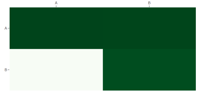
I think I see what the issue is in my case: the data always has a min and max value (hence the visual always has a maximum green cell and a minimum green cell). The question is, how do I tell it to pick the color scale based on a predefined range of values, not a range that is based on the current data?
EDIT:
Ah, yep. I needed to specify zmin and zmax for things to work as expected. I had assumed, based on the examples, that heat maps were calculated from a default range of 1 to 100.