Hahaha, yes, you caught me! I am a big fan of the material design library ![]() Curious of your final result!
Curious of your final result! ![]()
2 Likes
simply beatiful, well done Marieanne
![]()
2 Likes
Brilliant, amazing job
![]()
2 Likes
Hi, Thank you, absolutely I will keep creating dash app.
I never use AgGrid, since you referred it, I think it’s worth trying, thank you for recommendation.
the design look good with AgGrid, gonna try it, usually I use HTML table instead to make better design, ![]()
2 Likes
Hi Everyone,
Just a reminder that I am out of office tomorrow until next Thursday, so there will be no Figure Friday session tomorrow.
2 Likes
This is the one I’m going to study although my believes in AI decreased a lot today. Going crazy editting AI generated translations of a website where somebody just asked “translate” and pasted the result without ever reading it. You did a very cool thing @Avacsiglo21!
2 Likes
Looking at FF submissions for 2025-week-6 (will post my work later today), just want to say how impressed I am by the original dashboard from @marieanne, enhancements to it from @li.nguyen, and inspiring collaboration between FFFs (Figure Friday Friends). The growth of participation in this program is very impressive.
Some have mentioned the challenge of completing these projects within 1 week, and in many cases I feel the same way. Wonder if it would make sense to put FF on a 2-week cycle where the Friday call after the first week would be focused on initial or prototype work, while the second week focuses on more polished and robust visualizations or dash boards. Having a second week would give participants more time to incorporate improvements suggested on the first week Friday call or in this forum.
4 Likes
Well said Mike, Totally agree with your proposal.
1 Like
I love this idea because it gives more space and time to experiment with things you want to learn and more time to finish something. With this assignment I was actually just starting the part I was most interested in from a data point of view but hey, unexpected lot of heavy work days so this would be an unfinished idea, just as last week. It has something unfulfilling.
1 Like
Figure Friday Friends - i love that! ![]()
![]() I agree! @adamschroeder what do you think about the proposal of changing to a 2-week cycle?
I agree! @adamschroeder what do you think about the proposal of changing to a 2-week cycle? ![]()
2 Likes
Good idea FF Friends! ![]() Maybe we could improve this dataset until next Friday.
Maybe we could improve this dataset until next Friday.
1 Like
I think it’s an interesting idea. Thank you @Mike_Purtell.
But it has to be something that the great majority of community members prefer becasue it entails changing the essence and theme of Figure Friday which is weekly datasets.
The goal was to offer a limited but repeating time frame to introduce people to Plotly and encourage them to practice their data viz skills by creating graphs weekly. And if they have time, create Dash apps. The app-building challenge, which happens once every two months, was geared more towards app building.
Having a new dataset weekly is also something that is easy to remember and participate in, as opposed to every two Fridays.
I’d like to hear more about what everyone here is thinking. I’ll add it to the agenda to discuss at the next Figure Friday session on Feb 21.
6 Likes
Posting right at the very end! It’s been a very busy week, so I haven’t had much time to work on this. I initially wanted to do something with more math concerning weeks’ volatility behind it. I did think of a way to go about it, but it’d be more of a 2- or 3- week side project. ![]()
One thing that struck me was just the amount here. That’s a lot of books! I found when I could scroll easily through a list of the weeks, I would do just that. I did the same when I could scroll through the lists all at the same time. I wanted instead to design the page to encourage you to take your time… so, the columns individually scroll.
I wanted the user to be able to click a book and it highlight everywhere it is on the screen, but alas, that’s about all the time for this week. ![]()

edit: I forgot to mention the other reason for the independent scrolling! When you line them up, you get a sense of a book’s performance over time as well:

7 Likes
This code for FF week 6 shows book title rankings on a time line plotted with graph_objects/go.Scatter. Plots for each publisher show all of their books with 10 or more weeks ranked in the top 10. I may move this visualization loop to a dashboard.
The Scatter plot lines used line_shape=’spline’ for the curvature. Here are a few examples:
Big Little Lies debuted in 2014 as an immediate #1 bestseller. The peak in 2017 coincides with the HBO adaptation of this story. The peak in January 2105 coincides with the paperback release on Amazon. This pattern with peaks when the paperback is released and again with TV or movie adaptations is common.

Doubleday had so many top 10 titles that their legend required a scroll bar.

This one strikes me as a publisher’s timely replacement of the old #1 with a new one.

Here is the code:
import polars as pl
import plotly.express as px
import plotly.graph_objects as go

#-------------------------------------------------------------------------------
#   This code groups NY Times best selling books by publisher, and plots their
#   rank over time. You can see how long they stayed on the top 10 list, and
#   when they peaked. Only books with 10+ weeks in the top 10 are included
#-------------------------------------------------------------------------------
df = (
    pl.scan_csv('NYT Fiction Bestsellers - Bestsellers.csv')
    .with_columns(pl.col('title').str.to_titlecase())
    .with_columns(
        pl.col('bestsellers_date', 'published_date')
        .str.strptime(pl.Date, '%m/%d/%Y')
    )
    .filter(pl.col('rank') <= 10)  # filter out everything below top 10
    .with_columns(  # title_tot is a count of weeks in the top 10 for each book
        title_tot = pl.col('title').count().over(pl.col('title')),
    )
    # filter out books with less than 10 weeks in the top 10
    .filter(pl.col('title_tot') >= 10)
    .select(
        pl.col(
            'author', 'title',  'publisher', 'bestsellers_date',
            'rank', 'weeks_on_list'
        )
    )
    .collect()
)

publisher_list = sorted(list(set(df['publisher'])))
for publisher_index, publisher in enumerate(sorted(publisher_list),start=1):
    publisher_titles = (
        df.filter(pl.col('publisher') == publisher)
        .unique('title')
        .sort('title')
        ['title']
        .to_list()
    )
    trace_list = []
    my_colors = px.colors.qualitative.Alphabet
    my_color_count = len(my_colors)
    fig = go.Figure()
    for color_index, title in enumerate(sorted(publisher_titles)):
        df_title = (
            df
            .filter(pl.col('title') == title)
            .select(pl.col('rank', 'bestsellers_date'))
        )
        trace = go.Scatter(
            x=df_title['bestsellers_date'],
            y=df_title['rank'],
            mode='lines+markers',
            line=dict(color=my_colors[color_index % my_color_count]),
            marker=dict(color='gray', size = 5),
            name=title,
            line_shape='spline',
            connectgaps=False
        )
        fig.add_trace(trace)
    fig.update_layout(
        template='simple_white',
        height=400, width=800,
        yaxis=dict(range=[10, 1]),
        title=f'{publisher_index}) Publisher: {publisher}',
        yaxis_title='New York Times Bestsellers Rank',
        showlegend=True
        )
    fig.update_yaxes(
        range=[10.5, 0.5], # 1 on top, 10 on the bottom
        showgrid=True,
        tickvals=[i for i in range(1, 11)],  # 1 to 10 in steps of 1
        ticktext= [f'#{i}'for i in range(1, 11)],
    )
    fig.show()
5 Likes
Hey everyone,
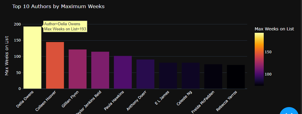
I’m excited to share a dashboard for analyzing the NYT Bestsellers. I ended up finishing it a bit later than planned, but I decided to post it anyway. The dashboard features interactive visualizations with a sleek dark theme, letting you explore top publishers, authors, and other interesting trends by year. Plus, there’s a neat Book Reviews tab that pulls cover images dynamically from the Open Library Covers API.
Feel free to check it out on GitHub: NYT-Bestsellers-Analysis. I’d love to hear your thoughts and feedback!


4 Likes
Hi @hefnermw,
Nice modal in the info/about-me button.
Do these messages go to an external database you maintain?

Nice Dash app, @feanor_92 .
I’m not sure I would add color to the bar graphs. Take the first bar graph, for examples. Just by looking at the y axis numbers and the height of every Bar marker, I could easily tell the difference between the publishers. I’m not sure the color adds any more information.
In the second bar graphs, does the number of bestsellers represent the number of unique books or could the same book be considered a bestseller multiple times?
1 Like
Thanks for the feedback!
- Color in Bar Graphs:
I initially added color as an aesthetic choice to provide an additional visual cue, but you’re right—the y-axis values and bar heights already make the differences clear. - Counting Bestsellers:
For the second bar graphs, the counts represent the number of times a book appears on the bestseller list rather than unique titles. In other words, if a book remains on the list for multiple weeks, it will be counted multiple times. This approach helps capture the persistence of an author or publisher on the list.
1 Like