Figure Friday 2025 - week 5

join the Figure Friday session on February 7, at noon Eastern Time, to showcase your creation and receive feedback from the community.

Did you know that Counter-Strike 2 is the number one played game with 1,485,535 current players? (Steam)

In week 5 of Figure Friday, we’ll explore the top 100 most played games.

Things to consider:

  • what can you improve in the sample figure below (Marginal Distribution Plot)?
  • would you like to tell a different data story using a different graph?
  • can you create a Dash app instead?

Sample figure:

Code for sample figure:
import plotly.express as px
import pandas as pd

df = pd.read_csv("https://raw.githubusercontent.com/plotly/Figure-Friday/refs/heads/main/2025/week-5/Steam%20Top%20100%20Played%20Games%20-%20List.csv")

# Convert columns' data from string to float or integer
df["Price"] = df["Price"].replace("Free To Play", 0.0)
df["Price"] = df["Price"].astype(str).str.replace("£", "", regex=False).astype(float)
df["Current Players"] = df["Current Players"].str.replace(",", "").astype(int)
df["Peak Today"] = df["Peak Today"].str.replace(",", "").astype(int)


fig = px.scatter(df, x="Price", y="Current Players", marginal_x="histogram", marginal_y="rug")#
fig.show()

Participation Instructions:

  • Create - use the weekly data set to build your own Plotly visualization or Dash app. Or, enhance the sample figure provided in this post, using Plotly or Dash.
  • Submit - post your creation to LinkedIn or Twitter with the hashtags #FigureFriday and #plotly by midnight Thursday, your time zone. Please also submit your visualization as a new post in this thread.
  • Celebrate - join the Figure Friday sessions to showcase your creation and receive feedback from the community.

:point_right: If you prefer to collaborate with others on Discord, join the Plotly Discord channel.

Data Source:

Thank you to Makeovermonday and Steam for the data.

2 Likes

To get thing started, I made 2 dataframes, one for paid games, one for free games. I assume the marketing world views these classifications in different ways, so I analyze them separately.

Current Players means players in this game right now, updated every 15 minutes.

Peak Today means peak number of players simultaneously in this game in the past 24 hours.

I created a parameter I call BUZZ, which is the ratio of Peak Today to Current Players, as a percentage. Each data visualization is a 2-point scatter plot for each game, showing the Current Players on one end, Peak Today on the other. Only the games with top 10 values of BUZZ are included.

These visualizations provide instantaneous views of game traffic. They may be of value when looked at over time, but not so much when based on single snapshot of the data. That said, this type of visualization can be adapted to show start and stop values and shifts for large number of metrics.

Here is the screenshot of top 10 paid games based on BUZZ:

This screenshot shows the paid game with the most BUZZ

Here is a screenshot of top 10 free games based on BUZZ:

Here is the code:

import polars as pl
import polars.selectors as cs
import plotly.express as px
import plotly.graph_objects as go
from plotly.subplots import make_subplots

fig_height = 600
fig_width = 600
dollars_per_pound = 1.24
data = 'https://raw.githubusercontent.com/plotly/Figure-Friday/refs/heads/'
data += 'main/2025/week-5/Steam%20Top%20100%20Played%20Games%20-%20List.csv'

#-------------------------------------------------------------------------------
#  FUNCTIONS FOR ANNOTATION AND UPDATE LAYOUT ARE SIMILAR FOR EACH PLOT
#-------------------------------------------------------------------------------
def annotate_disclaimer(fig):
    fig.add_annotation(
        text='Data changes frequently, visit Data Source (Steam) for updates',
        showarrow=False,
        x=0.1, xref='paper',
        y=1.05, yref='paper',
        xanchor='left'
    )
    return fig

def update_my_layout(fig, title):
    fig.update_layout(
        legend=dict(
            #y=0.5,
            orientation='h'
        ),
        legend_title_text=title,
        showlegend=True,
        xaxis_title='',
        yaxis_title='NUMBER OF PLAYERS'
    )
    return fig

#-------------------------------------------------------------------------------
#   READ AND CLEAN DATA, TO DATAFRAME df
#-------------------------------------------------------------------------------
df = (
    pl.read_csv(data)
    .with_columns(
        pl.col('Current Players', 'Peak Today')
            .str.replace_all(',', '')
            .cast(pl.UInt32())
    )
    .with_columns(
        pl.col('Price')
        .str.replace('Free To Play', '0.0')
        .str.replace('£', '')
        .str.replace(',', '')
        .cast(pl.Float32)
    )
    .with_columns(
        BUZZ_PCT = 
            100.0 * 
            (pl.col('Peak Today') / pl.col('Current Players') - 1.0)
    )
    .with_columns(
        Name = pl.col('Name') + pl.lit(' (') +
            pl.col('BUZZ_PCT').round(1).cast(pl.String) + pl.lit('%)')
        )
    .sort('Current Players', descending=True)
    .select(pl.col('Rank', 'Name', 'Current Players','Peak Today','Price', 'BUZZ_PCT'))
)

#-------------------------------------------------------------------------------
#   FILTER MAIN DATAFRAME df TO SELECT PAID GAMES
#-------------------------------------------------------------------------------
df_paid = (
    df
    .filter(pl.col('Price') > 0.0)
    .sort('BUZZ_PCT', descending=True)  # pre-sorted, used just in case
    # redo the Ranks for paid games only, using "with_row_index"
    .with_row_index(offset=1)
    .drop('Rank')
    .rename({'index': 'Rank', 'Name':'PAID_GAME'})
    .head(10)
    .transpose(include_header = True, column_names = 'PAID_GAME')
    .rename({'column' : 'PAID_GAME'})
    .filter(pl.col('PAID_GAME').is_in(['Current Players','Peak Today']))
)
#-------------------------------------------------------------------------------
#   FILTER MAIN DATAFRAME df TO SELECT FREE GAMES
#-------------------------------------------------------------------------------
df_free = (
    df.filter(pl.col('Price') == 0.0)
    .sort('BUZZ_PCT', descending=True)  # pre-sorted, used just in case
    # redo the Ranks for free games only, using "with_row_index"
    .with_row_index(offset=1)
    .drop('Rank')
    .rename({'index': 'Rank', 'Name':'FREE_GAME'})
    .select(pl.col('FREE_GAME', 'Current Players', 'Peak Today'))
    .head(10)
    .transpose(include_header = True, column_names = 'FREE_GAME')
    .rename({'column' : 'FREE_GAME'})
    .filter(pl.col('FREE_GAME').is_in(['Current Players','Peak Today']))
)
#-------------------------------------------------------------------------------
#   SUP TITLE IS SAME FOR BOTH GRAPHS
#-------------------------------------------------------------------------------
sup_title = (
    '<sup>Data Source: ' +
    '<a href="https://store.steampowered.com/charts/mostplayed">' +
    'Steam</a></sup>'
)

#-------------------------------------------------------------------------------
#   fig_paid is a 2-point line for each selected paid game 
#-------------------------------------------------------------------------------
fig_paid=px.scatter(
    df_paid,
    'PAID_GAME',
    [c for c in df_paid.columns if c != 'PAID_GAME'],
    template='simple_white',
    height=fig_height, width=fig_width,
    title = 'PAID GAMES WITH HIGHEST BUZZ - TOP 10<br>' + sup_title
)
fig_paid.update_traces(mode ='lines+markers')
fig_paid = update_my_layout(fig_paid, 'PAID GAME BUZZ (%)')
fig_paid = annotate_disclaimer(fig_paid)
fig_paid.write_html('fig_paid.html')
fig_paid.show()

#-------------------------------------------------------------------------------
#   fig_free is a 2-point line for each selected free game 
#-------------------------------------------------------------------------------
fig_free=px.scatter(
    df_free,
    'FREE_GAME',
    [c for c in df_free.columns if c != 'FREE_GAME'],
    template='simple_white',
    height=fig_height, width=fig_width,
    title = 'FREE GAMES WITH HIGHEST BUZZ - TOP 10<br>' + sup_title
)

fig_free.update_traces(mode ='lines+markers')
fig_free = update_my_layout(fig_free, 'FREE GAME BUZZ(%)')
fig_free = annotate_disclaimer(fig_free)
fig_free.write_html('fig_free.html')
fig_free.show()

9 Likes

I like the idea of calculating the ratio of Peak to Current players as a percentage.
@Mike_Purtell what’s the reason you chose to put Current Players to the left of the xaxis and Peak Today to the right? When I initially looked at the data I saw the Peak to Current more as a drop. For example, Phasmophobia had ~40k at peak but dropped about 50% to 20k of current players. I’m not sure why I saw it that way, maybe because of chronological reasoning. I assumed that peak is always in the past while current players is more present time.

Following your logic of Current to Peak, I think it could be nice to see a comparison in the following line chart: Calculate the percentage difference between current to peak (like you did), and assume everyone starts at 1000 current players. Then, draw out the lines to Peak players based on percentage difference.

Thank you @adamschroeder. My decision to put Current Players on the left was very arbitrary, I could have gone either way on that point. Your comment that peak is in the past while current players is present time makes good sense.

Great idea to focus a graph on percent difference. I still want to show user counts and percent change, and maybe better to split this message into 2 separate visualizations in a side-by-side subplot. Hopefully I will hopefully repost this in a day or two.

1 Like

I created a bubble chart with links based on the awesome YT video “Charming Data: Bubble Chart with Links to Google Maps”. :slightly_smiling_face::green_circle: Pycafe will be later.

6 Likes

Here’s a quick summary of the visualizations I’ve created for my Steam Top 100 Played Games project, which explores data on the most played games on Steam. Each chart provides insights into different aspects of the dataset:

  • Top Game Genres: A bar chart showing the most common game genres.
  • Average Game Price by Genre: A bar chart displaying the average price of games in each top genre.
  • Peak Players by Genre: A bar chart comparing the average peak player count across different genres.
  • Genre Distribution: A histogram illustrating the distribution of game genre counts.
  • Top Genres in Free and Paid Games: Bar charts showcasing the most popular genres among free-to-play and paid games.
  • Top 10 Free & Paid Games by Peak Today: Bar charts highlighting the most popular free and paid games based on peak player count.
  • Current Players by Price: A histogram aggregating the number of current players across different price ranges.
  • Price vs. Player Count: A scatter plot with marginal histograms and rug plot showing the relationship between price and the number of players.

Check out the project here:

Would love to hear your thoughts and feedback!


9 Likes

Nice chart, @Ester . From this bubble chart it’s clear that there is no correlation between price and number of players playing a game. In fact, most of the top most played games appear to be free.

2 Likes

Interesting to see how the the largest amount of games fall under the Multiplayer Genre (71), but the average Peak Players falls under strategy.

@feanor_92 what is the Distribution of games Genre Counts histogram showing us (4th graph)? Am I supposed to see Genre type somewhere?

1 Like

The bar chart might have been better, I haven’t really used the bubble chart yet. :thinking:

3 Likes
3 Likes

Hello Everyone,

I just follow the same Adams Approach,a just creating a price range to filter the scatter and the bar chart.
The scatter plot is Current Players vs Price but filtering by price range could be interesting, the same filter works for the Bar Chart which is % Difference (Peak vs Current Numbers) by Game

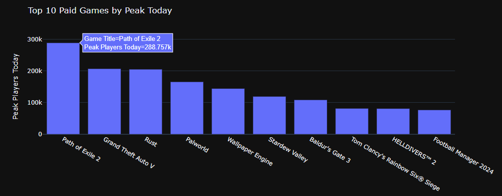
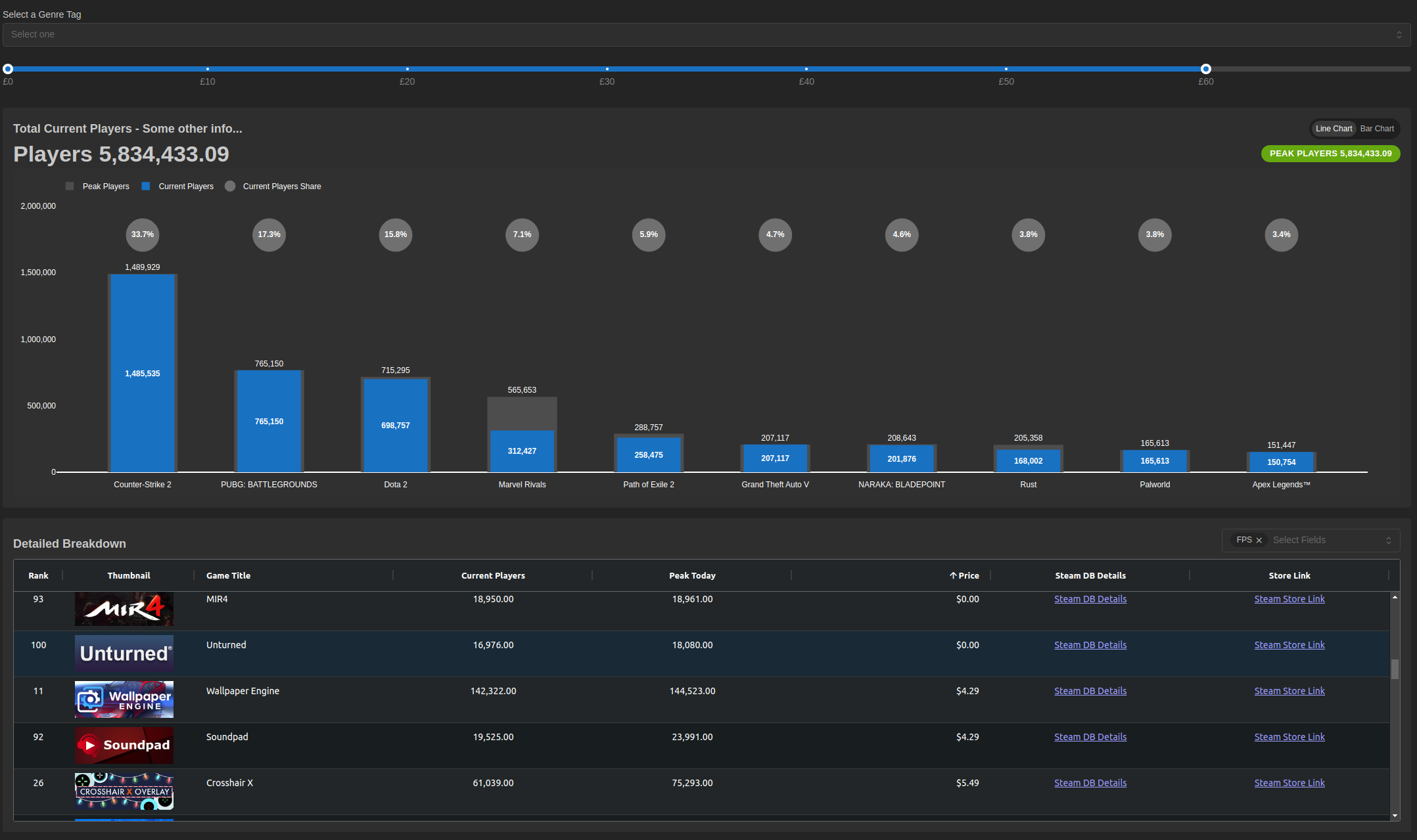
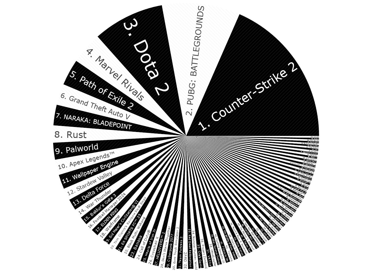
Here attached some images, later on I will upload to py cafe


import dash
from dash import Dash, html, dcc, Output, Input
import plotly.express as px
import numpy as np
import pandas as pd
import dash_bootstrap_components as dbc

df = pd.read_csv("Steam Top 100 Played Games - List.csv")
df["Price"] = df["Price"].replace("Free To Play", 0.0)
df["Price"] = df["Price"].astype(str).str.replace("£", "", regex=False).astype(float)
df["Current Players"] = df["Current Players"].str.replace(",", "").astype(int)
df["Peak Today"] = df["Peak Today"].str.replace(",", "").astype(int)

df['Players diff'] = (((df['Peak Today']  - df['Current Players'])/df['Current Players'])*100).round(2)

external_stylesheets = [dbc.themes.SUPERHERO,'https://cdnjs.cloudflare.com/ajax/libs/font-awesome/5.15.1/css/all.min.css']

price_ranges = {
    'Less 12$': (0, 12),
    'Between 13-24$': (13, 24),
    'Between 25-36$': (25, 36),
    'Between 37-48$': (37, 48),
    'Between 49-60$': (49, 60)
}

app = dash.Dash(__name__, external_stylesheets=external_stylesheets)  # Estilos de Bootstrap

app.title = "Steam Top 100 Games"

# 2. Estructura del layout
app.layout = dbc.Container([
    dbc.Row([
        html.Hr(className="my-2"),
        dbc.Col(html.I(className="fa fa-gamepad", style={"color": "#FD944D", "fontSize": "4rem"}), width=1),
        dbc.Col(html.H2("Steam: The Top 100 Most Played Games",className="display-4",
                        style={'text-align': 'center', 'padding': '10px'}), width=10),
        dbc.Col(html.I(className="fa fa-trophy", style={"color": "#FD944D", "fontSize": "4rem"}), width=1)]),
    html.Hr(),
    html.H4("Price & Popularity: A Steam Game Analysis", style={'text-align': 'center', 'padding': '10px'}),
    html.Hr(),
    dbc.Row([
        dbc.Col(
            [
                html.H5("Select Price Ranges", style={'text-align': 'left'}),
                html.Hr(className="my-2"),
                dcc.Checklist(
                    id='price-checklist',
                    options=[{'label': label, 'value': label} for label in price_ranges],
                    value=['Between 25-36$', 'Between 49-60$'],
                    inline=True,
                    style={'fontSize': '24px', 'display': 'flex', 'flex-direction': 'row', 'justify-content': 'space-between'},
                    className="btn btn-secondary"
            ),
            ],
            width=12
        ),
    ],className="navbar navbar-expand-lg bg-primary"),
    html.Hr(),
    dbc.Tabs(
        [
            dbc.Tab(label="Impact of Game Prices on Player Numbers", tab_id="tab-1"),
            dbc.Tab(label="Player Number Gap (%) by Game (by Price Range)", tab_id="tab-2"),
        ],
        id="tabs",
        active_tab="tab-1",
    ),
    html.Div(id="tab-content"),
], fluid=True
                          )

# 3. Callbacks
@app.callback(
    Output("tab-content", "children"),
    Input("tabs", "active_tab"),
    Input('price-checklist', 'value'),
)
def render_tab_content(active_tab, selected_ranges):
  
    filtered_df = df.copy()
    if selected_ranges:
        mask = pd.Series(False, index=df.index)
        for range_label in selected_ranges:
            min_price, max_price = price_ranges[range_label]
            mask |= (df['Price'] >= min_price) & (df['Price'] <= max_price)
        filtered_df = df[mask]

    if active_tab == "tab-1":
        # 4. Funciones de gráficos adaptadas
        fig = px.scatter(filtered_df, x="Price", y="Current Players", marginal_x="histogram",
                         template='xgridoff', size='Current Players', size_max=30, hover_name='Name')
        fig.update_layout(
            xaxis=dict(
            title="Price in US$",
            titlefont=dict(size=20),
            showline=True, showgrid=True, showticklabels=True,
            linecolor='rgb(201, 192, 191)', linewidth=3,
            ticks='inside', tickfont=dict(family='Arial', size=18, color='rgb(20, 20, 20)')
    ),
            yaxis=dict(
            title="Current Players",
            titlefont=dict(size=20),
            showline=True, showgrid=True, showticklabels=True,
            linecolor='rgb(201, 192, 191)', linewidth=3,
            ticks='inside', tickfont=dict(family='Arial', size=18, color='rgb(20, 20, 20)')
    )
)
        fig.update_traces(marker=dict(color='slategray'))
        tab_content = dcc.Graph(figure=fig)
    elif active_tab == "tab-2":
        fig = px.bar(filtered_df.sort_values('Players diff', ascending=False), x='Name', y='Players diff', 
                     template='xgridoff', text_auto=True, labels={'Name':''})

        fig.update_layout(
            xaxis=dict(
            showline=True, showgrid=True, showticklabels=True,
            linecolor='rgb(201, 192, 191)', linewidth=3,
            ticks='inside', tickfont=dict(family='Arial', size=12, color='rgb(20, 20, 20)')))
        
        fig.update_yaxes(visible=False)
        fig.update_traces(marker=dict(color='slategray'))
        tab_content = dcc.Graph(figure=fig)

    return tab_content

if __name__ == '__main__':
    app.run_server(debug=True)type or paste code here`Preformatted text`
8 Likes
2 Likes

Righto! Other than being eye candy at the moment this is what im working on. More focused on Plotly options and DMC to get my head around it. Maybe it will work by Friday?

9 Likes

Saw a great opportunity to use a wordcloud finally! Here is my DashApp that includes a word cloud for game genres, a bar chart for top-played games, a histogram of peak player distribution, and a pie chart for free vs. paid games, all styled with a retro minimalistic theme

The Distribution of Peak Players was an interesting perspective on the data.


7 Likes

@ThomasD21M I’ve used wordcloud before, it looks really good in the dark. I think you should try a dropdown at the top, it works really well if you filter it.:slight_smile:

2 Likes

Thank you for your feedback!
The “Distribution of Game Genre Counts” histogram isn’t showing you the genre names directly. Instead, it’s giving you a big-picture view of how often different genres occur in the dataset.

2 Likes

Not really a make-over, no (key) insights, just me, trying UI things out. The idea was:

  • most used tags in a clickable wordcloud. After spending a few hours to get the d3 clickable wordcloud installed I gave up and created my idea of a wordcloud via a checklist (multiselect)
  • click one or more, add some toggles for multi-select and free/paid and filter (never happened)
  • I struggled a lot with the multiclick/filter, now it is a working regex construction.
    The rest will be ideas, I still want the cardgrid to function as a masonry and maybe the taglist (cloud) would look nice as a masonry. I had css rotationclasses, it worked technically, it was a horror.

I copied a few lines of code from @Avacsiglo21 (your are mentioned) and some solutions from stackoverflow (links inserted).

demo and code : PyCafe - Dash - Alternative for clickable wordcloud + regex filtering based on selected tags

Code, there is also some css involved, pycafe assets folder

-- coding: utf-8 --

“”"
Created on Fri Jan 31 21:53:20 2025

@author: win11
AG grid image : Dash ag-grid: input property when using cellRendererSelector
from @paeger
“”"

import dash
from dash import dcc, html, Input, Output
import pandas as pd
import dash_bootstrap_components as dbc
from random import randint
from sklearn.utils import shuffle

df = pd.read_csv(“https://raw.githubusercontent.com/plotly/Figure-Friday/refs/heads/main/2025/week-5/Steam%20Top%20100%20Played%20Games%20-%20List.csv”)
#I’ve copied the following 4 lines from member Avacsiglo21, short in time
df[“Filter Price”] = df[“Price”].replace(“Free To Play”, 0.0)
df[“Filter Price”] = df[“Filter Price”].astype(str).str.replace(“£”, “”, regex=False).astype(float)
df[“Current Players”] = df[“Current Players”].str.replace(“,”, “”).astype(int)
df[“Peak Today”] = df[“Peak Today”].str.replace(“,”, “”).astype(int)

is this a multiplayer game or not, to show on card, no time for filtering

df[‘Multiplayer’] = df[‘Genre Tags’].str.contains(‘Multiplayer’)

#google queen, thanks to substack, on top of the tags lists is +, whatever that may mean.

df_tags_raw = df[‘Genre Tags’].str.split(‘,\s+’, expand=True).stack().value_counts().reset_index()

Or rename the existing DataFrame (rather than creating a copy)

df_tags_raw.rename(columns={‘index’: ‘tag’}, inplace=True)
#remove a few tags for the tagselection, were supposed to be on two extra filteroptions
tags_remove = [‘+’, ‘Multiplayer’,‘Singleplayer’,‘Free to Play’, ‘Massively Multiplayer’]
df_tags = df_tags_raw.apply(lambda row: row[~df_tags_raw[‘tag’].isin(tags_remove)])

def set_fontcolor():
#generate trhee numbers between 0 and 255 and create an rgba outputstring
gencolor = [randint(0, 255) for p in range(0, 3)]
fontcolor=f"rgba({gencolor[0]},{gencolor[1]},{gencolor[2]})"
return fontcolor

def set_fontsize(c):

calculate_size = c/17
fontsize=f"{calculate_size}rem"

return fontsize

def wordcloud(all_tags):
#shuffling the tags because it looks better when color and fontsize are random on screen.
df_rand = shuffle(all_tags, random_state=0)
#rotateoptons for all words removed, did work, not usable

transition_classes=[‘rotate45’, ‘rotate0’, ‘rotate-45’,‘rotate90’, ‘rotate-90’]

#code to grep a rotateclass: {sample(transition_classes, 1)[0]}

options=[
    {'label': html.Span(i, style={'color': set_fontcolor(), 'fontSize': set_fontsize(df_rand.loc[df_rand['tag'] == i, 'count'].iloc[0])}), 'value': i}  for i in df_rand.tag.unique()]
    
tagbuttons =  dbc.Form( dbc.Checklist(
        id="taglist",
       className="btn-group",
       inputClassName="btn-check",
       labelClassName="btn btn-outline-primary ",
       labelCheckedClassName="active",
       options=options,
       label_checked_style={"color": "black", "backgroundColor": "rgba(255,255,255,0.1)", "borderColor": "rgba(5,5,5,0" },
    ))

return tagbuttons

def card_with_overlays(r):
multiplayer = ‘Multiplayer’
if r[‘Multiplayer’] == False: multiplayer = ‘Singleplayer’
card = dbc.Card(
[
dbc.CardImg(
src=r[‘Thumbnail URL’],
top=True,
style={“opacity”: 0.5},
),
dbc.CardImgOverlay(
dbc.CardBody(
[ html.Div([
html.Span(r[‘Rank’], className=‘rondje’),
html.Span(r[‘Price’], className = ‘info-rondje’)
], className = ‘miniflex’),
#this title bothers me and it’s not a seo assignment
html.Div(html.H4(r[‘Name’], className=“card-title”, style={‘display’: ‘none’}),),

                html.Div([
                    html.Span(f"Current players: {r['Current Players']}", className = 'info-rondje'),
                    html.Span(f"{multiplayer}",  className = 'info-rondje')
                    
            ], className='miniflex'),
            
    ]),
        )
],
className='col-md-6',

)

return card

def card_grid(filtered_df):

card_list = []
for i in range(len(filtered_df)):  
    card_list.append(card_with_overlays(filtered_df.iloc[i]))

return card_list

Dash app setup

app = dash.Dash(name, external_stylesheets=[dbc.themes.CYBORG, dbc.icons.FONT_AWESOME])

app.layout = dbc.Container([
dbc.Row([
dbc.Col([
html.Div(
id=‘wordcloud’,
children = wordcloud(df_tags.head(30))
),
html.P(id=“radioitems-checklist-output”),

    ], className='col-md-6'),
dbc.Col([html.Div(id="popularity_container", className='flexgrid')], className='col-md-6')

], className='col-md-12'),

], fluid=True)

@app.callback(

Output("popularity_container", "children"),
    Input("taglist", "value"),
    #prevent_initial_call=True,
    )

def on_form_change(checklist_value):

 regexstring = ''
 
#where I ended up when I tried to filter the tags on a and b, I know of chatgpt
#https://stackoverflow.com/questions/6930982/how-to-use-a-variable-inside-a-regular-expression
 base = r'^{}'
 expr = '(?=.*{})'
 words = checklist_value  #checklistvalue is a list of selected tags
 regexstring = base.format(''.join(expr.format(w) for w in words))


 filtered_df = df[df['Genre Tags'].str.contains(rf'{regexstring}',regex=True)]


 return card_grid(filtered_df)

if name == ‘main’:
app.run_server(debug=True)

10 Likes

Excellent work.

2 Likes

I like your idea too. It would be amazing if you can identify exactly one specific genre for each game , adding a column with critic/users Score for each game. I know Is too much for the Time ,:joy::joy::joy::joy:

3 Likes

Hi all! This is my first Figure Friday!

I wanted to make a dashboard to explore tags (I think they’re interesting). I had an idea for some filters with a dynamic-tag-layered sunburst for sorting where each leaf’s arc angle represented numeric values (players or price).

For players that makes sense; there’s no double counting. If a player is playing 2 games, those are both “valid” “votes” or “counts” towards the game. Price is a little weird though. Other than visualizing proportional price of games (which can be helpful for spotting outliers, I suppose,) I’m not sure of many uses for that particular numeric as the leaf’s arc angle, but it was interesting to explore.

Actually implementing the sunburst to be dynamic was… the longest part lol.

Here are some plots I made with it!

Here is the dashboard!

6 Likes