Figure Friday 2025 - week 4

join the Figure Friday session on January 31, at noon Eastern Time, to showcase your creation and receive feedback from the community.

Figure Friday week 4 dataset contains a comprehensive list of the writers sponsored by the National Endowment for the Arts (NEA) fellowships from the organization’s founding in 1965 to 2024. It includes information about the writers’ demographics, education, and geography. (Post45 Data Collective)

Things to consider:

  • can you improve the sample figure below (Histogram)?
  • would you like to tell a different data story using a different graph?
  • can you expand on the Dash app?

Sample figure:

Code for sample figure:
from dash import Dash, dcc
import dash_ag_grid as dag
import plotly.express as px
import pandas as pd

df = pd.read_csv("https://raw.githubusercontent.com/plotly/Figure-Friday/refs/heads/main/2025/week-4/Post45_NEAData_Final.csv")
df['age of writer'] = df.nea_grant_year - df.birth_year
fig = px.histogram(df, x='age of writer')

app = Dash()
grid = dag.AgGrid(
    rowData=df.to_dict("records"),
    columnDefs=[{"field": i} for i in df.columns],
    dashGridOptions={"pagination": True}
)

app.layout = [
    grid,
    dcc.Graph(figure=fig)
]


if __name__ == "__main__":
    app.run(debug=True)

Participation Instructions:

  • Create - use the weekly data set to build your own Plotly visualization or Dash app. Or, enhance the sample figure provided in this post, using Plotly or Dash.
  • Submit - post your creation to LinkedIn or Twitter with the hashtags #FigureFriday and #plotly by midnight Thursday, your time zone. Please also submit your visualization as a new post in this thread.
  • Celebrate - join the Figure Friday sessions to showcase your creation and receive feedback from the community.

:point_right: If you prefer to collaborate with others on Discord, join the Plotly Discord channel.

Data Source:

Thank you to Alexander Manshel and Post45 Data Collective for the data.

3 Likes

I created an interactive Dash app to visualize NEA data.

You can review my app:
[PyCafe - Dash - A Dash app for visualizing NEA data]

Here’s the summary:

Certifications by Gender: A grouped bar chart showing the count of certifications (Bachelor’s, Master’s, etc.) by gender.

Gender by University: A bar chart depicting gender distribution across universities.

Grants by State: A bar chart visualizing NEA grants across U.S. states.

Choropleth Map: An interactive map showing grant distribution by state, with a year slider for filtering.

Male vs Female Grants Over the Years: which uses a line chart to show trends in grant counts for males and females over time

I found it interesting to see that it wasn’t until 2010 that we see woman take the lead on grants issued

Its also interesting that the issuance of grants seemed to have peaked in the 80’s?

from dash import Dash, dcc, html, Input, Output
import pandas as pd
import plotly.express as px

# Load the data
file_path = "https://raw.githubusercontent.com/plotly/Figure-Friday/main/2025/week-4/Post45_NEAData_Final.csv"

data = pd.read_csv(file_path, on_bad_lines='skip')
print(data.columns)
# Initialize the Dash app
app = Dash(__name__)

# Preprocess the data
# Melt certifications data for better grouping
certification_columns = {
    'ba': "Bachelor's Degree",
    'ba2': "Additional Bachelor's Degree",
    'ma': "Master's Degree",
    'ma2': "Additional Master's Degree",
    'phd': "PhD",
    'mfa': "MFA",
    'mfa2': "Additional MFA"
}

certifications = data.melt(
    id_vars=['gender'], 
    value_vars=list(certification_columns.keys()),
    var_name='certification_type', 
    value_name='institution'
).dropna(subset=['institution'])

# Map the abbreviated certification names to full names
certifications['certification_type'] = certifications['certification_type'].map(certification_columns)

# Prepare data for the Choropleth map
# Combine year columns F and G into a single year column for counting
choropleth_data = data.copy()
choropleth_data['grant_year'] = choropleth_data['other_nea_grant'].fillna(choropleth_data['nea_grant_year'])

# Clean grant_year column by handling cases like "1979, 1989" or "1987;1979"
def clean_grant_year(value):
    if isinstance(value, str):
        for delimiter in [',', ';']:
            if delimiter in value:
                return int(value.split(delimiter)[0].strip())  # Take the first year
        try:
            return int(value.strip())  # Handle single-year strings
        except ValueError:
            return None
    try:
        return int(value)  # Handle numeric values
    except ValueError:
        return None

choropleth_data['grant_year'] = choropleth_data['grant_year'].apply(clean_grant_year)
choropleth_data = choropleth_data.dropna(subset=['grant_year'])
choropleth_data = choropleth_data.groupby(['us_state', 'grant_year']).size().reset_index(name='count')

# Prepare data for gender trends over years
gender_trends = data.copy()
gender_trends['grant_year'] = gender_trends['other_nea_grant'].fillna(gender_trends['nea_grant_year'])
gender_trends['grant_year'] = gender_trends['grant_year'].apply(clean_grant_year)
gender_trends = gender_trends.dropna(subset=['grant_year', 'gender'])
gender_trends = gender_trends.groupby(['grant_year', 'gender']).size().reset_index(name='count')

# Layout of the Dash app
app.layout = html.Div([
    html.H1('NEA Data Visualizations', style={'textAlign': 'center', 'color': 'white'}),

    # Visualization 1: Certifications by Gender
    html.H2('Certifications by Gender', style={'color': 'white'}),
    dcc.Graph(id='certifications-by-gender'),

    # Visualization 2: Gender by University
    html.H2('Gender by University', style={'color': 'white'}),
    dcc.Graph(id='gender-by-university'),

    # Visualization 3: Grant by State
    html.H2('NEA Grants by State', style={'color': 'white'}),
    dcc.Graph(id='grant-by-state'),

    # Visualization 4: Choropleth Map
    html.H2('NEA Grants Choropleth Map', style={'color': 'white'}),
    dcc.Slider(
        id='year-slider',
        min=choropleth_data['grant_year'].min(),
        max=choropleth_data['grant_year'].max(),
        value=choropleth_data['grant_year'].min(),
        marks={year: str(year) for year in range(choropleth_data['grant_year'].min(), choropleth_data['grant_year'].max() + 1)},
        step=None
    ),
    dcc.Graph(id='choropleth-map'),

    # Visualization 5: Gender Trends Over Years
    html.H2('Male vs Female Grants Over the Years', style={'color': 'white'}),
    dcc.Graph(id='gender-trends')
], style={'backgroundColor': '#1e1e1e', 'padding': '20px'})

# Callbacks to generate the graphs
@app.callback(
    Output('certifications-by-gender', 'figure'),
    Input('certifications-by-gender', 'id')
)
def update_certifications_by_gender(_):
    fig = px.histogram(
        certifications, 
        x='certification_type', 
        color='gender',
        title='Count of Certifications by Gender',
        barmode='group'
    )
    fig.update_layout(
        plot_bgcolor='#1e1e1e',
        paper_bgcolor='#1e1e1e',
        font_color='white'
    )
    return fig

@app.callback(
    Output('gender-by-university', 'figure'),
    Input('gender-by-university', 'id')
)
def update_gender_by_university(_):
    university_gender = certifications.groupby(['institution', 'gender']).size().reset_index(name='count')
    fig = px.bar(
        university_gender, 
        x='institution', 
        y='count', 
        color='gender',
        title='Gender Distribution by University'
    )
    fig.update_layout(
        plot_bgcolor='#1e1e1e',
        paper_bgcolor='#1e1e1e',
        font_color='white'
    )
    return fig

@app.callback(
    Output('grant-by-state', 'figure'),
    Input('grant-by-state', 'id')
)
def update_grant_by_state(_):
    state_grants = data.groupby('us_state')[['nea_grant_year', 'other_nea_grant']].count().reset_index()
    state_grants = state_grants.melt(id_vars=['us_state'], value_vars=['nea_grant_year', 'other_nea_grant'], 
                                     var_name='grant_type', value_name='count')
    fig = px.bar(
        state_grants,
        x='us_state', 
        y='count', 
        color='grant_type',
        title='NEA Grants by State'
    )
    fig.update_layout(
        plot_bgcolor='#1e1e1e',
        paper_bgcolor='#1e1e1e',
        font_color='white'
    )
    return fig

@app.callback(
    Output('choropleth-map', 'figure'),
    Input('year-slider', 'value')
)
def update_choropleth_map(selected_year):
    filtered_data = choropleth_data[choropleth_data['grant_year'] == selected_year]
    fig = px.choropleth(
        filtered_data,
        locations='us_state',
        locationmode='USA-states',
        color='count',
        scope='usa',
        title=f'NEA Grants by State for {selected_year}',
        labels={'count': 'Number of Grants'}
    )
    fig.update_layout(
        geo=dict(bgcolor='rgba(0,0,0,0)'),
        plot_bgcolor='#1e1e1e',
        paper_bgcolor='#1e1e1e',
        font_color='white'
    )
    return fig

@app.callback(
    Output('gender-trends', 'figure'),
    Input('gender-trends', 'id')
)
def update_gender_trends(_):
    fig = px.line(
        gender_trends, 
        x='grant_year', 
        y='count', 
        color='gender',
        title='Male vs Female Grants Over the Years'
    )
    fig.update_layout(
        plot_bgcolor='#1e1e1e',
        paper_bgcolor='#1e1e1e',
        font_color='white'
    )
    return fig

# Run the app
if __name__ == '__main__':
    app.run_server(debug=True)
9 Likes

wow, University of Iowa is off the charts with around 550 NEA grants (in the second chart).
Given the amount of universities, it’s not possible to see all universities on the chart at once (unless you zoom in). Maybe adding a dropdown that allows the user to choose their universities of interest would make the chart easier to read. Or if a person clicks on a state in the choropleth map, all universities from that state would pop up on the chart.

@ThomasD21M what’s the reason you chose a slider for the choropleth map instead of an animated map?

2 Likes

Adam, Great considerations. I had ambitions to make the animation and improve that university chart but haven’t got around to it haha. I also considered a pareto chart with some of the data as well the university distr. being one example. I haven’t utilized pareto much with Plotly and I think the next iteration before Friday ill share an update using a pareto chart.

2 Likes

I tried the bar stacked bar chart and a dropdown. (Code will be a little later)

6 Likes

I noticed many people got a sponsorship more than once, I created a histogram where the total is divided into people with 1,2,3,4th sponsorship.
What I actually want is a filterfunction that based on the selected point on the histogram, say 1997, 4th time sponsored, shows the people who comply to this filter, in the grid with some data, but that is either complicated or I haven’t found the right help pages yet. I found something on external filtering the aggrid. Maybe thursday, or friday, probably not.


EDIT NEXT MORNING

AI to the rescue, it works, it’s not very userfriendly in the details. Only part that did not work after the following prompt was the selected number of nea’s , it should be + 1 in the callback function.

Prompt

Hi, I have a dash/plotly app that shows a histogram by year. Every bar is divided in 4 categories. I also have a aggrid. What I need is a callback function which on click on a part of a bar (get year and neacount) shows the users who belong to this selection. The dataframe has a column nea_grant_year and ‘count neas’ which map to the values on mouseclick in the bar. Question: can you create the callback function. The code until now:

Code

-- coding: utf-8 --

“”"
Created on Wed Jan 29 07:25:02 2025

@author: win11
“”"

from dash import Dash, dcc, html, Input, Output
import dash_ag_grid as dag
import plotly.express as px
import pandas as pd
import plotly.graph_objects as go

df = pd.read_csv(“https://raw.githubusercontent.com/plotly/Figure-Friday/refs/heads/main/2025/week-4/Post45_NEAData_Final.csv”)
df[‘age of writer’] = df.nea_grant_year - df.birth_year

df.sort_values(by=‘nea_grant_year’, inplace=True)

df[‘teller’] = 1
df[‘count neas’] = df.groupby(“nea_person_id”)[‘teller’].cumsum()

dfs = df.groupby(‘nea_grant_year’)[‘teller’].sum().reset_index()

color_discrete_map = {4: ‘#072F5F’, 3: ‘#1261A0’, 2: ‘#3895D3’, 1: ‘#58CCED’}

fig = px.histogram(
df,
title=‘NEA sponsorships granted by year’,
x=“nea_grant_year”,
color=‘count neas’,
color_discrete_map=color_discrete_map,
labels={‘nea_grant_year’: ‘Year’, ‘count’: ‘Total’},
nbins=60
)

fig.update_xaxes(range=[1966, 2025])
fig.update_layout(
legend=dict(x=1, y=1, title=“Number of sponsorships”)
)

fig.add_trace(go.Scatter(
x=dfs[‘nea_grant_year’],
y=dfs[‘teller’],
text=dfs[‘teller’],
mode=‘markers+text’,
name=“Total number of writers sponsored by NEA”,
textposition=‘top center’,
textfont=dict(size=12),
showlegend=True
))

for tr in fig.select_traces():
tr[‘name’] = tr[‘name’].replace(‘1’, ‘First sponsorship’)
tr[‘name’] = tr[‘name’].replace(‘2’, ‘Second sponsorship’)
tr[‘name’] = tr[‘name’].replace(‘3’, ‘Third sponsorship’)
tr[‘name’] = tr[‘name’].replace(‘4’, ‘Fourth sponsorship’)

app = Dash()

def filter_grid(filtered_data):
columnDefs = [
{“headerName”: “Full Name”, “field”: “full_name_lastfirst”},
{“headerName”: “Gender”, “field”: “gender”},
{“headerName”: “Year”, “field”: “nea_grant_year”},
{“headerName”: “Age of writer”, “field”: “age of writer”},
{“headerName”: “Hometown”, “field”: “hometown”},
{“headerName”: “Country”, “field”: “country”},
{“headerName”: “Number of sponsorships”, “field”: “count neas”},
]

defaultColDef = {"resizable": False, "sortable": True, "editable": False}

return dag.AgGrid(
    id="custom-component-graph-grid",
    rowData=filtered_data.to_dict("records"),
    columnDefs=columnDefs,
    columnSize="autoSize",
    defaultColDef=defaultColDef,
    dashGridOptions={"pagination": True}
)

app.layout = html.Div([
dcc.Graph(id=“nea_histogram”, figure=fig),
html.Div(id=“grid-container”, className=‘md-9’)
])

@app.callback(
Output(“grid-container”, “children”),
Input(“nea_histogram”, “clickData”)
)
def update_grid(clickData):
if clickData is None:
return filter_grid(df) # Show all data initially

# Extract year and sponsorship count from click event
clicked_year = clickData["points"][0]["x"]
clicked_neacount = clickData["points"][0]["curveNumber"] +1  # Adjust if needed

# Filter dataframe
filtered_df = df[
    (df["nea_grant_year"] == clicked_year) & 
    (df["count neas"] == clicked_neacount)
]

return filter_grid(filtered_df)

if name == “main”:
app.run(debug=True)

I’ll pimp it up a bit later and/or put it on py.cafe tomorrow. And I bumped into a famous name by accident, Paul Auster.

9 Likes

Fantastic man! Beautiful work, couple of hours pouring into this! I’ll hope you can join us on Friday session…

2 Likes

Here’s a quick summary of the visualizations I’ve created for my NEA Grant Analysis project, which explores data on writers and grants. Each chart helps shed light on different aspects of the dataset:

  • Writer Age Distribution: A histogram showing the distribution of writer ages when they received their grants.
  • Age Group Distribution: A pie chart categorizing writers into age groups to easily compare their proportions.
  • University Count Distribution: A histogram that displays the number of universities per writer and how common these values are.
  • University Count vs. Grant Count: A bar chart comparing the number of universities a writer attended versus the number of grants they received.
  • Grants by State: A choropleth map that visualizes the number of grants distributed across U.S. states.
  • Writers by Hometown (Bar Chart): A bar chart showing the top 10 hometowns of writers based on grant data.
  • Writers by Hometown (Map): A map displaying the distribution of writers by hometown, with sizes representing the number of writers.
  • Grants per Year: A line chart showing the trend of grants distributed over the years.

Check out the project here:

Would love to hear your thoughts and feedback!


8 Likes

Some updates, have some minimalistic tab feature separating the different charts and illustrations into 3 categories (certs*, grants an trends) heat map and now animation to the map.

8 Likes

Hi! The question of “how many writers have received more than one fellowship?” led me to this dashboard.
The bar chart required some data grouping, and then with clickData on bar chart, the table below updates to show only the selected writers, which are stored in a dcc.Store component for later download using the dcc.Download button. The bar chart also updates the ‘Top Universities’ chart.
The app also includes a navigation bar, dmc.Drawer, intended to add filters (work for home).


2025w4__ff_NEA

Code
from dash import Dash, dcc, html, Input, Output, State, _dash_renderer, callback, no_update # type: ignore
from dash.exceptions import PreventUpdate # type: ignore
import dash_mantine_components as dmc # type: ignore
import dash_ag_grid as dag # type: ignore
import plotly.express as px # type: ignore
import pandas as pd # type: ignore
from dash_iconify import DashIconify # type: ignore
_dash_renderer._set_react_version("18.2.0")

# df = pd.read_csv("https://raw.githubusercontent.com/plotly/Figure-Friday/refs/heads/main/2025/week-4/Post45_NEAData_Final.csv")


df = pd.read_csv(r'data/Post45_NEAData_Final.csv')

## df1: ids of writters with more than one fellowships, only author's ids with more than one
## df1 ids lookup DataFrame -- 2 cols ['nea_person_id', 'count_grants']
df1 = (df
 .loc[df['nea_person_id'].duplicated(keep=False)]
 .sort_values(by='nea_person_id') # type: ignore
 .groupby(by='nea_person_id', as_index=False)
 .agg(count_grants=('nea_person_id','count'))
)

# df writters with more than one NEA fellowship 
# df duplicated only with full columns
df_author_more_than_one = (df
 .loc[df['nea_person_id'].duplicated(keep=False)]
 )

## df with authors with only one fellowship
df_author_one = (df
 .loc[~df['nea_person_id'].duplicated(keep=False)]
 )

df2 = (df
 .groupby(by='nea_person_id', as_index=False) # not grouped as df1
 .agg(count_grants=('nea_person_id','count'))
)

## grouped by number of grants
df3 = (df2
       .groupby(by='count_grants', as_index=False)
       .agg(count_grants_by_autohr=('count_grants','count'))
       .astype({'count_grants':'category'})
)

## Top University >> 
## University of Iowa with 553 fellowships
# (pd.DataFrame(df
#               .loc[:,['ba','ba2','ma','ma2','phd','mfa','mfa2']]
#               .stack()).value_counts().reset_index().rename(columns={0:'University'})).loc[0]#,'University']
## Top State >>
## NY with 643 fellowships
# (pd.DataFrame(df
#               .loc[:,['us_state']]
#               .stack()).value_counts().reset_index().rename(columns={0:'US_State'})).loc[0]#,'University']
## df all Authors with no duplicated 'nea_person_id'
df_all_authors = (df
 .loc[~df['nea_person_id'].duplicated(keep='first')] #.assign(author=lambda df_: df_
)

total_recipients = df_all_authors.shape[0] # >> 3214

total_fellowships = df.shape[0] # >> 3705


# df[df['nea_person_id'] == 1953] # https://english.cornell.edu/robert-morgan
# df[df['nea_person_id'] == 437]

# ---------- APP SETUP ----------
app = Dash(__name__, external_stylesheets=dmc.styles.ALL)
# app.title = "NEA Grants Dashboard"


# ---------- 1. NAVIGATION DRAWER (Collapsible) ----------
# A Drawer that will contain filters or navigation items later
nav_drawer = dmc.Drawer(
    id="nav-drawer",
    title="Filters & Navigation",
    padding="md",
    size="25%",   # up to 1/4 of the screen width
    # hideCloseButton=True,  # We'll manually control open/close
    children=[
        dmc.Text("Placeholder for filters / links"),
        dmc.Space(h=20),
        dmc.Button("Apply Filters (placeholder)", id="apply-filters-btn", fullWidth=True),
    ],
)

# Button that toggles the drawer
nav_toggle_btn = dmc.ActionIcon(
    DashIconify(icon="ic:baseline-menu", width=20),
    id="toggle-drawer-btn",
    variant="light",
    size="lg",
)

# ---------- 2. TOP TOOLBAR ----------
# Contains the drawer toggle button + the main title
top_bar = dmc.Group(
    children=[
        nav_toggle_btn,
        dmc.Text("NEA Grants Dashboard", fw=700, size="xl"),
    ],
    justify="left",  # For older DMC versions, use justify="left"
    style={"marginTop": "20px", "marginBottom": "20px"},
)

# ---------- 3. SUMMARY CARDS (4 in a responsive Grid) ----------
# We'll create a small helper function for consistent styling
def make_summary_card(title: str, value: str):
    return dmc.Card(
        children=[
            dmc.Text(title, c="dimmed", size="sm", style={"fontSize": 20},),
            dmc.Text(value, fw=700, size="xl", ta="center", style={"fontSize": 18},),
        ],
        shadow="sm",
        withBorder=True,
        radius="md",
        style={"padding": "20px"}
    )

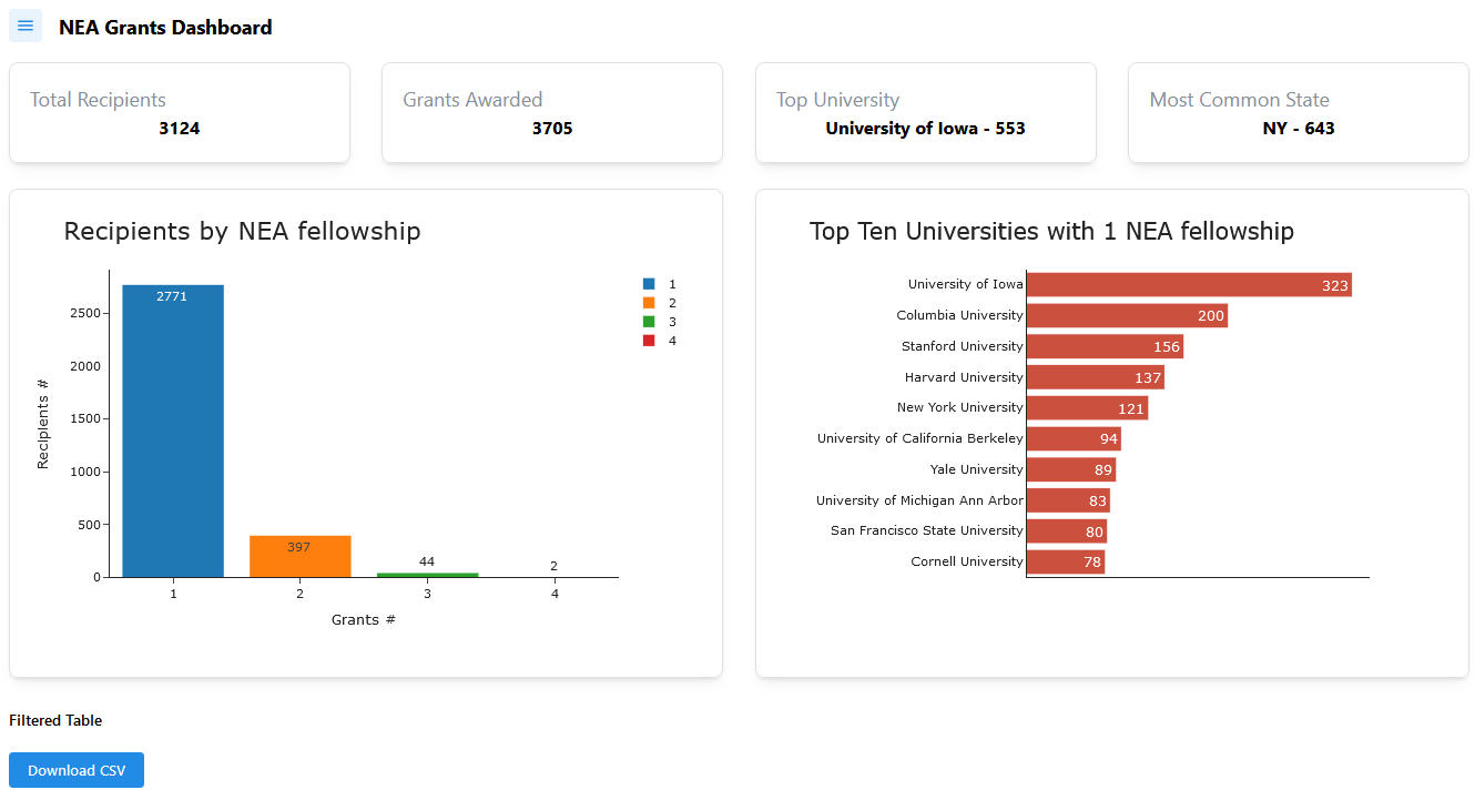
card_a = make_summary_card("Total Recipients", "3124")
card_b = make_summary_card("Grants Awarded", "3705")
card_c = make_summary_card("Top University", "University of Iowa - 553")
card_d = make_summary_card("Most Common State", "NY - 643")

summary_cards = dmc.Grid(
    children=[
        dmc.GridCol(card_a, span=3),
        dmc.GridCol(card_b, span=3),
        dmc.GridCol(card_c, span=3),
        dmc.GridCol(card_d, span=3),
    ],
    gutter="xl",
)

# ---------- 4. CHARTS SECTION ----------
# ++++++++++++++++++++  FIG 1  +++++++++++++++++++++++++++++++++

# hover_data=['lifeExp', 'gdpPercap'] adding fields to hover
# hover_data={'col_name':False}, # remove col_name from hover data
fig1 = px.bar(
    df3,
    x='count_grants',
    y='count_grants_by_autohr',
    color='count_grants',
    template='simple_white',
    text_auto=True,
    hover_name="count_grants", # column name!
    hover_data={'count_grants':False}, # remove 'count_grants' from hover data
    labels={'count_grants_by_autohr':'Recipients #',
            'count_grants':'Grants #'},
    ).update_xaxes(type='category').update_layout(legend_title_text='',
                                                  title={'text':'Recipients by NEA fellowship',
                                                         'font_size':25,
                                                         'font_weight':500})

# ++++++++++++++++++++  FIG 2  +++++++++++++++++++++++++++++++++
df_fig100 = (pd.DataFrame(df_author_one
                        .loc[:,['ba','ba2','ma','ma2','phd','mfa','mfa2']]
                        .stack())
             .value_counts()
             .reset_index()
             .rename(columns={0:'University'}))
# df_fig100.nlargest(n=20, columns='count').sort_values(by='count')

fig100 = px.bar(
    df_fig100.nlargest(n=10, columns='count').sort_values(by='count'),
    y='University',
    x='count',
#     color='orange',
    template='simple_white',
    text_auto=True,
#     hover_name="count_grants", # column name!
#     hover_data={'count_grants':False}, # remove 'count_grants' from hover data
    labels={'University':'',
            'count':''},
    ).update_layout(legend_title_text='',
                    title={'text':'Top Ten Universities with 1 NEA fellowship',
                           'font_size':23,
                           'font_weight':550})
fig100.update_yaxes(tickfont_weight=550,
                    ticks='')
fig100.update_xaxes(showticklabels=False,
                    ticks='')
fig100.update_traces(marker_color='rgb(204,80,62)',
                   textfont_size=20) # , textangle=0, textposition="outside"


# ---------- 4. CHARTS SECTION ----------
chart_section = dmc.Grid(
    [
        dmc.GridCol(
            dmc.Card(
                # children=[
                    dcc.Graph(
                        id={"index": "fig1_id"},# 'fig1_id',#
                        figure=fig1,
                        ),
                    # dmc.Text('whatever')],
                        withBorder=True,
                        my='xs',
                        shadow="sm",
                        style={"marginTop": "20px", "padding": "20px"},
                        radius="md"
                        ),
                        span={"base": 12, "md": 6},
                        ),
        dmc.GridCol(
            dmc.Card(
                dcc.Graph(
                    id={"index": "fig2_id"}, # 'fig2_id',#
                    figure=fig100,
                    ),
                    withBorder=True,
                    my='xs',
                    shadow="sm",
                    style={"marginTop": "20px", "padding": "20px"},
                    radius="md"
                    ),
                    span={"base": 12, "md": 6},
                    )
    ],
    gutter="xl"
    # style={"height": 800}
)


# ---------- 5. TABLE + DOWNLOAD (Placeholder) ----------
table_section = html.Div(
    [
        dmc.Text("Filtered Table", fw=600, mb=10),
        html.Div(id="filtered-table-area",
                 children=[]),  # Will fill dynamically
        dcc.Store(id="filtered-data-store", data=[]),
        dmc.Group(
            [
                dmc.Button("Download CSV", id="download-btn", my='xs'),
                dcc.Download(id="download-dataframe-csv"),
            ],
            justify="left"
        )
    ],
    style={"marginTop": "20px"}
)

# ---------- MAIN LAYOUT CONTAINER ----------
app.layout = dmc.MantineProvider(
    dmc.Container(
        children=[
            nav_drawer,         # The drawer is outside the flow, overlays
            top_bar,            # Toolbar (toggle button + title)
            summary_cards,      # 4 summary cards in a grid
            chart_section,      # Main chart or multiple charts
            table_section       # Table + download button
        ],
        fluid=True,
        style={"padding": "20px"}
    )
)

# ---------- CALLBACKS ----------
# +++++++++++++++++++++++++++++++
# (A) Toggle the Drawer open/closed
@callback(
    Output("nav-drawer", "opened"),
    Input("toggle-drawer-btn", "n_clicks"),
    State("nav-drawer", "opened"),
    prevent_initial_call=True
)
def toggle_nav_drawer(n_clicks, currently_open):
    """When user clicks the hamburger button, toggle the nav drawer."""
    if n_clicks:
        return not currently_open
    return currently_open

# # (B) Apply Filters (placeholder)
# @app.callback(
#     Output("filtered-table-area", "children"),
#     Input("apply-filters-btn", "n_clicks"),
#     prevent_initial_call=True
# )
# def apply_filters(n):
#     # For now, just return a placeholder
#     return dmc.Text("Table updated.")

# # (C) Update AG Grid table based on clickData
@callback(
    Output("filtered-table-area", "children"),  # AG Grid inside children
    Output("filtered-data-store", 'data'),      # dcc.Store() inside table_section
    Output({"index": "fig2_id"}, 'figure'),     # 2nd chart - Universities chart
    Input({"index": "fig1_id"}, "clickData"),   # Pattern-matching ID for the left chart
    prevent_initial_call=True
)
def update_table_from_bar(clickData):
    if not clickData:
        raise PreventUpdate

    # print(clickData['points'][0]['x']) # string type
    # print(type(clickData['points'][0]['x']))
    # Extract the x-value from the bar that was clicked
    # clickData['points'][0]['x'] => str type

    try:
        selected_count = int(clickData['points'][0]['x'])  # x-axis is "count_grants"
    except (IndexError, KeyError):
        raise PreventUpdate

    # # Filtering df based on bar_chart
    if selected_count != 1:
        mask = (df1
                .loc[df1['count_grants'] == selected_count]
                )['nea_person_id'].to_list()
        filtered_df = (df
                       .loc[df['nea_person_id'].isin(mask)] # mask here
                    ).sort_values(by='nea_person_id') # type: ignore
    else: # '1'
        filtered_df = (df
                       .loc[~df['nea_person_id'].duplicated(keep=False)]
                       )
    
    output_data = filtered_df.to_dict("records") # type: ignore

    table = dag.AgGrid(
        id="table_1",
        rowData=output_data,
        columnDefs= [{"field": col} for col in df.columns.to_list()],
        columnSize="autoSize",
        dashGridOptions={
            "pagination": True,
            "paginationPageSize": 15,
            "animateRows": False
        },
    className="ag-theme-alpine")

    if selected_count == 1:
        return table, output_data, fig100
    
    else:
        # authors with ids according to selected_count greater than 1.-
        ids_selected_count = (df1
                 .loc[df1['count_grants'] == selected_count]
                 )['nea_person_id'].to_list() 
        df_mask_selected_count = (df
                                  .loc[:,'nea_person_id']
                                  .isin(ids_selected_count)
                                  )
        
        # filter data from full df suppressing duplicated to count Universities
        df_selected_count = (df
                             .loc[df_mask_selected_count]
                             .pipe(lambda df_:df_.loc[~df_.duplicated(subset='nea_person_id', keep='first')]) # type: ignore
                             )
        df_fig20 = (pd.DataFrame(df_selected_count
                                .loc[:,['ba','ba2','ma','ma2','phd','mfa','mfa2']]
                                .stack())
                                .value_counts()
                                .reset_index()
                                .rename(columns={0:'University'}))
        
        fig20 = px.bar(
            df_fig20.nlargest(n=10, columns='count').sort_values(by='count'),
            y='University',
            x='count',
            template='simple_white',
            text_auto=True,
            labels={'University':'',
                    'count':''},
                    )
        fig20.update_layout(legend_title_text='',
                            title={'text':'Top Universities from which they graduated',
                                   'font_size':23,
                                   'font_weight':550},
                            uniformtext_minsize=12,
                                   )
        fig20.update_yaxes(tickfont_weight=550,
                           ticks='',
                           )
        fig20.update_xaxes(showticklabels=False,
                           ticks='',
                           )
        fig20.update_traces(marker_color='rgb(204,80,62)',
                            textfont_size=20,
                            textangle=0,
                            )
        
        return table, output_data, fig20


# # (D) Download CSV (placeholder)
@callback(
    Output("download-dataframe-csv", "data"),
    Input("download-btn", "n_clicks"),
    State("filtered-data-store", "data"),  # get the stored data
    prevent_initial_call=True
)
def download_csv(n_clicks, store_data):
    if not store_data:
        raise PreventUpdate
    else:
        df_download = pd.DataFrame(store_data)
    return dcc.send_data_frame(df_download.to_csv, filename="filtered_df.csv")

if __name__ == "__main__":
    app.run(debug=True, port=8088, jupyter_mode='external')

8 Likes

I made a dashboard with cross-filtering on pie chart.

6 Likes

Hello Ester, Excellent choice treemap for Grant Distribuition accross US States

3 Likes

Very neat @JuanG , I like the consolidation of the charts and the table at the bottom.

2 Likes

Thanks! I could’ve gone into more detail, but as you know, it requires time.

I made a simple scatterplot to show the median age by USA state or territory. Decided to focus on USA after noticing that 91.4% of the entries were listed as USA, and 7.5% were listed as “No State or Country”. The variation of median age by states or territories is more than I expected.

This code was run on newly released plotly 6.0. My un-scientific/un-benchmarked observation is that this version of plotly is really fast. Version 6.0 is said to be dataframe agnostic, which should speed up visualizations of the polars dataframes that I am using.

Here is the code:

import polars as pl
import plotly.express as px
import plotly
print(f'{plotly.__version__ = }')

#-------------------------------------------------------------------------------
#  91.4% of data set comes from the United States; 7.5% listed as "No state or
#  country". This visualization uses USA data to show the median age of writers
#  by US State. 
#-------------------------------------------------------------------------------

# split long path name, PEP-8
source_file = 'https://raw.githubusercontent.com/plotly/Figure-Friday/refs/'
source_file += 'heads/main/2025/week-4/Post45_NEAData_Final.csv'

df = (
    pl.scan_csv(source_file)  # lazy frame
        .rename(
        {
            'family_name': 'LAST_NAME',
            'given_name_middle': 'FIRST_NAME',
            'us_state': 'STATE'
            }
        )
    .filter(pl.col('STATE').str.len_chars() == 2)
    .filter(pl.col('birth_year').is_not_null())
    .filter(pl.col('country') == 'USA')
    .with_columns(
        WRITERS_AGE = (pl.col('nea_grant_year') - pl.col('birth_year'))
    )
    .with_columns(
        STATE_COUNT = pl.col('STATE').count().over('STATE'),
        STATE_MEDIAN_AGE = pl.col('WRITERS_AGE').median().over('STATE'),
    )
    .select(
        pl.col(
            [
                'FIRST_NAME', 'LAST_NAME', 'WRITERS_AGE', 
                'STATE', 
                'STATE_COUNT', 
                'STATE_MEDIAN_AGE',
            ]
        )
    )
    .collect()   # lazy frame to polars dataframe
)

fig = px.scatter(
    df.sort('STATE_MEDIAN_AGE', descending=True),
    x='STATE',
    y='STATE_MEDIAN_AGE', 
    color='STATE',
    template='simple_white',
    height=500, width=1200,
    title='NEA WRITERS - MEDIAN AGE BY US STATES AND TERRITORIES',
   ) 
fig.update_traces(
    mode='lines+markers',
    line=dict(color='blue', width=5)
    )
fig.update_layout(showlegend=False)

# annotation positioned by 'paper', better to position by data or 'graph'
fig.add_annotation(
    text = 'North Dakota (median age - 57)', 
    x = 0.06, xref='paper', 
    y = 0.97, yref='paper',
    showarrow=False, align='left', 
)
# annotation positioned by 'paper', better to position by data or 'graph'
fig.add_annotation(
    text = 'Puerto Rico (median age - 36)', 
    x = 0.94, xref='paper', 
    y = 0.02, yref='paper',
    showarrow=False, align='left', 
)

fig.show()
5 Likes

Hi Adam, and everyone! Just chiming in to say that all this work is so cool! I’m thrilled to see what people are doing with the NEA dataset, and—as I write a short piece on preliminary findings—it’s cool to see the questions that are most of interest, many of which have been on my mind for years!

— Alexander Manshel

1 Like

Thank you Alexander and welcome to the Plotly community :wave: