Hello everyone,
So this week, I’m finally getting started on this dashboard project – kinda like throwing out the first pitch in baseball
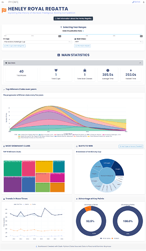
This dashboard is intended for individuals with an interest in historical sporting events and data analysis, a domain I find particularly engaging.
The fundamental objectives of this dashboard are as follows:
- To present the Henley Royal Regatta data in a visually appealing and interactive format, enabling users to explore the information through dynamic charts.
- To facilitate the identification of temporal trends, such as shifts in winning teams and changes in race times over the years.
- To determine key statistics, including the most successful clubs, the prevalent types of victories, and the significance of leading at various stages of the race.
- To provide users with the ability to conduct focused analysis by filtering data based on specific year ranges, cup categories, and boat classes.
- To offer relevant background information regarding the regatta, the different cups, boat classifications, and the terminology used to describe race outcomes, thereby enhancing data comprehension.
- To ensure a user interface that is modern, intuitive, and aesthetically pleasing, employing a consistent visual style and appropriate design elements for optimal usability.
In essence, the aim of this project is to transform historical racing data into an accessible and informative tool, allowing users to explore and gain insights into the Henley Royal Regatta’s history and evolution in an engaging manner.
The dashboard
I hope this proves to be a useful tool. Your comments and suggestions are most welcome.


