 What’s New
Dash Mantine Components 2.3.0 is here! Built on top of Mantine 8.3.0, this release brings:
-
DirectionProviderfor RTL layouts -
MiniCalendarfor compact date displays -
Vertical orientation in
Progress -
RichTextEditornow powered by Tiptap V3 - enabling features like BackgroundColor, FontFamily, FontSize, LineHeight. -
New
ScrollAreafeatures, includingscrollToandScrollAreaAutosize -
New
Overlaycomponent -
Autocompletenow supportsdebounceprop -
MultiSelectnow enables multiple selections from the same search query -
New
LLMs.txtto get better answers from your AI coding assistanct
 Want to Try It Live?
This post shows screenshots only — for live interactive examples with code, check out the
 DMC 2.3.0 Release Announcement on the docs site.
New DirectionProvider component
Mantine supports right-to-left (RTL) layouts out of the box. Try the new direction toggle in the header of the DMC docs — one click and the entire app flips to RTL. Not just the text, but every component adapts. Check out the sliders in RTL mode, they feel completely natural.
See the RTL (right-to-left) direction guide for details on enabling RTL direction and adding a toggle to your app.
app.layout = dmc.DirectionProvider(
    dmc.MantineProvider([
     # your app layout
     ]),
    direction="rtl"
)

New MiniCalendar component
The new MiniCalendar component makes it easy to add compact calendars.
DMC has an extensive collection of feature rich date and time pickers that are configurable, accessible and look great in light and dark mode. See the new Date Pickers Overview in the docs.

Progress vertical orientation
Progress now supports vertical orientation:

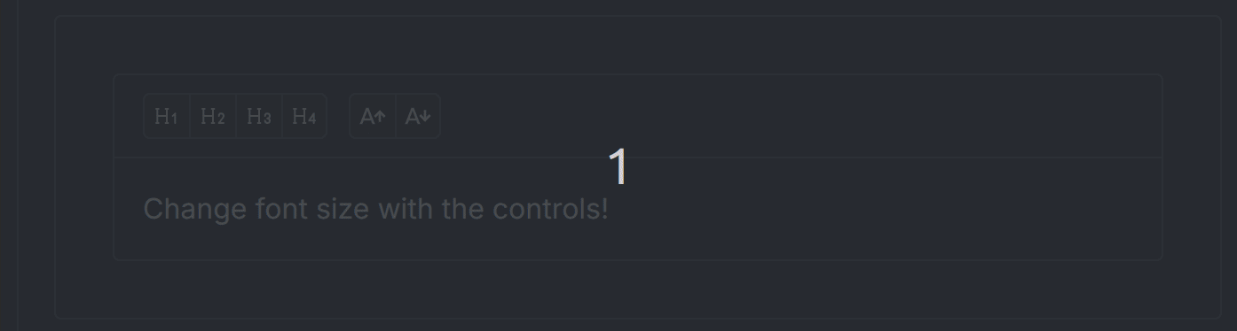
RichTextEditor upgraded to Tiptap V3
RichTextEditor is now built on Tiptap V3 enabling features like BackgroundColor, FontFamily, FontSize, LineHeight.
Here is an example of creating custom buttons to change the font size:
ScrollArea scrollTo prop
The ScrollArea, now includes a scrollTo prop to control the viewport position.

New ScrollAreaAutosize component
ScrollAreaAutosize component creates a scrollable container once a given max-height is reached.
New Overlay component
Overlay creates a customizable layer over content or the entire viewport. It’s useful for dimming effects, interactive overlays, and custom loading states. You can configure opacity, color, and positioning.

MultiSelect improvement
MultiSelect now supports clearSearchOnChange=False allowing multiple selections from the same search query.
import dash_mantine_components as dmc

dmc.MultiSelect(
    data=["aa", "ab", "ac", "ba", "bb", "bc"],
    value=["aa"],
    searchable=True,
    clearSearchOnChange=False
)

Autocomplete debounce prop
The Autocomplete component now supports the debounce prop. This delays the update of the value until the user stops interacting, reducing callback frequency.
LLMs.txt
You can now use LLMs.txt file with Cursor and other IDEs. The file is automatically updated with each release and includes every demo and documentation page from the DMC docs site. It is about 1.6MB. You can find the latest version of LLMs.txt and documentation in the LLMs section of the DMC docs.
 Maybe one that could be inverted (0-10 or 10-0)…