Hello everybody,
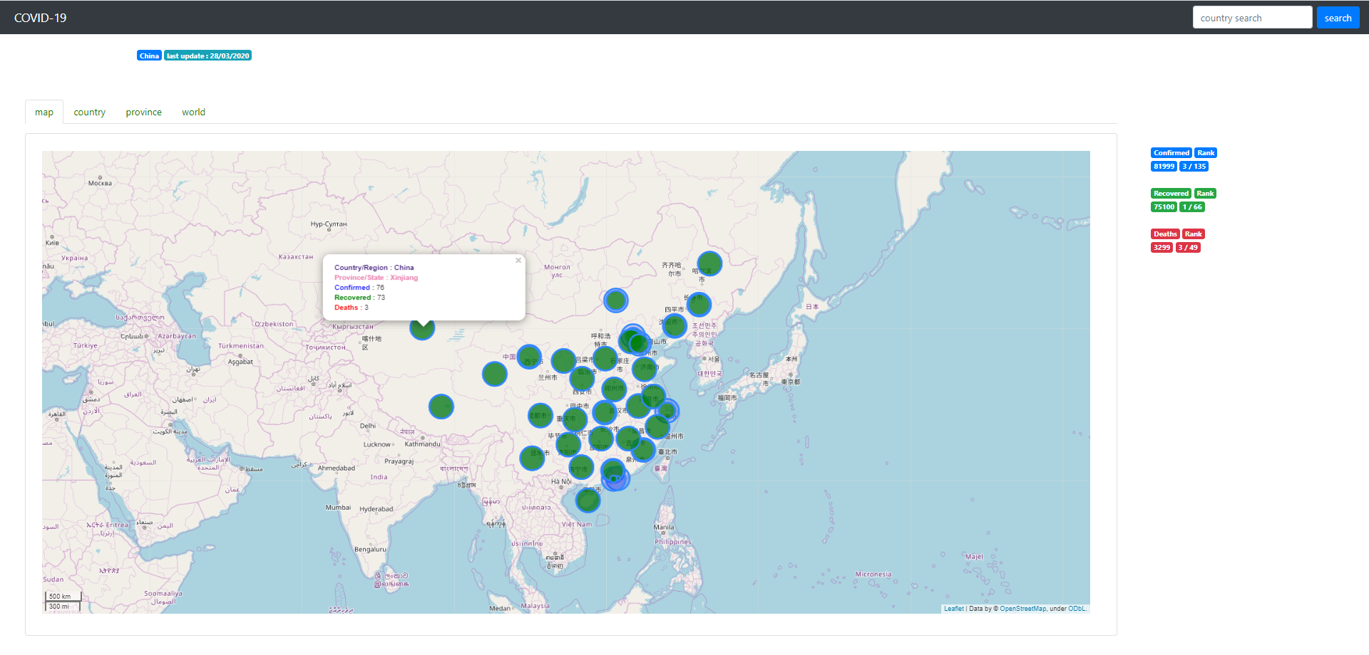
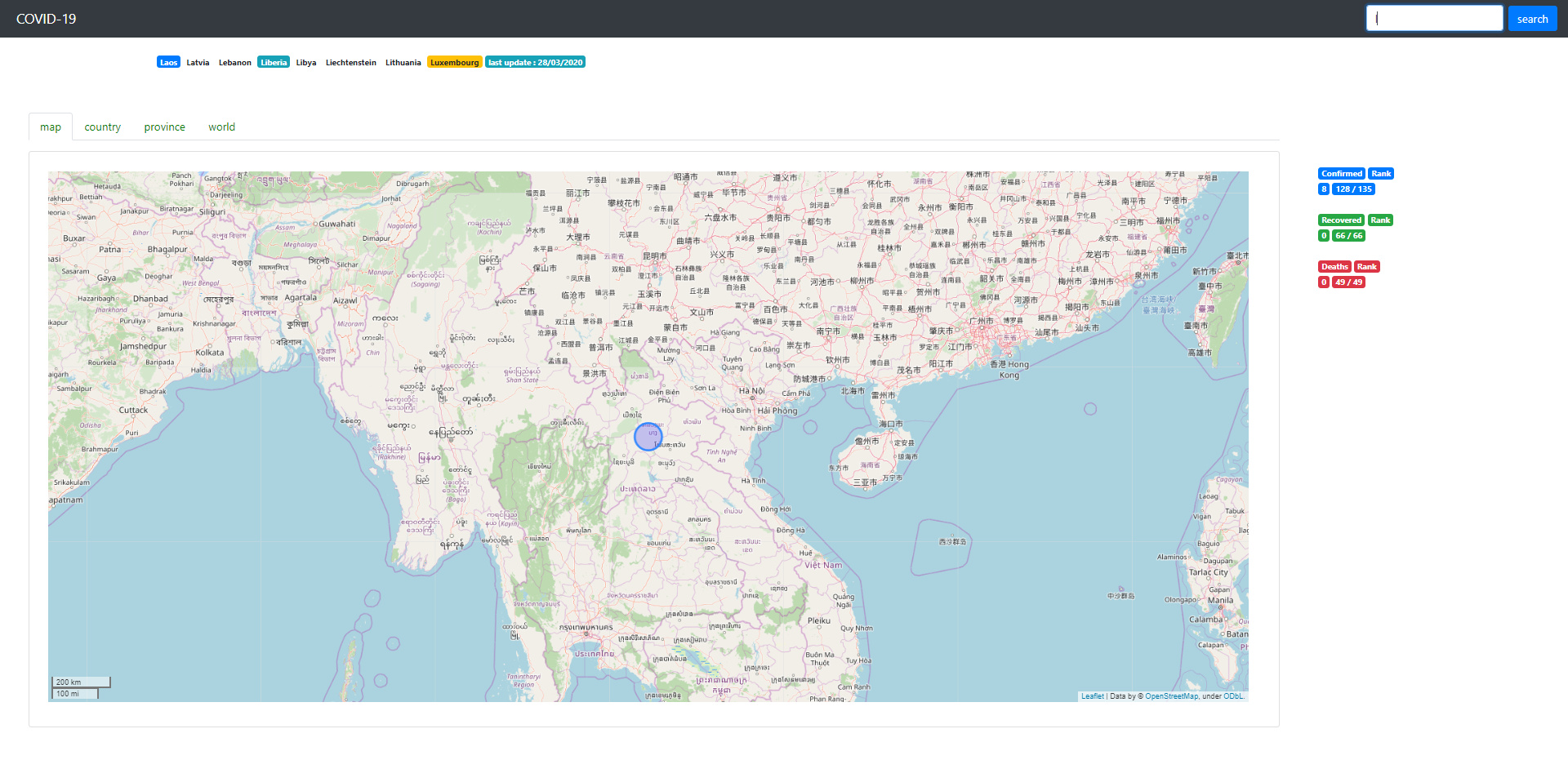
I used dash, plotly and leaflet to create a dashboard to represent the evolution of covid-19 in the world. Here is the link to the first version http://covid19go.herokuapp.com and some screenshots Desktop
I’m open for contribution and ideas.
Merci to plotly, dash, folium, heroku, Johns Hopkins University, Open Street Map, …


Gabriel Orabi
Data Scientist
France