Bars won't align on x axis

Hi,

I am having some trouble getting things to align properly on my bar chart.
I am using a go.Figure() (fig) with overlaid px.bar() traces (fig1, fig2):

# Create plotly figure from params
def make_figure(df2, makeStacked) -> go.Figure:
    # figure
    fig = go.Figure()

    # Whether plot is stacked or grouped
    if makeStacked:
        x = df2['Dummy']
        opacity = 0.5
        title = 'Budget (Stacked)'
        x_title = ''
        barmode_budget = 'relative'  # 'group', 'overlay' or 'relative' (default 'relative')
        # barmode_data = 'stack'
        # barmode_fig = 'overlay'
    else:
        x = df2['Group']
        opacity = 0.5
        title = 'Budget (Grouped)'
        x_title = 'Group'
        barmode_budget = 'overlay'  # 'group', 'overlay' or 'relative' (default 'relative')
        # barmode_data = 'overlay'
        # barmode_fig = 'overlay'

    # budget
    fig1 = px.bar(
        data_frame=df2,
        x=x,
        y=df2['Budget'],
        custom_data=['Group', 'Budget', 'Percent', 'Margin'],
        opacity=opacity,
        barmode=barmode_budget
    ).update_traces(
        width=0.8,
        hovertemplate="<br>".join([
            "Group: %{customdata[0]}",
            "Budget: $%{customdata[1]:.0f}",
        ]),
        # hovertemplate=None,
        # hoverinfo='skip'
    )
    fig1.data[0]['showlegend'] = True
    fig1.data[0]['name'] = 'Budget'
    fig1.data[0]['hoverlabel'].namelength = 0

    # data
    fig2 = px.bar(
        data_frame=df2,
        x=x,
        y=df2['Amount'],
        custom_data=['Group', 'Budget', 'Percent', 'Margin'],
    ).update_traces(
        width=0.7,
        marker_color=df2['Color'],
        hovertemplate="<br>".join([
            "Group: %{customdata[0]}",
            "Amount: $%{y:.0f}",
            "Budget: $%{customdata[1]:.0f}",
            "Percent: %{customdata[2]:.1f}%",
            "Margin: $%{customdata[3]:.0f}",
        ]),
    )
    # fig2.update_layout(barmode=barmode_data)
    fig2.data[0]['showlegend'] = True
    fig2.data[0]['name'] = 'Data'
    fig2.data[0]['hoverlabel'].namelength = 0

    # add figs to chart
    fig.add_traces([fig1.data[0], fig2.data[0]])

    # layout
    fig.update_layout(
        title=title,
        title_x=0.5,
        xaxis_title=x_title,
        yaxis_title='Amount',
        showlegend=True,
    )

    if not makeStacked:
        # this is causing certain traces to overlay instead of stack
        # but without it the bars are not aligned exactly on top of each other...
        # fig.update_layout(barmode='overlay')
        pass
    else:
        # fig.update_xaxes(showticklabels=False)
        pass

    return fig

The chart looks something like this (when makeStacked is True):

I cannot seem to figure out how to make the blue and green portions align on the x-axis.
(Like in this example: Create Overlapped/Superimposed Barchart - #2 by eliasdabbas)

I’ve tried many things but it always causes the data to be displayed incorrectly. (one of the traces ends up overlaid when it should be stacked.)

Now if there are no stacks on any of the traces (ie, one blue bar and one green bar), then it will overlay correctly. This is what happens when I do makeStacked=False. But only if I do the fig.update_layout(barmode='overlay') code near the bottom that is currently commented out. And only if those groups again do not have any stacks. As soon as I add more data for stacking it breaks.

Any help would be appreciated. In the meantime I’ll see if I can provide some more / simpler examples.

Thanks!

Here’s a full example code you can run.
The goal is to make the “makeStacked” plot align on the x-axis.

import pandas as pd
import plotly.express as px
import plotly.graph_objects as go


# Create plotly figure from params
def make_figure(df2=None, makeStacked=False, debug=True) -> go.Figure:

    if debug:
        data = {
            'Dummy': [0, 0],
            'Field': ['Category', 'Category'],
            'Group': ['Misc', 'Food'],
            'Amount': [-778.69, -589.71],
            'Budget': [-500, -500],
            'Percent': [155.738, 117.942],
            'Margin': [278.69, 89.71],
            'Color': ['#D62728', '#D62728'],
        }
        df_test = pd.DataFrame(data)
        print('df_test=\n', df_test)
        df2 = df_test.copy()

    # figure
    fig = go.Figure()

    # Whether plot is stacked or grouped
    if makeStacked:
        x = df2['Dummy']
        opacity = 0.5
        title = 'Budget (Stacked)'
        x_title = ''
        barmode_budget = 'relative'  # 'group', 'overlay' or 'relative' (default 'relative')
        barmode_data = 'relative'  # 'group', 'overlay' or 'relative' (default 'relative')
        barmode_fig = 'overlay'  # 'stack', 'relative', 'group', 'overlay' (default 'relative'?)

        # budget
        fig1 = px.bar(
            data_frame=df2,
            x=x,
            y=df2['Budget'],
            custom_data=['Group', 'Budget', 'Percent', 'Margin'],
            opacity=opacity,
            barmode=barmode_budget,  # 'group', 'overlay' or 'relative' (default 'relative')
        ).update_traces(
            width=0.8,
            hovertemplate="<br>".join([
                "Group: %{customdata[0]}",
                "Budget: $%{customdata[1]:.0f}",
            ]),
            # hovertemplate=None,
            # hoverinfo='skip'
        )
        fig1.data[0]['showlegend'] = True
        fig1.data[0]['name'] = 'Budget'
        fig1.data[0]['hoverlabel'].namelength = 0

        # data
        fig2 = px.bar(
            data_frame=df2,
            x=x,
            y=df2['Amount'],
            custom_data=['Group', 'Budget', 'Percent', 'Margin'],
            # barmode=barmode_data,  # 'group', 'overlay' or 'relative' (default 'relative')
        ).update_traces(
            width=0.7,
            marker_color=df2['Color'],
            hovertemplate="<br>".join([
                "Group: %{customdata[0]}",
                "Amount: $%{y:.0f}",
                "Budget: $%{customdata[1]:.0f}",
                "Percent: %{customdata[2]:.1f}%",
                "Margin: $%{customdata[3]:.0f}",
            ]),
        )
        # fig2.update_layout(barmode=barmode_data)
        fig2.data[0]['showlegend'] = True
        fig2.data[0]['name'] = 'Data'
        fig2.data[0]['hoverlabel'].namelength = 0

        # add figs to chart
        fig.add_traces([fig1.data[0], fig2.data[0]])

        # layout
        fig.update_layout(
            title=title,
            title_x=0.5,
            xaxis_title=x_title,
            yaxis_title='Amount',
            showlegend=True,
            # barmode=barmode_fig,  # 'stack', 'relative', 'group', 'overlay' (default 'relative'?)
        )

        return fig

        # below is good
    else:
        x = df2['Group']
        opacity = 0.5
        title = 'Budget (Grouped)'
        x_title = 'Group'
        barmode_budget = 'relative'  # 'group', 'overlay' or 'relative' (default 'relative')
        barmode_data = 'relative'  # 'group', 'overlay' or 'relative' (default 'relative')
        barmode_fig = 'overlay'  # 'stack', 'relative', 'group', 'overlay' (default 'relative'?)

        # budget
        fig1 = px.bar(
            data_frame=df2,
            x=x,
            y=df2['Budget'],
            custom_data=['Group', 'Budget', 'Percent', 'Margin'],
            opacity=opacity,
            barmode=barmode_budget,  # 'group', 'overlay' or 'relative' (default 'relative')
        ).update_traces(
            width=0.8,
            hovertemplate="<br>".join([
                "Group: %{customdata[0]}",
                "Budget: $%{customdata[1]:.0f}",
            ]),
            # hovertemplate=None,
            # hoverinfo='skip'
        )
        fig1.data[0]['showlegend'] = True
        fig1.data[0]['name'] = 'Budget'
        fig1.data[0]['hoverlabel'].namelength = 0

        # data
        fig2 = px.bar(
            data_frame=df2,
            x=x,
            y=df2['Amount'],
            custom_data=['Group', 'Budget', 'Percent', 'Margin'],
            barmode=barmode_data,  # 'group', 'overlay' or 'relative' (default 'relative')
        ).update_traces(
            width=0.7,
            marker_color=df2['Color'],
            hovertemplate="<br>".join([
                "Group: %{customdata[0]}",
                "Amount: $%{y:.0f}",
                "Budget: $%{customdata[1]:.0f}",
                "Percent: %{customdata[2]:.1f}%",
                "Margin: $%{customdata[3]:.0f}",
            ]),
        )
        # fig2.update_layout(barmode=barmode_data)
        fig2.data[0]['showlegend'] = True
        fig2.data[0]['name'] = 'Data'
        fig2.data[0]['hoverlabel'].namelength = 0

        # add figs to chart
        fig.add_traces([fig1.data[0], fig2.data[0]])

        # layout
        fig.update_layout(
            title=title,
            title_x=0.5,
            xaxis_title=x_title,
            yaxis_title='Amount',
            showlegend=True,
            barmode=barmode_fig,  # 'stack', 'relative', 'group', 'overlay' (default 'relative'?)
        )

        return fig


# test
# fig = make_figure(makeStacked=False)
# fig.show()

fig = make_figure(makeStacked=True)
fig.show()

I found these settings worked for the “Grouped” (makeStacked=False) plot in all cases, so I think that part is resolved:

barmode_budget = ‘relative’
barmode_data = ‘relative’
barmode_fig = ‘overlay’

However the same settings cause the “Budget” trace to overlap on itself, when it should be stacked (relative.) Example below:

Good: both blue and red bars are stacked on each other.
Bad: Red bars should be overlaid on top of blue, not staggered.

Good: Traces are overlaid
Bad: Blue ‘Budget’ bars are not stacked correctly–they appear to be overlaid on themselves.

Hey @daflamingpotato, could you plesae explain how you want the graph to look like? What do you mean by stacked and overlayed in this context?

Sure–it might be easier to tell with different ‘budget’ values.
Here’s an example df:

data = {
            'Dummy': [0, 0],
            'Field': ['Category', 'Category'],
            'Group': ['Misc', 'Food'],
            'Amount': [-778.69, -589.71],
            'Budget': [-800, -500],
            'Percent': [155.738, 117.942],
            'Margin': [278.69, 89.71],
            'Color': ['#2ca02c', '#D62728'],
        }

If you comment out the barmode-setting part of the makeStacked code (line 64)…

fig2 = px.bar(
            data_frame=df2,
            x=x,
            y=df2['Amount'],
            custom_data=['Group', 'Budget', 'Percent', 'Margin'],
            # barmode=barmode_data,  # 'group', 'overlay' or 'relative' (default 'relative')
        ).update_traces(

This is what you will get:

The Budget values (-500, -800) represented by the blue bars are stacked on top of each other.
The Amount values (-778.69, -589.71) represented by the red/green bars are also stacked.
This is the desired behavior. The only problem is that the blue and red/green bars should all be centered on 0. However for some reason they are staggered.

Now here is what happens if you try to uncomment line 64, and set the figure barmode to ‘overlay’:

Everything is centered on 0, which is what we want.
However, you’ll notice that all the bars are plotted incorrectly.
They are no longer stacked. They are overlayed.

What I want is the data within the individual traces to be stacked (or ‘relative’ mode, whatever you want to call it. All the values are negative in this case.) But ‘budget’ trace (fig1) and the ‘data’ trace (fig2) should be overlaid.

Hope that makes sense.

I believe the default value for barmode_fig (if none is supplied) is ‘group’.
This is the behavior of the 1st plot where I said they were staggered.

I tried messing with the bar width and the bargroupgap. However there is no way to superimpose the data in this mode.

This seems like an improvement, if I set the bars to equal width and just display in group mode, but still not really what I want… if only bargroupgap could supply negative values as well…

EDIT: Don’t really know why this worked, but I just got this plot:

Turns out I was wrong, there does seem to be a way to superimpose while in group mode.
Setting the ‘bargap’ = 1.0 did the trick for me.

budget_width = 1.2
data_width = 1
x_range = (-2, 2)
bargroupgap = 0.0  # doesn't matter if you set the widths... range [0,1]
bargap = 1.0  # in range [0,1]

Full code:

import pandas as pd
import plotly.express as px
import plotly.graph_objects as go


# Create plotly figure from params
def make_figure(df2=None, makeStacked=False, debug=True) -> go.Figure:

    budget_width = 1.2
    data_width = 1
    x_range = (-2, 2)
    bargroupgap = 0.0  # doesn't matter if you set the widths... range [0,1]
    bargap = 1.0  # in range [0,1]

    if debug:
        data = {
            'Dummy': [0, 0],
            'Field': ['Category', 'Category'],
            'Group': ['Misc', 'Food'],
            'Amount': [-778.69, -589.71],
            'Budget': [-800, -500],
            'Percent': [155.738, 117.942],
            'Margin': [278.69, 89.71],
            'Color': ['#2ca02c', '#D62728'],
        }
        df_test = pd.DataFrame(data)
        print('df_test=\n', df_test)
        df2 = df_test.copy()

    # figure
    fig = go.Figure()

    # Whether plot is stacked or grouped
    if makeStacked:
        x = df2['Dummy']
        opacity = 0.5
        title = 'Budget (Stacked)'
        x_title = ''
        barmode_budget = 'relative'  # 'group', 'overlay' or 'relative' (default 'relative')
        barmode_data = 'relative'  # 'group', 'overlay' or 'relative' (default 'relative')
        barmode_fig = 'group'  # 'stack', 'relative', 'group', 'overlay' (default 'group'?)

        # budget
        fig1 = px.bar(
            data_frame=df2,
            x=x,
            y=df2['Budget'],
            custom_data=['Group', 'Budget', 'Percent', 'Margin'],
            opacity=opacity,
            barmode=barmode_budget,  # 'group', 'overlay' or 'relative' (default 'relative')
        ).update_traces(
            width=budget_width,
            hovertemplate="<br>".join([
                "Group: %{customdata[0]}",
                "Budget: $%{customdata[1]:.0f}",
            ]),
            # hovertemplate=None,
            # hoverinfo='skip'
        )
        fig1.data[0]['showlegend'] = True
        fig1.data[0]['name'] = 'Budget'
        fig1.data[0]['hoverlabel'].namelength = 0

        # data
        fig2 = px.bar(
            data_frame=df2,
            x=x,
            y=df2['Amount'],
            custom_data=['Group', 'Budget', 'Percent', 'Margin'],
            # barmode=barmode_data,  # 'group', 'overlay' or 'relative' (default 'relative')
        ).update_traces(
            width=data_width,
            marker_color=df2['Color'],
            hovertemplate="<br>".join([
                "Group: %{customdata[0]}",
                "Amount: $%{y:.0f}",
                "Budget: $%{customdata[1]:.0f}",
                "Percent: %{customdata[2]:.1f}%",
                "Margin: $%{customdata[3]:.0f}",
            ]),
        )
        fig2.update_layout(barmode=barmode_data)
        fig2.data[0]['showlegend'] = True
        fig2.data[0]['name'] = 'Data'
        fig2.data[0]['hoverlabel'].namelength = 0

        # add figs to chart
        fig.add_traces([fig1.data[0], fig2.data[0]])

        # layout
        fig.update_layout(
            title=title,
            title_x=0.5,
            xaxis_title=x_title,
            yaxis_title='Amount',
            showlegend=True,
            #barmode=barmode_fig,  # 'stack', 'relative', 'group', 'overlay' (default 'relative'?)
            bargroupgap=bargroupgap,
            bargap=bargap,
        )
        fig.update_xaxes({'range': x_range, 'autorange': False})

        return fig

        # below is good ###################################################################################
    else:
        x = df2['Group']
        opacity = 0.5
        title = 'Budget (Grouped)'
        x_title = 'Group'
        barmode_budget = 'relative'  # 'group', 'overlay' or 'relative' (default 'relative')
        barmode_data = 'relative'  # 'group', 'overlay' or 'relative' (default 'relative')
        barmode_fig = 'overlay'  # 'stack', 'relative', 'group', 'overlay' (default 'relative'?)

        # budget
        fig1 = px.bar(
            data_frame=df2,
            x=x,
            y=df2['Budget'],
            custom_data=['Group', 'Budget', 'Percent', 'Margin'],
            opacity=opacity,
            barmode=barmode_budget,  # 'group', 'overlay' or 'relative' (default 'relative')
        ).update_traces(
            width=0.8,
            hovertemplate="<br>".join([
                "Group: %{customdata[0]}",
                "Budget: $%{customdata[1]:.0f}",
            ]),
            # hovertemplate=None,
            # hoverinfo='skip'
        )
        fig1.data[0]['showlegend'] = True
        fig1.data[0]['name'] = 'Budget'
        fig1.data[0]['hoverlabel'].namelength = 0

        # data
        fig2 = px.bar(
            data_frame=df2,
            x=x,
            y=df2['Amount'],
            custom_data=['Group', 'Budget', 'Percent', 'Margin'],
            barmode=barmode_data,  # 'group', 'overlay' or 'relative' (default 'relative')
        ).update_traces(
            width=0.7,
            marker_color=df2['Color'],
            hovertemplate="<br>".join([
                "Group: %{customdata[0]}",
                "Amount: $%{y:.0f}",
                "Budget: $%{customdata[1]:.0f}",
                "Percent: %{customdata[2]:.1f}%",
                "Margin: $%{customdata[3]:.0f}",
            ]),
        )
        # fig2.update_layout(barmode=barmode_data)
        fig2.data[0]['showlegend'] = True
        fig2.data[0]['name'] = 'Data'
        fig2.data[0]['hoverlabel'].namelength = 0

        # add figs to chart
        fig.add_traces([fig1.data[0], fig2.data[0]])

        # layout
        fig.update_layout(
            title=title,
            title_x=0.5,
            xaxis_title=x_title,
            yaxis_title='Amount',
            showlegend=True,
            barmode=barmode_fig,  # 'stack', 'relative', 'group', 'overlay' (default 'relative'?)
        )

        return fig


# test
fig = make_figure(makeStacked=False)
fig.show()

fig = make_figure(makeStacked=True)
fig.show()

This works for the stacked plot but sadly I noticed I have the same issue still on the grouped (makeStacked=False) plot. When I thought it was working before, it actually has the same problem (if any of the data are stacked, it makes them overlay instead.)

If I apply the same logic, as above, only the first group is displayed correctly:

Changing the bargroupgap seems to have no effect.

So, I found a sort of hacky solution by manually setting the widths of the bars depending on the number of groups:

num_groups = df2['Group'].nunique()
print('num_groups=\n', num_groups)

b = 0.6
d = 0.5

budget_width = b/num_groups + b
data_width = d/num_groups + d

if num_groups == 1:
    budget_width = b
    data_width = d

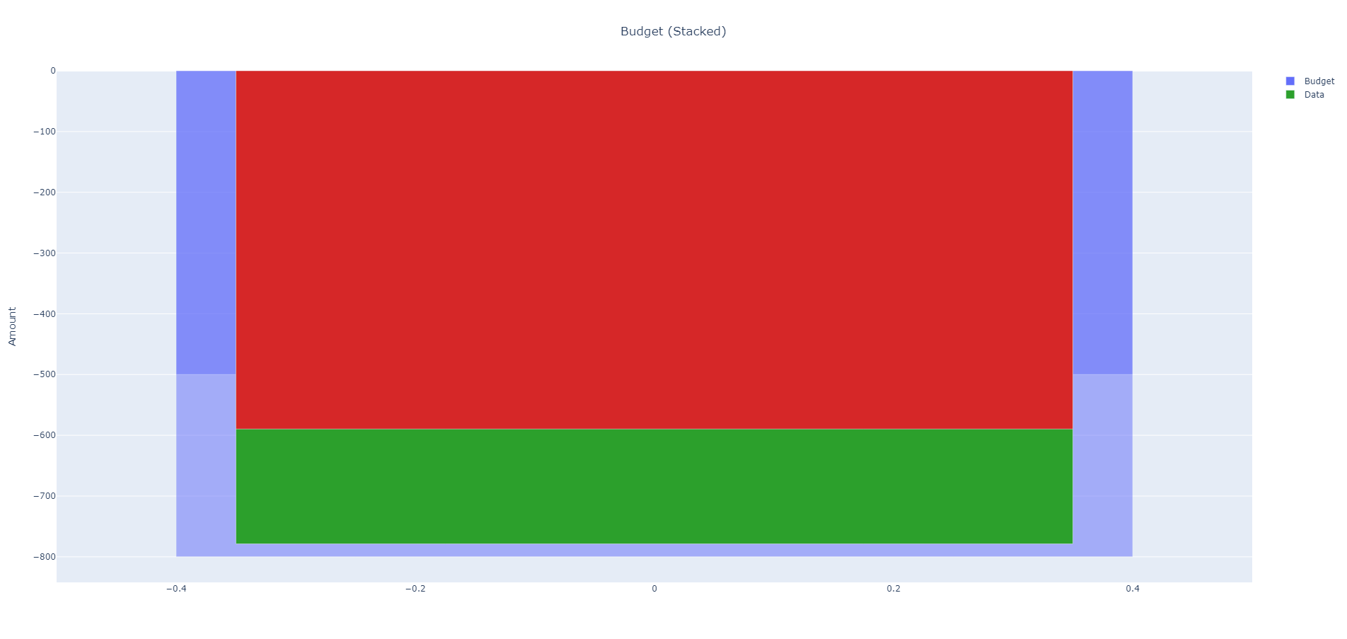
I found this to work pretty well. You can play around with the values of ‘b’ and ‘d’ for the widths of each bar. Here’s an example plot:

I’ll mark this as solved, although I still don’t fully understand why this works.

plotly.graph_objects.Figure — 5.20.0 documentation.
bargap: “Sets the gap (in plot fraction) between bars of adjacent location coordinates.”
For some reason, setting this to 1.0 results in the overlapping behavior that I want. I guess it considers bars within the same group to be at adjacent locations. But the behavior is counter-intuitive. (why does a bargap of 0.0 mean the edges are touching, while a bargap of 1.0 makes them overlap?)
Meanwhile, try setting ‘bargroupgap’ and you’ll find it does absolutely nothing in this example…

EDIT:
I cleaned up the code a bit.
I’ll post the full example code here so people can play around with it if they want:

import pandas as pd
import plotly.express as px
import plotly.graph_objects as go

# from app import num_to_month


# Get test data
def get_test_data(num_groups: int):
    if num_groups not in [1, 2, 3, 4, 5, 6]:
        raise ValueError('Invalid range for num_groups (must be in [1,6])')

    ##############################################
    # 6 groups
    if num_groups == 6:
        dummy = ['', '', '', '', '', '', '', '', '', '', '', '']
        field = ['Month', 'Category', 'Category', 'Category', 'Category', 'Category', 'Category', 'Month', 'Category',
                 'Category', 'Category', 'Category']
        group = ['2', 'Misc', 'Insurance', 'Housing', 'Food', 'Transportation', 'Subscriptions', '3', 'Misc',
                 'Subscriptions',
                 'Transportation', 'Food']
        amount = [-2046.67, -646.61, -162.25, -840.43, -307.03, -71.37, -18.98, -686.06, -365.82, -37.64, -34.28,
                  -248.32]
        budget = [-2263, -500, -163, -850, -500, -200, -50, -2263, -500, -50, -200, -500]
        percent = [90.4406, 129.322, 99.5399, 98.8741, 61.406, 35.685, 37.96, 30.3164, 73.164, 75.28, 17.14, 49.664]
        margin = [-216.33, 146.61, -0.75, -9.57, -192.97, -128.63, -31.02, -1576.94, -134.18, -12.36, -165.72, -251.68]
        color = ['#2CA02C', '#D62728', '#2CA02C', '#2CA02C', '#2CA02C', '#2CA02C', '#2CA02C', '#2CA02C', '#2CA02C',
                 '#2CA02C',
                 '#2CA02C', '#2CA02C']

    # 5 groups
    if num_groups == 5:
        dummy = ['', '', '', '', '', '', '', '', '', '', '']
        field = ['Month', 'Category', 'Category', 'Category', 'Category', 'Category', 'Month', 'Category',
                 'Category', 'Category', 'Category']
        group = ['2', 'Misc', 'Housing', 'Food', 'Transportation', 'Subscriptions', '3', 'Misc', 'Subscriptions',
                 'Transportation', 'Food']
        amount = [-2046.67, -646.61, -840.43, -307.03, -71.37, -18.98, -686.06, -365.82, -37.64, -34.28, -248.32]
        budget = [-2263, -500, -850, -500, -200, -50, -2263, -500, -50, -200, -500]
        percent = [90.4406, 129.322, 98.8741, 61.406, 35.685, 37.96, 30.3164, 73.164, 75.28, 17.14, 49.664]
        margin = [-216.33, 146.61, -9.57, -192.97, -128.63, -31.02, -1576.94, -134.18, -12.36, -165.72, -251.68]
        color = ['#2CA02C', '#D62728', '#2CA02C', '#2CA02C', '#2CA02C', '#2CA02C', '#2CA02C', '#2CA02C', '#2CA02C',
                 '#2CA02C', '#2CA02C']

    # 4 groups
    if num_groups == 4:
        dummy = ['', '', '', '', '', '', '', '', '']
        field = ['Month', 'Category', 'Category', 'Category', 'Category', 'Month', 'Category',
                 'Category', 'Category']
        group = ['2', 'Misc', 'Housing', 'Food', 'Subscriptions', '3', 'Misc', 'Subscriptions', 'Food']
        amount = [-2046.67, -646.61, -840.43, -307.03, -18.98, -686.06, -365.82, -37.64, -248.32]
        budget = [-2263, -500, -850, -500, -50, -2263, -500, -50, -500]
        percent = [90.4406, 129.322, 98.8741, 61.406, 37.96, 30.3164, 73.164, 75.28, 49.664]
        margin = [-216.33, 146.61, -9.57, -192.97, -31.02, -1576.94, -134.18, -12.36, -251.68]
        color = ['#2CA02C', '#D62728', '#2CA02C', '#2CA02C', '#2CA02C', '#2CA02C', '#2CA02C', '#2CA02C', '#2CA02C']

    # 3 groups
    if num_groups == 3:
        dummy = ['', '', '', '', '', '', '', '']
        field = ['Month', 'Category', 'Category', 'Category', 'Month', 'Category',
                 'Category', 'Category']
        group = ['2', 'Misc', 'Food', 'Subscriptions', '3', 'Misc', 'Subscriptions', 'Food']
        amount = [-2046.67, -646.61, -307.03, -18.98, -686.06, -365.82, -37.64, -248.32]
        budget = [-2263, -500, -500, -50, -2263, -500, -50, -500]
        percent = [90.4406, 129.322, 61.406, 37.96, 30.3164, 73.164, 75.28, 49.664]
        margin = [-216.33, 146.61, -192.97, -31.02, -1576.94, -134.18, -12.36, -251.68]
        color = ['#2CA02C', '#D62728', '#2CA02C', '#2CA02C', '#2CA02C', '#2CA02C', '#2CA02C', '#2CA02C']

    # 2 groups
    if num_groups == 2:
        dummy = ['', '', '', '', '', '']
        field = ['Month', 'Category', 'Category', 'Month', 'Category', 'Category']
        group = ['2', 'Misc', 'Food', '3', 'Misc', 'Food']
        amount = [-2046.67, -646.61, -307.03, -686.06, -365.82, -248.32]
        budget = [-2263, -500, -500, -2263, -500, -500]
        percent = [90.4406, 129.322, 61.406, 30.3164, 73.164, 49.664]
        margin = [-216.33, 146.61, -192.97, -1576.94, -134.18, -251.68]
        color = ['#2CA02C', '#D62728', '#2CA02C', '#2CA02C', '#2CA02C', '#2CA02C']

    # 1 group
    if num_groups == 1:
        dummy = ['', '', '', '']
        field = ['Month', 'Category', 'Month', 'Category']
        group = ['2', 'Misc', '3', 'Misc']
        amount = [-2046.67, -646.61, -686.06, -365.82]
        budget = [-2263, -500, -2263, -500]
        percent = [90.4406, 129.322, 30.3164, 73.164]
        margin = [-216.33, 146.61, -1576.94, -134.18]
        color = ['#2CA02C', '#D62728', '#2CA02C', '#2CA02C']

    ##############################################
    # Create dataframe from test data
    data_dict = {
        'Dummy': dummy,
        'Field': field,
        'Group': group,
        'Amount': amount,
        'Budget': budget,
        'Percent': percent,
        'Margin': margin,
        'Color': color,
    }
    df = pd.DataFrame(data_dict)
    # df['Group'] = df.apply(num_to_month, axis=1)

    # Copy and remove unnecessary data
    df_test = df.copy()
    df_test = df_test.loc[df_test['Field'] == 'Category']
    print('df_test=\n', df_test)

    return df_test


# Create plotly figure from params
def make_figure(df2=None, makeStacked=False) -> go.Figure:
    # figure
    fig = go.Figure()

    # common settings
    budget_barmode = 'relative'  # 'group', 'overlay' or 'relative' (default 'relative')
    data_barmode = 'relative'  # 'group', 'overlay' or 'relative' (default 'relative')
    fig_barmode = 'group'  # 'stack', 'relative', 'group', 'overlay' (default 'group')
    custom_data = ['Group', 'Budget', 'Percent', 'Margin']

    # bar gap
    bargap = 1.0  # in range [0,1]
    # bargroupgap = 0.0  # does absolutely nothing
    showlegend = False

    # opacity and bar width
    budget_opacity = 0.5
    budget_default_width = 0.6  # 0.6
    data_default_width = 0.5  # 0.5

    # Whether plot is stacked or grouped
    if makeStacked:
        x = df2['Dummy']
        title = 'Budget (Stacked)'
        x_title = ''

        budget_width = budget_default_width
        data_width = data_default_width

    else:
        x = df2['Group']
        title = 'Budget (Grouped)'
        x_title = 'Group'

        num_groups = df2['Group'].nunique()
        print('num_groups=\n', num_groups)

        # slight adjustment to bar width for large number of groups
        if num_groups > 2:
            budget_default_width += 0.03 * num_groups
            data_default_width += 0.03 * num_groups

        budget_width = (budget_default_width / num_groups) + budget_default_width
        data_width = (data_default_width / num_groups) + data_default_width
        if num_groups == 1:
            budget_width = budget_default_width
            data_width = data_default_width

    ##############################################
    # Make Traces

    # budget trace
    fig1 = px.bar(
        data_frame=df2,
        x=x,
        y=df2['Budget'],
        custom_data=custom_data,
        opacity=budget_opacity,
        barmode=budget_barmode,  # 'group', 'overlay' or 'relative' (default 'relative')
    ).update_traces(
        width=budget_width,
        hovertemplate="<br>".join([
            "Group: %{customdata[0]}",
            "Budget: $%{customdata[1]:.0f}",
        ]),
        # hovertemplate=None,
        # hoverinfo='skip'
    )
    fig1.data[0]['showlegend'] = True
    fig1.data[0]['name'] = 'Budget'
    fig1.data[0]['hoverlabel'].namelength = 0

    # data trace
    fig2 = px.bar(
        data_frame=df2,
        x=x,
        y=df2['Amount'],
        custom_data=custom_data,
        barmode=data_barmode,  # 'group', 'overlay' or 'relative' (default 'relative')
    ).update_traces(
        width=data_width,
        marker_color=df2['Color'],
        hovertemplate="<br>".join([
            "Group: %{customdata[0]}",
            "Amount: $%{y}",
            "Budget: $%{customdata[1]:.0f}",
            "Percent: %{customdata[2]:.1f}%",
            "Margin: $%{customdata[3]}",
        ]),
    )
    fig2.data[0]['showlegend'] = True
    fig2.data[0]['name'] = 'Data'
    fig2.data[0]['hoverlabel'].namelength = 0

    ##############################################

    # Add traces to chart
    fig.add_traces([fig1.data[0], fig2.data[0]])

    # Update figure layout
    fig.update_layout(
        title=title,
        title_x=0.5,
        xaxis_title=x_title,
        yaxis_title='Amount',
        showlegend=showlegend,
        barmode=fig_barmode,  # 'stack', 'relative', 'group', 'overlay' (default 'relative'?)
        bargap=bargap,
        #bargroupgap=bargroupgap,
    )

    return fig


if __name__ == '__main__':

    for i in range(1, 7):
        # Get test data
        df_test = get_test_data(num_groups=i)

        # Make figures
        # fig_stacked = make_figure(df2=df_test, makeStacked=True)
        # fig_stacked.show()
        fig_grouped = make_figure(df2=df_test, makeStacked=False)
        fig_grouped.show()

1 Like