Bar overlay behavior

Hi community,

I am trying to overlay 2 bars having a set opacity and I would like the intersection of both to have a combined opacity of both bars.

When doing it with bar the result is as expected :

(
    go.Figure()

    .add_bar(
        x=[1], 
        y=[1], 
        width=[2], 
    )

    .add_bar(
        x=[1], 
        y=[0.5], 
        width=[1], 
    )

    .update_layout(barmode='overlay')
    .update_traces(opacity=0.5, marker_color='red')
)

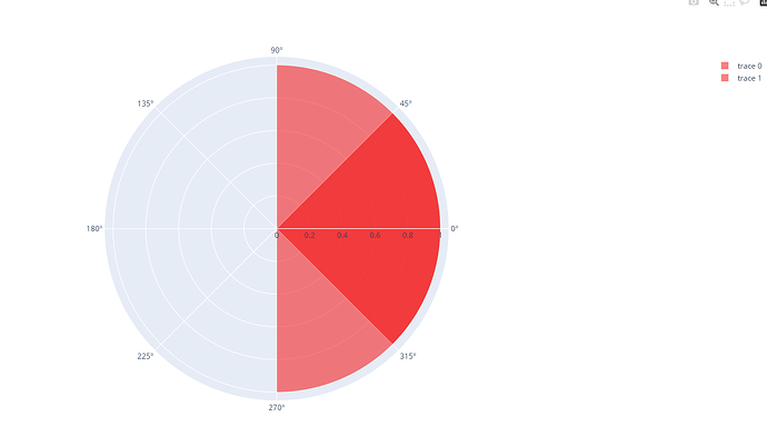
However, when doing the same with bar_polar the result is different :

(
    go.Figure()

    .add_barpolar(
        r=[1], 
        theta=[0], 
        width=[180], 
    )

    .add_barpolar(
        r=[1], 
        theta=[0], 
        width=[90], 
    )

    .update_layout(barmode='overlay')
    .update_traces(opacity=0.5, marker_color='red')
)

Why are the 2 results different and how can I manage to have the same behavior with barpolar as with bar ?

Thanks community !

Welcome to the community.

I’ve had a look around, and I think the following link solves your issue.

I would mock something up myself, but I am out and about until about 6 hours time.

If this doesn’t help please reply with what’s missing and ill have a stab at it

Regards

Tom

1 Like

OK, so I couldn’t resist having a play with this. This isn’t a work of art, just some boilerplate code that can be repurposed.

The following code was created by playing with the polar_bar chart example

I save it as an offline HTML as I’m just playing in PyCharm, not Jupyter.

import plotly.graph_objects as go
import plotly.offline as offline

fig = go.Figure()

fig = go.Figure(go.Barpolar(
    r=[1, 2, 3, 4],
    theta=[45, 90, 135, 180],
    width=[20,15,10,20],
    marker_color='rgb(158,154,200)',
    marker_line_color="black",
    marker_line_width=2,
    opacity=0.8,


))

fig.add_trace(go.Barpolar(
    base=0,
    r=[1, 2, 3, 4],
    name='trace 1',
    marker_color='rgb(106,81,163)',
    marker_line_color="black",
    marker_line_width=2,
    opacity=0.4
))

fig.update_layout(
    template=None,
    polar = dict(
        radialaxis = dict(range=[0, 5], showticklabels=False, ticks=''),
        angularaxis = dict(showticklabels=False, ticks='')
    )
)

# Save the fig as an HTML file
offline.plot(fig, filename='polar_bar.html', auto_open=True)

The resulting chart shows the colours combined.

1 Like

Having carried out my own look at it, then re reading what you were actually looking for I noted you were not defining the ‘base’ for your polar bar chart so it was stacking them. The following code gives you what you want.

import plotly.graph_objects as go
import plotly.offline as offline

fig = go.Figure()

fig.add_barpolar(
    r=[1],
    theta=[0],
    width=[180],
)

fig.add_barpolar(
    base=0,
    r=[1],
    theta=[0],
    width=[90],
)

fig.update_layout(barmode='overlay')
fig.update_traces(opacity=0.5, marker_color='red')


# Save the fig as an HTML file
offline.plot(fig, filename='polar_bar.html', auto_open=True)

Hope this helps